
A Dashboard for Planet Earth
The history of the influential planetary boundaries diagram raises the question: Can a single chart show the health of the entire planet?


In 2007, Bo Ekman stood in the kitchen of his Stockholm apartment. As a founder of the Tällberg Foundation, Ekman had spent a large part of his career gathering business and political leaders from aross the world to discuss the environmental challenges of globalization. But today, he had a new approach in mind.
Also in the kitchen with him was Johan Rockström, who at the time was executive director of the Stockholm Environment Institute. He remembers the day clearly: “[Ekman] made the point that Earth is always the missing ‘stakeholder’ around any negotiation table — be it climate, trade, or finance,” explains Rockström. “So, his idea was to create a big (like ten metres in diameter) round table, have Earth depicted visually as the “cloth” and run a negotiation with actors from business, culture, science, politics, etc., over how to govern humanity’s future on Earth.”
That was the birth of the planetary boundaries diagram — a data visualization that acts as a dashboard for the health of Earth’s bio- and geophysical processes. Together, the boundaries define a “safe operating space” for humanity, beyond which there would be severe repercussions for human wellbeing. The graphic has proven enormously influential — in both academia and among policymakers — and has shaped the discussion around how humankind can live together on Earth ever since.

At this point though, it was still just an imaginary tablecloth. “He asked me what I thought,” says Rockström. “I gave my support, but also said that if one does this, wouldn’t it be interesting to provide some scientific background. What constitutes the edge of the table? In other words, what’s the safe space we need to stay within?” Over a cup of coffee, Rockström promised Ekman that he’d come up with some numbers to support the idea.
That turned out to be no easy task. For years, environmental scientists had been observing and gathering data on the state of all of Earth’s major systems: the atmosphere, the oceans, the soil, the cryosphere, and the biosphere. The fact that the planet was changing was well-understood. But the question of how far it could change without major impacts on human society was not yet answered. “There were no ‘guardrails’ or ‘boundaries’ for Earth published in the scientific literature,” says Rockström, “so I started gathering groups of scientists to explore this in more depth.”
“We came up with a classic spaghetti diagram to end all spaghetti diagrams.”
One of those scientists was Will Steffen, at the time the executive director of the Australian National University’s Climate Change Institute. “It was a combination of Bo’s infectious enthusiasm and Johan’s confidence that science could actually deliver on this challenge that got me hooked,” Steffen says. “Even though I had worked in earth system science for quite a while, this was clearly a novel, exciting and very important concept.”
In early summer 2008, as the ice and snow disappeared from the scattered islands that make up Stockholm’s archipelago, Rockström gathered key experts across all strands of the Earth sciences to a workshop at a small hotel and conference centre on one of those islands called Villa Brevik. “We had a very creative scientific brainstorming, trying to put our fingers on the big systems regulating the state of the Earth system, and started playing with different visualisations,” he says.
Steffen recalls that the gathered researchers made an early attempt to explore how the different Earth systems interact with each other. “This was a mistake,” he says. “We came up with a classic spaghetti diagram to end all spaghetti diagrams! After admiring our work for only a few minutes, we quickly decided to leave the interactions for now and focus on the individual boundaries themselves, which was a wise decision.”
Ekman asked another group to convene around the mirror question of moral boundaries. But Alexander Crawford, research director at the Tällberg Foundation, says that it didn’t gel as well. “It lacked the kind of leadership that Rockström provided among the scientists, and it dissolved.”
The First Iteration
In the end, the assembled team arrived at the basic form of the planetary boundaries graphic, which was then developed further by researcher Björn Nyvkist and eventually published in the journal Ecology and Society in early 2009.
This early version is an unconventional nonagon-shaped radar chart, consisting of a series of red wedges representing different systems, sized by a relevant variable. A green area at the centre indicates the border between safe (green) and unsafe (white) conditions. Black points and lines show the estimated recent time trajectory of each variable since 1950, where available. Environmental systems that the researchers couldn’t quantify are represented as missing wedges. One wedge, representing biogeochemical flows, is split in half to show both nitrogen and phosphorus systems independently. Biodiversity loss is faded at the end, to show that it exceeds the space available in the graphic.

Once published, most scientific visualizations disappear into the fast-flowing river of academic discourse, rarely to be seen again. But this one did not — it kept bubbling to the surface, again and again.
Going Global
The highly prestigious journal Nature took an interest in the idea, as it was authored by some of the biggest names in the field. So Rockström and his team wrote a shorter summary of the paper which was published as a non-peer-reviewed feature alongside several commentaries from others.
During the editing process for that feature, Nature’s art director Wesley Fernandes decided to rework the diagram. A 2017 paper by Piero Morseletto analyses the changes he made in depth. First, Morseletto writes, Fernandes added a circular map of the Earth, centered on the Americas, to show that the systems represent our planet. The wedges were replotted to fit onto the globe, showing that some cross its border. “The diagram offers a vivid image of the planet framed/monitored by a radar. This is an instrument providing standard information and alert signals,” writes Morseletto.
“The observer is like an astronaut, but — continuing the narrative — an astronaut who has to return back.”
Slight distortion of the shape of the Americas allowed the centre of the diagram to be positioned where the Atlantic and Pacific oceans touch each other at the Panama Canal, aligning the pictorial elements of the graphic to make it appear as a target to be aimed at. The time trajectories from the original graphic were removed as unnecessary clutter, and Fernandes used transparency and more muted colours than the original graphic to make it more visually appealing.
Morseletto added: “The overhanging boundaries form a shape that recalls the radioactive symbol. This enforces even further the idea of the Earth in peril. There is another element of involvement: the observer is like an astronaut, but — continuing the narrative — an astronaut who has to return back. In a snapshot, the figure provides recognition and conceptualisation of the planetary issues.”

Once published in Nature, the diagram had immediate impact. It began showing up in scientific presentations, seminars, journal articles, and websites. But it also spread beyond the academic community. It attracted news coverage, began appearing in high-level policy briefs, and was featured at the United Nations’ Rio+20 conference on sustainable development. “Once the PB concept is mentioned, the diagram appears” notes Morseletto.
But this attention brought criticism, and one of its critics is Sarah Cornell, who coordinates the international Planetary Boundaries Research Network. “I have a love-hate relationship with that graphic,” she says. “It’s a really good planetary dashboard but it also has some of the worst elements of science dataviz.”
Cornell became aware of the planetary boundaries graphic shortly after it was published in 2009. “My reaction, and several of my early/mid career colleagues was ‘Wow! The old guys have woken up to interdisciplinary sustainability science’,” she says.
“I have a love-hate relationship with that graphic.”
The message that many global sustainability scientists want to transmit is simple — that humans can push environmental change beyond safe boundaries. That, she says, is a clear and a scientifically robust message. “In fact, several processes already lie well beyond precautionary boundaries, so I think we have an urgent responsibility to transmit the message clearly and impactfully.”
Starting Again
In 2011, Cornell was hired to work with Will Steffen, Johan Rockström and Katherine Richardson on making the quantifications in the graphic more robust and looking again at the tricky interactions that resulted in spaghetti in 2008. The work of that team resulted in a new paper in 2015 — published in another highly-prestigious journal, Science.
In the paper, a new version of the graphic appears. This version is pared back down again from the 2009 Nature paper, but retains some of its elements. The globe is gone, but the circular shape remains. The wedges have been re-ordered, and the biosphere wedge has also now been split in half to represent both genetic diversity (the variety of different species on Earth), and functional diversity (the variety of things that those species do in ecosystems).
Chemical pollution has disappeared, and been replaced by “novel entities” — things created and introduced into the environment by human beings that could have disruptive effects on the Earth system. That includes chemicals, but also synthetic organic pollutants, radioactive materials, genetically-modified organisms, nanomaterials, and microplastics, among others. The missing wedges have been coloured grey, and feature a prominent question mark to show that information is lacking. A third yellow safety category has been added between safe and unsafe —that of “increasing risk”. And finally, the wedges fade towards white in the centre to show that they don’t have a common baseline.
“I have to make a blunt confession now,” says Cornell. “The visualization in the Steffen et al. 2015 article (of which I am a co-author) has been the absolute bane of my life and in my view it should NEVER have been published!”
Cornell’s list of criticisms is long — that the picture and its caption equates risk and uncertainty, that the traffic light colours create a muddle between “uncertainty about variability in biophysical processes” and “risk to people”, that the yellow zone throws together all kinds and sources of uncertainty, that the split wedges look half as important as the full wedges, that some people interpret it as a pie chart, that others think there must be meaning in the sequencing of the boundaries, and particularly that that different wedges don’t have a common metric but many people think they do.
“This means that we can’t say that biodiversity loss is ‘three times worse’ than climate change — or that ‘it’s deeper into the red’,” she says. “The best we can say, and this is something the image does not signal well, is that the trajectory of change in biodiversity loss, climate change, etc needs to be halted and reversed urgently — and perhaps needs to be done more urgently than for global freshwater use, for example.”
On the question marks, she notes that: “For a paper that was supposed to be presenting advances in scientific understanding of human perturbation of a planet, a picture that is peppered with question marks and has so much greyed out space is a really counterproductive piece of dataviz.”
On the way the wedges fade towards the centre, Cornell is particularly scathing — “That’s by design, believe it or not. But putting a blob on a graph and saying in the very small print that each of the ‘axes’ shows a different scaling is hardly a scientifically robust response to a query about what the plot actually means.”
“It has been a science-communications nightmare.”
She adds that people have tried to measure the length and area of the wedges to use as the basis for calculations of things. “Dividing an ocean aragonite saturation [the chosen ocean acidification metric] of 4.2 by 7 billion and allocating that by national ecological footprint performance is not a step on the pathway to a glorious future for humanity by 2050, but that’s the kind of machination people do. That’s the curse of pseudoscientific numberology rather than the sign of a good picture. People expect figures in scientific articles to be scientific. And I think they have a right to have that expectation met.”
Finally, she says that people keep asking her why the climate wedge has been downgraded from red to amber between the 2009 and 2015 graphics. “That is exactly the opposite of the message we should have been transmitting,” she says. “The yellow is intended to mean that there is scientific uncertainty about the atmospheric concentration of CO2 at which irreversible physical changes will happen. But on an intuitive level, traffic lights always mean “risk” — and amber always means “less risk than red zone”, so there is no way that someone seeing that picture will understand that the colour-shading does not refer to risk (to us, people) without having read the whole paper.”
“For me, as a researcher trying to communicate my own research, it has been a science-communications nightmare,” she says. “I very rarely use it, except in my own classes as an example of a bad dataviz.”
Further Evolution
But the concept behind the visualization is so strong that it keeps evolving. A Google image search for “planetary boundaries” yields umpteen different variants on the same basic concept, each of which can be traced back to one of the above.
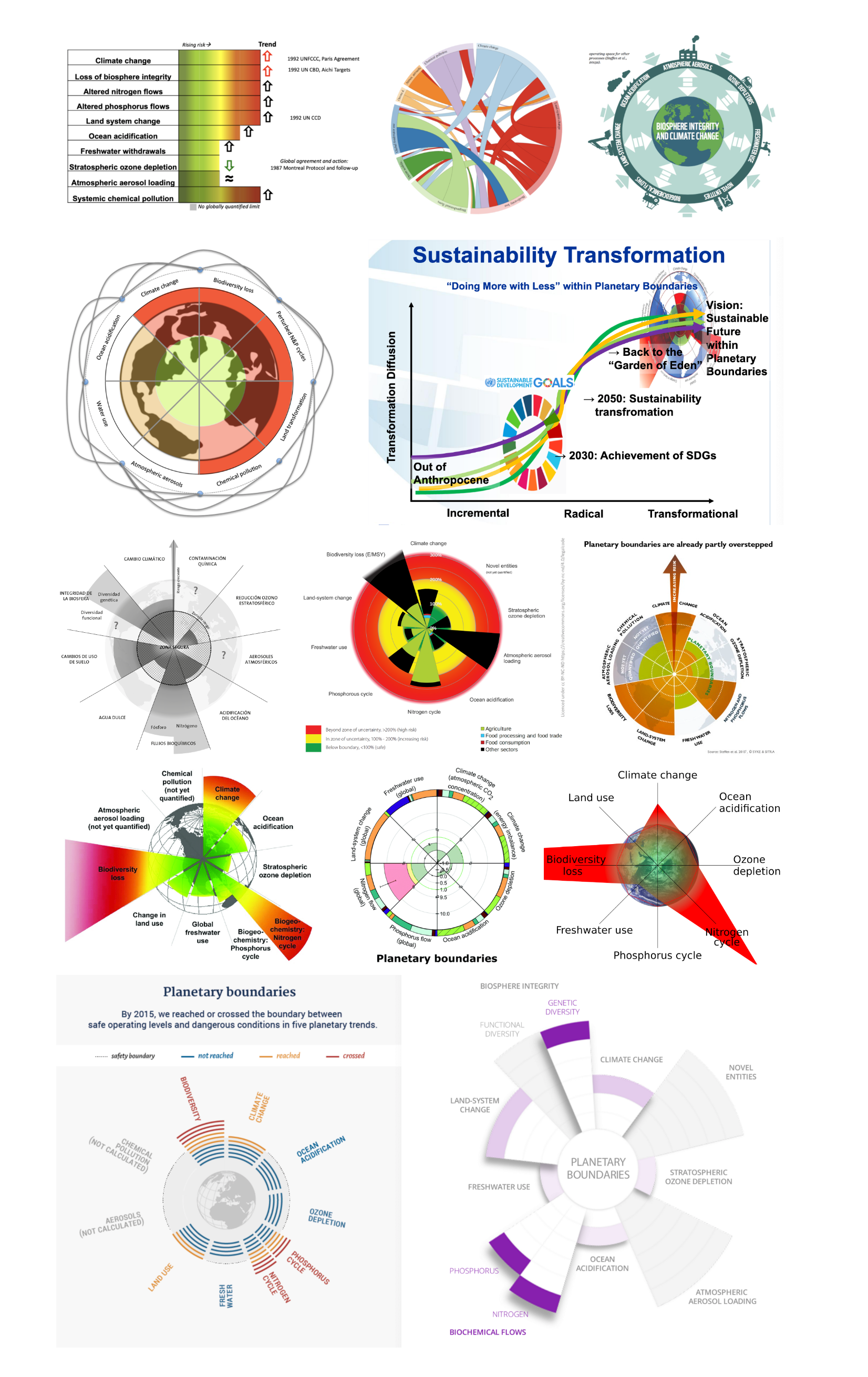
But there’s one iteration which has gained a life of its own, and now looks like it may even exceed the popularity of its progenitor. First emerging in 2012 in a paper written by British economist Kate Raworth for Oxfam, it used the planetary boundaries as a maximum, and a set of internationally agreed social standards as a minimum (from the 2012 Rio+20 summit), to identify an environmentally safe and socially just space where humanity can thrive. It’s called The Doughnut.
Raworth has finessed the concept over time, publishing a book in 2017 titled Doughnut Economics: Seven Ways to Think Like a 21st-Century Economist, and a comment piece in The Lancet the same year. In these publications, Raworth and her team quantified not just the areas where we’re overshooting the planetary boundaries, but also the areas where we’re falling short on providing a minimum social foundation for the world’s human population.
It bears many similarities to its planetary boundaries forebear, retaining the wedge structure and traffic lights colour scheme but this time in two directions. The outside shows the ecological ceiling (the planetary boundaries we must live within), while the inside shows the social foundation (the minimum services we need to provide humankind). The area between the two becomes the safe zone — the target to aim for.
“It’s our entire way of life, in one image.”
Like the planetary boundaries graphic, it shows which wedges aren’t yet quantified, which have overshot the target, and which we’re falling short on. And many of the wedges are split to show multiple indices — for example, half the water wedge shows access to improved drinking water (which 9% of humans lack), while the other shows access to improved sanitation (which 32% of humans lack). The full list can be found in the appendix to the Lancet article.
The Doughnut isn’t just a dashboard for the planet, it’s a dashboard for the planet and humankind. It’s our entire way of life, in one image.

Perhaps unsurprisingly, the Doughnut has proven immensely popular. It has shown up in a bewildering diversity of places, from the United Nations General Assembly to the tent camp of Occupy London. Very recently, it was formally adopted by the municipality of Amsterdam as the starting point for all of its public policy decisions.
“When suddenly we have to care about climate, health, and jobs and housing and care and communities, is there a framework around that can help us with all of that?” Raworth told the Guardian. “Yes there is, and it is ready to go.”
In recent months, Raworth has been working on building a collaborative platform to allow people —from teachers, artists and community organisers to city officials, business leaders and politicians — to put the the ideas of the Doughnut into action. The Doughnut Economics Action Lab is due to launch in June 2020.
“We’re going to need a whole heck of a lot of experimentation.”
In the meantime, work on planetary boundaries continues as we learn more about the Earth’s systems and the way they operate and interact. Cornell and her team are working on a “Planetary Boundaries 2020” assessment, setting out how much further the world has gone into the red since 2015. “In my view, we really need to stick with the successful elements of the 2009/2015 graphics for that,” she says. “This is not the time for a total rebrand!”
But there are still many visualization challenges ahead that will need fresh thinking. The complex interactions between Earth systems are beginning to be better-understood, and the more we understand them, the more complex they become, explains Cornell.
“In my view, we’re going to need a whole heck of a lot of experimentation on this front.”

This article was originally published as part of "Earth Week" on Nightingale, the Journal of the Data Visualization Society.