
Defending the Truth

There's an interesting line in the latest FlowingData newsletter.
It's difficult to plan for every single interpretation and use of your visualization once it enters the internet ethers. It's impossible to control.
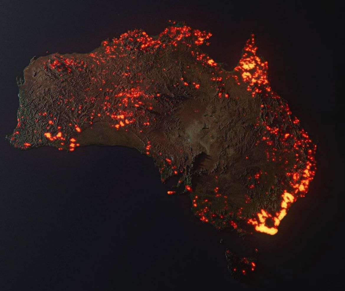
Nathan is writing about the 3D-rendered map of the Australian wildfires that was widely circulated on Twitter a couple of weeks back. The realistic style (a perfectly valid artistic choice) led people to believe it was a photo or satellite image, when actually it shows data from an entire month.
I've lost count of the number of times I've seen people's words be misinterpreted on Twitter. I don't need to go in-depth about how this is due to the brevity that the platform encourages, but I am heartened to see recent moves from Twitter to address it.
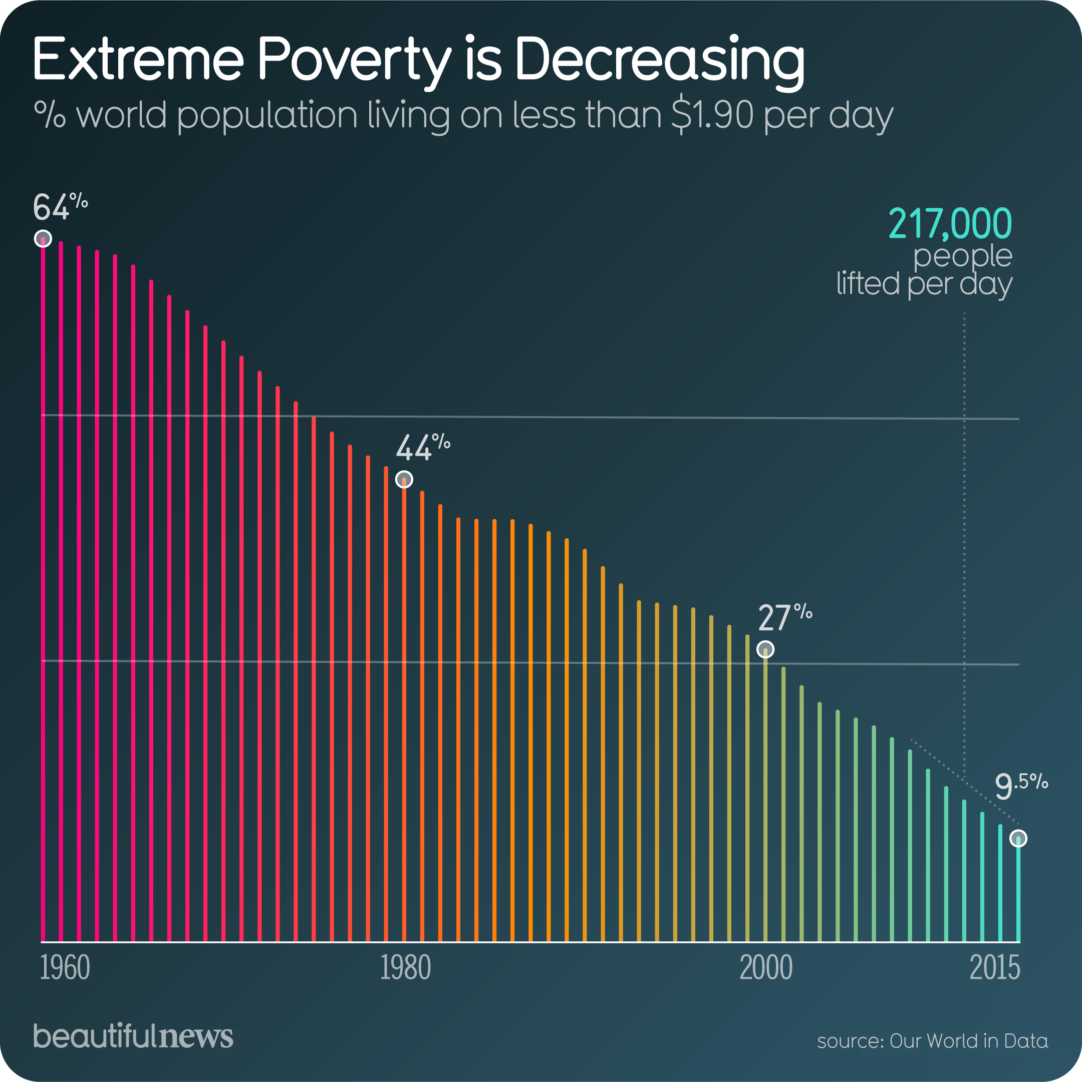
With dataviz, it's particularly tricky, because the way you seen data is inherently political. A dataset can be (and often is) interpreted in different ways depending on your viewpoint. Take falling global poverty, for example - some people see these figures as a defining success of neoliberalism. Others see neoliberalism's failures in the fact that it's not falling faster.
A key question is whether people who create data visualizations are responsible for the differing interpretations of their work. Nathan's right that it's limiting to always have to plan for people who, intentionally or not, misuse data visualizations to sell a lie. Climate deniers love their dataviz, after all.
On the other hand, there are techniques you can use to defend your design from this happening. Using the one key takeaway as the title helps a lot (as I described in my essay The Beginning, The Middle & The New Beginning), because it makes your intent explicit. So does clear labelling in terms of what a chart is showing (and sometimes even what it's not showing).
Ultimately, there's only so far you can go. As Nathan wrote back in 2018:
Put up enough graphics online, and they end up in weird places used in ways you did not anticipate. You can spend time trying to correct all the mistakes, or you can continue your work.
What techniques do you use to defend your work against misinterpretation and misuse? I'd love to hear your strategies.