
How to engage audiences with climate data

Recently, the kind folks at the European Journalism Centre asked me to appear on their Conversations With Data podcast, to talk about data and climate journalism.
Alongside data journalist Pei Ying Loh from Kontinentalist, and visual journalist Rodolfo Almeida, we spent an hour dissecting what organisations and the media frequently get wrong while telling climate stories, and how to deepen and broaden your audience reach.
Here's a summary of what I said in text form.
What audiences find engaging
I think what's most engaging for general audiences is stories about people.
It's so easy when you're working with climate data to write stories about temperature anomalies or sea level rise or atmospheric forcings, because those are the metrics that your data comes in. But those things are too abstract for most audiences. They don't care about model outputs. They care about what is happening and what's going to happen to human beings, and most of all they care about what happens to human beings like them.
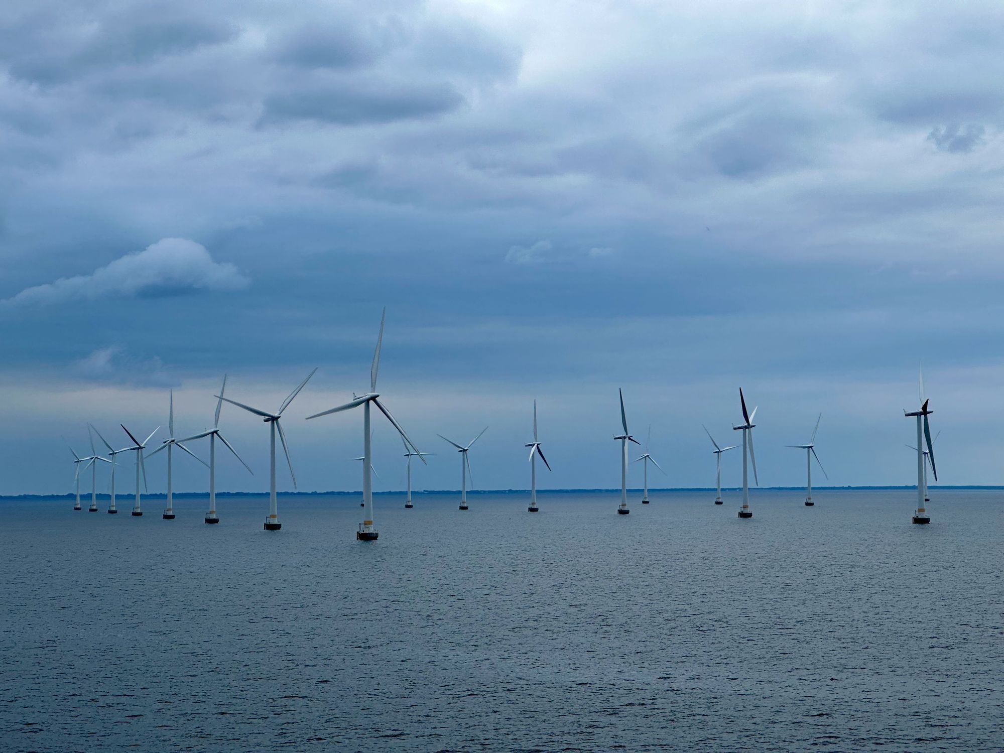
This speaks to another huge problem around climate stories, which is that many audiences are totally fatigued by stories about disasters happening on the other side of the world. If you're looking for maximum engagement on a climate story, you need to centre your readers in it - make it locally relevant. Find people in your audience being affected by climate change and tell their stories.
And then finally, and relatedly to that last point, I think people have become really numb to constant stream of disasters that the news presents - especially when almost all of our TV shows, movies, and books are about dystopias and disasters too. At Possible we try to focus our storytelling around solutions instead. Positive stories. Not necessarily to give people "hope", because (as Nasa scientist Kate Marvel points out) most experts on the subject don't have a lot of hope - but courage instead. The courage to do the right things without the assurance of a happy ending.
How data visualization can help
the most powerful thing dataviz does in terms of climate communication is give credibility to the science.
You can say something like "Summers are hotter than they used to be", and people will reply: "I remember some very hot summers when I was young!" But if you've got data that shows exactly how hot summers were when they were young, and how much hotter they are today, and you can present that in a clear and understandable way - like a chart, then I think it helps people to understand that the situation we're in is genuinely unprecedented.
The next step, of course, is getting people - especially people with power - to shift from understanding to actually doing something about it. But that's a bigger question.
Making information design more relatable and impactful
Over the past few years I've been experimenting a lot with sound, through my data sonification studio Loud Numbers. Sound is fascinating as a medium for data storytelling because it's so much more visceral than a chart.
To explain briefly for people who aren't familiar with sonification - it's just about mapping data to sound parameters instead of visual parameters. So in a graph, a larger number might be represented by a longer bar. But in a sonification a larger number might be represented by a louder noise.
And here's the thing - you can make a sound so loud that it hurts, that people are covering their ears in discomfort. That's not something you can do with a bar chart. Obviously that's a technique you need to use very sparingly, but the point I'm making is that sound can deliver experiences that visuals just can't. Visceral experiences like I just talked about, but also emotional experiences, where you use particular scales or chords or timbres or samples that have emotional resonance.
We did a story about climate change - the first episode of the Loud Numbers podcast. We made a techno track based on the records of a sweepstake that's held every year in a small town in Alaska, where they bet on when the ice in the river will break up each year. They've been doing it more than 100 years, and today - because of climate change - the river
We piled a lot of emotional associations into that. There's the associations people have around techno - about rigid predictable tempos and rhythms, and at the end of the track those things start to break down, just like the earth's systems are breaking down. We also put a siren over the top that gets louder and louder throughout the track - literally sounding the alarm on climate change.
So I think that sound can really help make a data story more relatable and impactful.
What's a favourite project you've worked on?
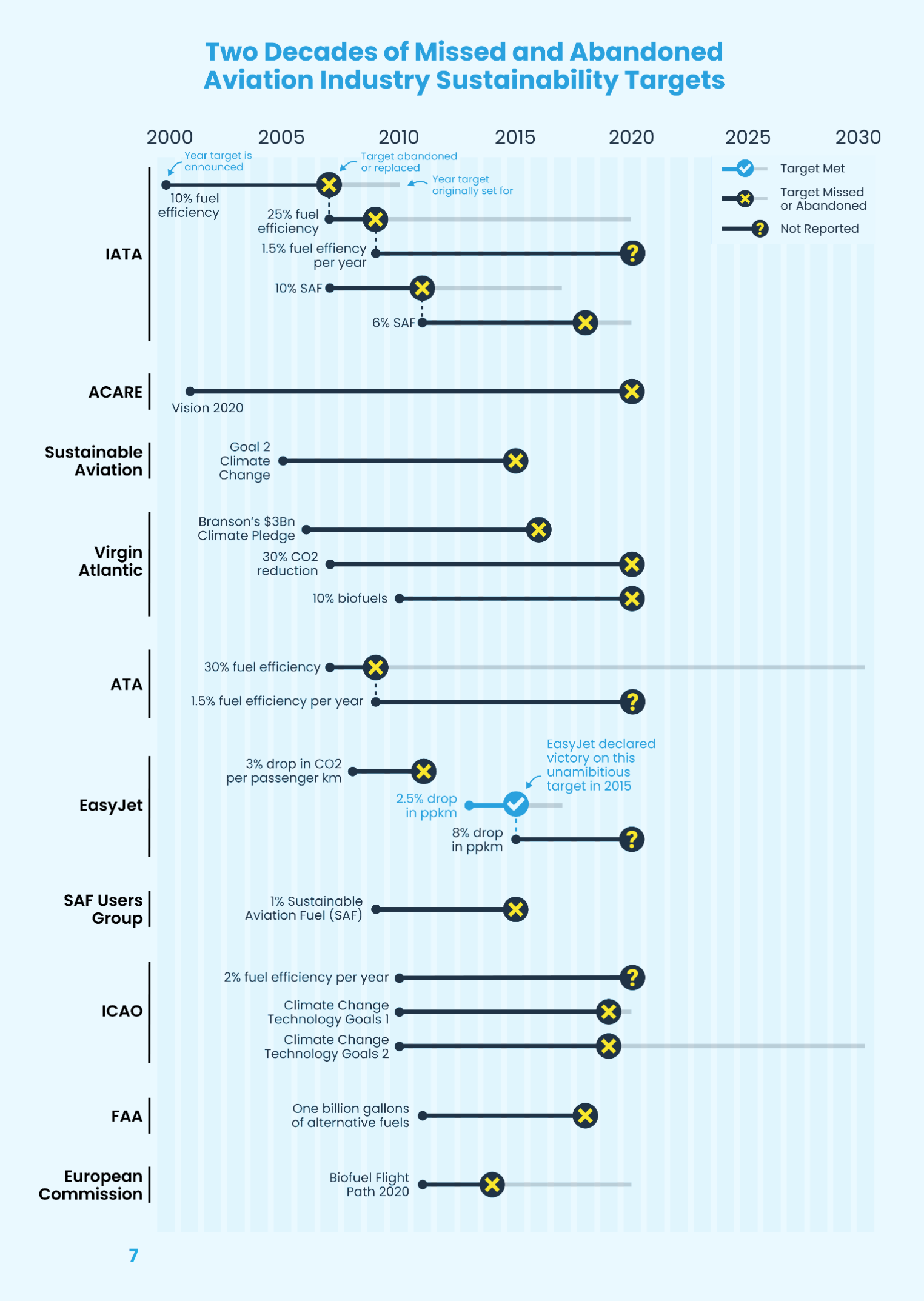
I think one of my favourite pieces of work I've done over the past few years was for Possible's "Missed Targets" report - which analysed 50 different sustainability targets that the aviation industry has set itself since 2000.
We found that all but one of those targets has either been missed, abandoned, or just totally forgotten about. I made a chart that plots these promises over time, showing when the target was announced, when the goal year was, and when the target was abandoned or replaced. Every line but one ends in either a big X or a big question mark.
What it shows that the industry uses sustainability targets incredibly cynically - to lobby politicians to allow air travel to keep growing and growing without proper regulation of its total emissions. It's a total scam.
So any time you hear a company or a government or anyone else set a sustainability target, remember that it's totally worthless without a credible plan to achieve it, and that plan being genuinely put into action.
What should journalists be mindful of when it comes to designing for accuracy and accessibility in visualizing scientific data?
I think the biggest thing that concerns me about the media and climate change isn't so much questions about accuracy, but around understanding that - as Jamie Alexander says - every job is a climate job. That's as true in news organisations as it is in the wider world - it's not just the environment desk that reports on climate any more. The business desk needs to understand climate. The politics desk needs to understand climate. The arts desk needs to understand climate! The technology desk really needs to understand climate - and I say that as a former technology journalist.
For example, you could really see this in the recent NFT craze a couple of years ago. I'm sure that you all, as well as many of the people listening, will know that crypto - by design - uses an insane and totally wasteful amount of energy. And that energy translates directly into carbon emissions. NFTs are powered by crypto, and so they have a huge carbon footprint too. But I saw so many articles hyping up the technology while totally failing to mention that it's working in the complete opposite direction of our attempts to stabilise our increasingly unstable climate.
 Duncan Geere
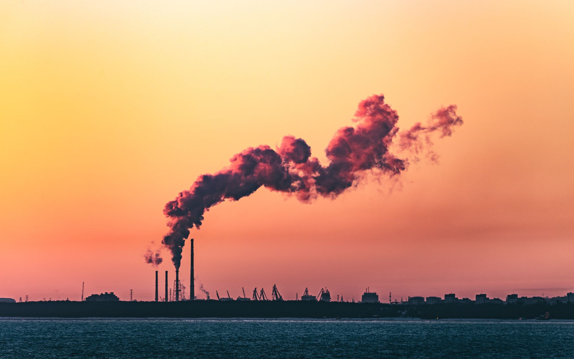
So yeah, what journalists should be mindful of in every story they write - I think - is whether the thing they're writing about is taking humankind closer to extinction, or not. That's an insane thing to need to say! But it's world we're living in now.
What's the future of data journalism in the context of climate change?
I'd like to see more journalists use data to interrogate politicians and businesses about the sustainability promises that they've made and whether they're actually meeting them. I want to see journalists speaking truth to power - setting out the situation we're in, setting out what can fix it, and asking why we're not doing that fast enough. We have all the solutions we need to fix our climate. We just need to see those solutions used.
Listen to the full podcast here: