What I Learned From 31 Days of Generative Inktober Sketches

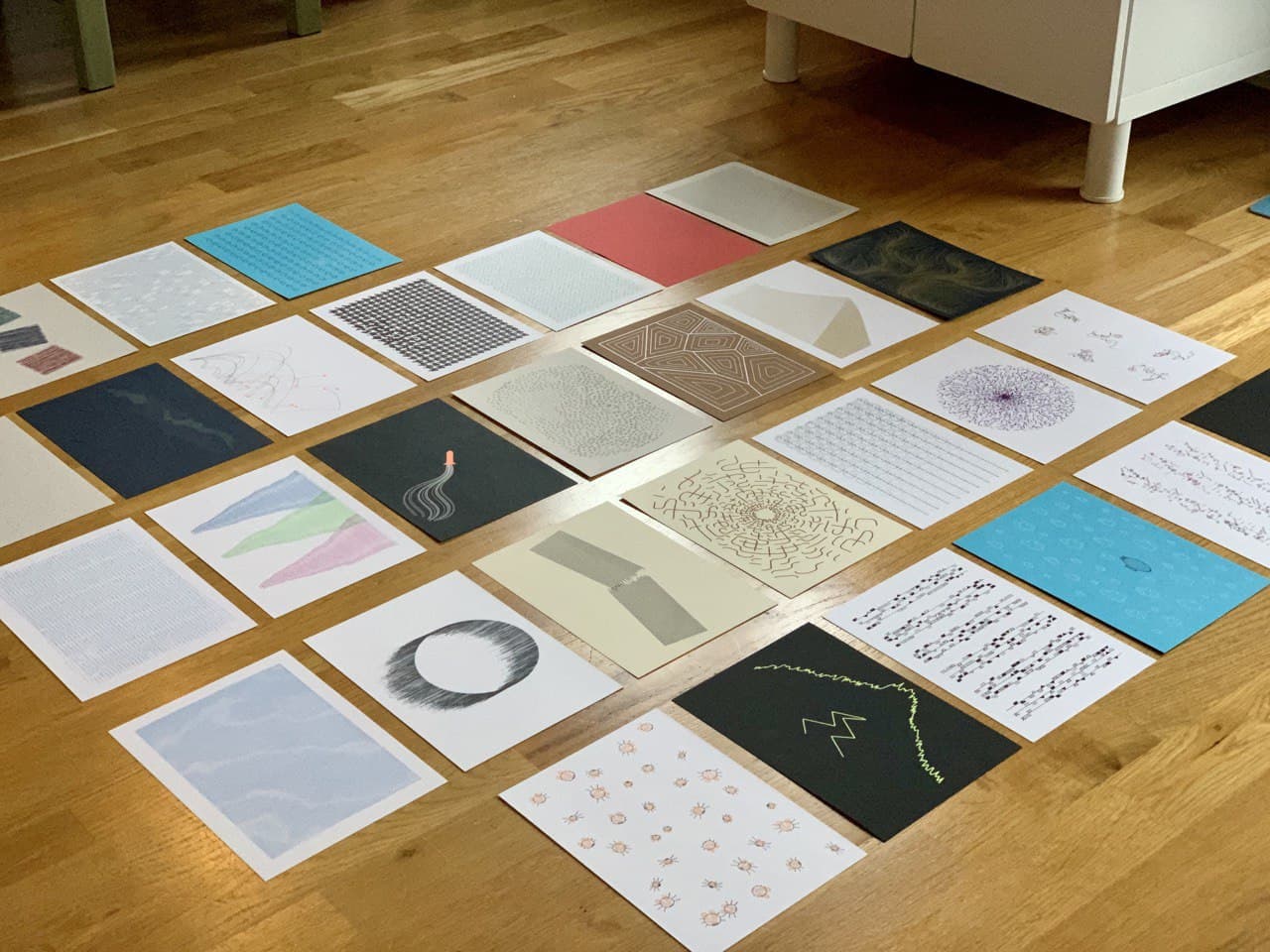
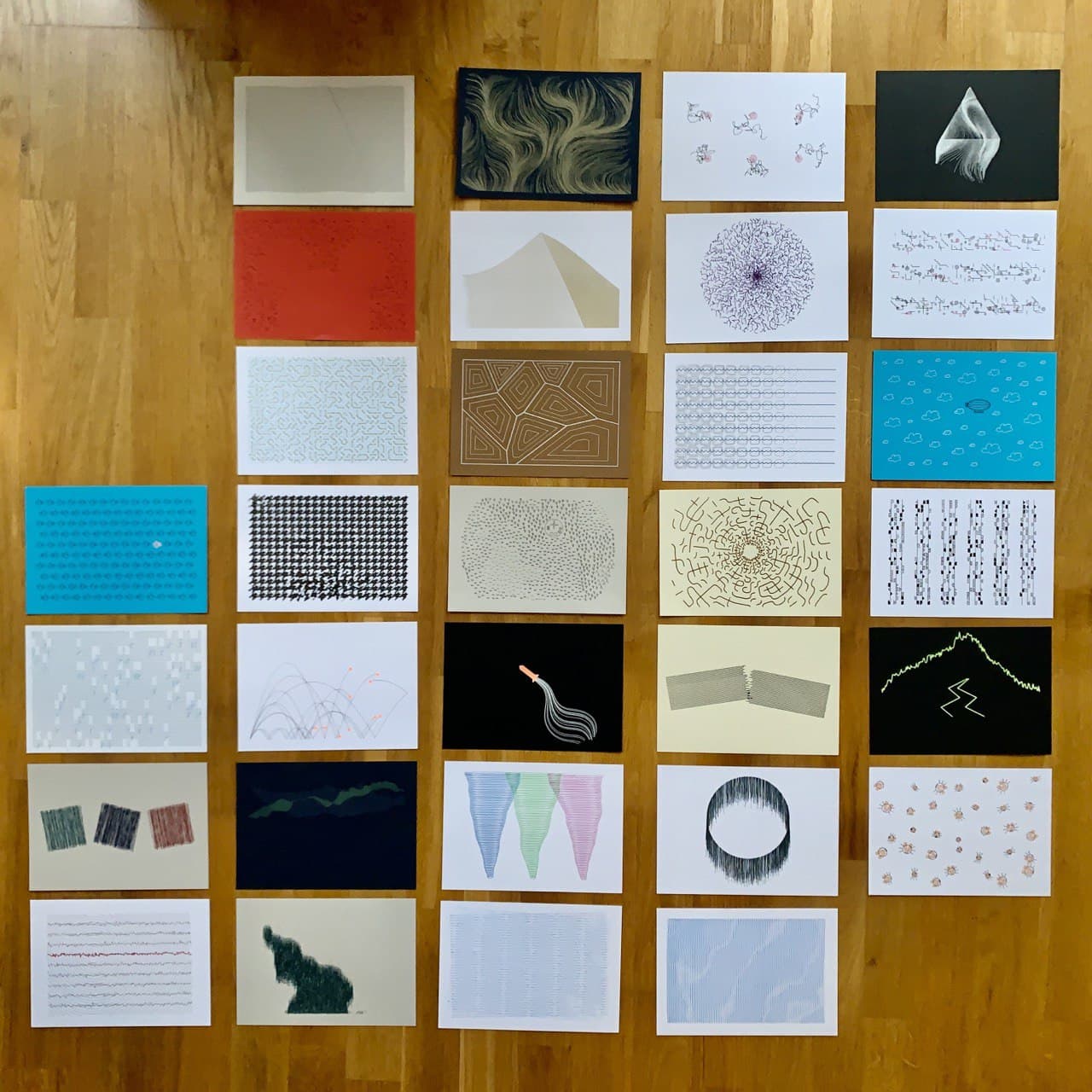
During the month of October 2020, I created 31 pieces of generative art – one a day – from a list of prompts published by the folks at Inktober. Normally people draw their artworks in a notebook by hand, but as I had a plotter lying around I thought it'd be fun to code them instead.
Sharing your work is an important part of Inktober, so I posted all my sketches on my generative art Instagram account, in this Twitter thread, and here on my blog. I also filmed each plot being created, and I'm slowly editing and uploading those on my Plottervision YouTube channel.
Not only did I share the sketches, but I uploaded the code for each sketch to this Inktober Github repository, and created a little generator for each one that you can use yourself to make your own versions of my sketches (available at duncangeere.com/inktober20/(sketchnumber)).
I had a lot of fun in the process of doing all of this. I created some beautiful work, and some not-so-beautiful work. But more importantly, I was able to practice my scales – I used loads of different generative art techniques, including some that I'd never tried before. I learnt a lot, and in this post I'm going to go over some of the things I learnt, pick out a few favourite sketches, and talk about what's next.
Techniques I Used
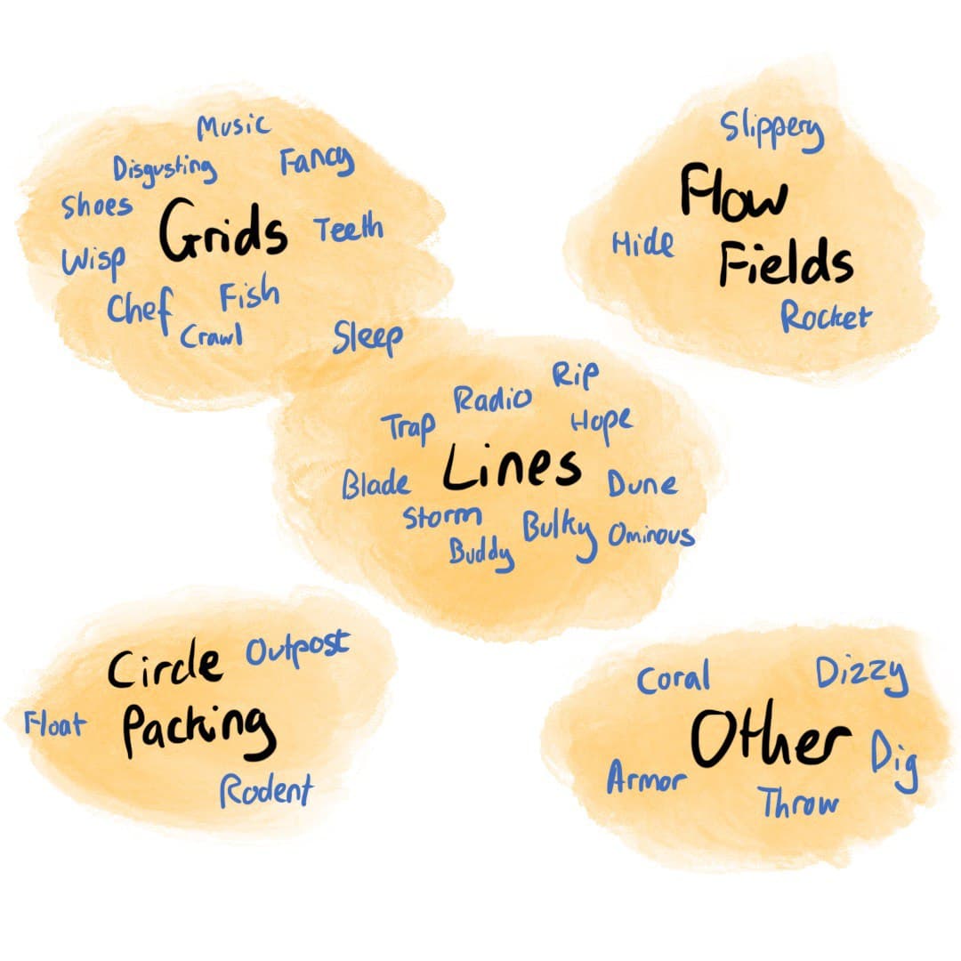
There are some fundamentals common to many generative artworks. Grids and lines are very common. So are flow fields and circle packing approaches. In the diagram below, I've roughly split my artworks by the technique I used to create them.
Grids
Grids are very simple - you have a set of rows, a set of columns, and then you draw things where they meet. The rigidity of the grid feels satisfying, and you can draw the eye by breaking that rigidity in one or a few places. In my Wisp piece, for example, the grid is broken in a few places by "ghost" boxes that float away. In Teeth, the dogtooth pattern is distorted by noise in a few places.
You don't have to break the grid. You can also create a gradient across it, as I did in the Molnár-esque Sleep, or interweave two grids, as I did in Fancy (which didn't photograph well). You can also create multiple grids in one image, like I did in Music, which approximates the graphic score for 1/1 from Brian Eno's transcendent Music for Airports.
Lines
Another powerful tool is a line, and by "line" I really mean a path - a collection of nodes, joined up by straight or curved lines. When I'm doing a line-based piece, I tend to have a start point for the path, and then a "detail" variable which defines the number of nodes along it. Each node then gets its own coordinate based on the start point, but perturbed in some way.
You can use lines to approximate fills (which plotters don't do very well), like I did in Bulky, or to create a jagged or wavy effects, as I did in Radio and Storm (in the case of the latter, I just plotted different-sized narrow ellipses along a wavy line). For extra fun, you can break lines, like I did in Blade, Dune and Rip, which again draws the eye.
Flow Fields
Combine grids and lines and you get a flow field. It works a bit like this - make a grid, fill each grid box with an angle (I recommend using Perlin or Simplex noise to generate the angles to keep the flow smooth), and then run lines across it that change direction based on the angle below them.
I love flow fields because they come out looking beautifully organic and ghostly, they work well on plotters, and they're a little more advanced than lines and grids alone. The purest form of a flow field is shown in Slippery, which just distributes line start points randomly across the whole grid. But you can also have fun by starting them on the edges of polygons (Hide) or clustered in a single place (Rocket).
I had made a couple of flow fields before I started Inktober, mostly by following this tutorial from Tyler Hobbs, but for my Hide sketch I coded my own from scratch and it turned out to not be as tricky as I thought it would be.
Circle Packing
A technique for layout that doesn't rely on grids or lines is circle packing. This is where objects are filled randomly into a given space in such a way that they don't overlap. It's usually an iterative process, where you position one object at a time, testing in the process that it doesn't overlap with anything that's already there. If it does, find a new position and if it doesn't then add it to a list of placed objects.
You can see it in action in my Outpost sketch, which picks one of four things to draw based on a Perlin noise field behind it. None of the things overlap. The map shape edges come from two additional criteria that the position needs to not be off the sides, and not too far from a point in the very centre of the canvas. Circle packing is also a nice way of positioning the start points of lines in a flow field, though I didn't try that here.
Polar Coordinates
Coordinates around the edges of circles are a bit more tricky than coordinates in a simple grid, but a bit of Math.sin() and Math.cos() action will do the trick.
Alternatively, you can also just draw in one dimension and then rotate, which is how I put together my Chef piece. It's just like a regular grid with a 10 Print-style design inside, except that it has a longitude and a latitude instead of x and y. I've not seen a lot of generative artwork with polar coordinates, which is a shame because it's a lot of fun.
Space Colonisation, Voronoi and Physics Simulations
The layout possibilities don't stop there! There are loads of ways to fill a space, and in my Coral sketch I wanted to draw an iterative colonisation approach. There are a few possibilities in this 2019 blog post from Generative Landscapes, and the one I liked the most was the last - the branching network. It has a lovely natural look.
For Armor, I used a Voronoi tiling library created by Raymond Hill, which sets out a bunch of points randomly and creates a tile around each one consisting of the area that's closer to that point than any other.
Then for Throw I built a little physics engine where balls are hurled outward, bouncing off the floor and walls. Thanks to Daniel Shiffman and his Nature of Code book and video series for showing me how to make that happen.
Moiré patterning
A weird thing happens when you put two grids next to each other and tilt one ever so slightly. You get a strange interference pattern, called a Moiré pattern, which looks like some parts are thicker and thinner. It's often seen on screens (which are grids of pixels), but it's also possible to create it by plotting lines and grids.
I had a first go at this with Trap, which does what it intends to do but isn't especially exciting to look at. I had more success with Buddy, which layers three perturbed grids on top of each other to create something even more complex.
Minimalism
Some of the sketches I liked the most over the month took more of a minimalistic than a maximalistic approach. Throw is just lines and balls. Rip is just a bunch of straight lines. Bulky is just three squares, and Ominous is just three lines! It's amazing what you can do in generative art with very little. In several cases I sat back and thought: "Does this need more? No - it's good as it is." One of the nice things about needing to get out a sketch every day is that each one can't be too complicated. Embracing minimalism helped projects to not sprawl.
Object-Oriented Programming
Object-oriented programming, in the context of generative art, can be used to encapsulate an idea of something (like a ball, say), including its behaviours and properties (size, weight, bounciness, etc). You can then make lots of instances of that thing, put them in different situations, and see what happens.
Several of my sketches, most notably Throw and Dizzy, use an object-oriented approach, which helps abstract much of the complexity away from the main codebase. As a result, I am substantially more proficient at using Javascript classes and methods than I was at the start of the month, and that's going to be good for my future coding work.
Running a Node.js Server
Sometimes a browser isn't powerful enough to do what you want it to do, and you need to run some back-end code which delivers to the browser only the information it needs to do what it wants to do.
For example, in my Rodent sketch, I had to crawl through about 80MB of Google Quickdraw sketches of mice, pick some out at random, and render them in a circle-packing layout.
This would take aaaaages if I did it with regular Javascript. So instead I coded up a small Node.js server that does the hard work of loading the 80MB file, filtering out the ones I don't want, and serving up random sketches from what's left. I've tried building Node.js servers a couple of times in the past for things, but never with much luck. This time I had a simple enough task that I was able to get it working.
It means there's no online generator for that sketch (because I'd have to keep that server running all the time), but it's simple enough to download and run yourself if you want to. Having that Node.js success under my belt has boosted my confidence to go back and try those older tasks again.
Gestalt Principles
Many of my sketches employ Gestalt Principles, a set of ideas in visual design that you can use to create meaning from simple forms. These concepts are tremendously useful in generative art and if you're not familiar with them then I'd highly recommend reading up.
For example, the laws of continuity and proximity power Rip, making it appear that the lines are part of a fabric which has been torn in two. The laws of similarity and figure/ground make the orange figure in Fish stand out from the crowd. And the law of closure makes a triangle appear in Hide even though it's made up of just a series of lines.
Inspiration from Nature
If I listed all the instances where my sketches here were influenced by nature then we'd be here forever, but I wanted to note that whenever I was stuck on a sketch I just looked for patterns in the natural world. A lot of generative art tends towards the geometric, but it doesn't have to be that way. Nature has all of the best patterns and no-one's going to get annoyed at you if you steal them.
Telling Stories
Similarly, the most satisfying pieces to me were those where I was able to convey emotion and tell a story. The airship in Float is taking travellers on a journey, and the drunk pilots of Rocket make me laugh. An urgent message is arriving in Radio, lighting up the airwaves. There's a calmness to the geometric pieces that I like, but it's the story pieces that I love.
Favourite Sketches
I'll give you three lists of top five sketches - one chosen by the number of likes on Instagram, one by the number of favourites on Twitter, and my personal top five.
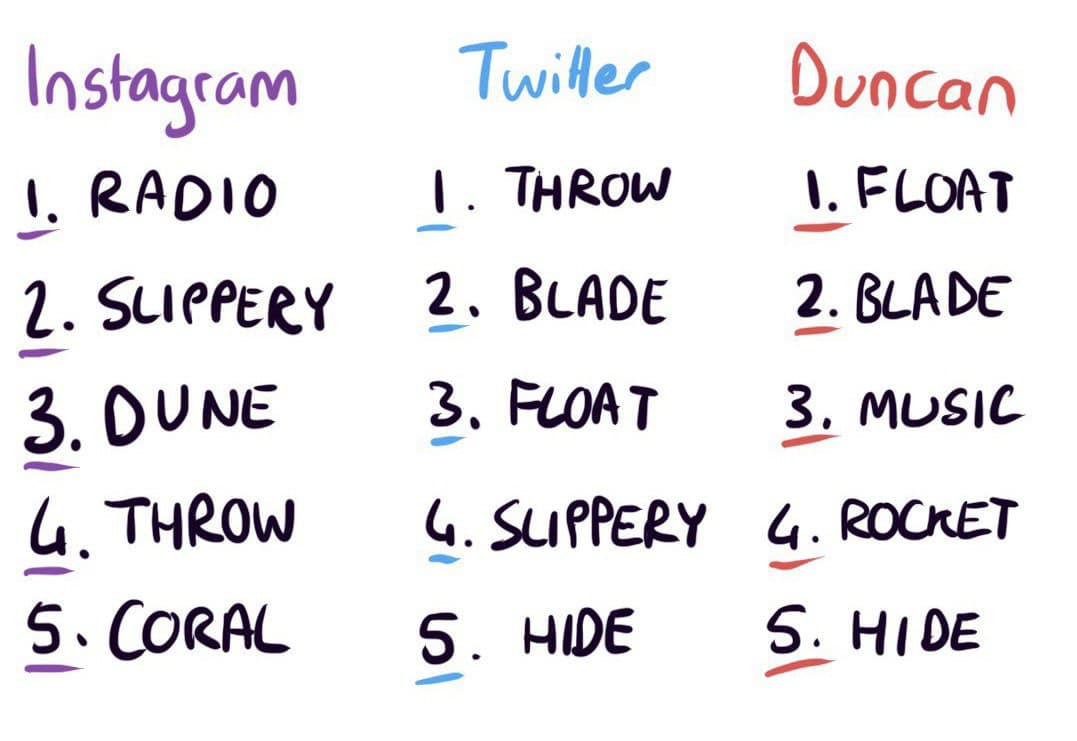
It's interesting to see that nothing appears in all three lists. The closest is probably Throw, which wasn't far from my personal top five but didn't quite edge out Hide in the process. I was also surprised that Music didn't prove more popular, but maybe the reference was too oblique (geddit?).
What's Next
I'm a little bit creatively drained after 31 days of new ideas, and so I'm taking a short break from generative art - just a week or two. When I'm ready, I plan to start developing some of the sketches into larger, more impressive and interesting pieces. I've got a lot of rich starting material here.
I'm also planning to investigate generative music. I spend a lot of time listening to ambient music when I'm working and coding, and it would be lovely to build a system that responds to what I'm doing somehow - perhaps pinging gently when I save a file, or growing in complexity as I write more lines of code. That feels like it'd be fun. Let's see!
I Couldn't Have Done This Without
Tools
- My plotter, the Axidraw V3/A3.
- Javascript and my SVG-drawing library of choice, Rune.js.
- Github, for hosting the code and the generators.
- Sublime Text, my beloved code editor (though I am side-eyeing VSCode...)
- http-server, which powers my generative art creation system (should I share my system? Would that be useful for folks?).
- Loads of pens but primarily Sakura Gelly Rolls, Pilot G-2s, and Zebra Sarasa Clips. Loads of paper but primarily Canson Bristol.
People
- Silfa, of course.
- The Elevate crew, especially Alli who recently completed a much larger bout of endurance creativity of her own!
- My Instagram and Twitter followers for voting with your hearts.
- You for reading this.
Thankyou to all of the above!
