Introducing Dataplotter

I've been working on a new series of videos for my nascent pen plotter YouTube channel (Plottervision), drawing and narrating data stories. It's called Dataplotter.
In it, I'm doing something I've not seen done much in the plotter community - data visualization using a pen plotter. Drawing dataviz with a plotter has its advantages and drawbacks, and I'll write a little about them in this post, as well as talking a little about the (somewhat painful) production process for my first video.
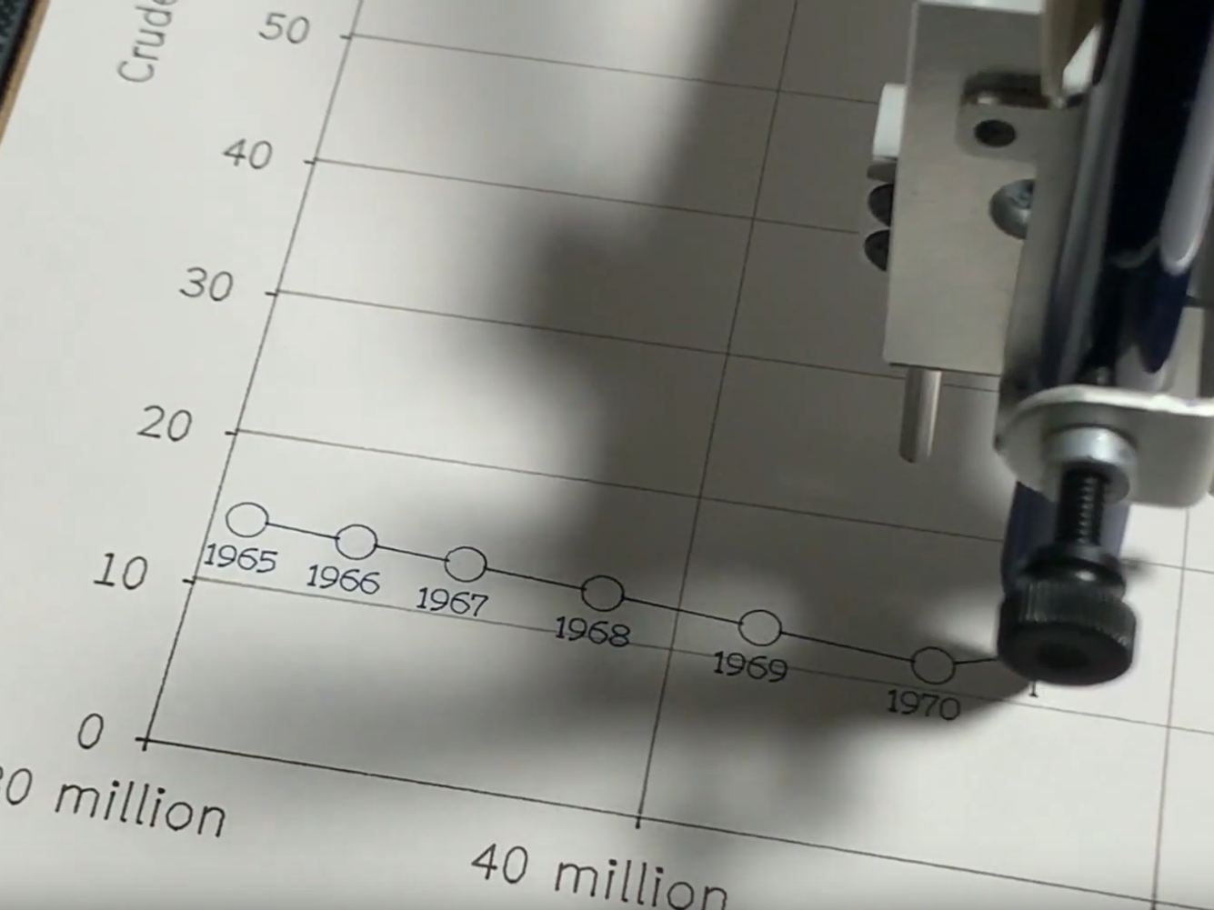
First, though, perhaps you'd like to watch my first video in the series. It's about the history of oil prices and production since 1965.
Done? Skipped it? Either way, let's talk about dataviz on a plotter.
Setting up a data visualization as a plot isn't super easy. First you need to plot the visualization in a platform that can output as SVG. I used Flourish to generate my plot, and then Figma to tidy it up.
For a plotter, you need an SVG that consists only of lines. That means no fills, of course, but almost all dataviz includes text, and that text has to be converted into a different kind of font that consists only of centre lines (normal fonts contain outlines). These stroke-based fonts are few and far between, and to convert them you need to use an Inkscape extension called Hershey Text.
Then you need to figure out how you want to draw it. Normally, a plotter will optimise a plot - meaning that it draws lines in a way that minimises pen-up travel distance. But when you're making a visualization and filming it with a voiceover, you want to draw things in a specific order, and that means turning off the optimisation and then arranging every element in a list. Groups help, but this still takes ages.
Finally, you need to do a lot of experimentation in terms of pen types, plot speeds, and even paper sizes. I think I plotted this one in the region of ten times in total - first because I was experimenting with different formats, and then several times during the filming process. One screw-up in live filming means starting the plot from scratch, because you can't erase it.
Once you've got your visualization set up for plotting, you need a script. I wrote one, then recorded it under a blanket on my Blue Snowball, with some hefty noise gating (the Snowball picks up every sound in the Universe). I've since invested in a nicer dynamic mic - the Audio Technica ATR2100x-USB, which is very lovely and not ridiculously expensive. It should make the audio a lot less of a pain next time. I edited the audio in Apple's Logic Pro X, which is overkill but I had it handy and it supports VST plugins like the brilliant Trileveler 2. If I didn't have Logic, I'd have used Cakewalk (free on Windows) or Reaper.
Then there's the filming, and I learnt a lot here because I've never done much video production in the past. The first thing I learnt was not to record in 4K - my computer just can't handle editing it.
The second thing I learnt was not to try to record loads of short clips and stitch them together. It's a fiddly mess and takes ages. I quickly abandoned my tiny clips, and instead did a rough storyboard of what shots I wanted and then filmed it on multiple cameras live - using OBS as a production studio. You can wirelessly send video to OBS from any mobile phone (I used my iPhone XS and Silfa's OnePlus 5), making this a pretty simple and cheap option, though the quality did suffer a little - particularly on the OnePlus 5. I need to investigate whether I can hook up a Fuji X100T to OBS without having to buy one of those £200 Elgato dongles. Any tips on that are welcome.
Finally, I learnt that not all video production software is created equal. I'm lucky enough to have an Adobe Creative Cloud subscription, but I don't like Adobe software much, so I try and find alternatives where I can. I didn't find any cheap video editing software that gave me the control I needed, so I used Adobe Premiere Pro to do my edit (for simpler videos, I tend to use Adobe Premiere Rush). Again, tips here are welcome.
The whole thing, from data collection to publishing the video took about three weeks - which is considerably more than I was hoping. A good chunk of that was spent avoiding doing the voice recording step, and avoiding doing the video editing step, so I could definitely do it faster - especially now I've done the hard work of figuring out how to do it.
I'm pretty happy with the outcome - plotters are super-satisfying to watch, and filming them creates a weird kind of permanent animation, where things can be drawn but not deleted again. That's an interesting creative constraint to work with. It's also fun to blend the digital precision of an SVG and a plotter with analogue pens, paper, hand-drawn annotations and a human voiceover telling a story.
I think there's a lot to explore in that digital/analogue combination, and I've only scratched the surface. In upcoming videos, I want to do a lot more hand-drawing on top of the plotted charts (maybe that's a solution to the stroke-based font issue?), maybe changing the paper? Maybe using tracing paper, or OHP transparencies? Maybe bringing in little props even? The creative possibilities are very rich.
But this blog post is getting long, so I'll end here. If you've got any plotter/dataviz questions or comments, I'd love to hear them. Email me, tweet me, or leave a YouTube comment.