Centring the Reader

Charles-Joseph Minard was a 19th-century civil engineer, who become famous for his early contributions to information design. You've almost certainly seen his map of Napoleon's disastrous 1812 Russia campaign.
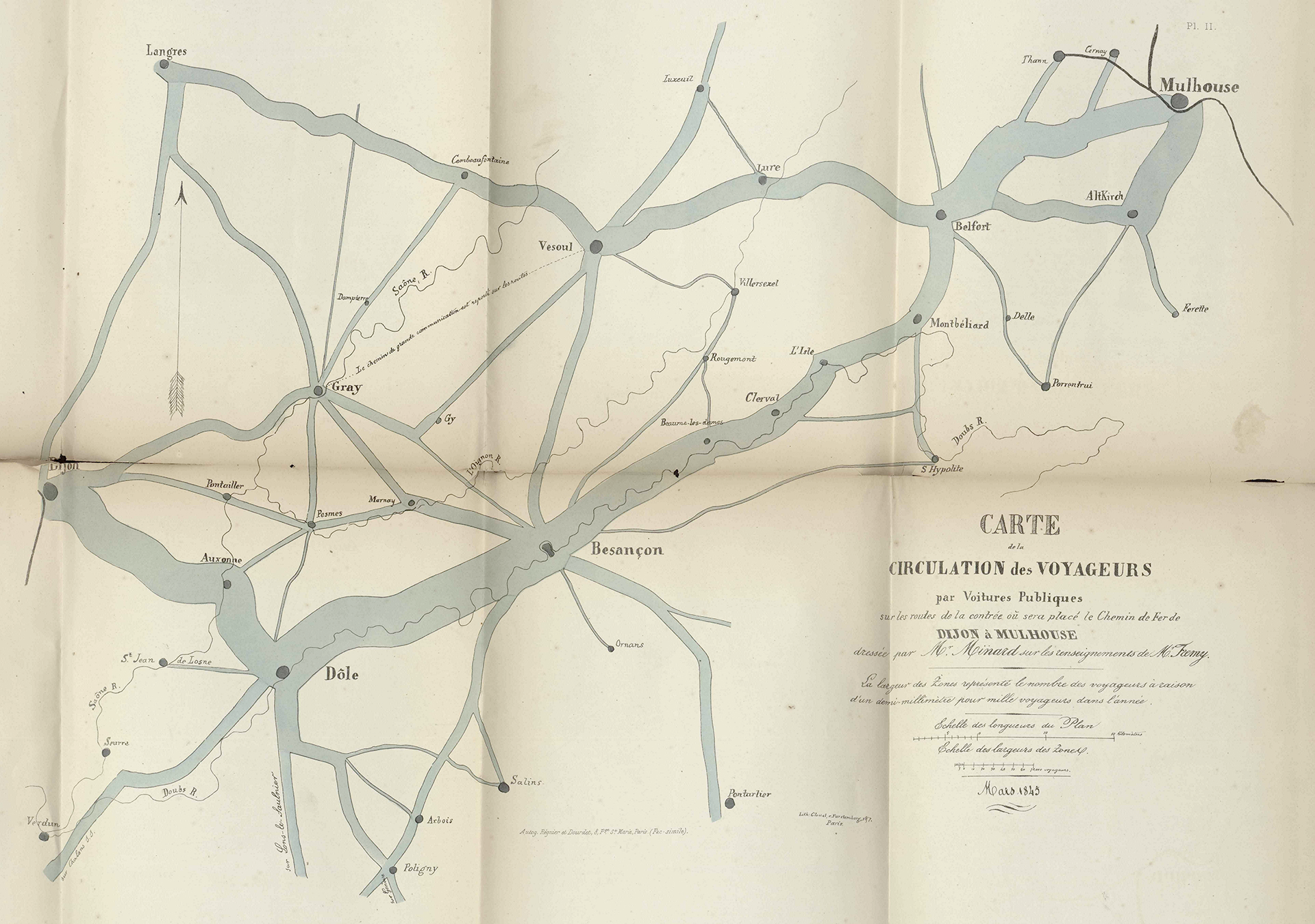
But his work extends far further, and RJ Andrews has just published a new translation of Minard's 1861 summary of his career, which includes a bunch of fantastic graphics and maps. One of them particularly stood out to me:

This is a map showing road traffic flows along roads in a rather obscure part of eastern France. But it just so happens that this part of eastern France is where my father lived for a decade and a half at the end of his life, and so I know it pretty well. He lived close to the bottom centre of the map, between Salins and Ornans, and I travelled many times along the roads that Minard charts here.
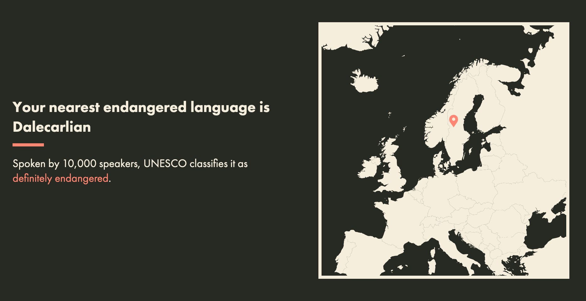
I guess the takeaway for you, reading this article, is that the emotional resonance of this map allowed me to connect with it in a way that I wouldn't have if it were about a place I didn't know. Which is essentially the oft-heard recommendation of centring your target audience in the narratives you create. There are lots of ways to do this. In my Disappearing Languages graphic, I asked the reader for their location then displayed their nearest endangered language.

Filip Hnizdo takes this to joyful extremes with his Relative Fiction project.


By centring the reader, you increase the emotional resonance of your story. Which makes it more likely to be remembered. And isn't essentially what we all want, at the end of the day?

