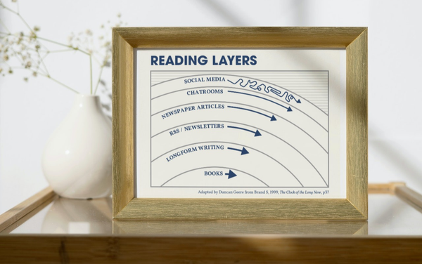
Dataviz Data Journalism Advice For Science Writers I was interviewed for a nice piece on The Open Notebook about data journalism for science writers. Interrogating Data: A Science Writer’s Guide to Data Journalism As with all
Behind the Scenes Blogroll: The Blogs I Love Remember when everyone had a blogroll? You probably do not, but I do. It was wonderful to see what the people you read were reading. So, in no particular order
Inspiration Society Centred Design If you work in the design space, or with designers, then you'll likely have heard of human-centred design. It's a concept which states that well-designed products and services are those
Inspiration Active Participation There was a great piece by Kevin Roose in the New York Times last week, which has only just filtered through the streams to reach me. It's about how Covid-19
Inspiration The World As a Subway Map The New York Times has published a good* scrollytelling piece about Covid-19, which makes use of particle flows to show how the virus spread from a single market in Wuhan
Music In My Head A few weeks back, I appeared on a local radio station for a show called "In Your Head". It's a bit like Desert Island Discs - they invite someone on
Inspiration Centring the Reader Charles-Joseph Minard was a 19th-century civil engineer, who become famous for his early contributions to information design. You've almost certainly seen his map of Napoleon's disastrous 1812 Russia campaign. But
Inspiration The Organograms of Government What does your organisation's structure look like? You could draw an org chart, but how about an drawing an organogram instead? These charts were put together by Peter Cook, and
Dataviz Food Miles Are Not As Important As You Think Our World in Data has just published a great article about the source of the emissions associated with different foods. It's a simple stacked bar chart. Each bar represents a
Design There Are Only 10 Types of Movies “Can I copy your homework?” “Okay, but don’t make it too obvious.” 2. Sexy legs pic.twitter.com/0IujkDyRKi — 𝕃𝔼𝔼 (@leesteffen) January 14, 2020 Click through for the full ten.
Dataviz The Missing Legacy of Marie Neurath Looking for a weekend read to dig your teeth into? You could do much worse than Jason Forrest's latest dive into the history of data visualization - The Missing Legacy
Dataviz Custom Isochrone Maps Isochrone maps are one of my favourite things. They show far you can travel from a place in a given amount of time. There are lots of classic examples, but
Design Scripter: Sketching with Code If you love Figma as much as I do, this may excite you. All-round smart dude Rasmus Andersson has built a Figma plugin called Scripter that lets you write simple
Inspiration Atomic Habits & Cadence For the last few months, I've been trying to cultivate better habits. Much of this was after reading James Clear's Atomic Habits, which is the best self-help book I've read in some time. It's simple, clear, exactly as long as it needs to be,
Inspiration Beginning I have a newsletter called Beginning, but today I'd like to share a cartoon by Grant Snider with the same title. New comic! Beginning pic.twitter.com/SfK3VK7ks9 — Grant Snider (@grantdraws) January 3, 2020 Feels appropriate for the new year.
Inspiration Girih Tiles Some interpretations of Islam include a ban of depiction of animate beings, so much of religious Islamic art is geometric in nature instead. A few years back, I picked up
Dataviz Dataviz in 2019 I have a love/hate relationship with roundup posts. I love reading them. I hate writing them. That's why I haven't really summed up my 2019. The best summary of 2019 in dataviz that I've read comes from Data Visualization Society founder Elijah Meeks.
Inspiration Alignment Chart Alignment Chart The latest XKCD goes meta D&D, though I'd argue that the alignment chart itself should be lawful evil. Actually, the soil chart (lawful good, though Wikipedia's rendition is chaotic neutral at best) is one of my all-time favourites, and I'd love to
Inspiration Peak Map Ridgeline plots (formerly known as joyplots - read the explanation for the name change) are a lovely way of displaying topography. Peak Map is a website created by Andrei Kashcha