
The Organograms of Government


What does your organisation's structure look like? You could draw an org chart, but how about an drawing an organogram instead?
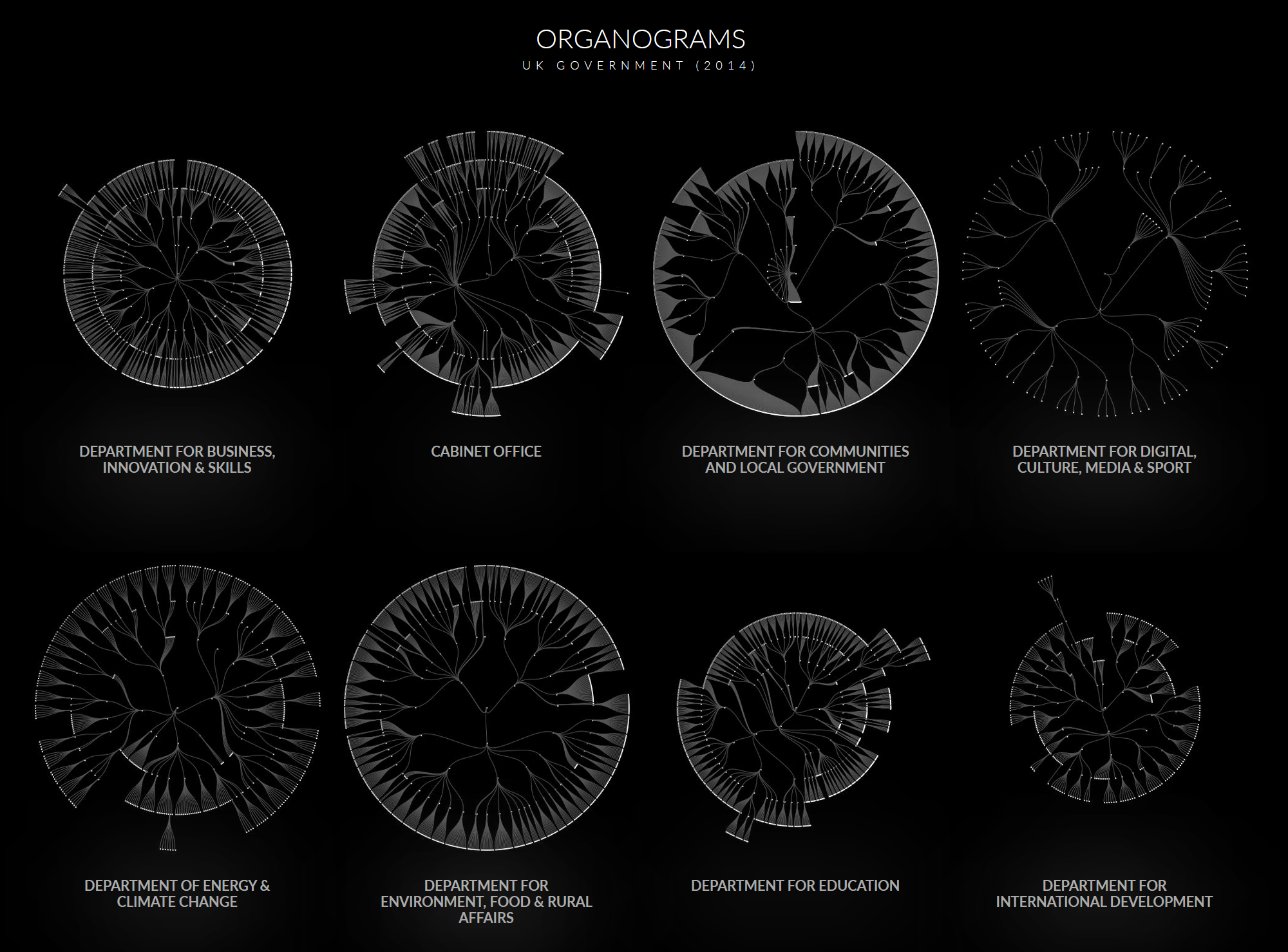
These charts were put together by Peter Cook, and show how different parts of the UK government are structured (or were in 2014, anyway). Okay, so maybe they're just org charts plotted in a circle. But they give a wonderful overview of the difference between departments. Compare DEFRA with the Foreign Office, for example.
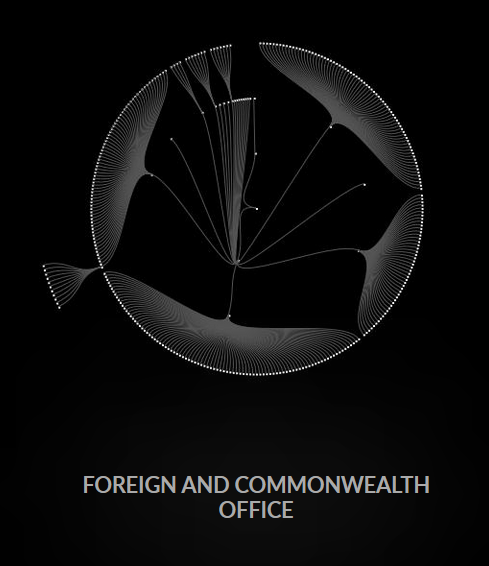
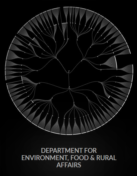
Peter says:
D3's tree layout was used to compute the tree shapes, voronoi for hover over, and D3's zoom for zoom and pan. Other than that it's custom code. The gallery view is static jpg images and if you click through the interactive charts are rendered to canvas.
You can see the finished graphic here, and the code used to create it here.