
The World As a Subway Map

The New York Times has published a good* scrollytelling piece about Covid-19, which makes use of particle flows to show how the virus spread from a single market in Wuhan to almost every country in the world.
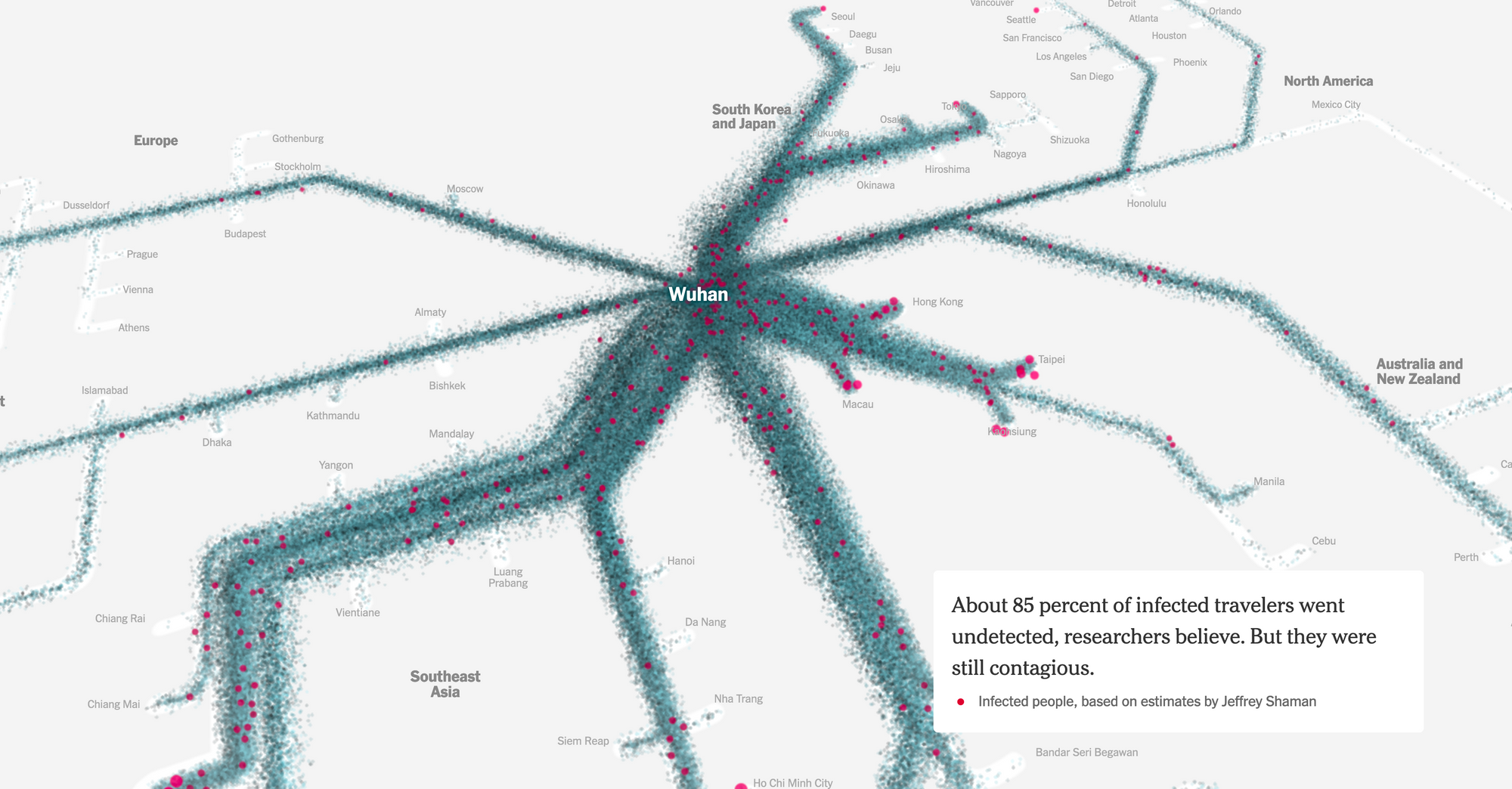
It makes great use of the scrollytelling format. But I wanted to highlight one element that I particularly liked - a subway map of the world, based on transport connections from Wuhan.

This is effective for the same reasons that subway maps are an effective tool to understand how to navigate a city. Depicting distances accurate isn't as important as showing connectivity. How easily can you, or a virus, travel from A to B?
Additionally, it helps give the reader a sense of the volume of travel between each of those destinations, and along trunk routes.
It's a lovely bit of work, and great inspiration as a new way to show geographical flows.
* Weirdly it doesn't mention Europe at all - going straight from China to the United States. To me, that seems like a major storytelling failure.