
Climate Change Solutions

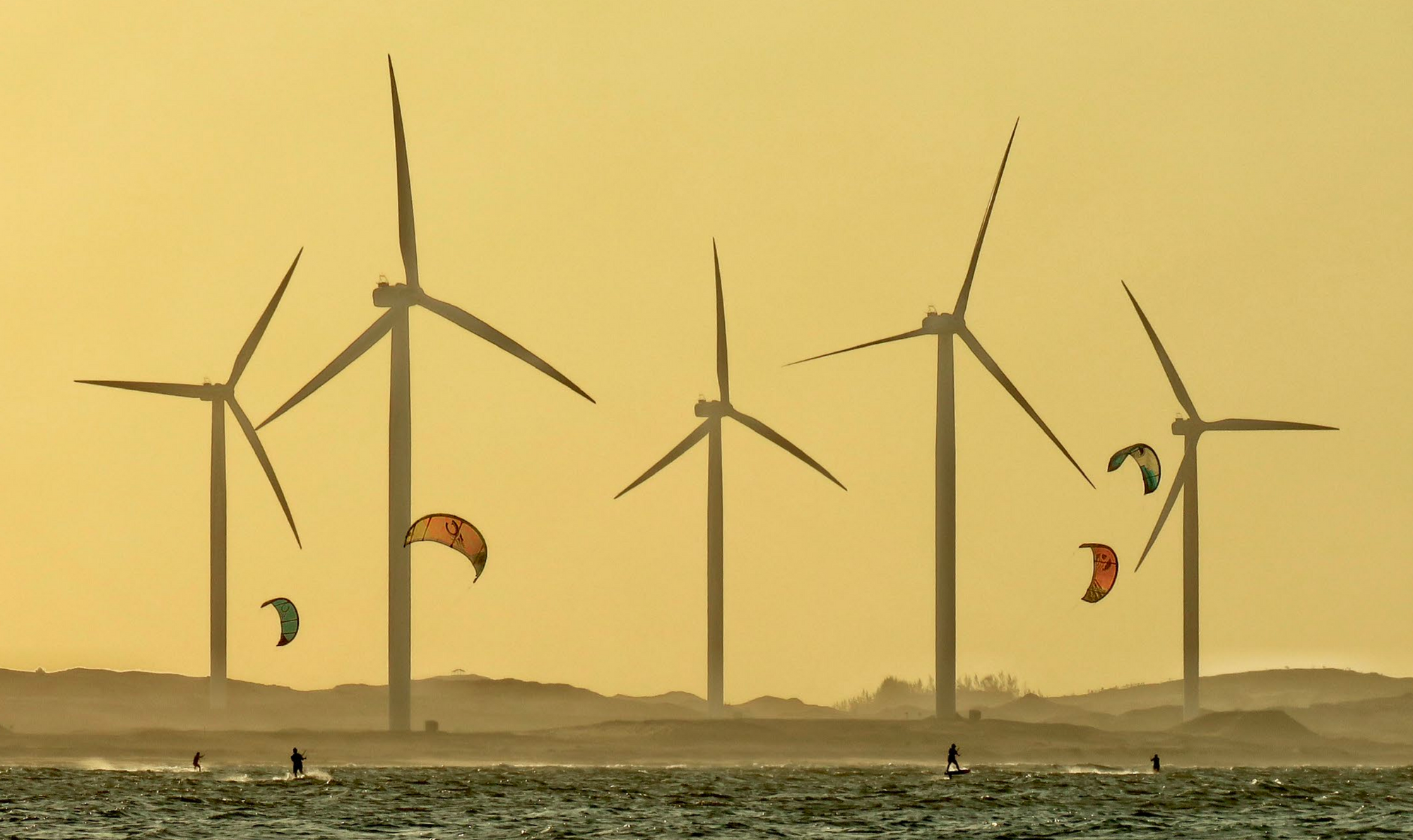
Towards the end of 2019, the team at Project Drawdown got in touch to ask if I could help them out with data visualization for an update to their best-selling compendium of climate change solutions. A chance to develop graphics for a huge audience on the single most important topic of our time? My answer, obviously, was "yes".
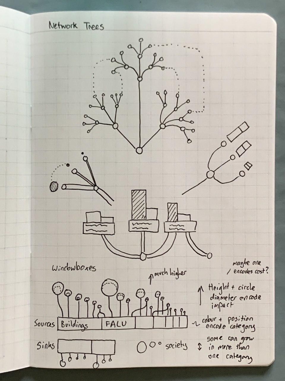
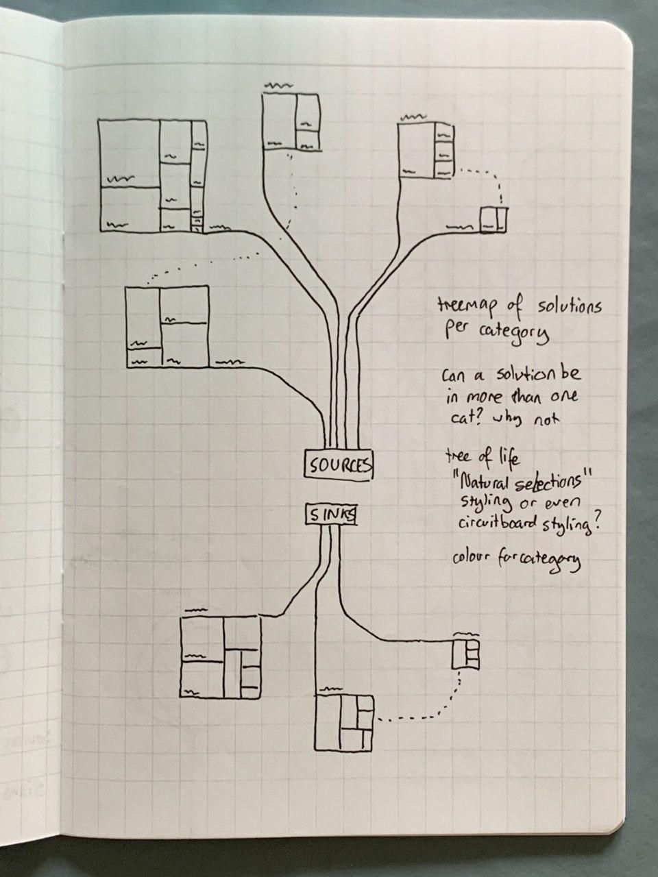
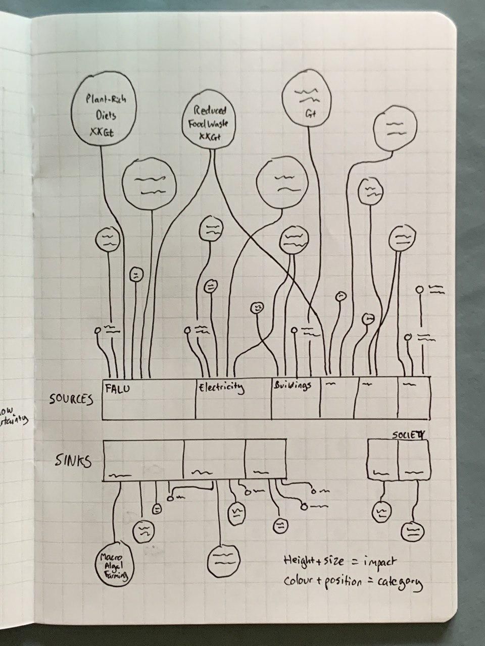
I spent some time working with the Drawdown team on analysing their data, and developing several different graphical approaches for representing it. Here are a few of the hand-drawn early sketch iterations that I went through.
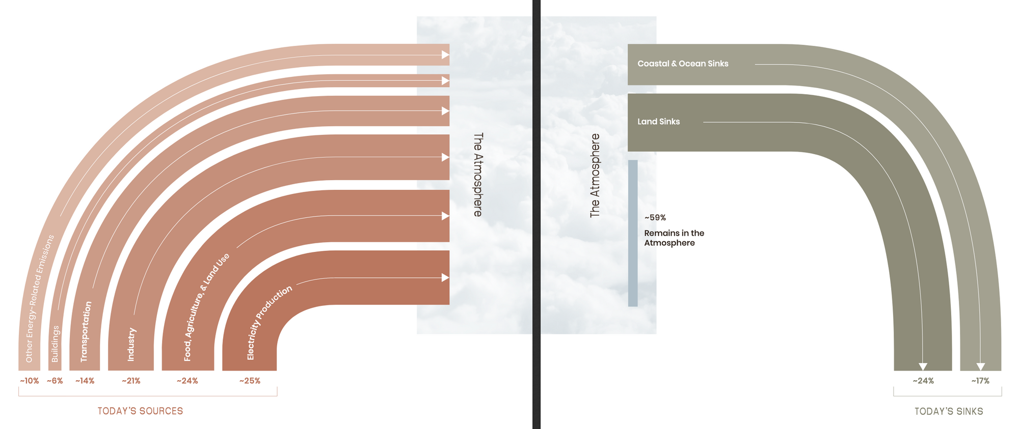
Once we had a visual approach agreed, and while the data team were finalising their figures, I began working with draft numbers in my tools of choice - Google Sheets, Flourish and Figma. I got the data into the right shape in Sheets, then exported as a CSV to Flourish to plot the shapes, then exported an SVG from Flourish into Figma to work on the design. That design went through several iterations too. Here are a few options I mocked up for the "rainbow" graphic on pages 10 and 11.
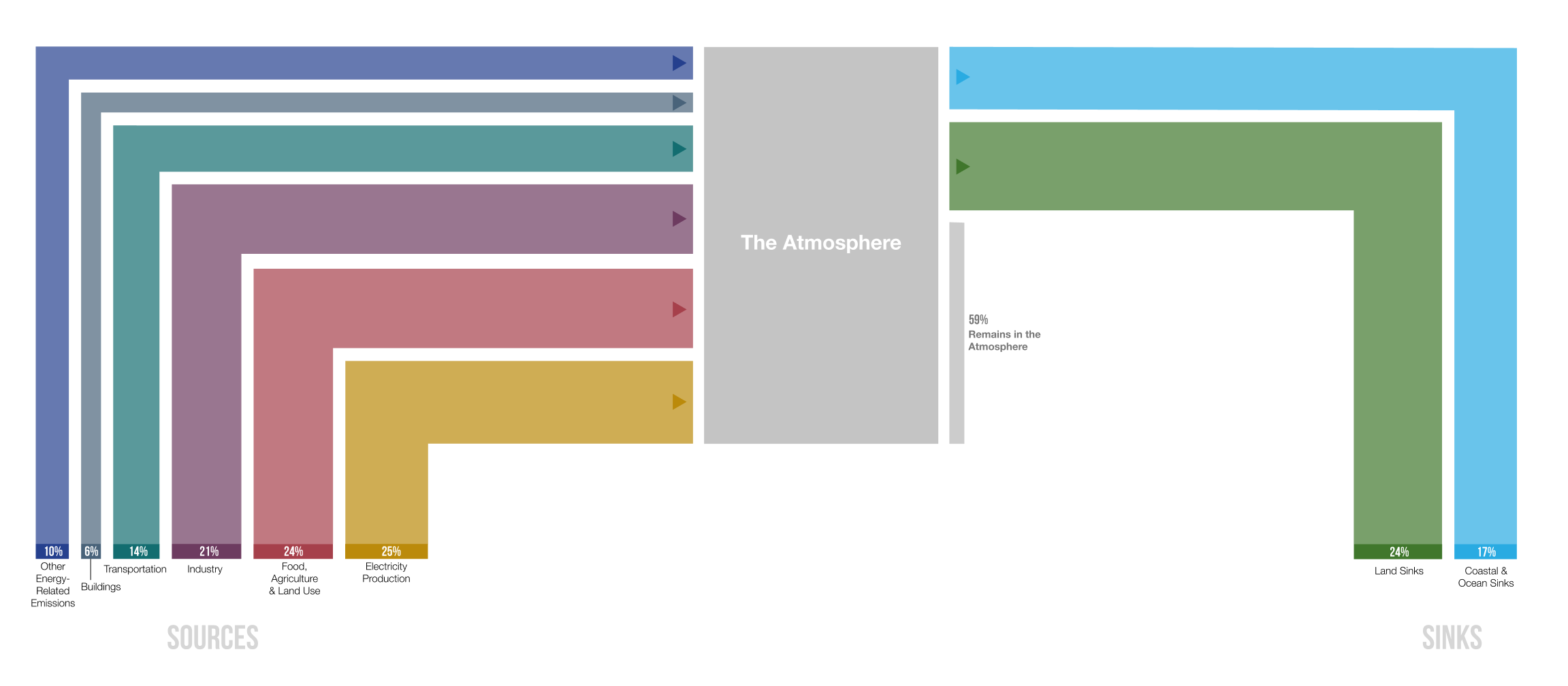
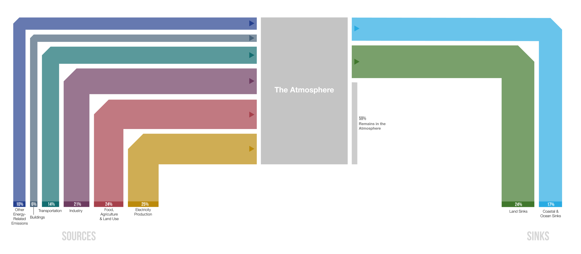
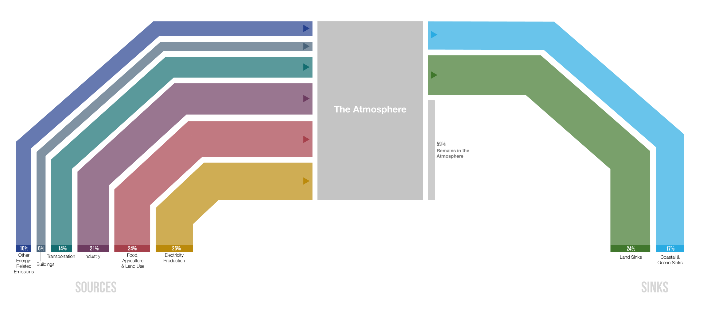
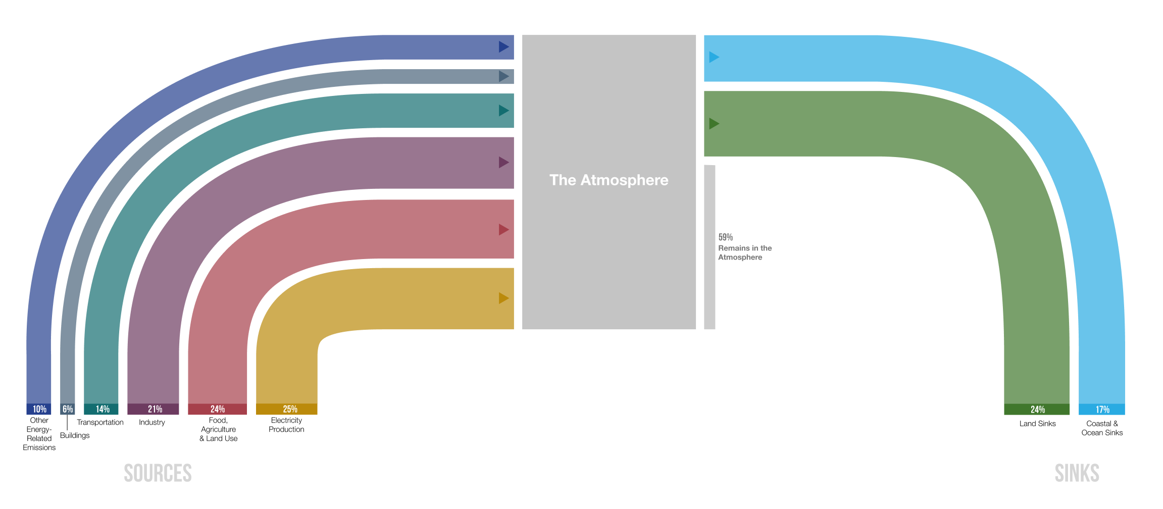
That eventually came out like this, with the help of Ampersand - who did the final graphic design and layout work for the full report.
One of the most challenging aspects of the project was drilling down to the detail of the individual solutions while also letting the large-scale hierarchy remain visible. To do this, I devised a "telescope" of several graphics that show detail at different levels, bringing in elements of stacked bars, sized circles, circle packing, Euler diagrams and uncertainty visualization.
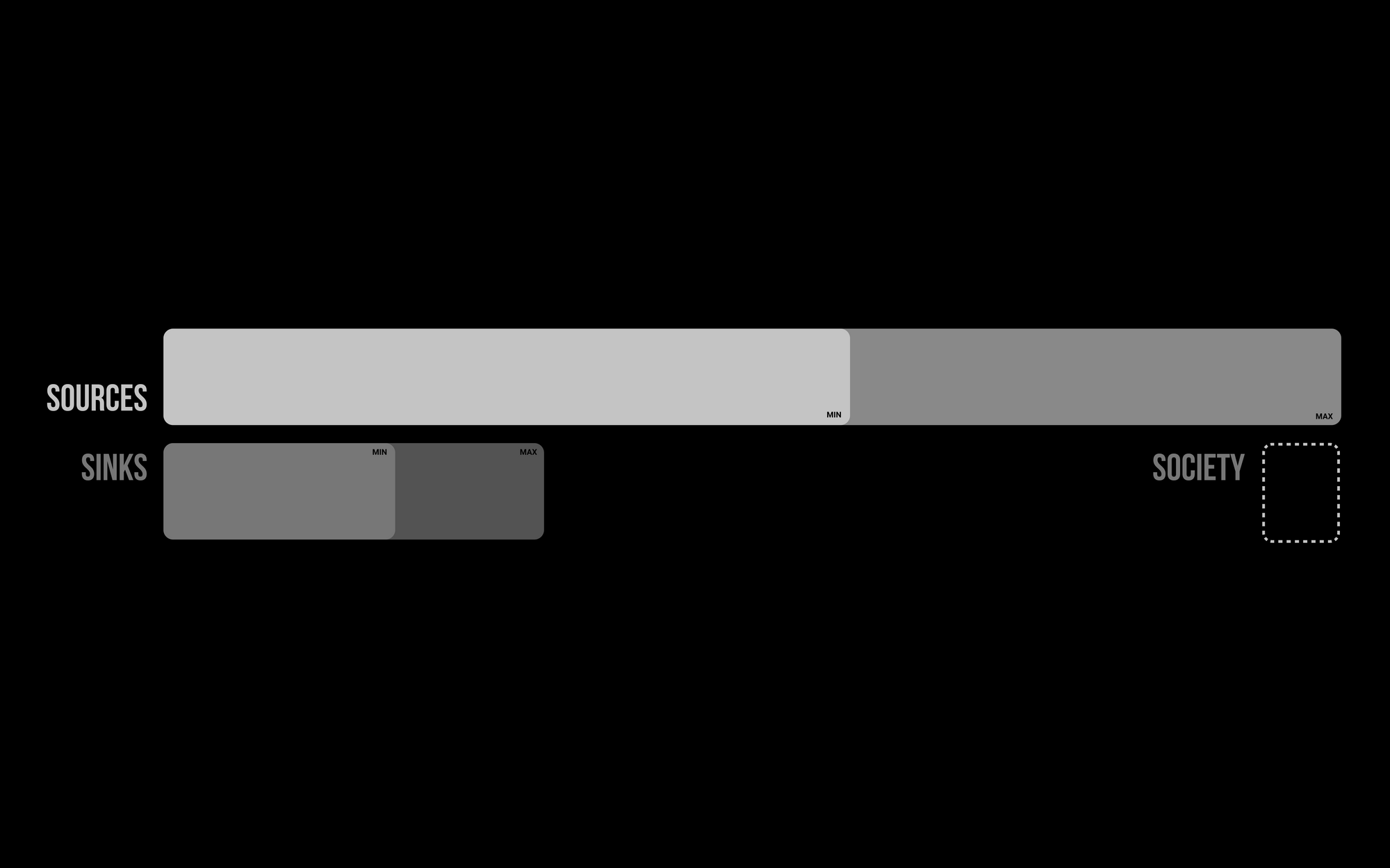
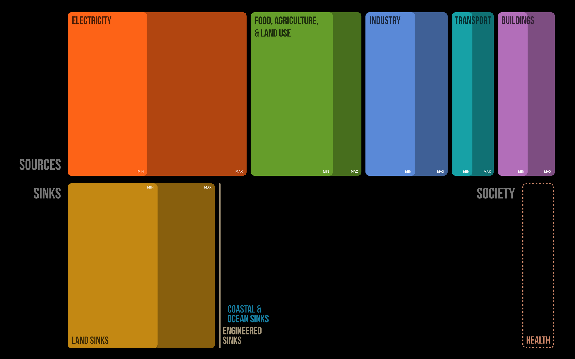
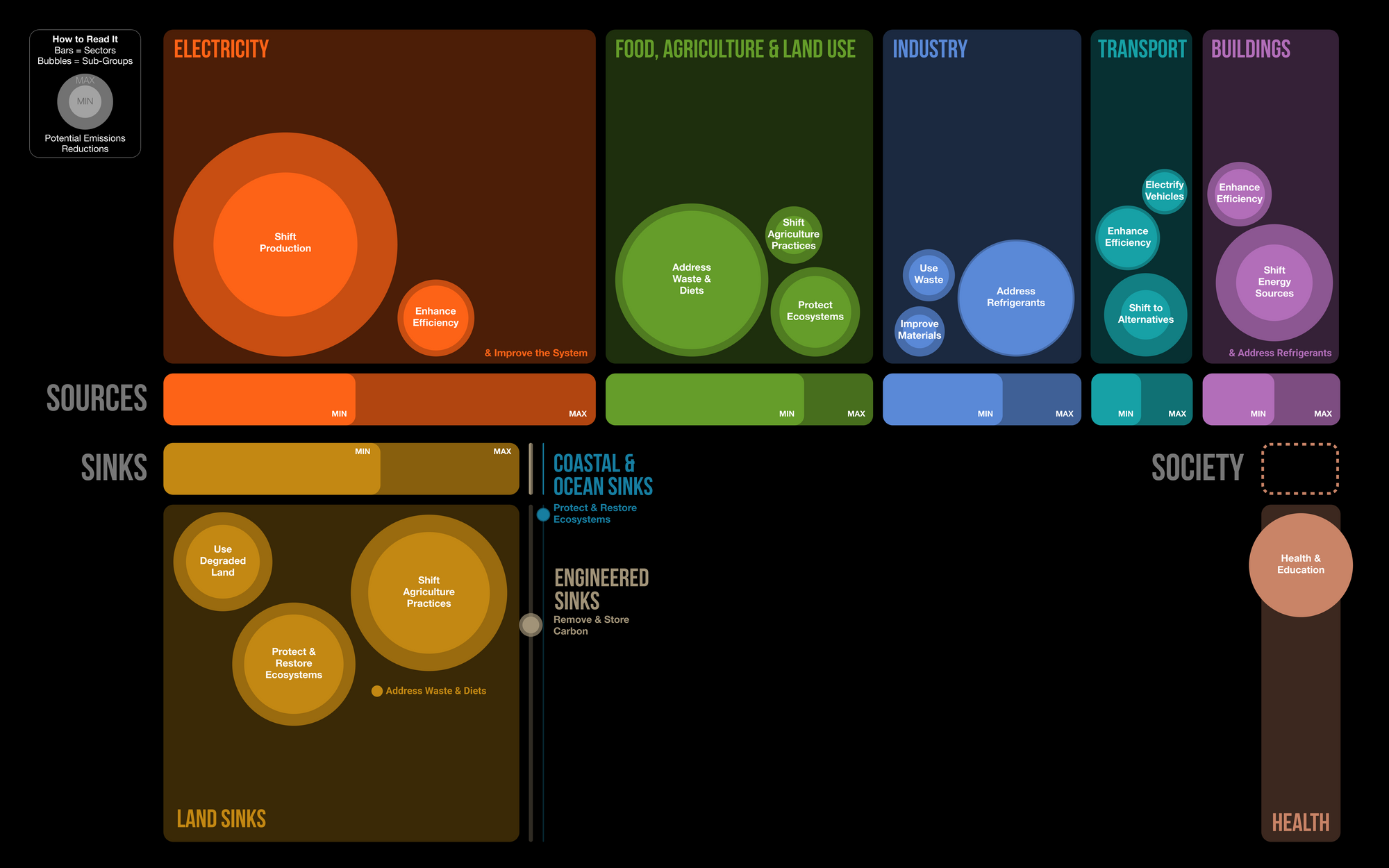
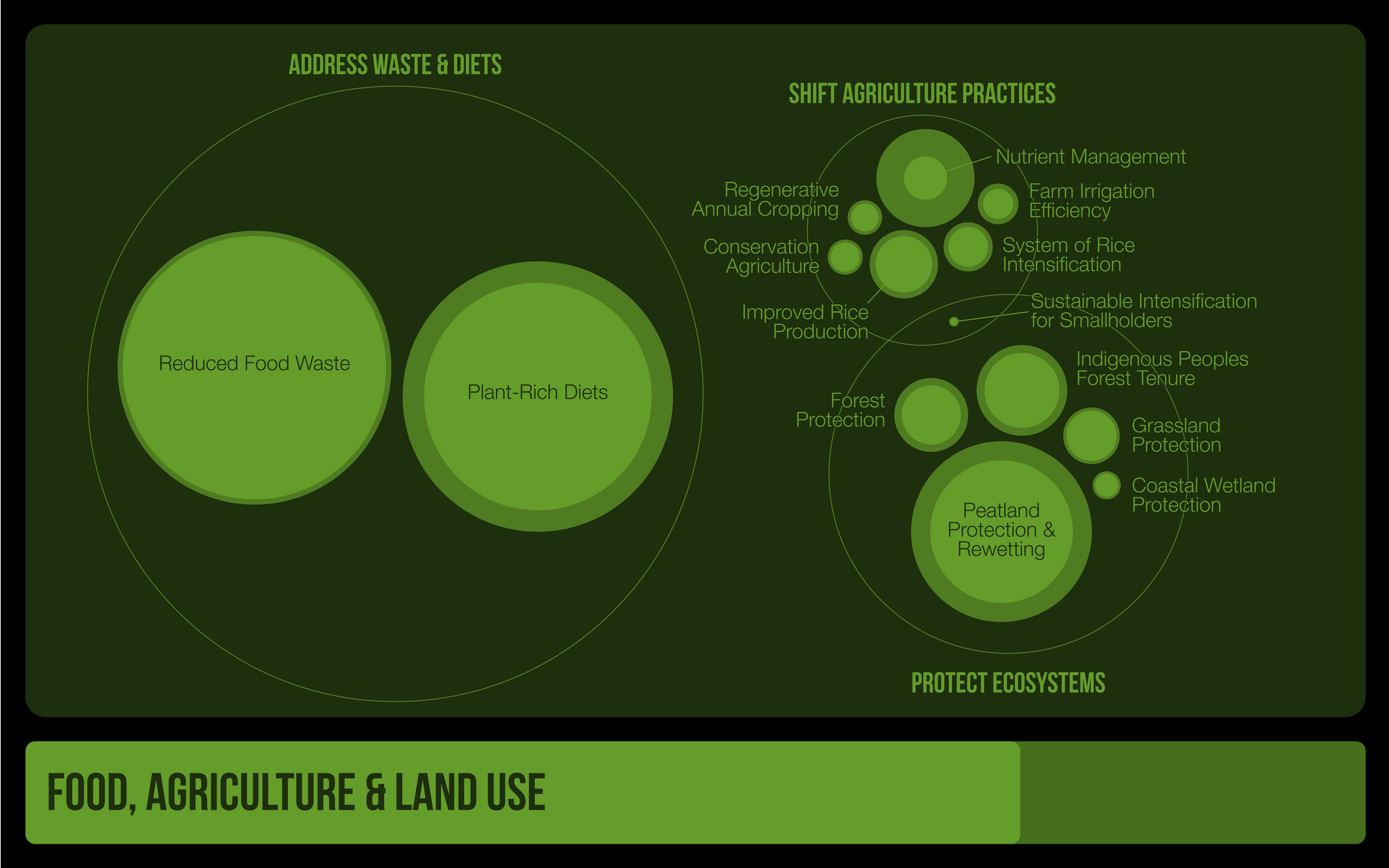
These appeared in a simpler form in the final report, but will be showing up in the Drawdown team's presentations in the coming months. In fact, they were designed specifically so that an audience can follow specific graphical elements between presentation slides, allowing them to keep track of what's going on. (I also particularly like that it looks a bit like the LCARS interface.)
One of the best things about this project is that the data for all the solutions is available at the end of the PDF and also on the Drawdown website. The PDF has a little more, in fact - it also has costings, which might be useful to those of you who find the financial aspect of solving climate change interesting.
You can yourself a free copy of the Drawdown Review 2020 in exchange for nothing but an email addresss. Download it from the Project Drawdown website.
If you'd like me to work on a similar project for you, my inbox is always open. Drop me an email with an outline of the data you have and the stories you want to tell with it, and I'll get back to you immediately.