Defining Information Design, Data Visualization and Infographics

This morning, in the Data Visualization Society's wonderful Slack community, Jane Zhang asked a question. She asked:
Has there been any good articles that are well-thought out that try to go into the nomenclature of data visualization vs. information design vs. infographic?
It's something that I've thought about a bit, so I started typing an answer, and then I sketched a drawing, and then I typed some more, and then I realised that it's probably something that should be a blog post, so here we all are.
I sometimes define myself as an information designer, because what I've been doing for most of my career has been taking existing information and redesigning it to easier for people to understand.
To begin with, that information was mostly words. I began my career, as many technology journalists do, largely rewriting announcements from companies - but to get my audience interested, I redesigned those announcements to make them funnier, shorter, and add relevant extra facts.
As I progressed into more senior roles, my design work shifted to editing - redesigning information from other journalists to make it sharper, more compelling, and more relevant to the audiences of the publications I was working for. I also began thinking about non-textual information - what would catch the eye of someone reading this - a beautiful illustration? A relevant photo? A chart or map?
Those last two possibilities sent me down a rabbit hole that I'm still yet to emerge from. I began taking stories and finding relevant charts and maps, and then redesigning those to make them easier to understand and more beautiful. After a while, I slowly found that I wasn't actually doing much writing any more - that my information design work had began to focus mostly on visuals.
I also noticed that I had begun doing work that didn't feel like information design at all. Sometimes I'd get raw data, and I'd have to do quite a bit of work before I could start thinking about how to design it for my audience. I made charts and maps that were just to help me understand the information, not to remake it for others. While this data analysis is absolutely necessary for the final result, I don't feel like it's part of information design.
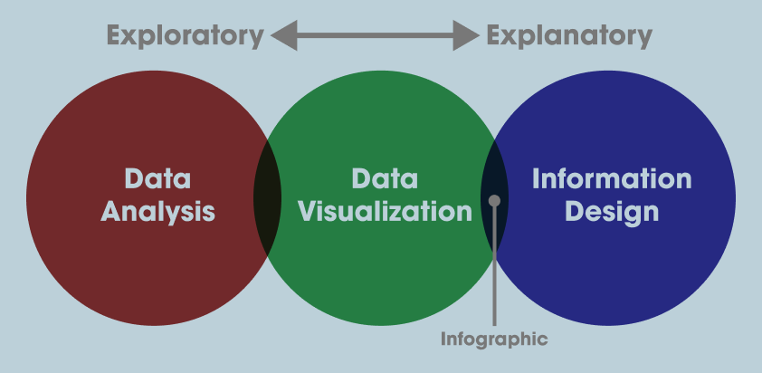
That lead me to a mental model where I see data visualization as a tool that's used in both data analysis and in information design. The former is often referred to as exploratory data visualization, and the latter is often called explanatory data visualization.
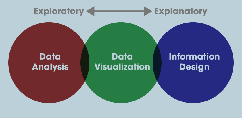
Which just leaves us with "infographic". I've heard this word in a bunch of contexts, including journalistic ones where it's sometimes looked down upon*. My personal definition is that an infographic is a data visualization designed to communicate information to a general audience.
My reasoning is that I've never heard anyone refer to a chart made for data analysis as an infographic, and I've never heard anyone call a chart in an academic paper an infographic.
That puts the infographic squarely between Data Visualization and Information Design in the model above.

I'd love to hear from other people who consider themselves data analysts, data visualization designers or information designers on their definitions of the terms. I'd also love to hear from people who don't work in this area at all about their associations with these terms. Sketch out a diagram of your own, or write a few words, and email them to me.
* This is largely because some companies think that journalists will only cover data-oriented stories if someone else does the visualization work for them, so they hire a designer to do that visualization. This is usually a waste of time and money because what the company wants from the visualization is not what the journalists, let alone their audiences, want from the visualization. So it gets treated as PR spam and disregarded by all but the most spam-friendly publications.