Emissions Inequality

The world's richest 10% (that's you, most likely) are responsible for almost half of global emissions. The poorest half of the world's population? Just 7%. Here's a new visualization I've put together illustrating this inequality:
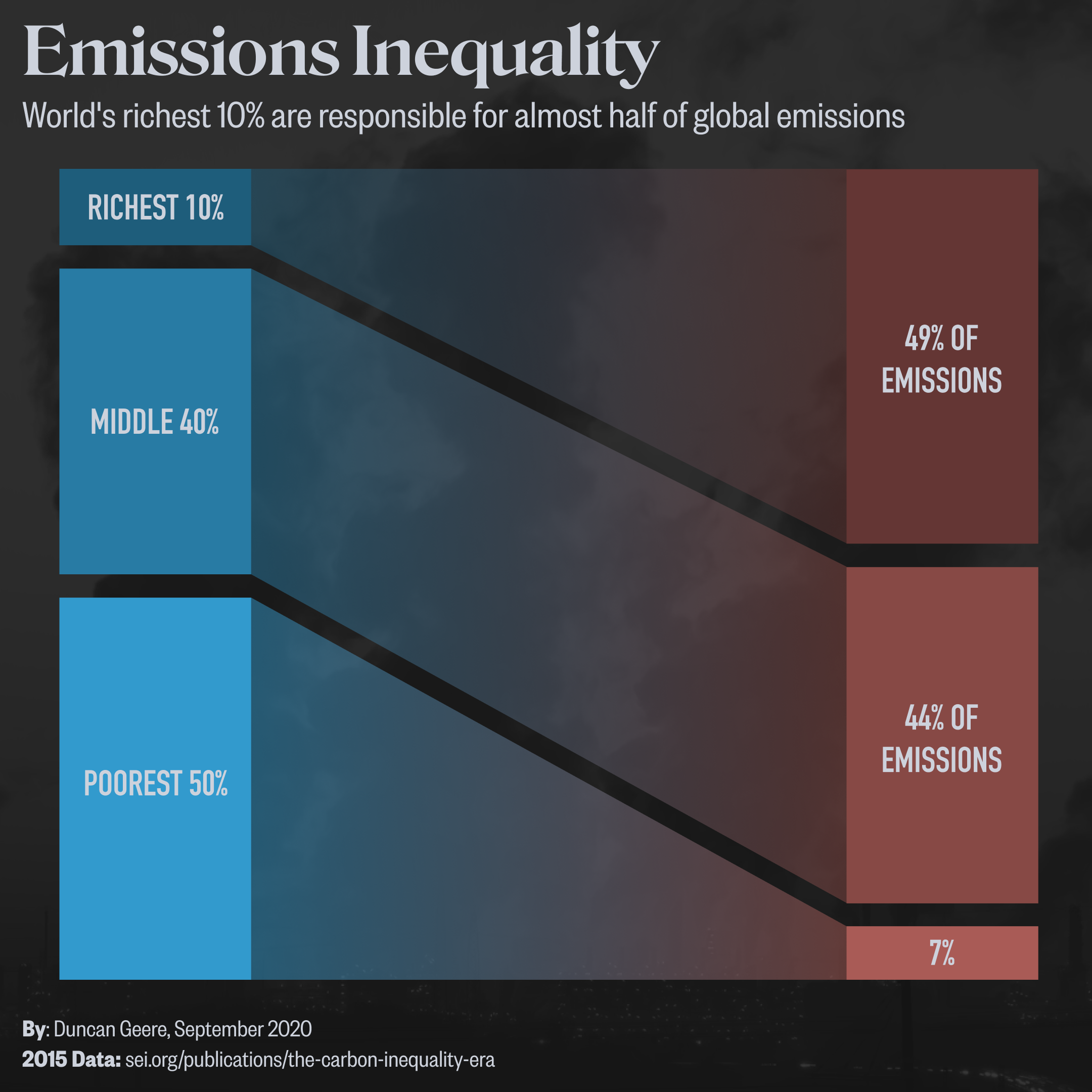
The data comes from a report called The Carbon Inequality Era, published by the Stockholm Environment Institute and Oxfam a couple of weeks ago. It compares the situation in 1990 with the situation today, but things haven't changed a great deal in terms of inequality in that timespan (which seems to be the point of the report), so I just visualized the 2015 data. That's five years ago, but it's tough to get global statistics on shorter timescales for most things, and I'd be willing to bet the situation hasn't improved much since. If you're wondering what you can do to reduce your personal emissions, there are a few good starting points in my Climate Breakdown graphic.
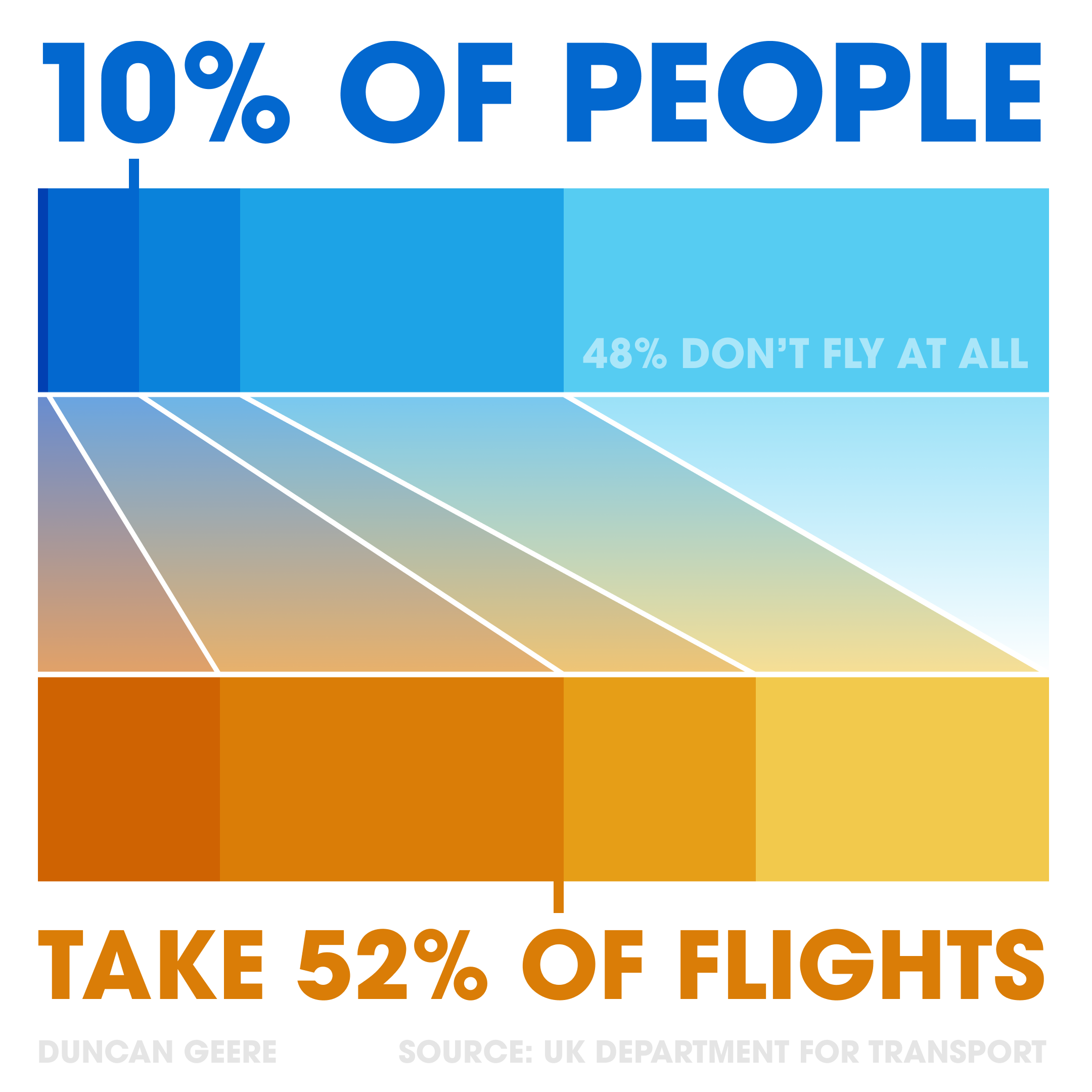
The graphic was made entirely with Figma. Fonts used are Roslindale v2 (title), DIN Condensed (labels) and Founders Grotesk Condensed (subtitle and footers). If you recognise the visual style, it's because I used a similar approach on my air travel inequality graphic from last year. It's somewhere between a slopechart, stacked bars and a sankey. I like it for its simplicity and effectiveness.
If you like this, then you should subscribe to my newsletter - an email every ten days or so on what I've been up to work-wise, good things I've read, and any creative projects that I've published. Sign up here, and unsubscribe at any time.