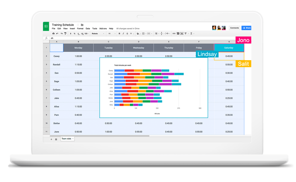
Tools I Love Tools I Love #4: Google Sheets I don't know if I've ever made a visualization without Google Sheets [sheets.google.com]. Like the sturdy vessel of a seasoned explorer, it's fast, powerful, and a key part of almost every data journey I undertake. It's there with me when
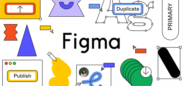
Tools I Love Tools I Love #3: Figma Here's a confession - I've never got comfortable with Adobe Illustrator. I'm pretty good with Photoshop. I've got a comfortable handle on Lightroom. But mastery of Illustrator has always eluded me. Why? Because it's bad software. It's slow, it&
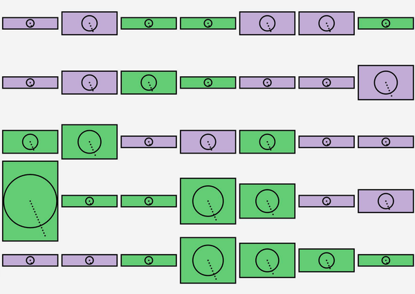
Experiments Make Your Own Data Glyphs With Joyful Data The folks at Gramener's Storylabs have built a "happy little tool" built on JOY.JS [https://ncase.me/joy/] that allows you to create your own system for encoding data in glyphs. It's called Joyful Data [https://gramener.com/joyfuldata/]. Joyful Data — make happy
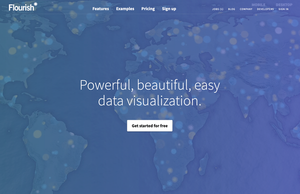
Tools I Love Tools I Love #2: Flourish The best free platform for making charts on the web is Flourish [https://flourish.studio/]. It has the best balance of usability, chart types, customisation and export options. Flourish has been a vital part of many of the visualizations I've made. Most complex charts are combinations of simple
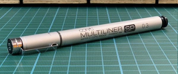
Tools I Love Tools I Love #1: Copic Multiliner SP Tools are important [https://blog.duncangeere.com/data-visualization-tools/]. A good tool not only removes barriers between you and what you want to do, but makes doing that thing delightful. That's why I want to share with you my current favourite pen. It's the Copic