
Tenday Notes: 11-20 Feb 2020

Every ten days I share a quick digest of what I've been working on. Here's the latest. You can find more in the series here.
I've been struggling to name a new project. The aim is to let people hear what the world might sound like if there were no humans. What would you call it? Answers on a postcard.
I’m pretty good with Google Sheets. But I’ve been pushing my skills further lately with a tutorial series that’s introducing me to some really advanced formulae. It’s designed to be worked through over 30 days, but I’ve been doing it in bursts instead. If you work with Sheets regularly, you’ll definitely learn a lot of handy shortcuts and new approaches to tricky data problems, as well as the occasional fun fact.
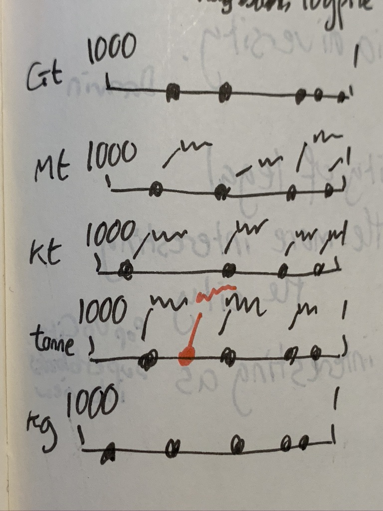
Woke up one morning with an idea burning a hole in my brain. It's a graphic that puts carbon emissions in context - I feel like it's hard for the average person to know what five gigatonnes, or 200kg of CO2 actually means in reality. I'd like to make that easier.
But what makes this graphic particularly special is that I think I've come up with a way of making log scales more accessible to average people, in what I'm calling a logpile chart. It's made up of a series of linear axes stacked on top of each other, each with a different scale (Gigatonnes, megatonnes, kilotonnes, tonnes, kg - for example), running from 1 to 1000. Rough sketch below. I'll need to test it out to see if it actually works in reality. But in my head it's a beautiful thing.
For an upcoming project, I've been digging into an app called Sonic Pi that lets you create music with code. It's designed for "live coding" of music, where you beam your screen onto a wall and show people what you're doing as you play, like you'd watch someone play a guitar. The tutorial's really gentle and encouraging, too. I'm aiming to work through it over the next few weeks.
One of the components of my current work for Drawdown is designing a series of graphics that’ll appear after each other in a slide deck. It’s a real pleasure, because I can tell a story in a number of stages rather than having to tell the story in a single graphic. But it has its own intricacies - like making sure elements that remain from one slide to the next stay in the same position. Or at least transition in a way that makes visual sense. Definitely a new format for me, but one that comes with lots of creative possibilities.
After reading Atomic Habits last year and implementing the Cadence system for long-term thinking, I've been cultivating quite a large collection of habits. Some have been more successful than others - I'm now regularly taking vitamins, exercising, dedicating time to my family, and improving my Swedish in a way I wasn't before. But I've started to feel the weight of some of the habits. It feels like I start each day with too many tiny things to do, and the visual weight of those in my to-do app slows me down. So I've taken out a few of the best-established daily habits in an effort to slim things down.
The other problem I've been having with my young to-do system is that I've been too ready to assign particular tasks to a day (usually tomorrow). That means that first thing every morning I have to re-assign them to another day. Instead, I want a system where the first thing I do each day (or last thing the previous day) is to look at my to-dos and more actively decide what I'm going to try to accomplish in my focused, creative time each day. So I'm gonna try and stop manually assigning tasks to a particular date in advance. Let's see how that goes.
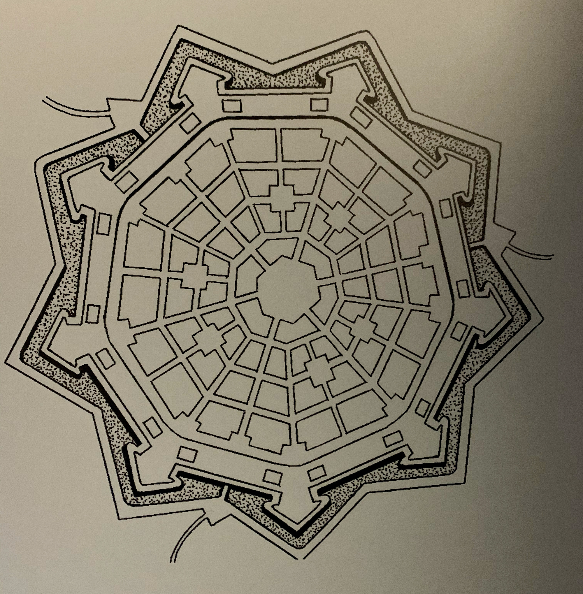
My nephew, Fabian, has been visiting for the last few days. He's a history nut, so we spent a whole morning in the Gothenburg City Museum, tracing back its development since it was founded in 1621 by Gustavus Adolphus. He wanted it to be a modern city, and at the time that meant an "ideal town" by the standards of Italian polymath Leon Battista Alberti.
Alberti insisted on choosing the location of the town first, followed by careful setting up of the size and direction of streets, then location of bridges and gates, and finally a building pattern ruled by perfect symmetry.
There's a great bit in the museum that talks about how this concept and how Gothenburg was built by its Dutch designers along these principles (plus canals, because they were Dutch). That's why it has a modern street grid with right-angles, as well as an old-fashioned star-shaped moat, right in the city centre. There are some lovely diagrams of ideal towns in the exhibition, which I've photographed with the intent to replicate them digitally when I get a moment.
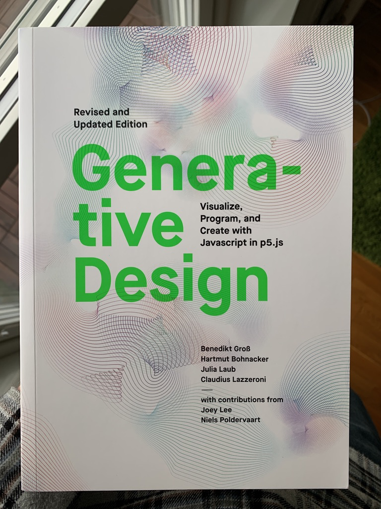
I've also been digging into generative design, after taking delivery of a great book that teaches P5.js. I wrote about it a bit, and posted a couple of sketches, in a blog post. It's surprisingly easy going so far. If you're interested in generative art in any way, then give it a look.
As part of the work I'm doing for Mojang, I've been compiling a database of every item, block and biome in Minecraft. There's a public version of that database here. It includes the name of the block or item, which patch it was added in, when it was added, and a link to any of the articles written about it in the Taking Inventory and Block of the Week series. For biomes, it includes the "temperature" of the biome too. If you make something with it, then drop me a line and let me know.
Finally, I'll leave you with a lovely bit of writing by Geoff Manaugh about the dimming of Betelgeuse.
Betelgeuse, of course, is more than 700 lightyears from Earth, which means that it could very well have exploded centuries ago—it could, technically speaking, not even be there anymore, and wasn’t there for your parents or their parents—but the light from that catastrophe simply hasn’t reached Earth. We are always out of synch with the stars we think we’re seeing, unwitting recipients of dead news from above.