Tenday Notes 17 Nov - 26 Nov 2020

Every ten days I share a quick digest of what I've been working on. Here's the latest. More in the series here. Want them in your inbox? Sign up.
First things first. I'm going to be giving at workshop at Datafest Tblisi between 15 and 17 December. Datafest will be held online, so you don't need to go to Georgia to attend (and neither do I - you just need to buy a pass, the cheapest of which costs 45 GEL (about £10).
The workshop I'm giving is titled "Creating Data Art With p5.js". In it, you'll learn how to go beyond bar, line and pie charts, creating your own custom visuals with code.
We'll use the p5.js web editor to recreate a famous data artwork, look at the creative possibilities of the p5.js library, and discuss where to find inspiration for creating your own data and generative art.
This workshop is for coding beginners, but not people who've never written a word of code in their life. If you know what loops, variables and functions are, then you'll be just fine.
Sound fun? Great! Grab a festival pass and join me in December.
I finished reading Marc Burrows' The Magic of Terry Pratchett, an unauthorised biography of the British fantasy writer whose books I loved between the ages of 15 and 21, then dropped, then picked up once more at age 35 and loved all over again.
Writing about Terry Pratchett is a bit weird because you either definitely know who he is or you don't know who he is at all. In most countries he's just a cult fantasy author, but in Britain he's a national treasure. A new Discworld book of his would top the bestseller charts at least twice a year between the early 1980s and his death in 2015. For the last decade of his life, he was also a prominent campaigner on issues around Alzheimer and assisted dying.
Burrows' biography is good. It's a bit slow-paced at the start and a bit fast-paced at the end, which is possibly because the target audience is fans who know his later career pretty well already, and possibly because writing the start of a book is easy and writing the end of a book is hard.
I learnt a lot - about some of the deeper themes in his writing that went over my head when I first read the books as a teenager, about what kind of a person he was in private (quite a bit grumpier than his public persona, it seems), and about his hugely diverse fanbase.
If you're a fan, you'll find a lot to like. If you're not too familiar with his work, then I'd recommend reading some of his Discworld novels first. Don't start at the beginning, though - it took him a while to get into his stride. My recommendation for the best place to start is The Truth, the story of William de Worde, accidental editor of the Discworld's first newspaper. It's lots of fun and totally self-contained.
I've finally got a little something I can share from Loud Numbers, my in-development data sonification podcast! It's a clip from our "Boom & Bust" episode, and I guarantee you've never heard a sonification like this before... Click to play the video:
There's data in that cacophony. The track is based around a famous drum loop called the Amen break. When the loop plays forwards, the US economy grew that quarter; when it plays backwards, the economy was in recession. When the economy started growing again after a recession, there’s also a celebratory airhorn (we couldn’t resist).
But there are many other musical layers. Some communicate a dataset that’s relevant to the story – the floaty synth sound moves up and down in pitch along with the Dow Jones index, for example – while others, like the bassline, are simply there to create mood, texture and musical structure.
More on Loud Numbers, and our philosophy of sonification, in a coming article for Nightingale which we submitted today, and should be published in a week or two.
Putting together the aforementioned workshop and testing it has been a large chunk of my last few days.
I'm really happy with the content, but my delivery needs a bit of work. I have a tendency to go much too fast - which I think I can trace back to my university student radio days (Junction11 represent) and a fear of "dead air". So I fill silences with extra information.
I'm figuring out how to handle this. Writing "slow down" on a post-it and sticking it to my monitor helps but only so much. Taking lots more drink breaks helps too. But if anyone has any advice on magic speaking tips to go slower, I'd appreciate hearing about it.
I've gone on a bit of a newsletter subscription spree lately. I do this sometimes, subscribing to a bunch of things, then unsubscribing from the ones I find myself not bothering to open after a while. Here are a few of the ones I'm currently enjoying:
- Garbage Day is a useful way of keeping up with whatever the latest drama is on a small corner of the internet (if that's something you want to do... and the jury's still out on that for me).
- Recomendo is a weekly newsletter with six, brief personal recommendations of cool stuff. It's unfortunately very US-centric, but there are some good bits in there.
- Carbon Brief does some of the best climate journalism on the web, and their Weekly Briefing is a good way to keep up to date (there's also a daily option if you can't get enough).
- I'm very much enjoying Craig Mod's Pachinko Road newsletter, where he's sharing daily photography and experiences from his 500-kilometre walk from Tokyo to Kyoto. It ends at the end of November.
- Finally, I've not been subscribed long but Chris Ried's Generative Collective is a nice compilation of miscellaneous tips, advice and articles about generative art.
While I'm in list mode, here are five ideas that I have been thinking about for a while but haven't had time to do.
- Maps of what cities might look like if they had parks where the roads are.
- Some sort of visualization of the many, many different names that the World Meteorological Organization has for different kinds of sea ice.
- A Twitter bot that gives random daily generative art prompts.
- Kintsugi-style patches of different shapes and sizes, designed for repairing clothes, that have fun slogans and patterns on them.
- A chatbot to help people choose the right chart for their data.
Want one? Take it! I'd rather it existed in the world than just sat in my to-do app.
My sonification of insect decline for Loud Numbers is progressing well. It has a "driving through New Mexico at night" vibe to it. I added a cowbell to mark each passing year and it sounded ridiculous so then I added a ton of reverb and now it sounds amazing, like something out of Red Right Hand.
Adrian Hon has been posting a bunch of nuanced, thoughtful stuff on Twitter this week that I'd like to share with you. The first is this thread about gamers seeing themselves as the "underdogs" due to poor coverage from the mainstream media, despite the games industry being larger than Hollywood. The best bit:
It’s pretty obvious to me that some games promote an unhealthy kind of engagement that their players later regret. We shouldn’t feel our entire hobby is threatened if those kinds of games (or mechanics) are criticised.
Then the second is a fascinating look at a Github feature that "gamified" coding by allowing coders to get "daily streaks" for contributing to repositories of code. He quotes a paper on the subject. Here's the crux of that paper:
Our findings suggest that some users will change their behavior to collect digital tokens, but that this behavior may optimize for the game, and not necessarily for healthy and productive activity.
Twitter isn't such a bad place if you ruthlessly cull the people and things that drain your energy.
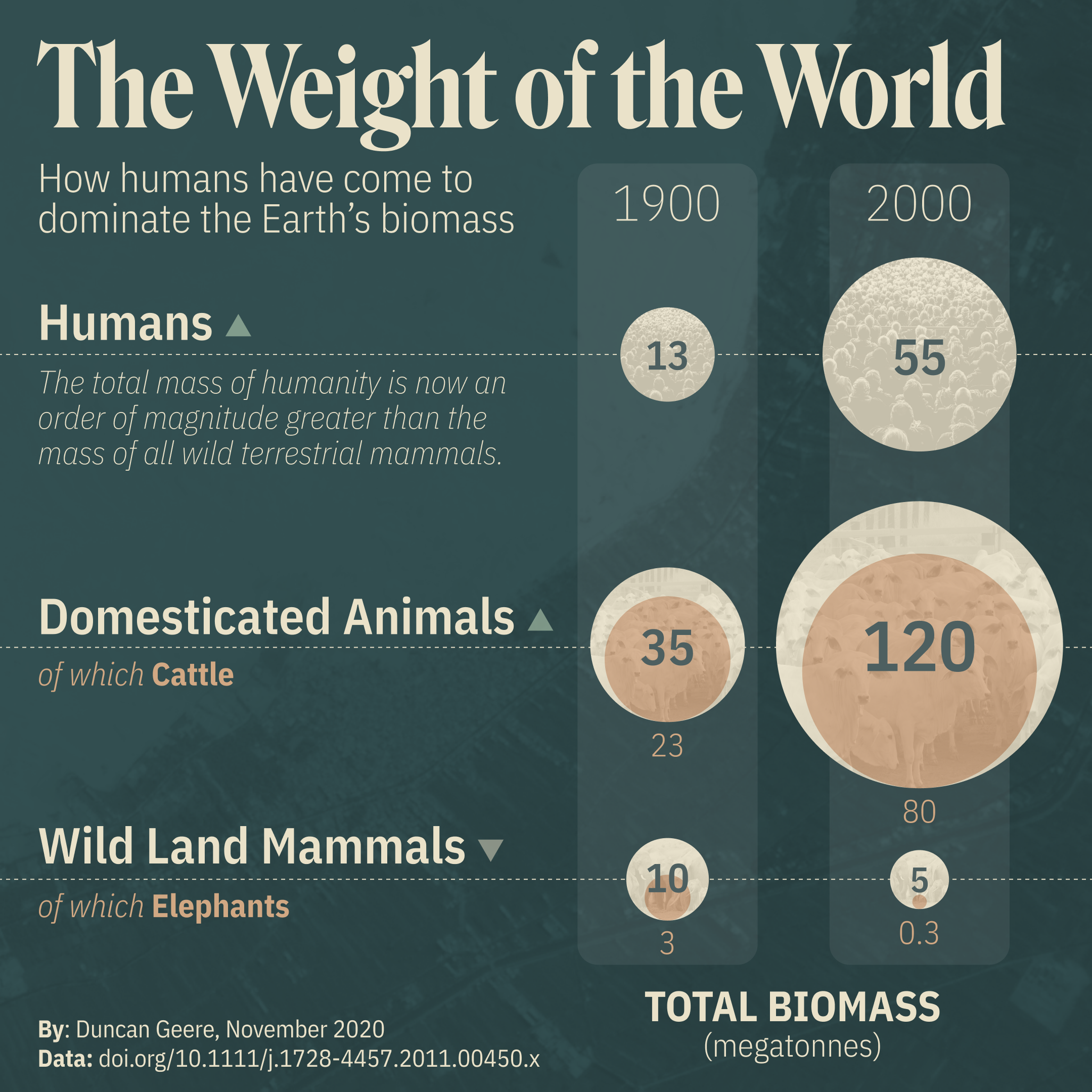
I've completed a new "small visualization", which is the name I've given to a series of charts that I'm making for social media (previously 1, 2, 3). This one is called "The Weight of the World".

You can take the title literally. The chart shows the total combined biomass of all the humans on the planet, all the domesticated animals on the planet, and all the wild land mammals on the planet, and how those figures changed between 1900 and 2000. The latter two categories separate out cattle and elephants respectively.
The data comes from Vaclav Smil's 2011 paper "Harvesting the Biosphere: The Human Impact", which is paywalled but can be downloaded in full from his website. I found it through Faunalytics, a site that shares peer-reviewed research for animal advocates.
The graphic was made entirely with Figma and Google Sheets. Fonts used are Roslindale v2 (title), and IBM Plex Sans Condensed (everything else). Photos came from Nasa and from Pixabay.
It's sometimes a little tricky doing work like this, because there's a risk that population control advocates will take it and use it as evidence that there are too many humans. There are too many humans, but authoritarian population control is not the solution. Why? Because the problem isn't the number of humans but their consumption of the world's resources, and - as I've visualized before - the vast majority of that consumption originates with people in rich countries.
What can you do about it? Just consume less - a topic that's more relevant than ever as the holiday season approaches. Maybe agree with your family to buy each other fewer gifts this Christmas, or even no gifts at all. Maybe tell your family that you'd like them to donate to a particular charity on your behalf as a Christmas gift.
This kind of cultural change is not easy. We've all been raised to celebrate Christmas as a festival of consumerism, so it's natural that it would feel weird or somehow less generous to not shower your loved ones with gifts. But just talking about it, just asking your family "should we be doing this?" is the way that change begins - and I think you'll be surprised how receptive others will be to it.
I'm doing some work at the moment for a client in Trinidad & Tobago, which reminded me of a fun fact that I learnt earlier this year. Trinidad is home to the world's largest natural deposit of asphalt.
That's right, the tar-like substance that roads are made out of. The deposit is called "Pitch Lake", and it's estimated to contain about 10 million tonnes of the stuff. It's a popular tourist attraction, and you can even cross it on foot - as the material is so viscous.
There are loads of theories about why it's there and where it came from. The indigenous people who lived in Trinidad before colonization believed it was created by the gods to punish a village who ate hummingbirds which contained the souls of their departed ancestors.
Geologists, on the other hand, believe it's there because a deep deposit of oil is being slowly forced up by the intersection of two faults, then the lighter elements in the oil evaporate in the tropical sun leaving just the heaviest asphalt behind.
Two more little interesting sub-facts: First, there's evidence of an active microbacterial ecosystem living in the pitch - one that's quite different from microbes found living in other tar pits around the world.
Second, many of the first asphalt roads in New York, Washington DC and other cities on the East Coast of the US were paved with asphalt from Trinidad. So next time you're driving through one of those cities, you'll want to thank Pitch Lake for making it possible.
I caught up with my friend Andrew over Zoom today, and it reminded me that one of my goals for 2020 was to learn to scuba dive. That didn't work out, did it?
In pursuit of that goal, though, I did read Reef Life, the memoir of oceanographer and marine biologist Callum Roberts. It's a lovely book, talking about how Roberts fell in love with the oceans and the flora and fauna that live in them.
It was particularly interesting for me, because Roberts spent quite a lot of his career in the Middle East around the same time that my parents lived there in the 70s and 80s. It seems to have been a dramatically different place back then...
Finally, a quick reminder that Miriam Quick and Stefanie Posavec's new book, "I am a book. I am a portal to the universe.", makes a great holiday gift for people who love beautiful and clever things.
Oh, and so does a beautiful pen plotter artwork by yours truly - now on sale outside of Gothenburg for the very first time (thanks Robin!).

