
Tenday Notes 19 August - 29 August

Every ten days I share a quick digest of what I've been working on. Here's the latest. You can find more in the series here.
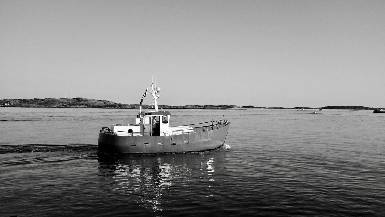
Well, that was a lovely break. I've just returned from a week on Björkö - one of the islands in Gothenburg's northern archipelago. It's only about 90 minutes' travel from home, via two buses and a ferry, but given that my world has shrunk down to walking distance in the past few months it was wonderful to get a bit of a change of scenery.
Gothenburg's northern archipelago is quite different to the southern one. While both were heavily militarised during the Cold War, they've taken slightly different development paths since. The southern one is more sparsely populated, with a few settlements connected by intermittant ferries and no cars allowed. The nothern one, in contrast, has much more regular ferry (and bus) services and feels like a place where people actually live and commute to the city. I've spent much more time in the southern islands, so it was great to spend a week exploring the northern islands - even if it was a little too hot and sunny for my tastes.
I'm back to work now, though, and my top priorities for this tenday chunk are to finish off the various Nesta write-ups I'm deep in the middle of, finish off the artworks for my exhibition (more on that below), and do some short-deadline visualization work for a new client, Ellipsis Earth, which I'll hopefully be able to share more about in due course.
I spent a good chunk of time on Björkö reading Rutger Bregman's Humankind. It's a non-fiction book that aims to deconstruct many of the myths around human nature, taking as its central thesis the idea that humans are by default pretty good to each other and to their environment. It's only when pesky politics and economics get in the way do we start being awful to each other.
He takes pot-shots at big names in the field, like Dawkins, Pinker and Diamond (as well as environmental activists, at one point), and also dismantles the myths that have built up around key touchstones like Milgram's electric shock studies, the Easter Island civilization, and the Stanford Prison experiment.
To augment these takedowns, he adds a bunch of real-world stories of his own to the canon - a tribe of schoolboys marooned on a Pacific island who simply didn't go all "Lord of the Flies", and the utter failure of both British and German bombing campaigns to break each others' spirits during WW2.
The book is a compelling and cheering read, and one that'll lead you to a warmer worldview. Which is something we all desperately need right now.
The last of my four pieces of plotter work is pretty much done, at least from a code point of view. There are still a few aesthetic issues that need working on, but it's doing what it needs to do.
This one was the hardest of all, conceptually speaking, mostly because of the structure I've set up for myself. The work is centred around utopian cities, and I wanted to showcase a collection of different utopian cities from history. I have one from the ancient world (Plato's Atlantis), one from the Renaissance (Filarete's Sforzinda), and one from modern times (the Fused Grid). I wanted one from the future.
To be clear, this isn't what we imagine future cities to look like today. It's what people of the future might wish for in an ideal city - a utopia of the future.
I did some deep thinking through all that on a long walk, and I came up with a plausible 50-100 year future where there is significant climate change, people packed into centralised megacities, detachment from nature, widespread use of renewable energy, near-total surveillance by private companies, mostly-synthetic food production, and Kessler syndrome has rendered satellites useless. What dreams would those people have of a better world?
I feel like those people might dream of a "return to nature", with small, distributed communities of 150 people or so (Dunbar's number) living in self-sufficient, climate-controlled domes dotted within areas of wilderness. Each community would be connected to the ones nearby, creating a resilient grid that could share information and energy around the globe. People could and would move between communities, and you could absolutely go outside the domes (when the weather allows) but most interaction between communities would be virtual and digital.
The next question was what that should look like in a plot. To get there, I combined a few things I've been experimenting with in recent months. The wilderness is represented by a series of hand- (i.e. mouse-) drawn sketches from Google's Quick, Draw! dataset, distributed randomly but with a minimum distance between them. Different areas get different types of terrain - water, grassland, forest, mountain - depending on a Perlin noise field. The domes are placed randomly in this field, again with a minimum distance between them, and represented by circles filled with geometric shapes for buildings, which were designed and positioned manually. There are five kinds of settlement, and it's random which you get.
You perhaps can't imagine quite what that looks like, but I'm holding off on sharing photos until the exhibition opens (around the time you're reading this). I am planning to publish a full write-up of the exhibition with lots of photos in due course, and I'll include a link here when I do. In the meantime, keep an eye on my generative art Instagram account for photos from the exhibition.
The other book I finished recently was I Am a Book, I Am a Portal to the Universe by my pals Miriam Quick and Stefanie Posavec. It's a weird, beautiful data physicalisation book for kids, and it's not quite like anything else I've ever read. It's very interactive - it asks you to do things with the book itself - to slam it shut to get a sense of how loud the sun is, or to flap its pages to see the amount of air that can be held in the lungs.
I helped out with one of the sections - the bit about dropping the book out of the sky, using my dormant fluid dynamics knowledge to help Miriam calculate terminal velocity and how long it would take until it hit the ground. So you'll see my name in the credits. But I'd be recommending it even if I hadn't had anything to do with it - it's the perfect gift for any nerdy kids (or adults!) in your life. Pre-order it now.
If you've ever been curious about what the craft of data visualization involves, then this Wired piece is a great introduction. Andrew Gelman and Jessica Hullman walk through some of the key tradeoffs that you come up against all the time when you're telling stories with data - beauty vs usability, novelty vs familiarity, and exploration vs explanation. Here's a snippet:
Scientists are drawn to parsimony, the elegant solution that hits all the marks. Visualization design, on the other hand, is riddled with tradeoffs. The graphic that exposes the data to us, minimizing our effort, will rarely be the graphic that puzzles us at first, evoking our curiosity. Instead, those who wish to communicate data should consider their intentions, and be aware of what they are prioritizing and what is lost.
Read the whole article here.
For those of you who have Netflix, John Was Trying to Contact Aliens is a lovely short film (16min) about a man beaming music into space for aliens from rural Michigan
Finally, I'll leave you this week with another short film: Laws of Motion in a Cartoon Landscape. Seven minutes long, it'ss actually a trailer for an hour-long piece by artist Andy Holden that exposes the physical realities of the world of Hanna-Barbera cartoons - “everything falls faster than an anvil,” “any body suspended in space will remain in space until made aware of its situation,” et cetera.
I came across it through the New York Review of Books' comprehensive analysis of Bojack Horseman, which contains the wonderful line:
The cartoon landscape is a model of the marvelous that’s an alibi for something much more malign: a world where infinite potentiality is experienced as terror.
The same could be said for the internet in 2020, right?