
Tenday Notes 21 May - 30 May

Every ten days I share a quick digest of what I've been working on. Here's the latest. You can find more in the series here.
I live in Gothenburg on the west coast of Sweden and I love it, but one of the few downsides is that it’s a relatively small town and so I’ve got no real professional network locally. There’s no local dataviz meet-up, and I only know one other person in town who does similar things to me.
To compensate, I take two approaches. The first is to try and participate extensively in online communities like the (brilliant) Data Visualization Society. The second is to attend conferences as much as I can, though unfortunately that tends to involve flying.
One silver lining of the pandemic has been that some of those conferences have gone online. That makes them substantially more accessible to me - and dramatically lessens their environmental footprint at the same time.
It’s not the same experience as attending a conference in person. You’re not forced to socialise with people in the breaks, and you don’t “bump into” people you know in the same way. But if those are the only downsides, compared with the huge upsides of substantially greater accessibility (both geographically and by lowering ticket prices) and reducing the environmental impact of traditional conferences, then I really hope that digital conferences will stay with us after the pandemic is over.
One of the reasons why digital conferences are on my mind is because I attended Datafest Tblisi over the weekend from the comfort of my armchair. It was pretty good - Valentina D'Efilippo ran a fantastic online workshop about sketch-drawing maps, and there were talks from various dataviz luminaries. Hopefully most will be posted online in due course.
The most valuable highlight for me, though, was being introduced to the work of Gabrielle Merite, a french dataviz designer who integrates a lot of photography into her work. It adds a layer of humanity to what can often be cold and impersonal statistics. Check out her Behance profile for lots of beautiful, impactful work.
Also in the "you should check this out" category, Will Chase has written a second part of his "Constructing a Career in Data Visualization" series (following the equally fantastic first part, which should probably be read first).
In it, he gives a lot of practical advice on how to actually start putting your knowledge into action - building up a portfolio that you can be proud of. He references a bunch of resources - books, courses, articles and more - that have helped him in his work (including my blog 😊).
If you're teetering on the edge of a career in data visualization, or you feel like you could use a boost, then it's well worth a read.
This week is passing very fast and I've not had a chance to write much. Things are progressing nicely with my Loud Numbers data sonification podcast project, and we're getting ready to soft launch it next week. By soft launch, I mean "start talking about it on social media and sharing our work".
Over the coming months, we'll be talking about some of the stories we'll be featuring, creating little mini-sonifications, sharing some of the tools we use to make sonifications, and talking about the work that's influencing us. If that sounds interesting, and you want to get ahead of the game, head over to loudnumbers.net and sign up for the mailing list, and/or follow us on Twitter and Instagram.
Sometimes you don't need colour, numbers or even an axis on your chart. Sometimes all you need is an arrow pointing the right direction.
In "54 Ways Coronavirus Has Changed Our World", Larry Buchanan shows the direction of travel of unemployment, stock prices, traffic, sex, books, rainbows and even pets.
Well worth a 30-second scroll.
I think I've locked in the subject-matter and the data for the next Dataplotter video I'm going to make. It's about how carbon emissions have changed around the world in response to the crisis, and whether it's enough to avoid dangerous global heating.
So far, I've got the numbers and a rough narrative in mind. What's missing is the exact form the graphic is going to take. I'll need to go back through my sketchbook and see if there's a nice approach I can take with it that'll make the most of the format. Something a little more intricate, perhaps...
I've never quite been comfortable working on the command line, in a terminal. I know how to navigate around the file system, list directories, maybe even make my own. But I'm always a little nervous that I'll accidentally delete autoexec.bat or something (a reference for readers of a certain age).
That's why, when I saw MIT was offering a free online course called The Missing Semester of Your CS Education (I missed all of them) on not just the command line but also basic text editors, version control, security and shell scripting, I made a careful note to work through it. That was back in.... January or something?
Anyway, I've finally got around to the first lecture (of eleven), and it's just as fantastic as I hoped it would be. I actually understand how to use chmod now! And how to pipe the output of programs into a file! There are exercises and everything, and it's at a really nice, gentle level.
If that sounds like something you'd be into, the course can be found online in its entirety.
A few people have asked me if I'm going to start selling some of my plotter work. The answer is "maybe eventually, not yet". But if you asked me if I was going to start trying to make a profit from my plotter work the answer would be "no".
The reason is that it's very hard. There's a good Twitter thread here that explains why. In short, it just doesn't generate very much in sales unless you go all out on the marketing, and marketing is not something that I enjoy doing.
Instead, I'm hoping that I'll make money from my plotter and generative art experiments indirectly, by having it inform my information design work. You probably saw Harry Stevens' "Flatten the Curve" Covid explainer in the early days of the pandemic - with all the bouncing balls. That started life as a bit of creative coding.
What's more, my creative coding experiments have already helped me become a much better coder. I've become much more proficient with Javascript, in particular, as a result of playing around with it a lot in the last few months to make things that are beautiful, as opposed to functional.
If I can do better professional work by having a lot of fun playing around with plotters and generative systems and code, then that's a win in my book. And I don't need to sell plots to do it.
But it might be fun to sell a few.
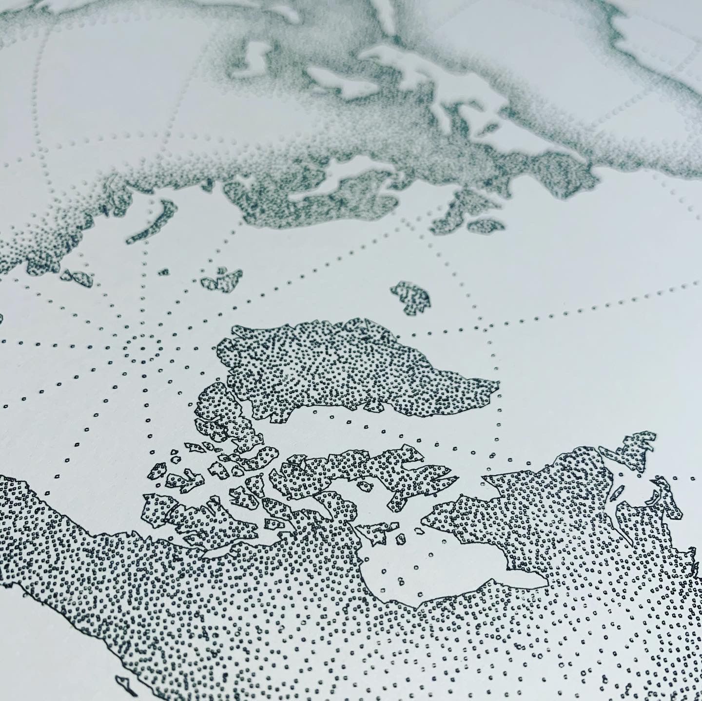
One evening last week, I had an hour before bedtime and I stumbled across a blog post by a chap named John Nelson, who'd managed to create a map styling system that generated really lovely stippled maps.
I thought it'd be nice for the plotter, so I poked around and it turned out it was for some software costing about £1,000. So that was out. I figured "how hard can it be to convert it?" The answer was "very hard". I spent about 90 minutes getting more and more frustrated that this seemed to be basically impossible.
The last thing I did before going to sleep very frustrated was reaching out to a mapping pro friend of mine, Ben Oldenburg, asking if they knew any way to convert it. The next morning, I woke up to a beautiful stippled map in my inbox, which Ben had made using Adobe illustrator and the Stipplism plugin.
I plotted it and it looked beautiful. So the moral of the story is: if you're getting frustrated, stop and ask for help and you'll probably be surprised by the generosity of your friends.