
Tenday Notes 21 Sep - 30 Sep 2022

Every ten days or so, I share a quick digest of what I've been working on and reading. Here's the latest. More in the series here.
I’ve been working with Conservation International for the last couple of years on the Exponential Roadmap for Natural Climate Solutions.

It’s a guide to understanding what we need to do on wild and working lands in the next decades to keep warming below 1.5C - and what businesses, policymakers, finance and social movements can do to accelerate things.
I served as the lead editor for the whole thing, and also worked on most of the dataviz. The brilliant Alex Parrott, who I've worked with a bunch of times, did the layout and design.
I'm really proud of the final document. It's an amazing tool for people across society to use when trying to understand what to prioritise in the coming years when it comes to changing humankind's relationship with the natural environment. I've learnt heaps and heaps through working on it, which I hope to bring to other, similar projects in the future.
Following the work on School Streets that I mentioned last time, I've also recently finished revamping a website I built for Possible that lets you find a great place to replace a parking space with a parklet. It's called the Parklet Plotter.
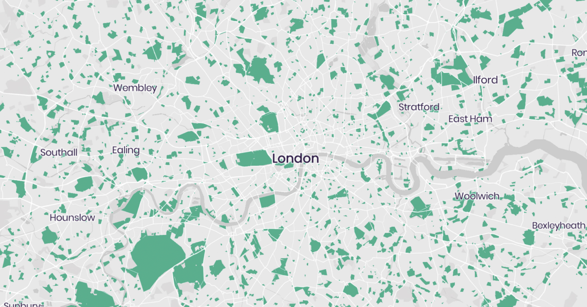
The site has a set of data layers that you can toggle on and off - green space, access to private green space, deprivation, and cars per household. When you think you've found the perfect spot, you can submit it to our database, share a link with your friends, and even contact your local councillor to ask them to make it a reality.
We've got data for the whole of England, and some for Scotland and Wales. None for Northern Ireland, sadly, because its open data authority is much less active than the other nations of the UK (just look at that homepage dashboard).
I'm always happy to answer questions about how this site Parklet Plotter was built, or chat about making something similar for you or your organisation. Hit reply and let me know.
A third thing that got published recently that I contributed to is a rework of the 1.5C Business Playbook. The Playbook is a document that's designed to help businesses, large and small, put together an actionable strategy for reducing their emissions. I helped out with some of the editing and the visuals.


Over the last few weeks, I've also been walking the members of the Elevate Dataviz Learning Community through the process of getting a basic portfolio online.
 0
0
In the first week, we chose what projects to include. In the second, we wrote short blurbs for each one. In part three we chose a place to publish it, and in part four, next week, we'll be getting it online.
It's been fun to think through what makes a "good" portfolio project, how best to write about it, and the pros and cons of different approaches. If you're a member of our community, you can find all the posts for the challenge right here.
This week I was also part of a panel about data sonification at the MEET Gallery in Milan, hosted by Sara and Paolo from the Data Sonification Archive.
It was partly in Italian (with live translation), but there were some interesting talks from Dan Lockton, Anita Zanella, and Michele Mauri. Miriam and I joined to chat about the Loud Numbers approach to data storytelling through sound - using our sonification of the UK heatwave in July as a core example.
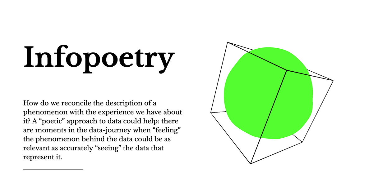
One of the most interesting talks presented a few examples from Density Design Lab's "infopoetry" workshop, which tasks students with creating weird, unusual and artistic representations of data. Here's the full library - there are hundreds in there, well worth a scroll.
I'm told a recording is coming soon, so keep an eye on MEET's social media for that.
Most of the rest of my work over the last ten days has been around planning the Loud Numbers workshop in Amsterdam for 11 October. It has been a long time since I attended an in-person workshop, let alone hosted one.

While we're going to go in-depth on almost every aspect of sonification in the one-day workshop, my primary aim is for the attendees to have fun. I want them to walk away saying "wow, sonification is fun", not "wow, sonification is complicated".
They'll get the chance to design "punk" sonifications without using computers, as well as learning how to make the most of the Loud Numbers VCV Rack module. We'll talk about data design, sound design, and story design for sonification. And we'll show people how best to share their sonification work on social media platforms that aren't really designed for audio alone.
It's gonna be awesome. And when I checked recently, we had someone pull out so I think there's one last-minute place available. Go snap it up!
"A custom sample mashing app designed by Aphex Twin"? Yes please.


Finally, check out episode two of the Elevate Dataviz Show on YouTube, in which Alli Torban, Gabrielle Merite and I talk about what they've been experimenting with recently - including physical dataviz, and visual metaphors.
That's all for today, see you again in 10 days!