
Tenday Notes: 28 Sep - 7 Oct

Every ten days I share a quick digest of what I've been working on. Here's the latest. You can find more in the series here. Want them in your inbox? Sign up.
As a music fan of a certain age from Britain, I have a great affection for BBC 6Music - a digital radio station that plays a wonderful selection of music I already like and music that I don’t know yet.
I almost never listen to the station itself, however. What’s important to me is its playlist, which is one half of my resilient system for finding great new music. Every Monday morning the new playlist is published on the 6Music website, and every Monday morning I go through and manually update a Spotify playlist I’ve made which contains every song on the current playlist.
I used to rely on a playlist made and updated by the station itself. But then they stopped updating it in favour of BBC Sounds - the BBC’s own streaming service. Which is not accessible outside the UK. So I had to make my own.
I update the playlist largely for my own purposes, but one nice side effect is that there's now a constantly- and reliably-updated version of the 6Music playlist on Spotify at all times. You can subscribe here. If you want just my picks of the best of both that playlist and Spotify's algorithmic "Discover Weekly", then you'll find that here. Happy listening!
The design process on my new website is pretty much complete. After a couple of mornings of working through various ideas with Figma, butting up against some of its limitations (many of which I’m hoping will be fixed in the November update), gathering feedback from some trusted advisors, and implementing some mild-to-moderate changes, I think I’m pretty happy with the design and ready to move onto the next stage - building it.
I’ve deliberately taken a very slow process in putting this together. First I figured out what I want the site to do - essentially just persuade people googling my name to hire me. It’s a shop window, essentially, showing off my best work to a potential client and the key reasons why I’d be the right choice to hire.
Then I wrote the copy (as discussed in my last newsletter), focusing on making it persuasive and compelling without being too overbearing. I’ve completed the design - figuring out how I want it to look and be used.
Which means that now I just need to build it. I’m estimating this will take me a couple of weeks, though we’ll see how that pans out. If it’s anything like other code projects I’ve done, the bulk will come together in a few hours and then the last few tweaks will take a week or two.
But it’s all good practice for building interactive visualizations that live on a website in due course. I’ve done a bit of this in the past, with help, but getting some hands-on experience and knowing how it all fits together as a system will make it much easier to customize for my needs in the future.
I spent a good chunk of today grabbing samples from various YouTube videos for the sonification of US recessions data in my upcoming Loud Numbers podcast.
Most of the clips I grabbed were little snippets from political speeches by various presidents, talking about the state of the economy and what they were doing about it. But for the later time periods (the dataset covers 1969-today) there was a lot more available and I was able to draw from a wider range of sources. I found two favourite clips.
The first is an interview with Tupac from 1992, talking about inequality, greed, and -- surprisingly -- Donald Trump. It's only about five minutes long, and it's wonderful all the way through. My favourite bit: "I know you're rich, I know you've got 40 billion dollars, but can you just keep it to one house?"
The second is a slightly longer collage piece (9m) recorded for Fidelity Investments, featuring "ordinary" Americans (and some tourists) talking about money in 1994. It's worth watching for the outfits alone, but my favourite bit is around 2m10s, where a woman is talking about how her goal is to have her own ranch. I really hope her dreams came true 🐄.
For several months, over on my Plottervision YouTube channel, I've been hosting semi-regular streams that I call "Chillplots".
Pen plotters are very satisfying to watch, so I figured it'd be fun to show my Axidraw V3/A3 pen plotter doing its thing in real-time. It's pretty easy to film and edit, with the camera on my iPhone XS and OBS Studio. The format of each video is very simple. I find something big and complicated to draw with my plotter, and stream it doing its thing with low-fi hip-hop music playing in the background. Here's an example.
They're nice to work to, so I try to run them on Friday afternoons. I like to imagine people streaming them to their television while kicking back and finishing off the last few tasks for the week.
They're also a nice way to slowly build the channel. I have no ambitions of becoming a YouTuber, but it's lovely to have a little community (>300 strong at the time of writing!) of pen plotter fans that I can delight on a semi-regular basis.
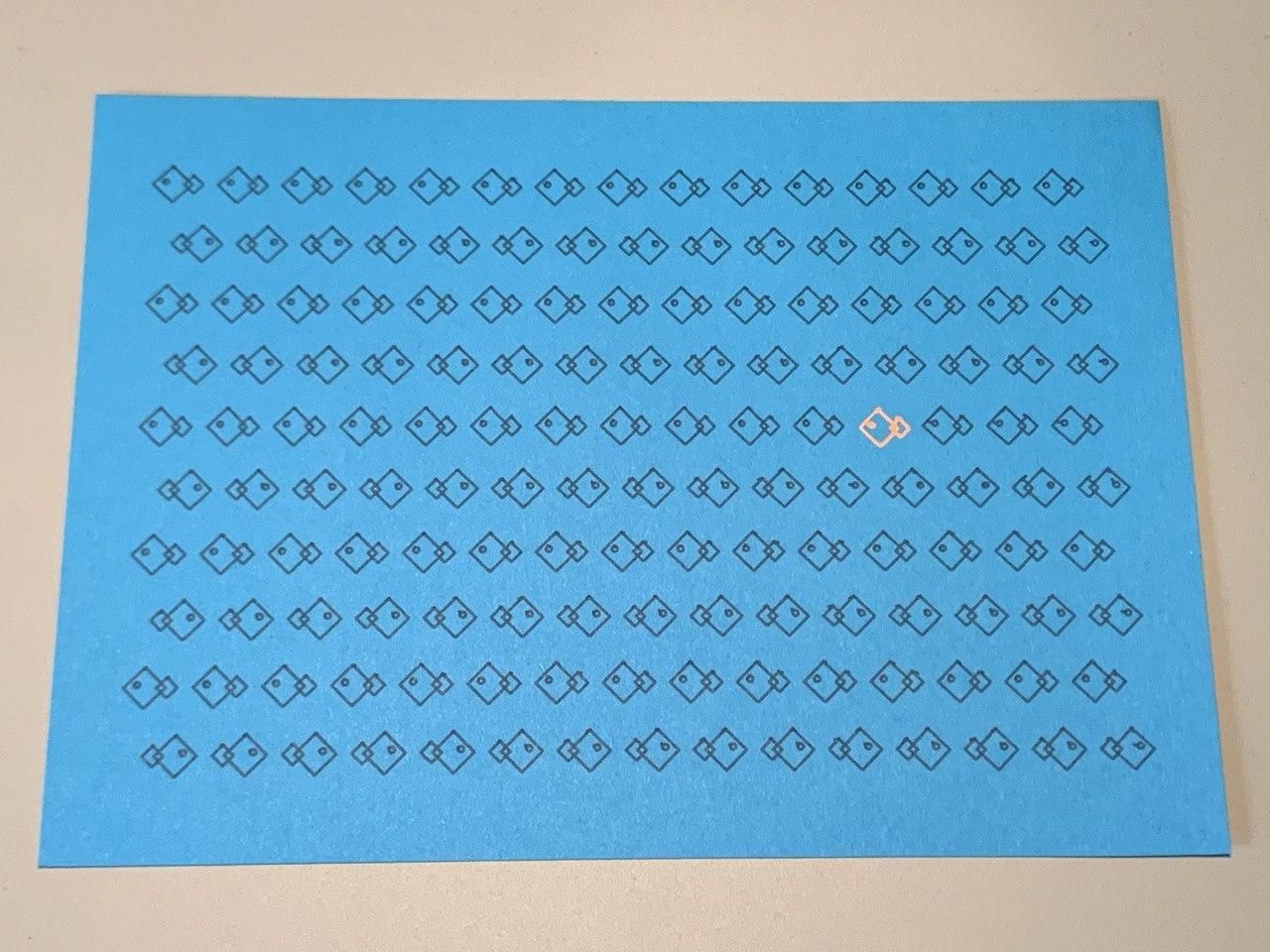
Speaking of the plotter, I'm participating in Inktober 2020. For the uninitiated, Inktober is a month-long challenge where you create an artistic work with ink from a given prompt each day.
I did it last year in a little notebook, but this year I'm planning to use it as an excuse to "practice my scales" when it comes to code and creativity.
I'm publishing all the plots, the code used to create it, and working SVG generators over on my blog, so head there if you want to keep up with my latest sketches.
In the meantime, here's a small selection from the first few days, including some of my favourites - blade, bulky and wisp.
When you lose weight, where does it go? That’s a question I had never asked myself before this week. If pressed, I would probably have said something about it being burnt as energy.
Here’s a write-up of a survey of 150 healthcare professionals who were asked this question. 98% of them got it wrong, saying (like me) that it was converted to energy, turns into muscle, or escapes through the colon. All these answers are incorrect.
The correct answer is that fat is converted to carbon dioxide and water. You exhale the carbon dioxide and the water mixes into your circulation until it’s lost as urine or sweat. If you lose 10kg of fat, precisely 8.4kg comes out through your lungs and the remaining 1.6kg turns into water. In other words, nearly all the weight we lose is exhaled.
Turns out that almost everything we eat comes back out through the lungs. The only major exception is dietary fibre. There are some great stats and a terrible dataviz in the article, which perhaps I'll endeavour to improve at some point.
As well as uploading my Inktober sketches to my blog, Twitter and Instagram, I've also started uploading videos of the plotting process to YouTube. In for a penny, in for a pound, right?
These lag the publishing of the sketches a little, because it's a rather manual process (which Silfa is helping a lot with!), but you can find them all in this YouTube playlist.
The world's richest 10% (that's you, most likely) are responsible for almost half of global emissions. The poorest half of the world's population? Just 7%. Here's a new visualization I've put together illustrating this inequality:
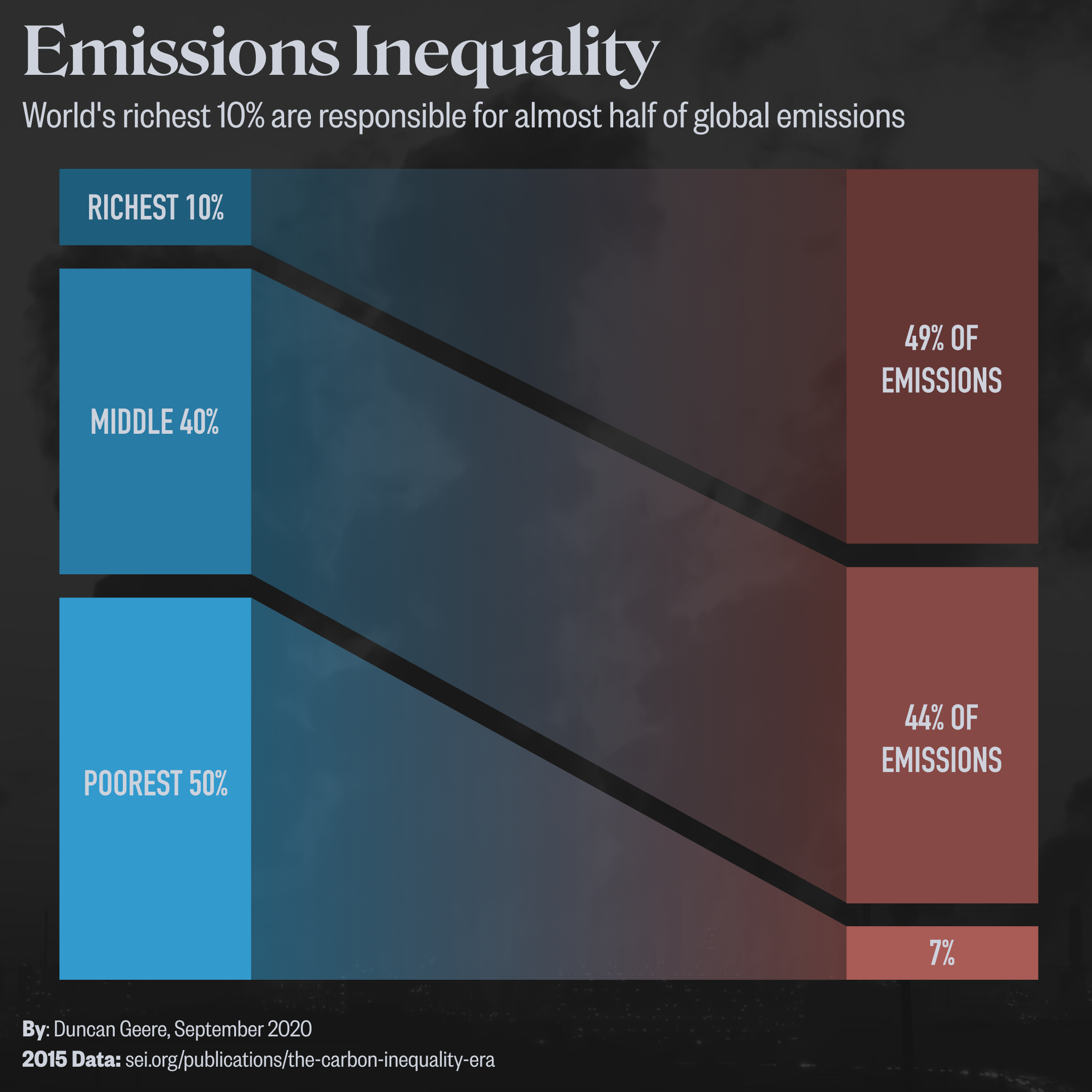
This is the next entry in my Small Visualizations series, which started with Climate Breakdown, and will hopefully continue for the time being. The goal is three-fold - first to visually communicate important new research on climate change, second to practice my skills (particularly when it comes to design and polish), and finally to build my expertise around environmental visualization.
It took a couple of hours to put together in Figma from start to finish - which included 20 minutes going down a dead end on another story idea that turned out not to have published data. The basic shape, which references my Air Travel Inequality poster from last year, came together very fast. But it took ages to get the final styling right.
I'm particularly pleased with the colour palette - I've been trying to build my confidence around colour, getting more comfortable with picking things out of the colour wheel that speak to me and then building a graded scale around it. This article helped tremendously in that goal.
Finally, I'll leave you with a jaw-dropping interactive 3D visualization of the closest stars to the Earth, sent over by regular reader Jack.
It's not only a technical masterclass (rendering hundreds of thousands of objects in the browser) but also gives a wonderful sense of scale of our galaxy - which is just one of countless galaxies in the Universe.
If you feel like you could do with some perspective right now, this'll do it. See you next time.