
Replicated Territories


The other day I saw this great bit of plotter work on Twitter, and loved the look, so I wanted to see if I could replicate something similar digitally.
Territories #axidraw #processing #plottertwitter #generativedesign #creativecoding #generativeart pic.twitter.com/3CyCeuY7bA
— Julien Gachadoat (@v3ga) January 6, 2020
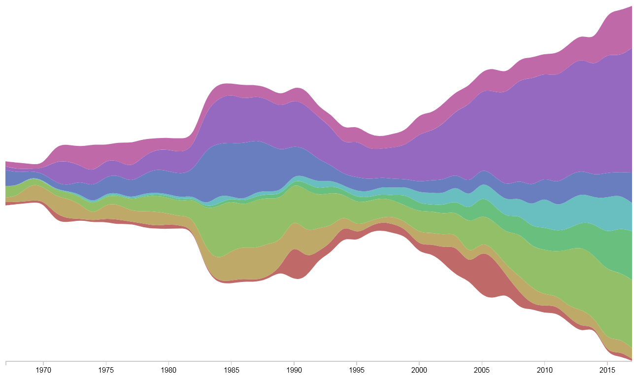
First I made a quick streamgraph in Rawgraphs. This is the data from Beautiful News' "Foreign Aid Has Exploded" graphic. It originally comes from OECD. The colours are different categories of aid.
I exported it as an SVG and imported it into Figma, my favourite vector graphics editor. Then I made a big canvas with a bunch of lines. I spaced them by hand.
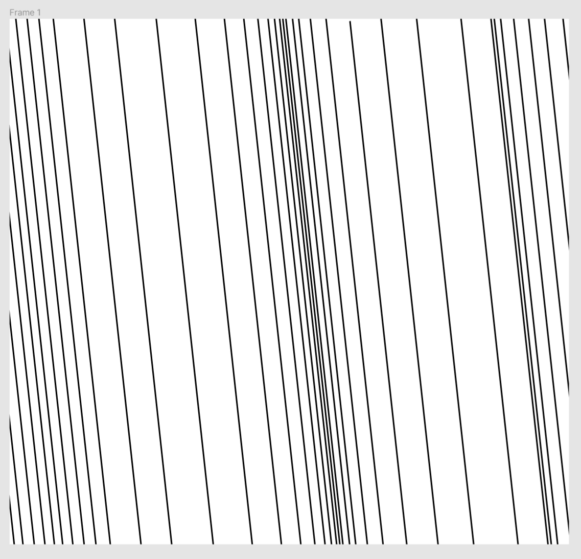
Then I just used the shapes as a mask for different sets of lines, rotating the lines between different examples. Here's the first output. It's okay, but the lines are too sparse.
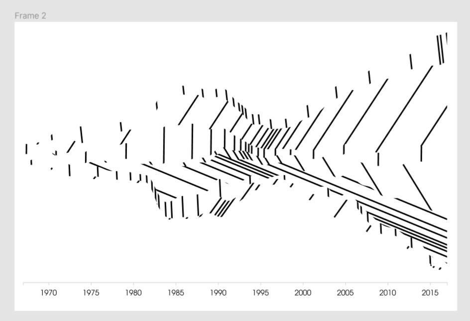
To fix this, we need a bit more line density. Let's make a a new set.

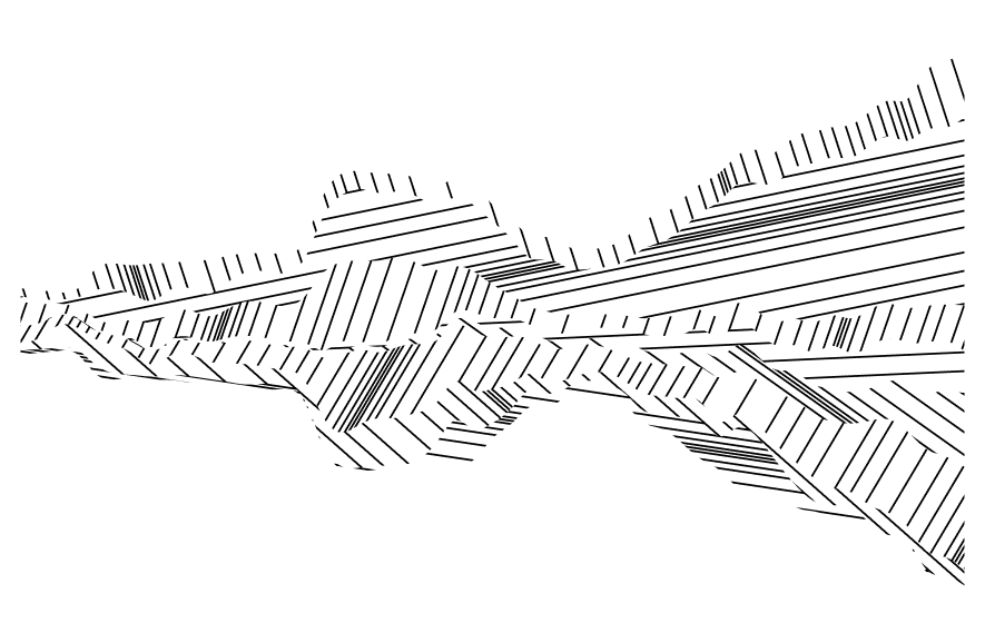
That's looking nicer. It's pretty unreadable as dataviz, so I took off the axis. But it's getting towards a nice piece of data art.
Improving it further would mean increasing the density of lines again, I suspect. There's definitely a code way I could do that which wouldn't mean aligning them by hand. Getting closer to the original would also mean finding a dataset (or faking one) which has more categories. Perhaps I'll look into those things another day.