
The Logpile Chart

A couple of months back, an idea came to me in a dream. That sounds ridiculous, I know, but it's true. I woke up one morning with a clear-as-crystal picture in my head of a kind of chart that I hadn't seen before.
The problem that it turns out my unconcious mind had been working on was finding an alternative to logarithmic scales. Log scales are great for those who understand them, but the vast majority of the general public do not. Surely there was a better alternative for allowing the easy comparison of vastly different quantities?
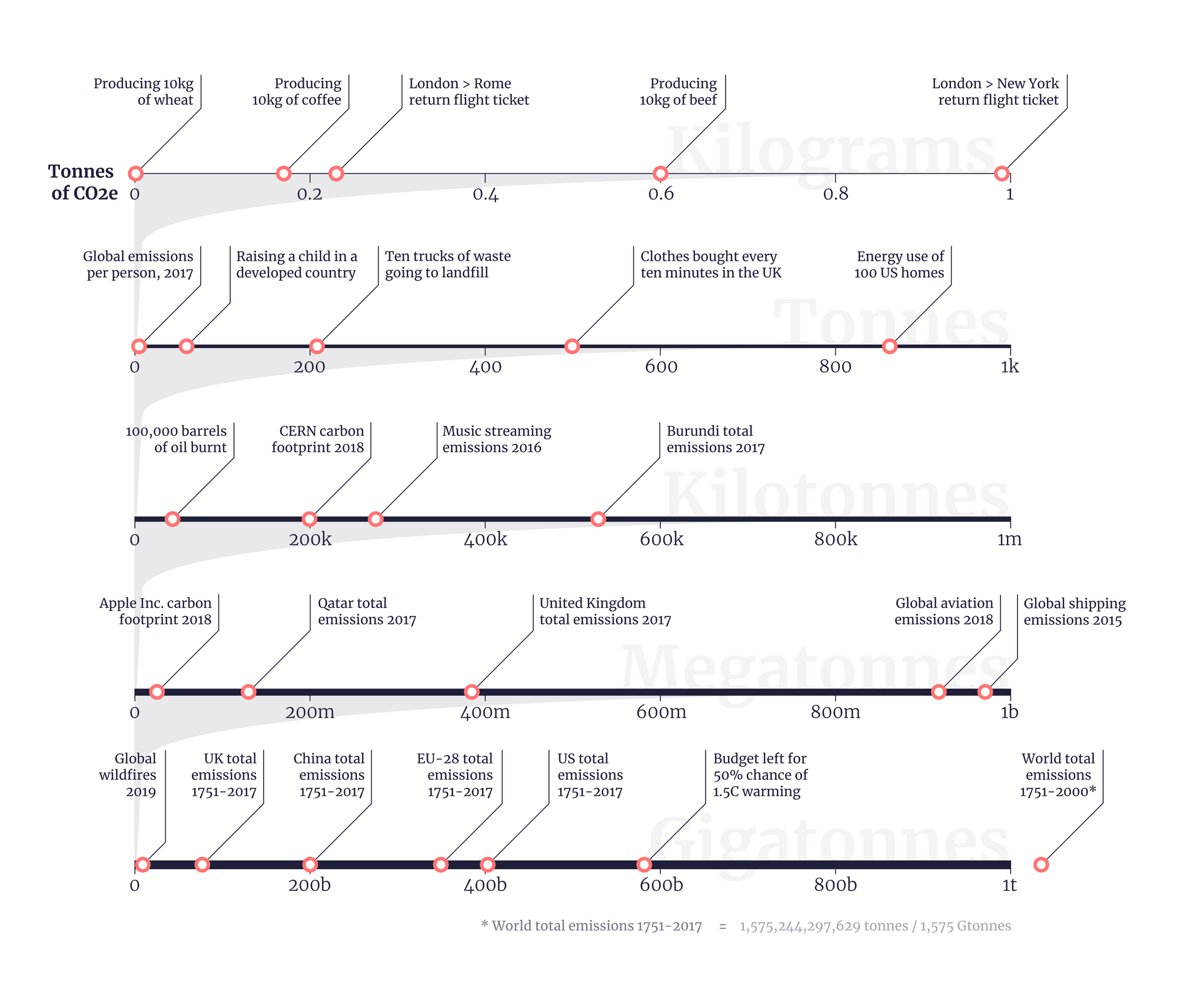
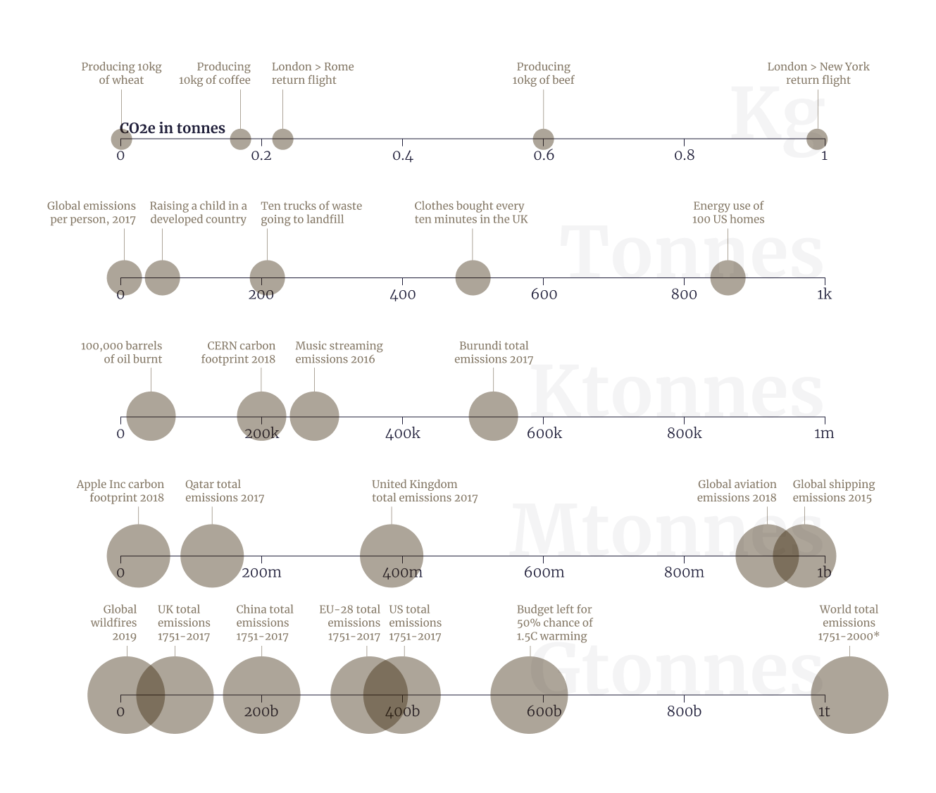
My solution, which I call a logpile chart, stacks a series of left-to-right linear scales in a pile on top of each other. Each scale represents just a tiny fraction of the one below it. This allows the viewer to come to a graphic with a quantity in mind and quickly find others that are comparable - putting that quantity in context.
As I'm publishing this idea during Earth Week, I decided to illustrate the concept with different carbon emissions figures – which I've found people have a very loose handle on. How much CO2 is emitted by producing wheat versus beef burgers, or by taking a transatlantic flight, or by different countries each year, or by the global shipping industry?
The media throws around kilograms, tonnes and gigatonnes loosely, but it’s hard for non-experts to understand how they compare. So I wanted to create a visualization that does that. I scoured the internet and the media for examples of CO2 quantities, and then narrowed those down to a nice even spread across the different scales in question. Here's the result, which I've also published independently at duncangeere.com/carbonincontext.
Challenges
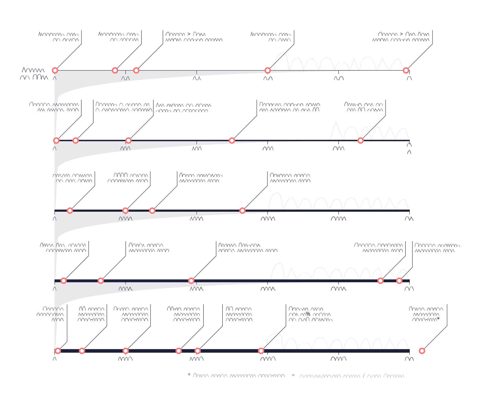
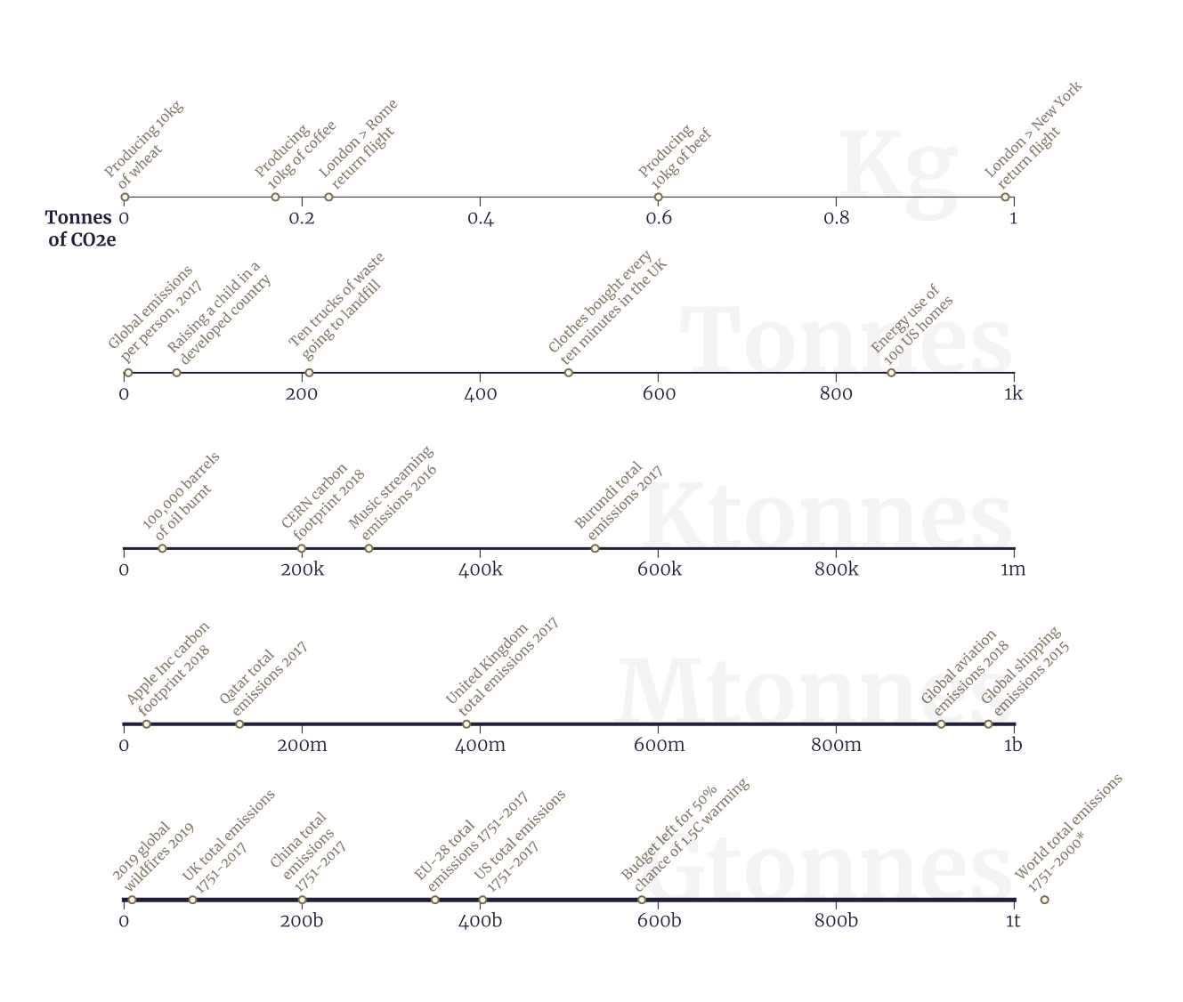
The process of developing it was pretty lengthy, but mostly just because I kept getting distracted by other projects. I went through several iterations of the design, some of which are below.
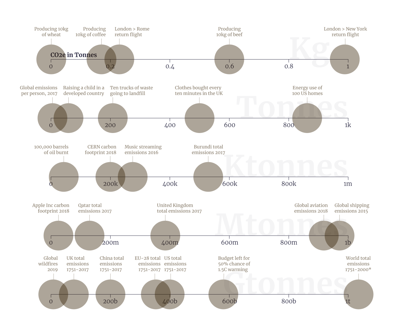
As you can see, the biggest difficulty I had was representing the points - originally they were circles with area scaled to the quantity of emissions. But even a square root scale couldn't handle the difference between the largest and the smallest. Then I went to large same-sized circles, but people I tested it with found that confusing.
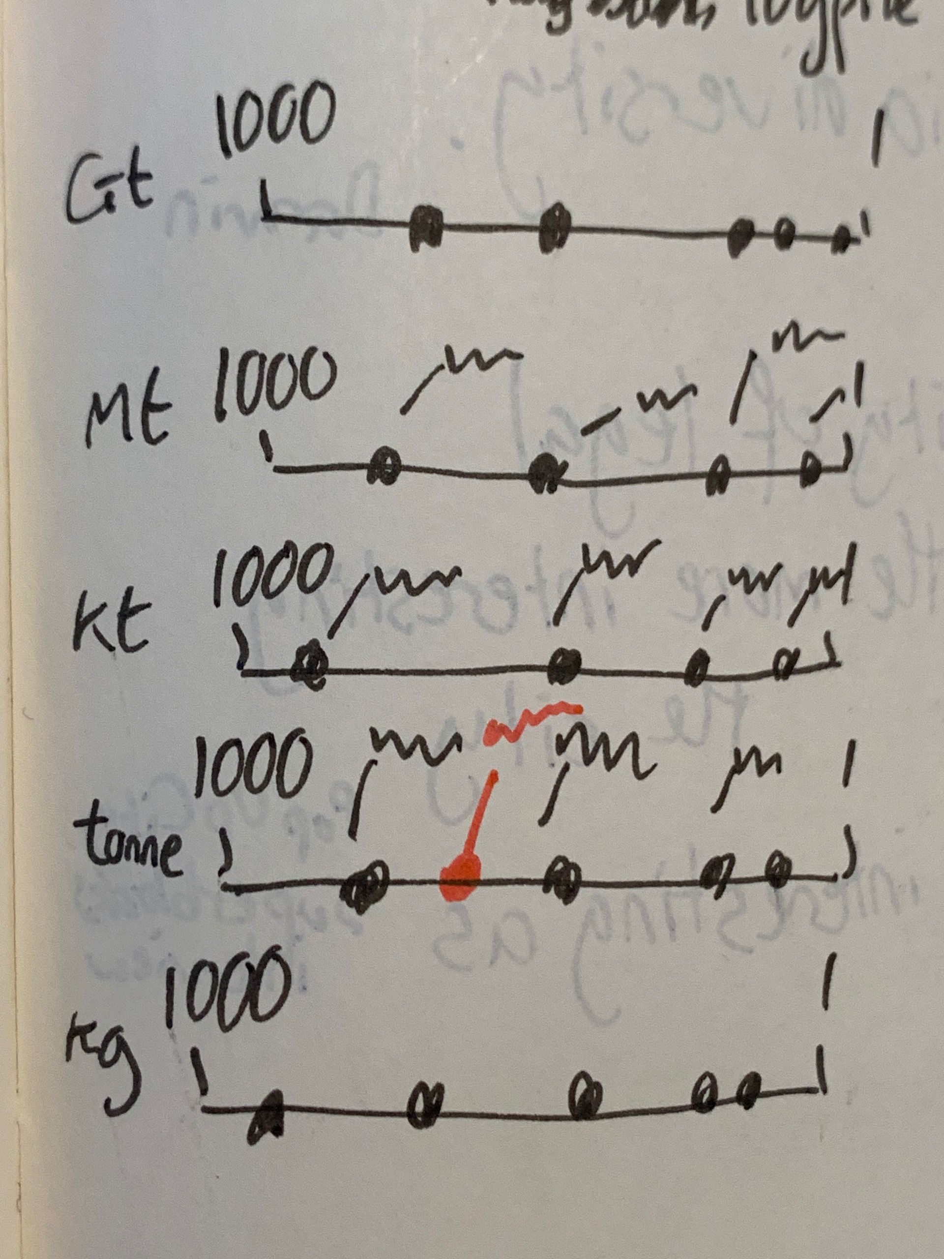
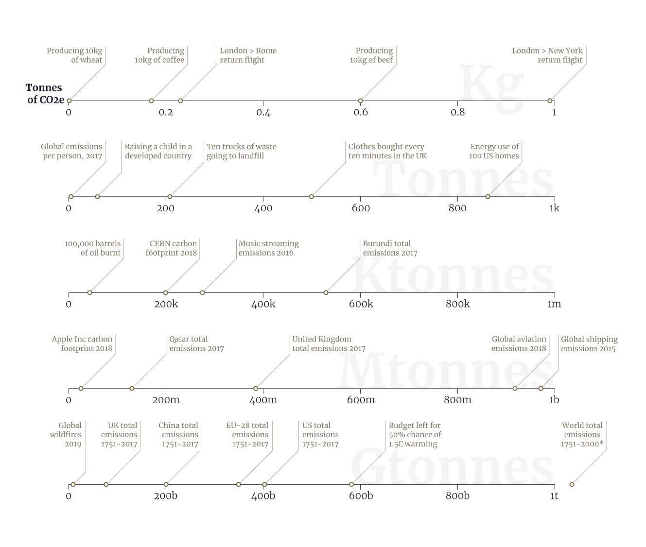
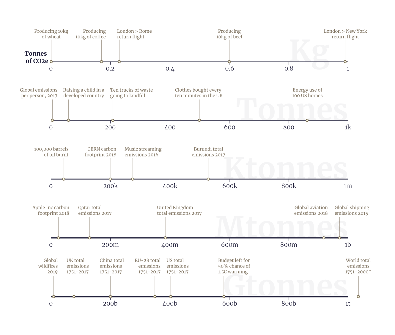
Eventually I resorted to simple points, which also had the benefit of giving more space for the annotations. It took a while to get to a point where I was happy with these too. I tried several different versions, and also gathered feedback on Twitter.
Working on some single axis annotation concepts. Which is your favorite? pic.twitter.com/ZUDzZosgxS
— Duncan Geere 🔰 (@duncangeere) April 9, 2020
Style A was the audience's favourite, so I went with that, after trying out and rejecting E and B (below). I liked C (and so did several voters), but felt like it would be a pain to arrange things. Not a single person voted for D.
Design Elements
I'd like to pick out a few of the more subtle design aspects of the chart that I think make it particularly effective. First is the increase in axis line thickness down the page - this gives a nice structure to the chart, as well as a visual cue that each axis is "larger" than the previous one. (Thanks to Silfa for suggesting this idea!)
Second is the large but faded background text, which lets a reader who has a quantity in mind very quickly find the right place for it in the chart. Finally, there are the hourglass-like curves below each axis, which visually reinforce the idea that each scale represents only a teensy chunk of the one below it.
Final thoughts
I think this chart works very well for its core purpose – which is to allow for the comparison of widely-varying quantities, and for a reader to quickly get context for a number they've found somewhere else. As well as carbon emissions, I think this would work nicely for dollar amounts, distances, weights or spans of time, among others.
I don't think it works so well for a single quantity increasing over time (e.g. cases of a disease rising), as datapoints that jump from one axis to another can't be so easily connected. I feel like a log scale is better for that use case. But hey, I might be wrong. If you have an idea to make it work, then go ahead and remix the chart.
And if you have any other questions or comments, I'd be very interested to hear them. Drop me a message any time.