
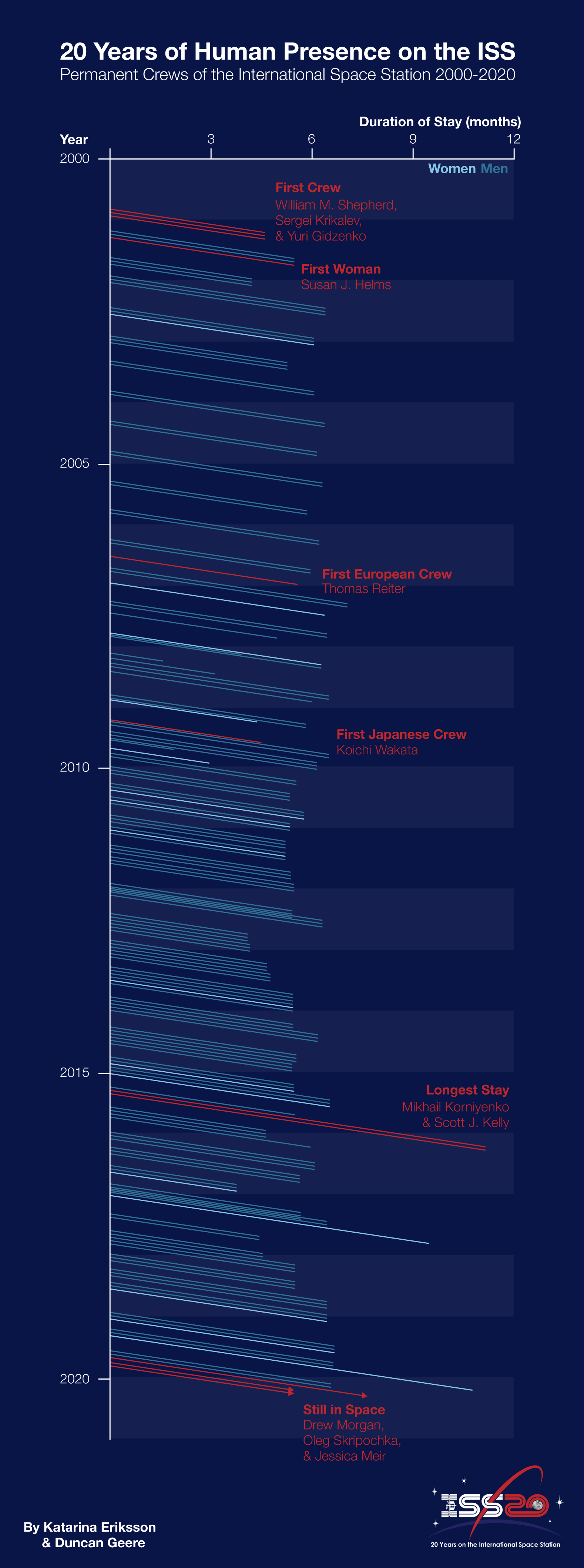
20 Years of Human Presence on the International Space Station

A few weeks back, I collaborated with Katarina Eriksson of Märka Design to create a visualization of the inhabitants of the International Space Station over the years.
It was an entry for an infographic contest that Nasa was running. We didn't win (turns out they were looking for a much more traditional infographic), but I'm proud of it. Here it is:

A few notes for those who are interested - firstly, it uses an unusual chart type - a Lexis diagram, which features time on both x and y axes, so you can see who overlapped with who. Secondly, I designed it in vertical format, so it could be more easily viewed on mobile devices. Finally, I built it with custom code in Scripter to save me drawing all the lines by hand.
Here's that code, for anyone who wants to replicate it. It relies heavily on this spreadsheet, downloaded as CSV and then converted to JSON and pasted at the top of the code.
const data = [insert data in JSON format here]

// Set up an empty nodes array
let nodes: SceneNode[] = []

// Loop over the data
for (let i = 0; i < data.length; i++) {
  let r = Line({
    x: data[i].x1,  // x position
    y: data[i].y1,  // y position
    width: data[i].length, // length of line
    rotation: data[i].angle, // rotation of line (constant)
    strokes: [ {type: "SOLID", color:{r: data[i].r, g: data[i].g, b: data[i].b}} ]  // colour
    })

  // Push each line into the nodes array in turn
  nodes.push(r)
}

// select our new lines
setSelection(nodes)

// pan & zoom the viewport to show the rectangles
viewport.scrollAndZoomIntoView(nodes)