
Creating the Car Free Megacities Data Dashboard

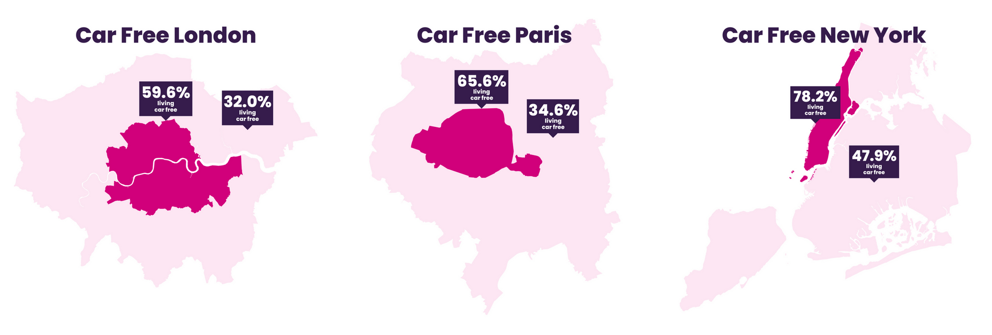
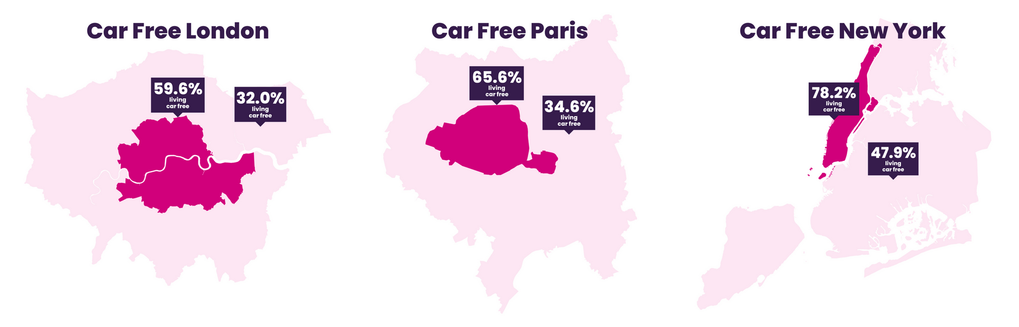
A project that I've been working on for climate charity Possible has just gone live! The Car Free Megacities data dashboard shows how London, Paris and New York are freeing themselves of the dangers, pollution and emissions caused by mass private car ownership. It's available in both English and French.
The data was provided by the team at the Active Travel Academy at Westminster University, who assembled it from a cornucopia of different sources. You can see all of those sources, along with the raw data, in the datasheet. The methodology of how the data was aggregated is available too.
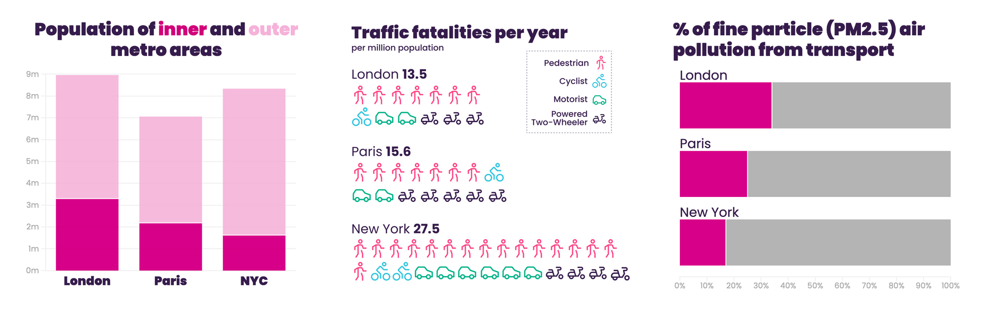
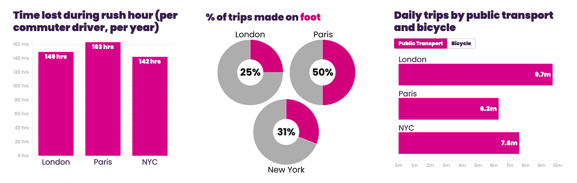
The dashboard is a combination of embedded interactive charts, developed in Flourish, and static ones that I made in Figma. Some lines have a mix of both, like this one that combines a bar chart and column chart from Flourish with an Isotype-style pictogram that I made in Figma. I opted for a square aspect ratio on all the charts, so they work well on both computers and mobile phones. It's all laid out in a grid in Squarespace, which needed a little fiddling to get it to appear in the right order on mobile but I got there.
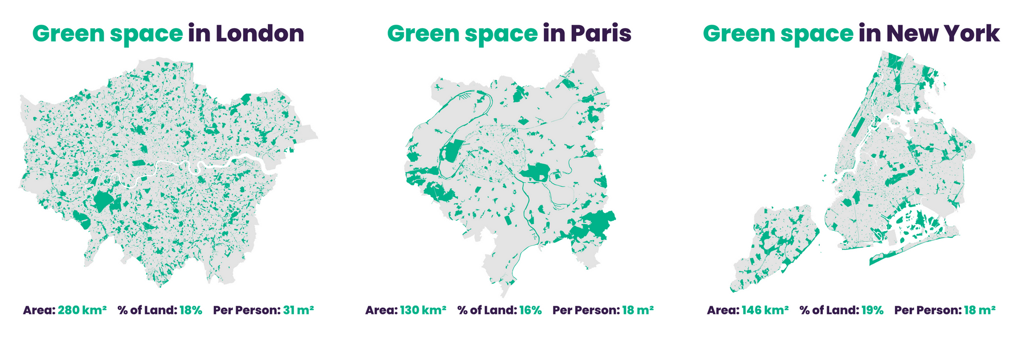
I particularly like the green space maps, which show public green space in the various cities, how much of the land area of the city it takes up, and how much is available per person. Who knew London was twice as green per person than Paris and New York? Props to the Active Travel Academy for the heavy geospatial data work on this one.
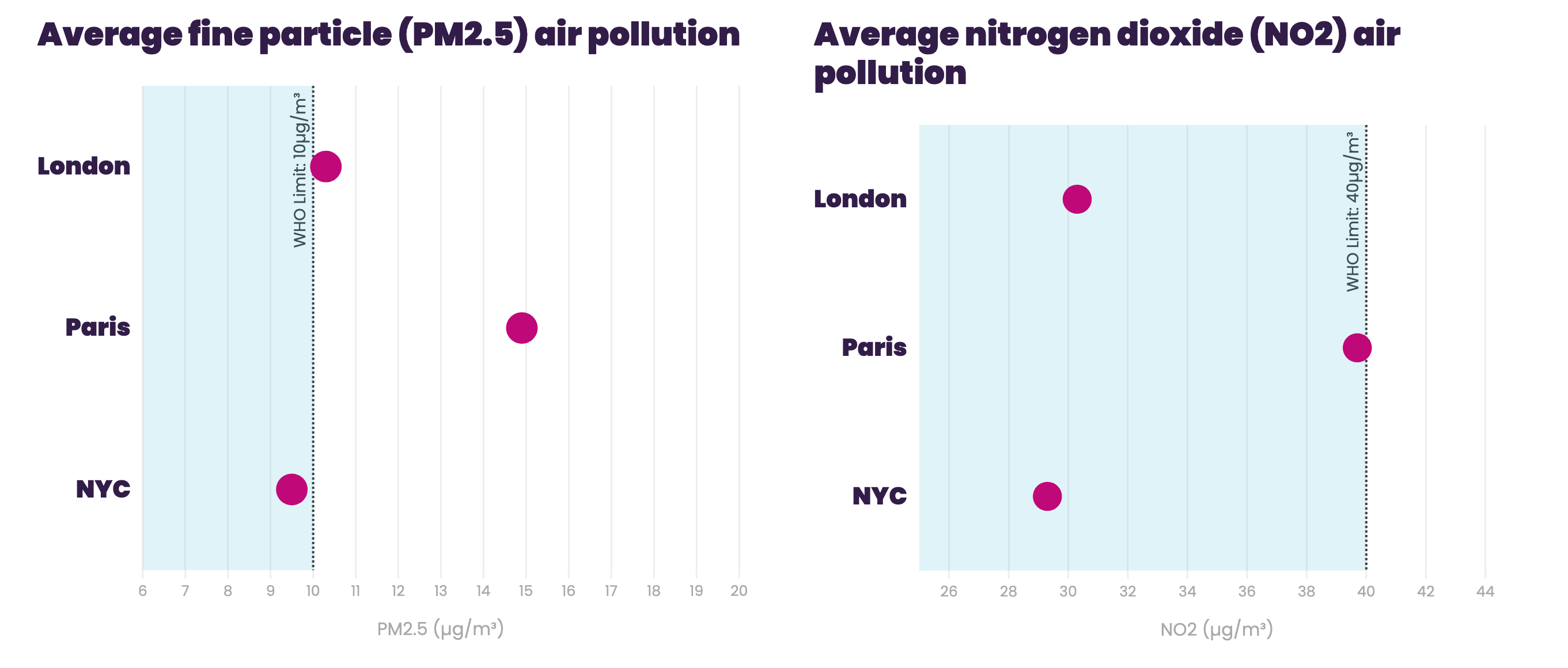
The air pollution charts probably underwent the most changes of all the charts during the design process. We had several sources giving us different annual average figures for each city, so originally we wanted to show the range of those figures - a max and a min. But during the testing process, people misread this as the maximum and minimum concentrations during the year, rather than range of averages. So we took an average of the averages instead, and just showed a single figure for each city - as well as the World Health Organization's recommended limits (though it's worth noting that there's no "safe" level of exposure to air pollution").
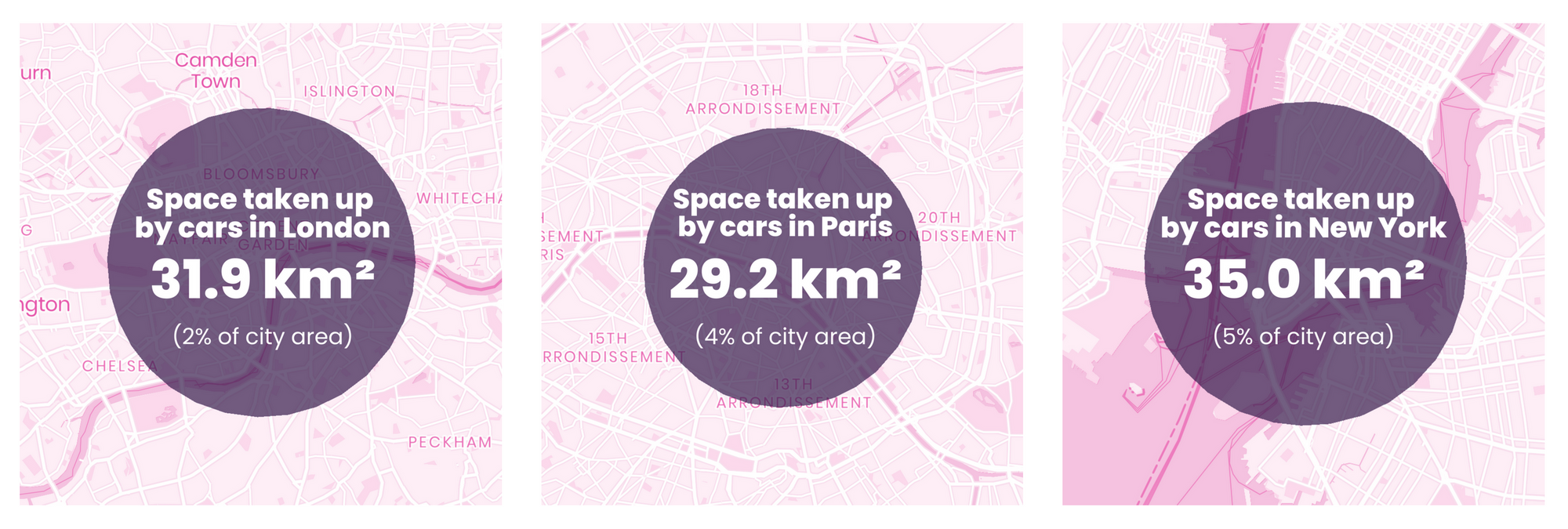
My personal favourite charts in the dashboard are the maps where the size of the circle represents the amount of space taken up by cars in each city (number of cars multiplied by the size of an average parking space). Imagine the entirety of central London, or all of the south of Manhattan and the water around it, covered entirely with cars! Such a powerful image. I used Mapbox and Geotools to create these.
We plan to keep these figures updated, so if you spot any outdated statistics that need replacing, or have any other questions about the data, then contact us at the email address in the datasheet.
If you want to ask something about the design of the dashboard, or if you'd like me to make something similar for you, then email me instead and let's chat.