
Ekistics: An Exhibition of Utopian Pen Plotter Art

Ekistics is the the science of human settlements, of how we fit into our environments, and how those environments affect us. The term was coined in 1942 by Greek archictect and town planner Constantinos Apostolou Doxiadis, who developed a set of 15 hierarchical levels for talking about places to live. He called them "Ekistic units" and they range from the "anthropos" and "room", with a population of one and two respectively, past the polis (pop. 75,000), metropolis (pop. 4,000,000), all the way up to the ecumenopolis (pop. 50,000,000,000).
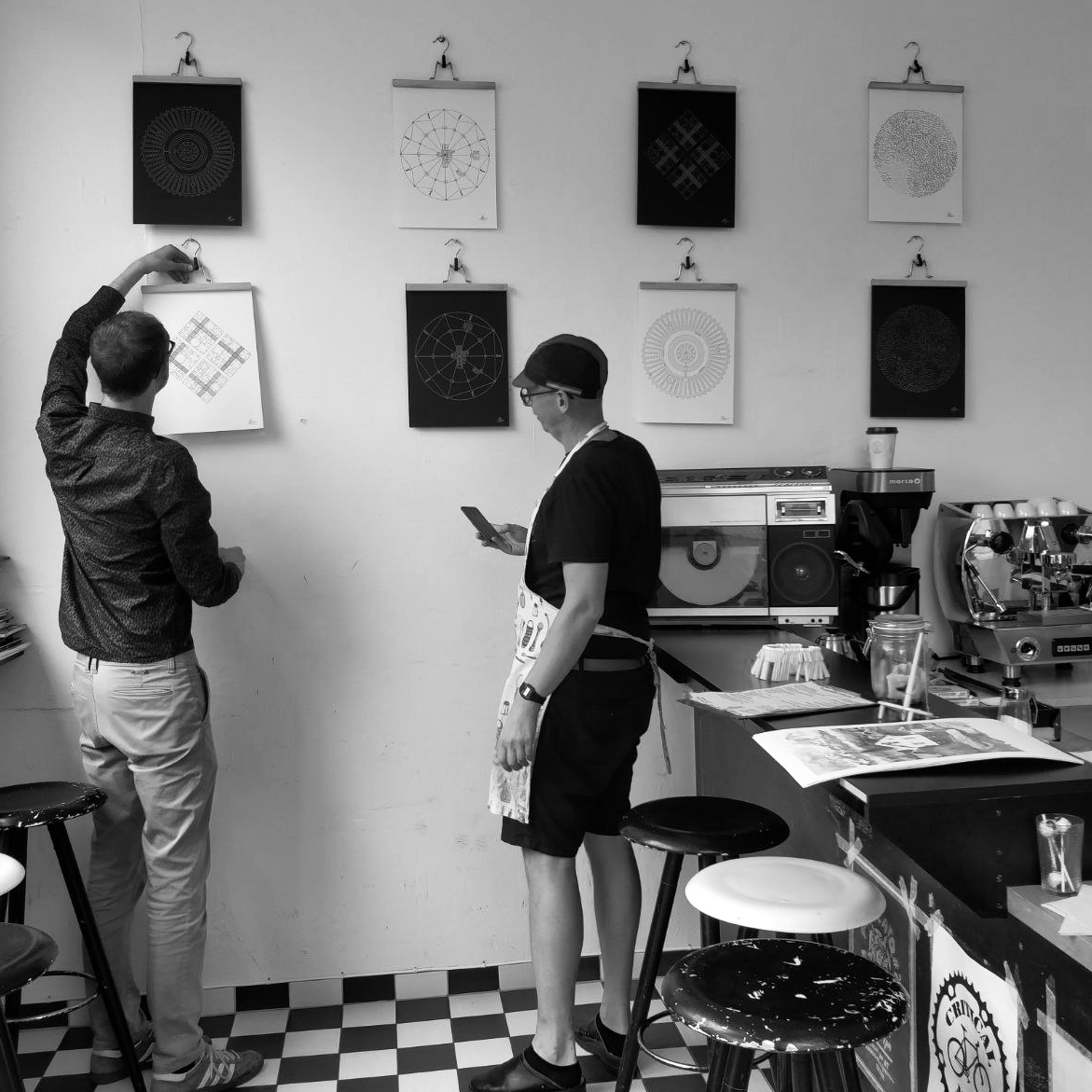
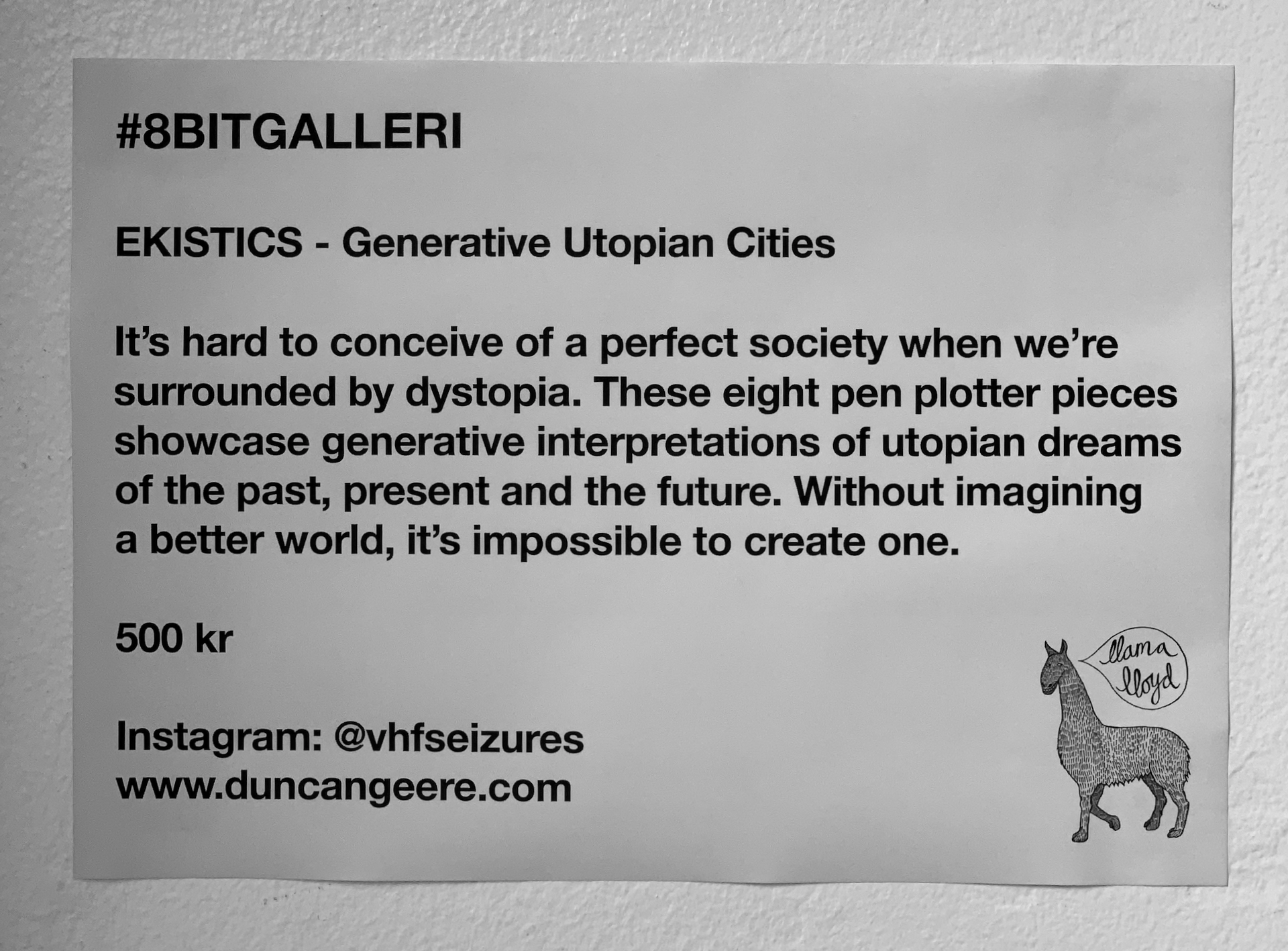
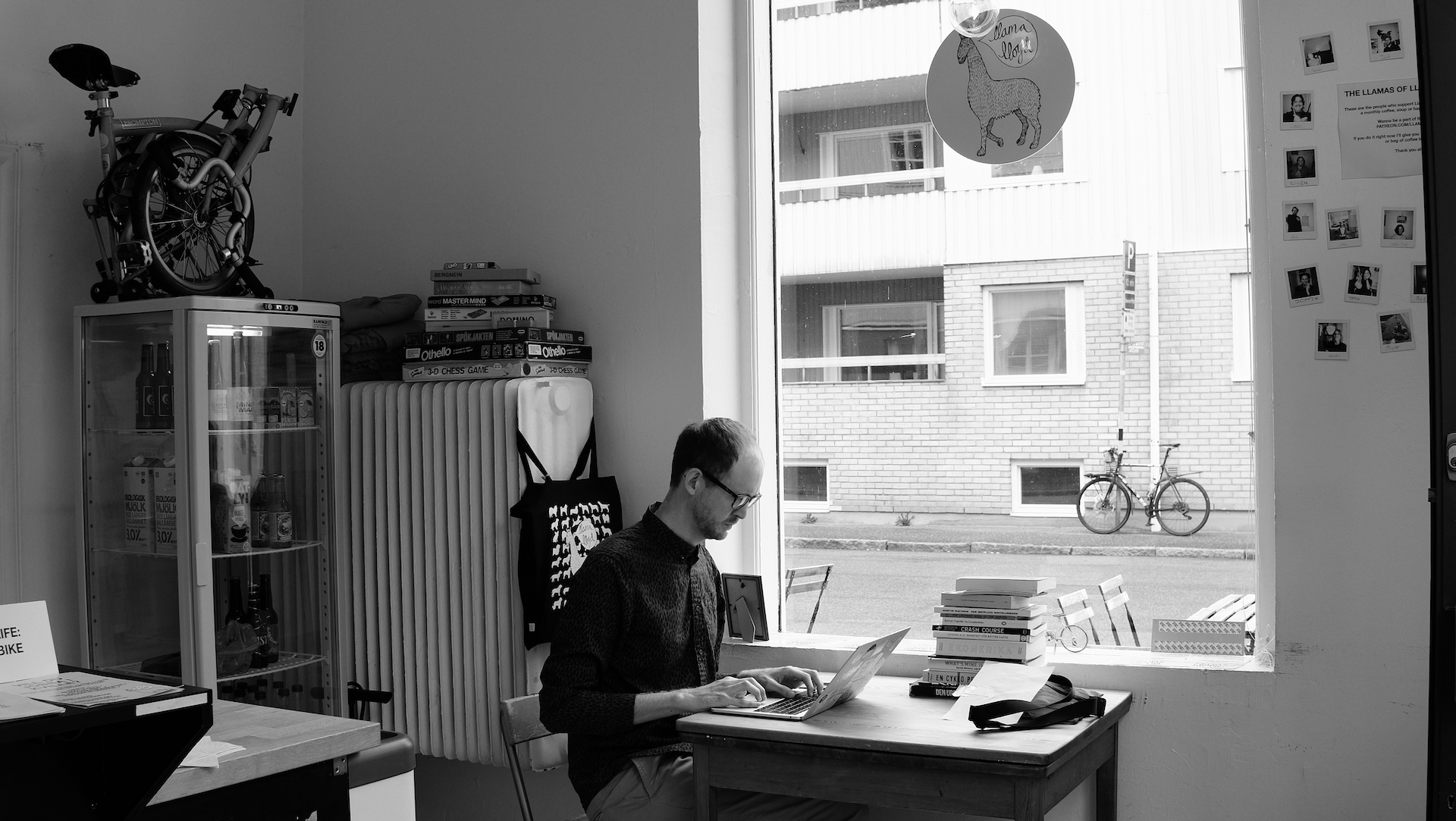
Ekistics is also a collection of generative pen plotter artworks, created by Duncan Geere (that's me) in July and August 2020. It questions our relationship with mass media, making the case that imaginary utopias are how we begin building a better world. It was exhibited at Llama Lloyd in September 2020.
Background
I've been fascinated by the concept of an "ideal city" for decades. In 2011, I wrote an article for Rock, Paper, Shotgun about how the 1994 videogame Sim City 2000 "laid a utopian streak in my thinking" at a formative point in my youth, and since then I've written widely about utopian ideas for cities. It's fair to say it's a bit of an obsession of mine.
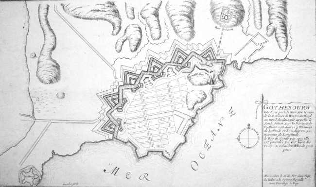
So when I visited the Gothenburg's Stadsmuseum in February 2020, I was really interested to find an exhibit about the ideas that the Dutch planners used to design the city in the early 1600s. They followed the principles of Italian polymath Leon Battista Alberti:
Alberti insisted on choosing the location of the town first, followed by careful setting up of the size and direction of streets, then location of bridges and gates, and finally a building pattern ruled by perfect symmetry.
That's why Gothenburg has a modern street grid with right-angles, as well as an old-fashioned star-shaped moat, right in the city centre.
The exhibit included a selection of drawings of "ideal cities" from around the same time, which I photographed. In April, I replicated one of my favourites in Figma.
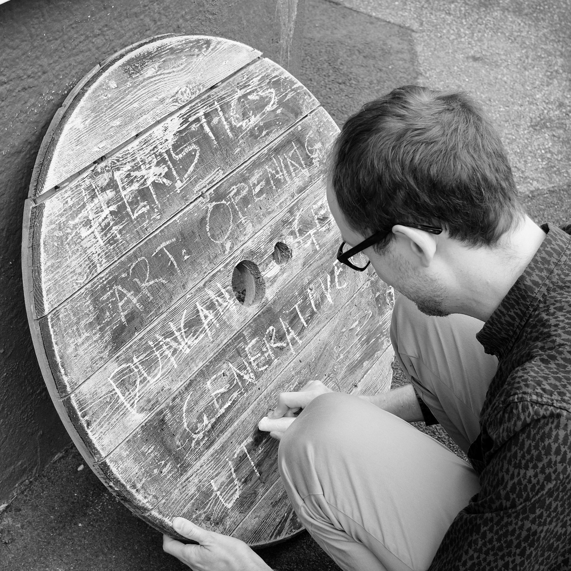
About the same time, I was getting into generative art. I had just bought a book called Generative Design, and I was interested in finding new projects to tackle. The acquisition of a pen plotter not long after sealed the deal. When a local cafe announced that it was re-opening in August, and was looking for artists to exhibit their work, I eagerly signed up without much idea of what I was going to show.
After a bit of thinking, I sat down and wrote out an artist's statement for the exhibition. It read as follows:
My name is Duncan and I collaborate with robots to make art that sits on the boundary of the physical and the digital, the expected and the unexpected, the imaginary and the real. Through careful control of random numbers, I create worlds of possibilities that result in unique, intricate artworks that are never the same twice.
The eight pieces that are featured in Ekistics centre around the theme of utopia. The Dutch planners that built Gothenburg drew inspiration from Italian Renaissance architects like Pietro di Giacomo Cataneo and Antonio di Pietro Averlino (Filarete), who planned out complex "ideal cities" in response to the squalor of the medieval era. An ideal city, they believed, would be the image of a perfect society.
Today, it's harder than ever to conceive of a perfect society. Every moment of the day, we're exposed to news broadcasts and social media aflame with the latest tragedy or outrage. Even in our spare time, we watch grimly dystopian sci-fi or dark crime dramas. Meanwhile, the climate crisis worsens and we fear what kind of a world we leave our children.
I believe we should start telling new stories. Stories of people building fair, equitable societies, in balance with their environments. Stories of communities coming together to solve their problems without conflict. Stories of human kindness and ingenuity. While we must acknowledge that reality is messy, a civilisation is shaped by the stories that it tells. Imaginary utopias, like the ones I depict in these works, are how we begin building a better world.
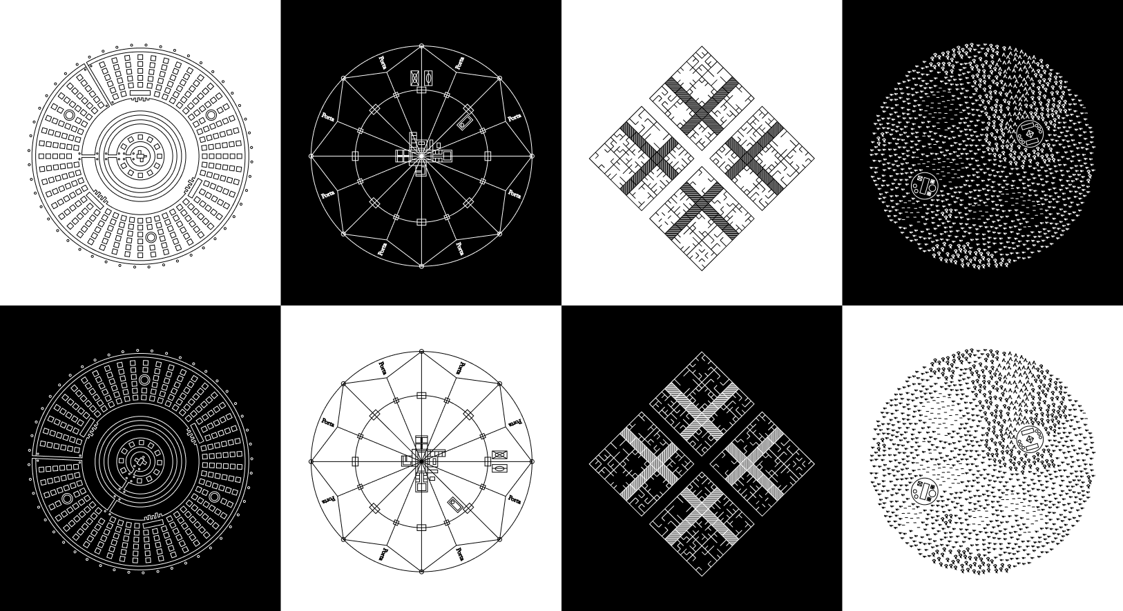
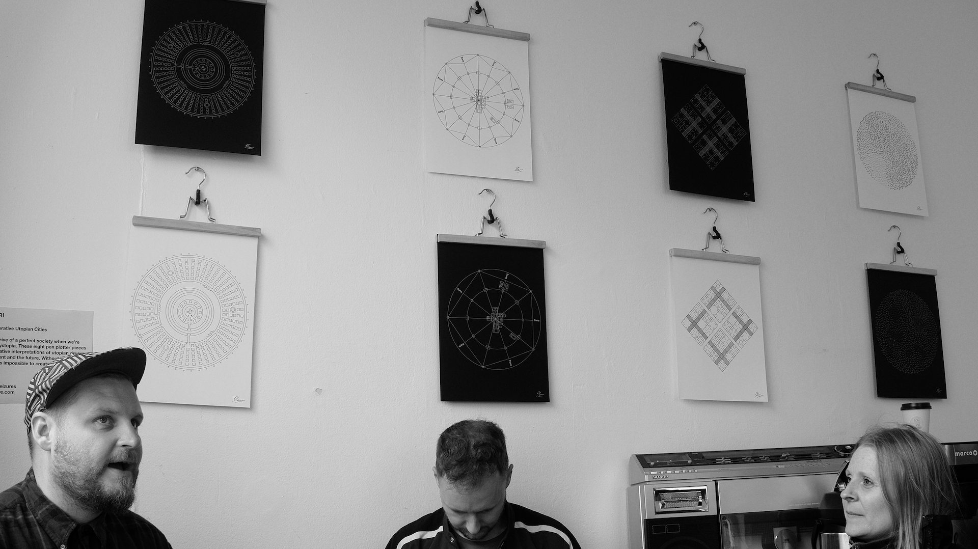
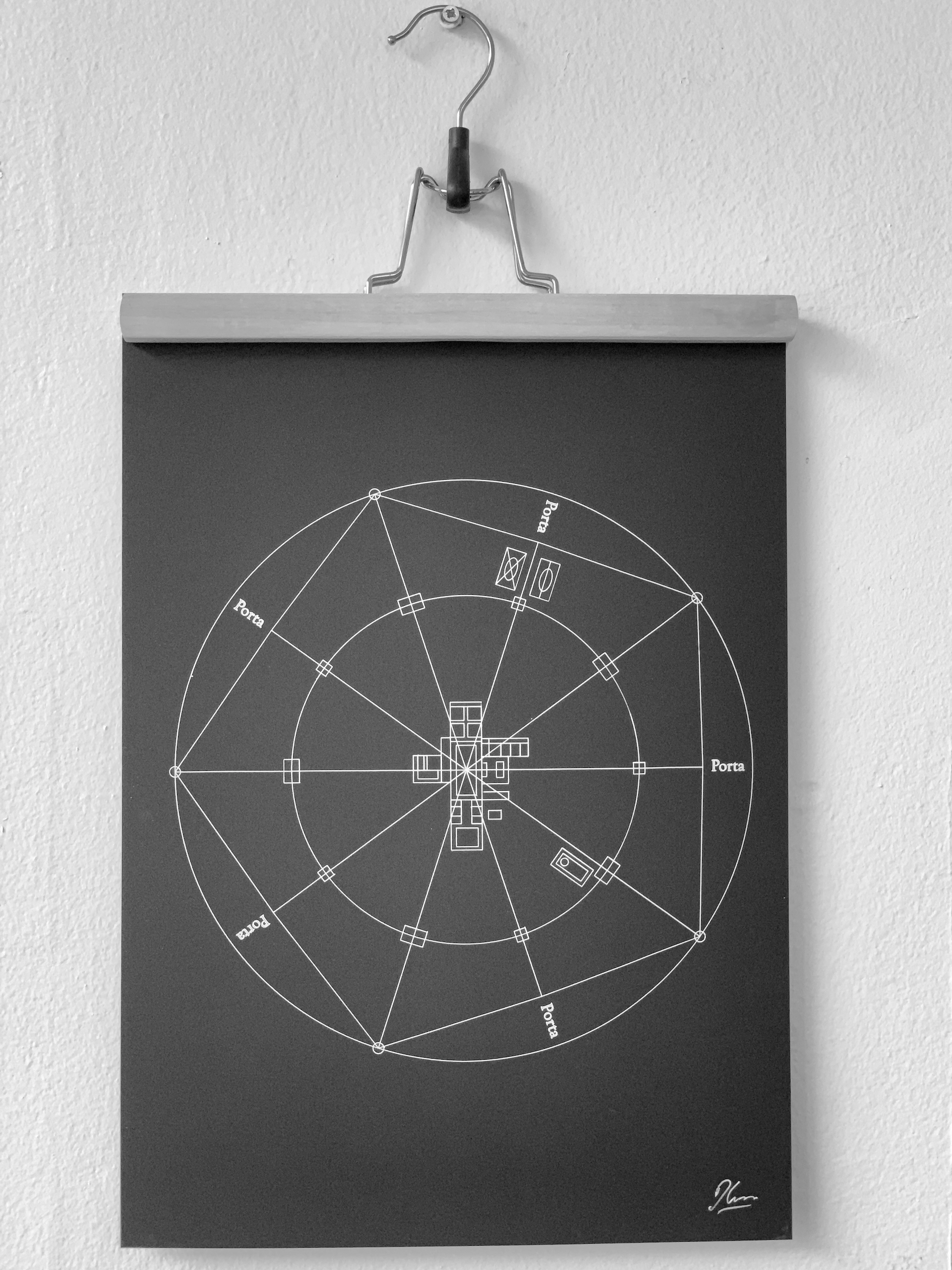
With that game plan in mind, I was then able to start the process of figuring out what artworks I wanted to create. I began by researching historical utopias - both those featured in the Gothenburg Stadsmuseum and others too. I made a shortlist of the most visually interesting, and then noticed that I had a nice temporal spread, going from ancient Greece to the present day. With a little more curation, I settled on four designs that I'd feature. Each would be plotted twice - once white on black, and once black on white - and arranged in a checkerboard pattern on the wall.
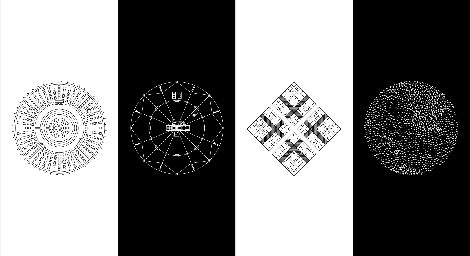
Atlantis
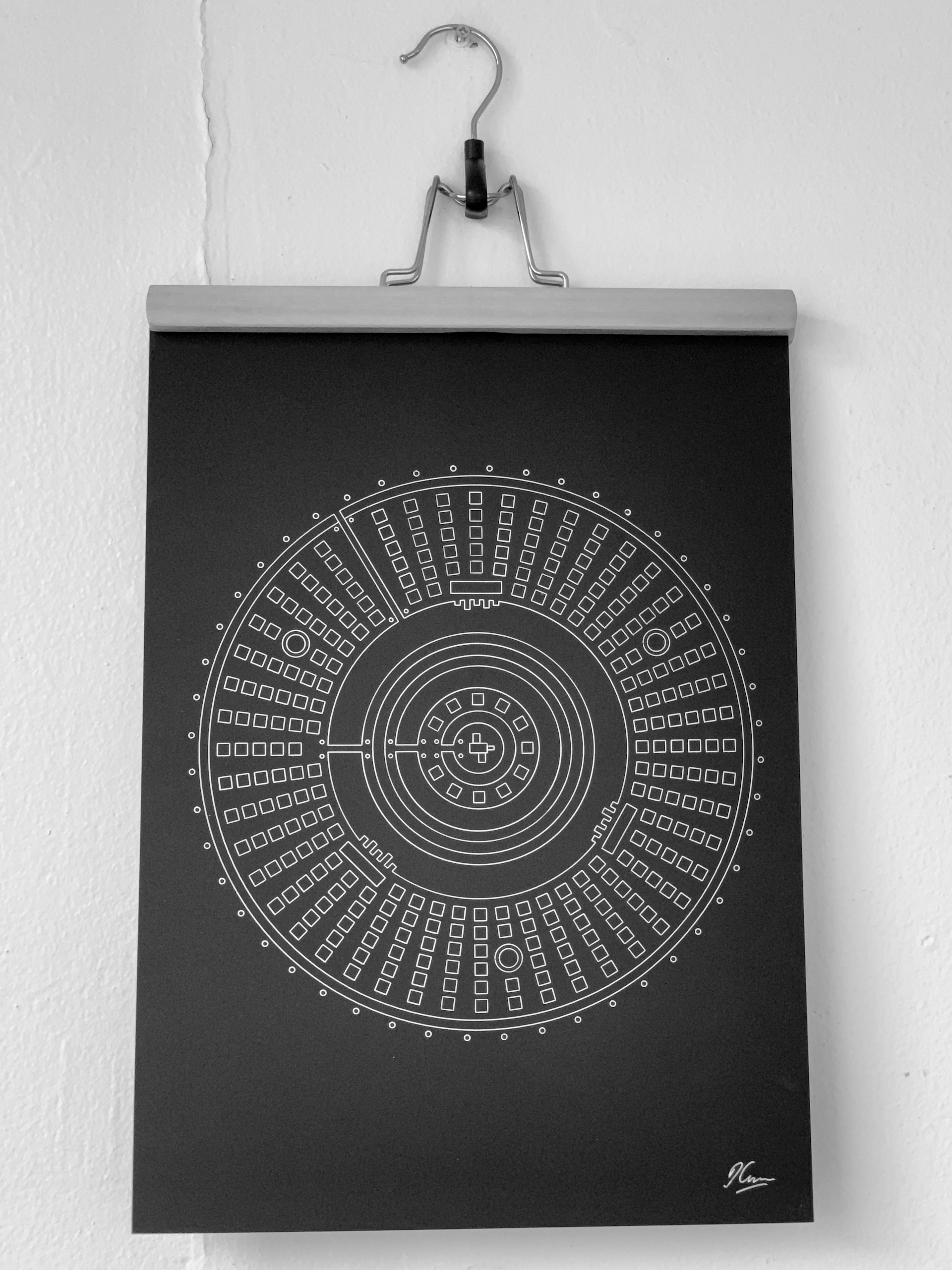
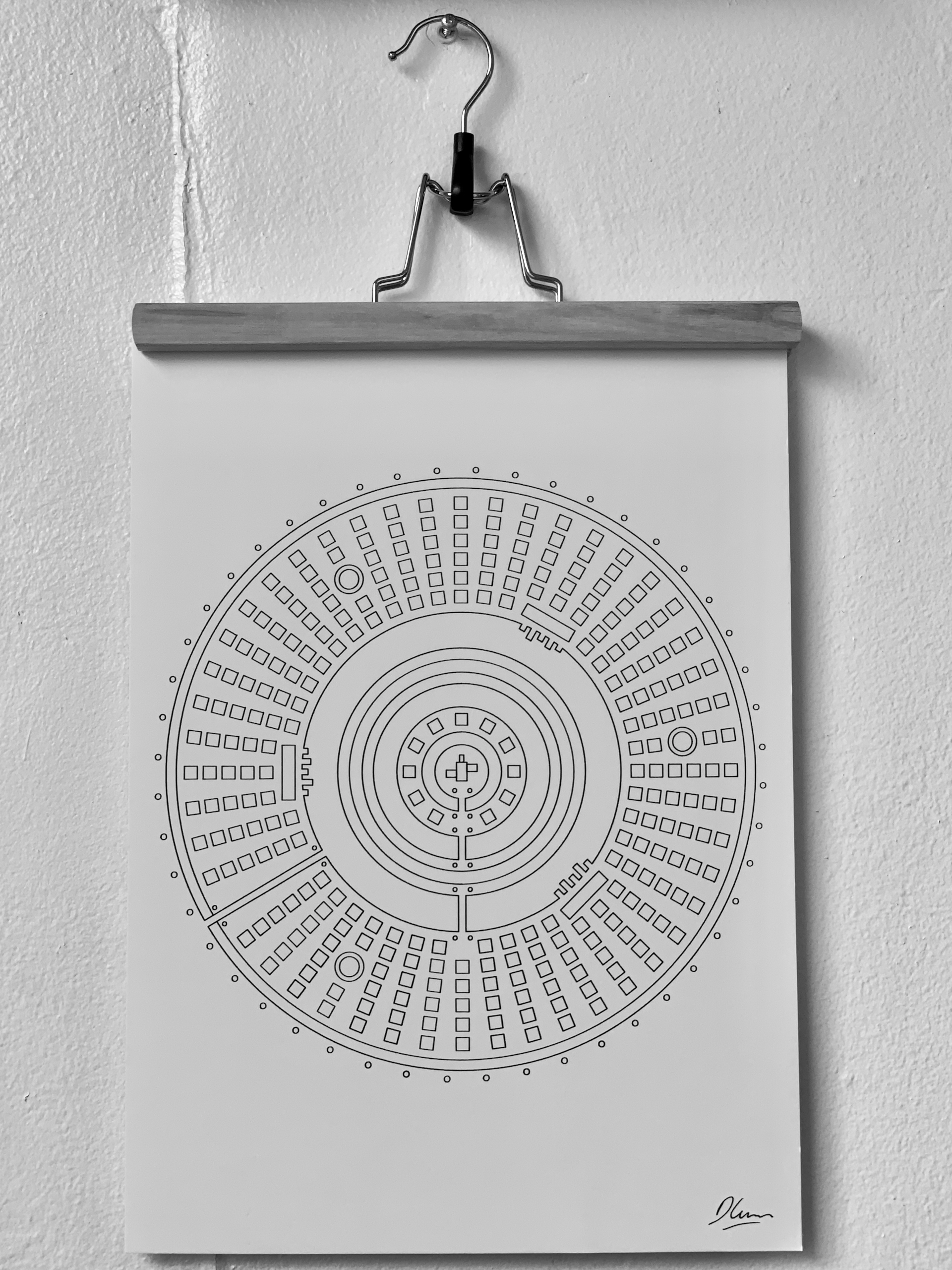
Atlantis is a fictional island described in Plato's Socratic dialogues, where it exists as an antagonistic naval power that besieges "Ancient Athens", Plato's utopian ideal of a city-state. The story goes that Athens is able to repel the attack due to the superiority of Plato's ideas for how the city should be run. The gods then get annoyed with Atlantis' warmongering and sink it below the waves.
While Atlantis is distinctly not the utopia in the original story, it did go on to inspire key utopian writers during the Renaissance. It shares a name with Francis Bacon's New Atlantis, an island where "generosity and enlightenment, dignity and splendour, piety and public spirit" are commonplace. Similarly, Thomas More's Utopia tells the story of a fictional island society and its enviable religious, social, and political customs.
Today we primarily know Atlantis as a stand-in for any generic lost civilization, thanks largely to the mistakes of amateur scholars of the 19th century who failed to recognise the story as an allegory and thought that it was historical fact. US Congressman and early conspiracy theorist Ignatius L. Donnelly, among many others, promoted Atlantis as a technologically sophisticated, advanced culture, from which all known ancient civilizations descended. They were, of course, wrong.
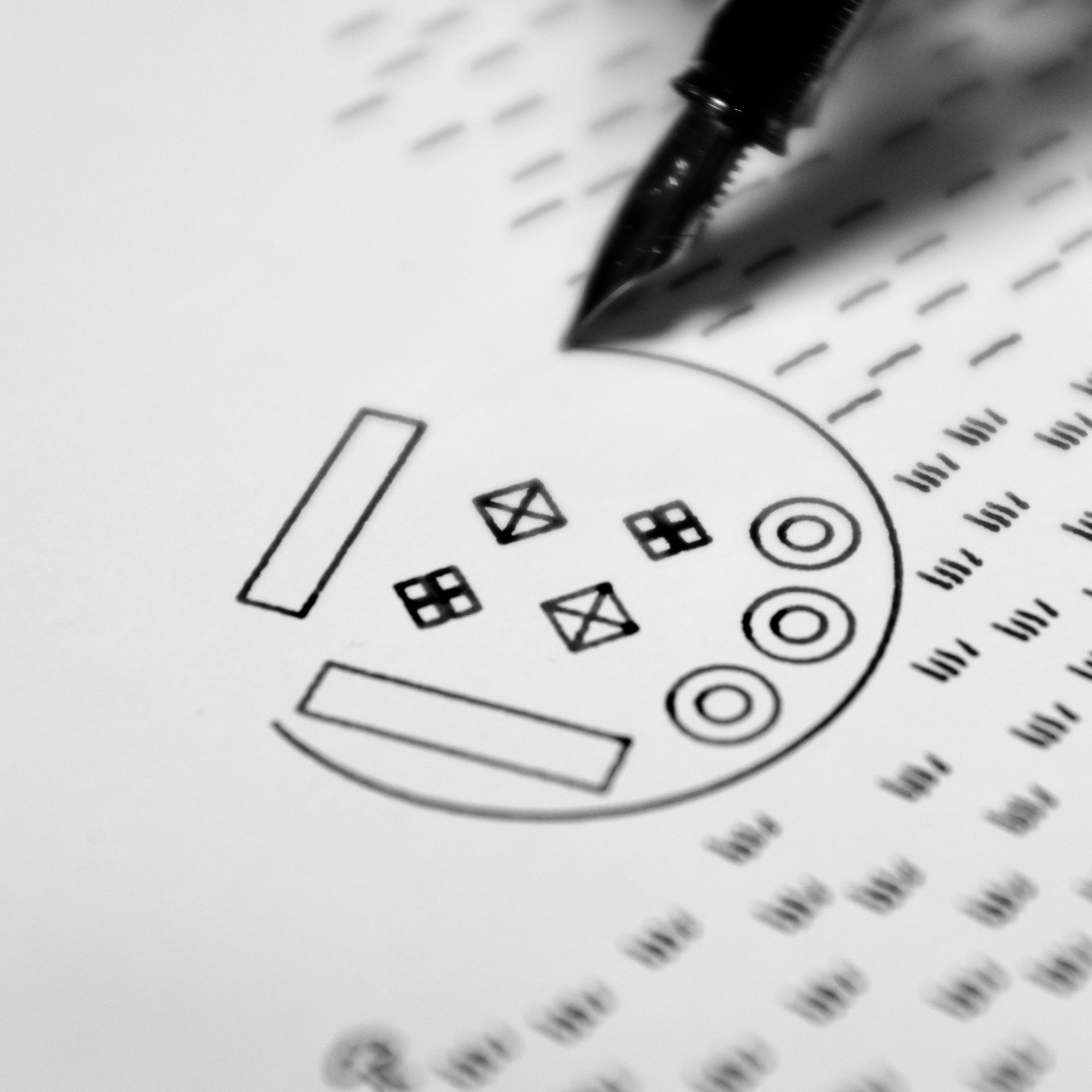
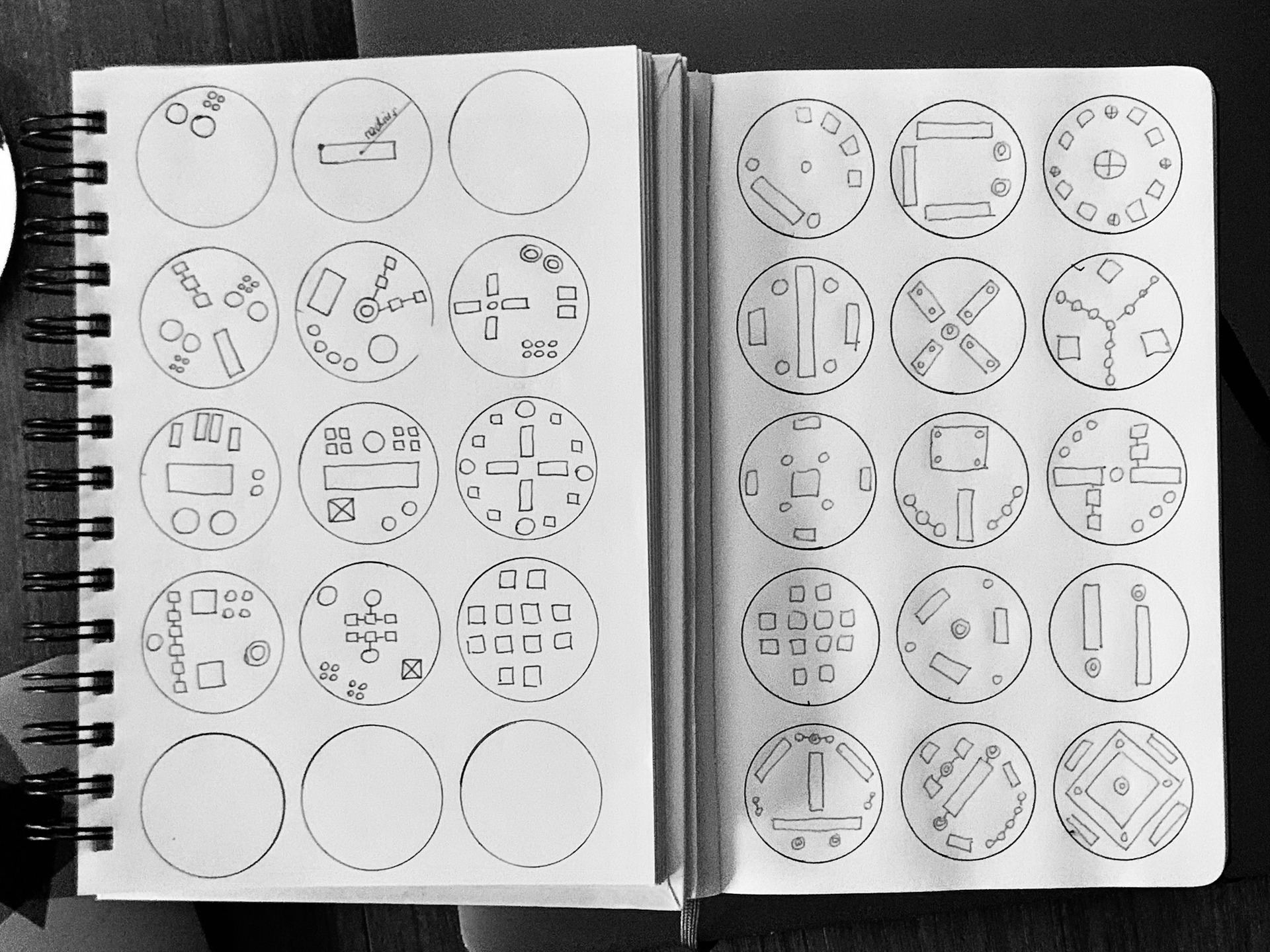
My rendering of Atlantis is based on Plato's description of the city as comprising three circular rings of land with moats in between. The rings have docks, and are connected by bridges and defended by watchtowers and walls. A temple to Poseidon stands in the centre, surrounded by other smaller temples, then a hippodrome, and finally the blocks where the city's inhabitants live.
It's the only one of the collection which wasn't created with code. Instead, I used Figma to draw and position the large-scale structure of the city, and a few automated plug-ins to position the smaller elements - the housing blocks, fountains, dock areas, watchtowers and temples. In the final artworks, I rotated the city a quarter turn to have the two images appear different.
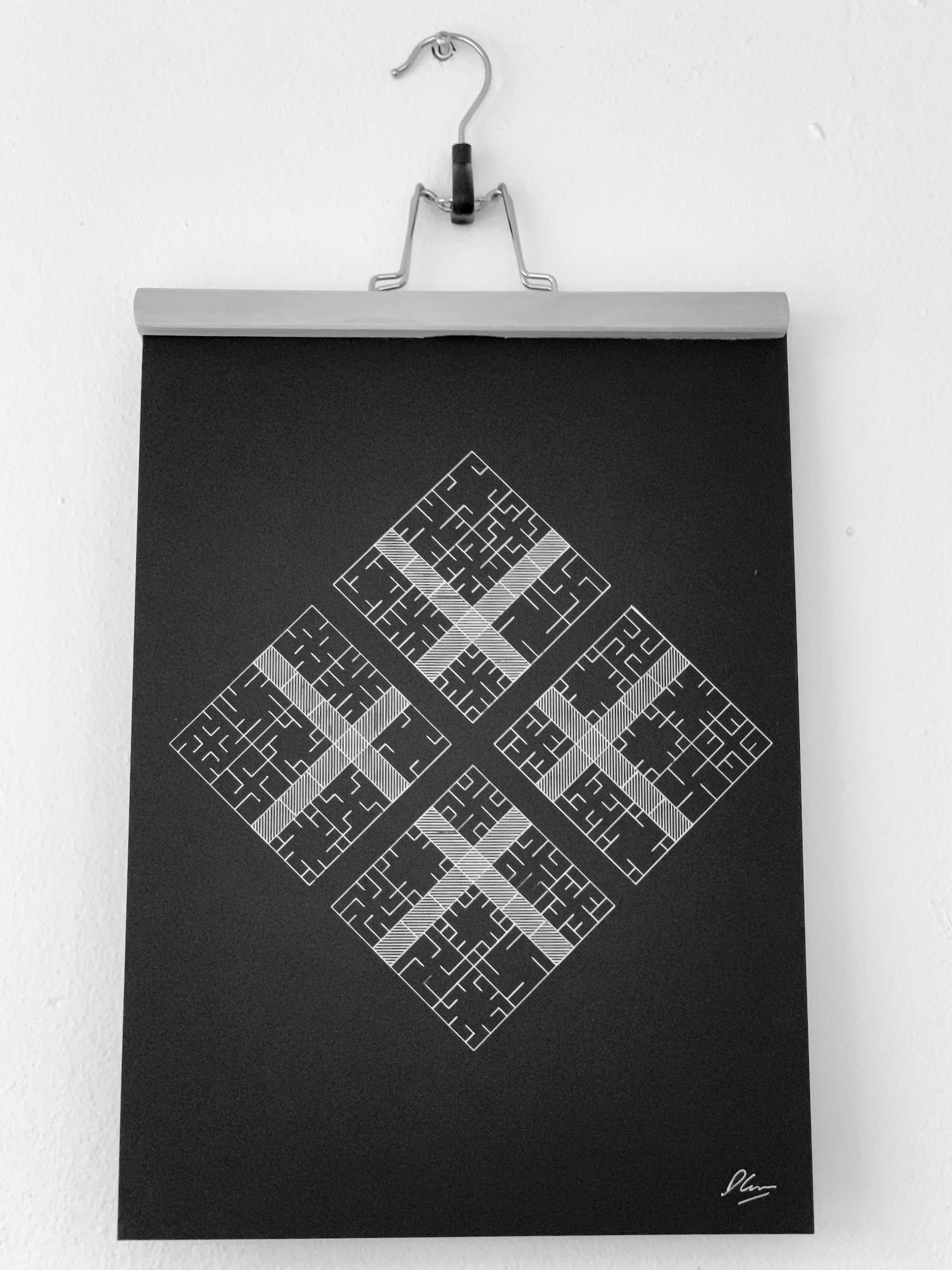
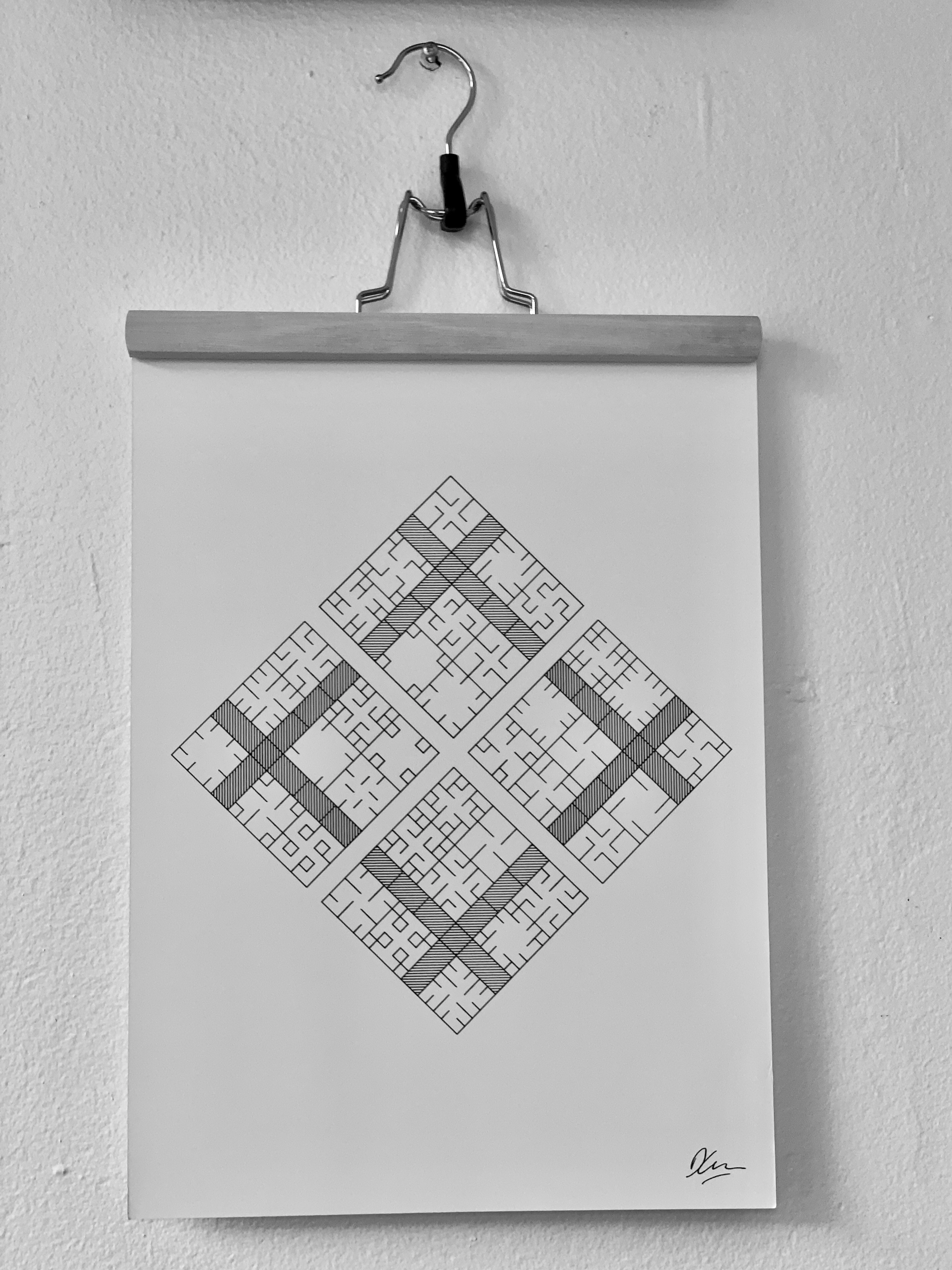
Sforzinda
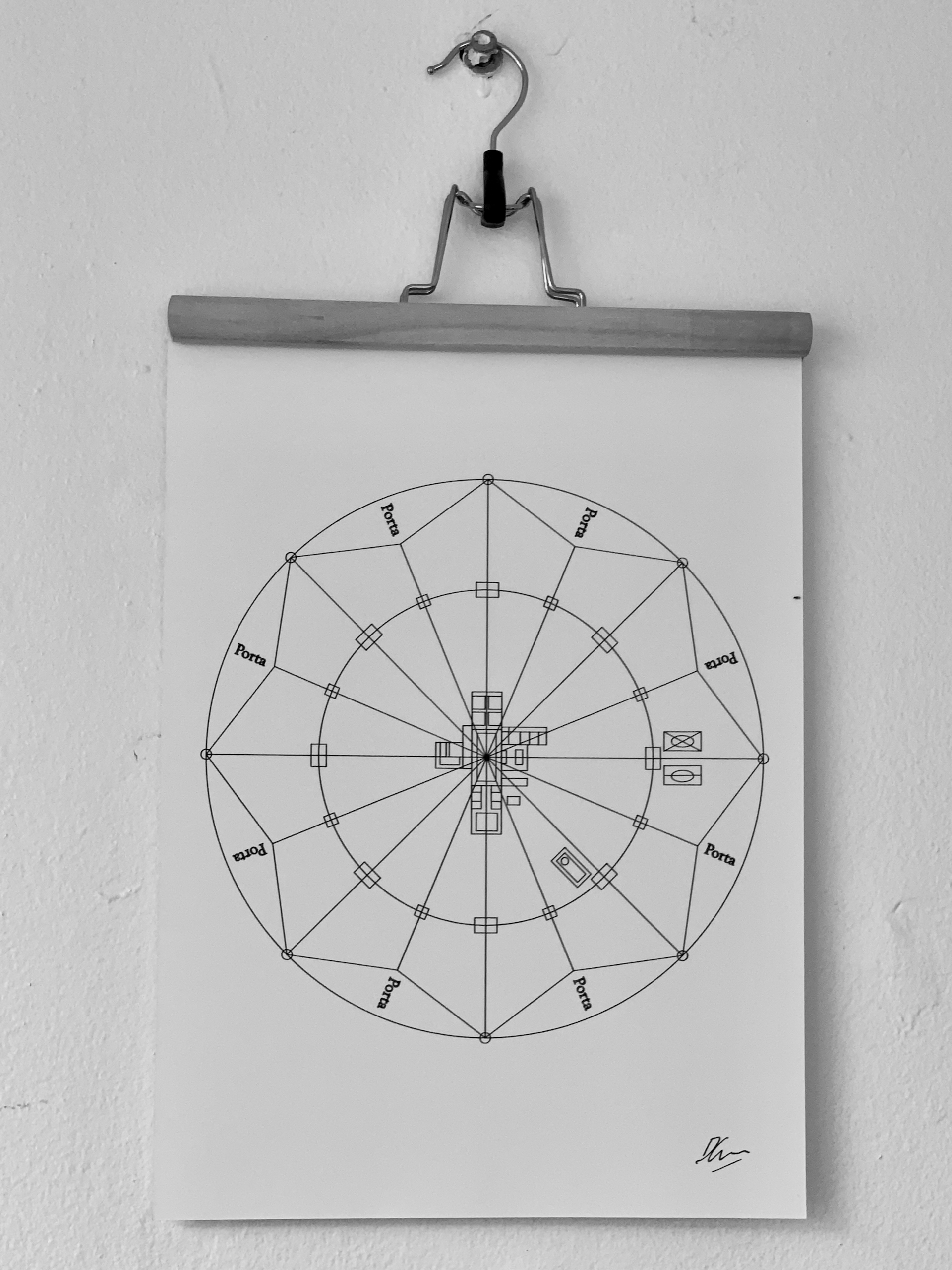
Sforzinda is a design for an ideal city created around 1464 by Antonio di Pietro Averlino, better known as Filarete. It was named after Francesco Sforza, the Duke of Milan at the time, because in those days the only way you could get important creative work done was to dedicate it to either a god or a politician.
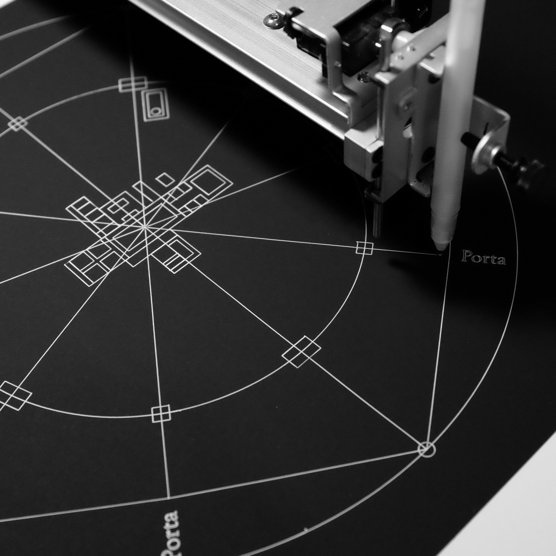
It takes the form of an eight-pointed star, surrounded by a circular moat, which looks a little occult. Historians reckon Filarete chose these shapes because he was interested in astrology and magic, and in fifteenth-century Italy there was a pretty strong link between "the talismanic power of geometry and the crucial importance of astrology". I kinda wish that had survived to the present day.
Each of the outer points of the star have towers, while the inner points have gates. This allows the town to be easily defended. A road runs from every tower and gate to the centre, and every other road has a canal in it, to improve cargo transport. There are three squares - one for the prince's palace, one for the market, and one for the cathedral in the centre.
It's thought that Sforzinda's rigid, geometric design was intentionally in opposition to the crowded, congested cities of the Medieval era. Like Plato's Atlantis, the power in this design flows from the centre outward, following Dante's assertion that "The human race is at its best under a monarch".
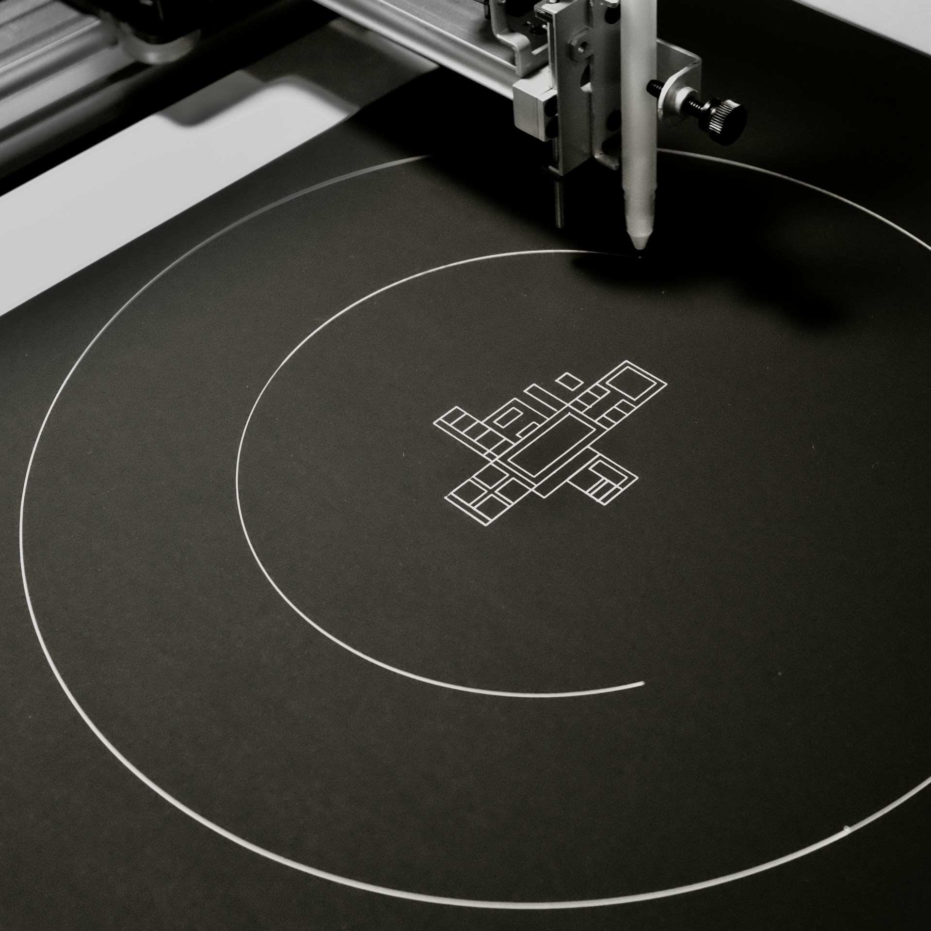
Sforzinda was the first design I created for the Ekistics project, as it's so clearly based on geometry and that's relatively easy to do with code. I created a system that generates a star with a random number of points and then distributes the appropriate towers, roads, squares, and so on randomly within. It's a nice example of how generative art thrives on randomness within limits.
Sforzinda was never built, but its designs inspired star fort cities across the world, including Gothenburg. The best-preserved example of a real Sforzinda is probably Palmanova, which today is a UNESCO World Heritage Site.
Fused Grid
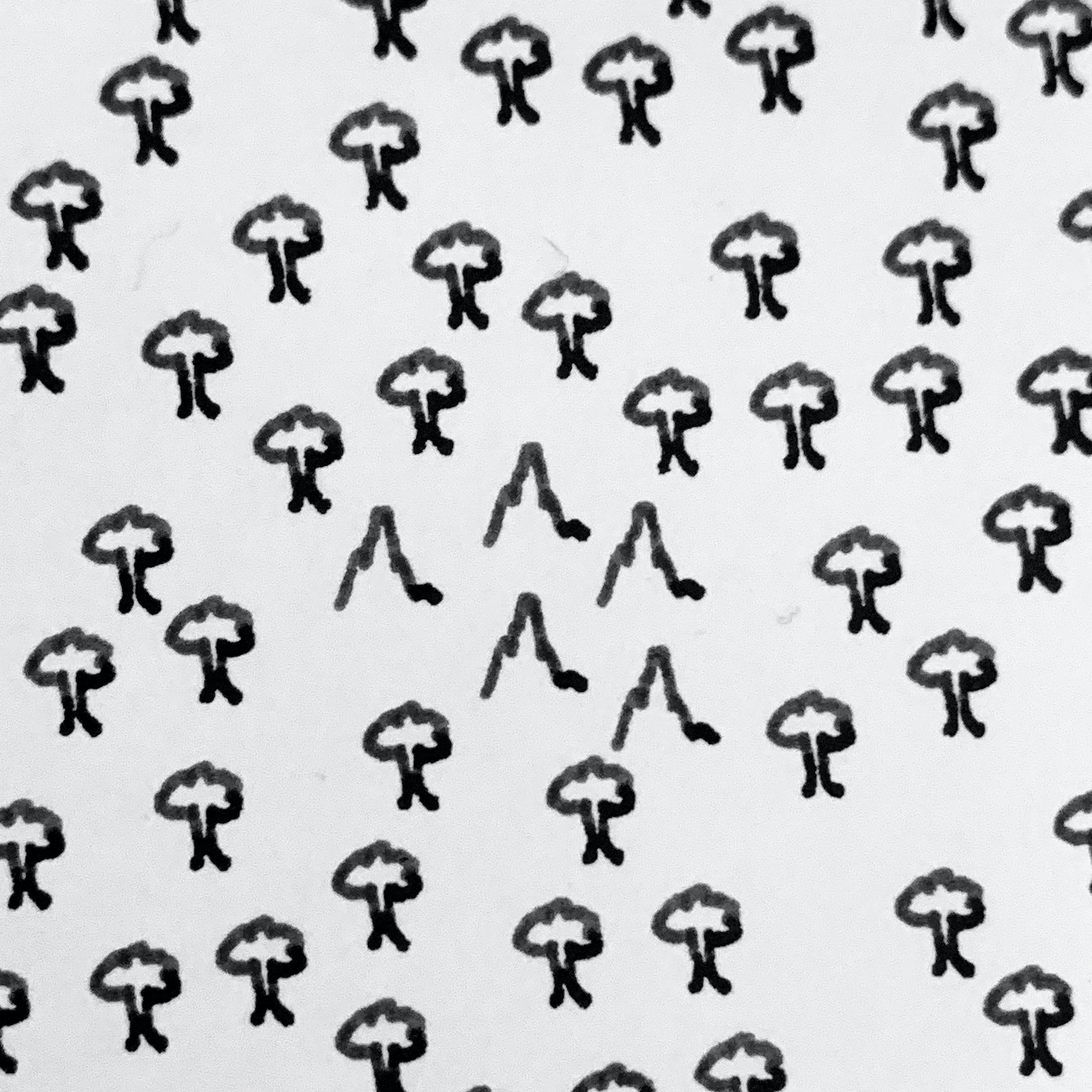
The Fused Grid is an urban design pattern created in 2002, which melds two pre-existing, and widely used, patterns - the Grid and the Radburn pattern.
You're almost certainly familiar with the Grid already. It's common around the world but particularly in American cities, where streets run at right angles to each other, creating blocks in between. The grid is widely associated with modernity, but is actually far, far older. In 2600 BC, major cities of the Indus Valley civilization like Mohenjo-daro and Harappa were built with a grid of straight streets. The Egyptians, Babylonians, Aztecs, Ancient Chinese, Greeks, and Romans also used grids.
Hippodamus of Miletus, an ancient Greek urban planner, was particularly enamoured of them - imposing them on every town he worked upon. Aristotle reckoned he was a bit of an attention-seeker, writing:
"Some people thought he carried things too far, indeed, with his long hair, expensive ornaments, and the same cheap warm clothing worn winter and summer."
You might not be as familiar with the Radburn pattern as you are with the Grid, but it's also very common in the Western world, particularly in suburbs. Named after Radburn, New Jersey, where it was first implemented, it consists of a "hierarchy" of streets, with small roads sprouting off large boulevards and then even smaller cul-de-sacs and crescents sprouting off the small through-roads. It avoids straight lines, large intersections and repetitive blocks in favour of something that appears more "organic".
Each of these patterns has its advantages and disadvantages. The Grid is easier to navigate, but the Radburn's organic hierarchy is less monotonous. The Grid allows for shorter, more direct journeys, easily accommodating public transport, while the Radburn reduces car traffic and offers more green space to residents. A Grid is easier to plan, while a Radburn is cheaper to construct and maintain.
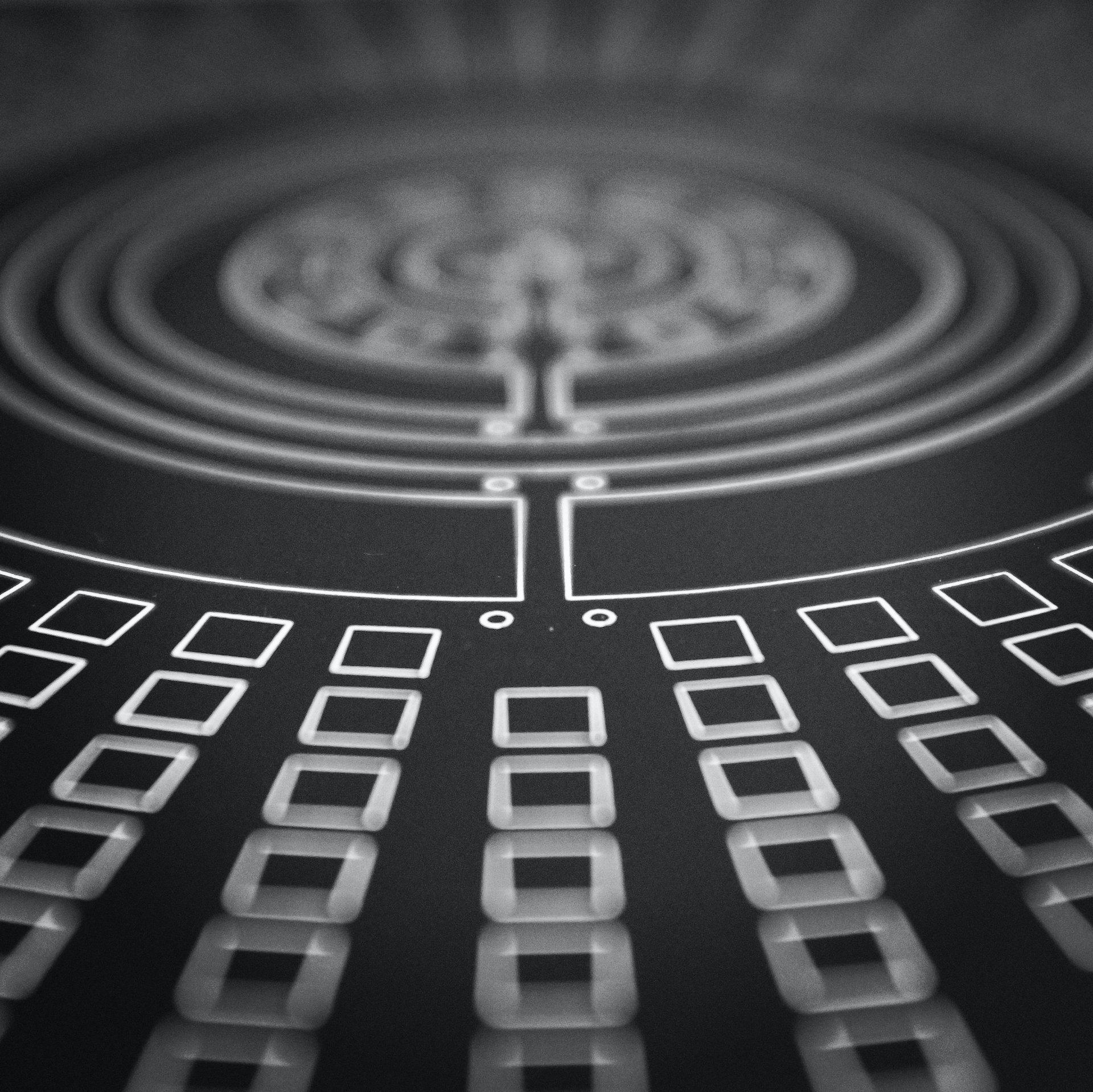
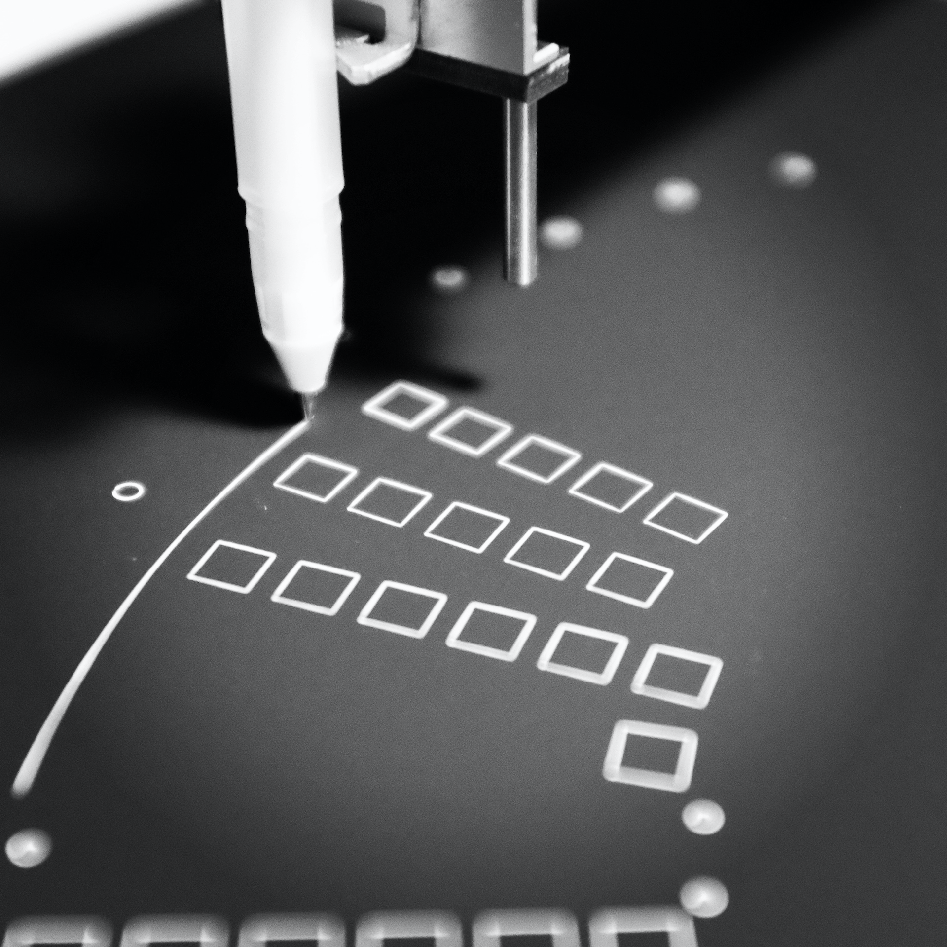
It wasn't long until architects started wondering whether we could have the best of both worlds, and so the Fused Grid was born. The Fused Grid sets up a large-scale grid, then embeds smaller Radburn patterns within. It has easy navigability, while still allowing for a nested hierarchy of streets. I consider the Fused Grid to be a modern utopia in that it melds together the advantages of a traditional Grid-based inner city with the benefits of living in leafy, low-density Radburn-planned suburbs.
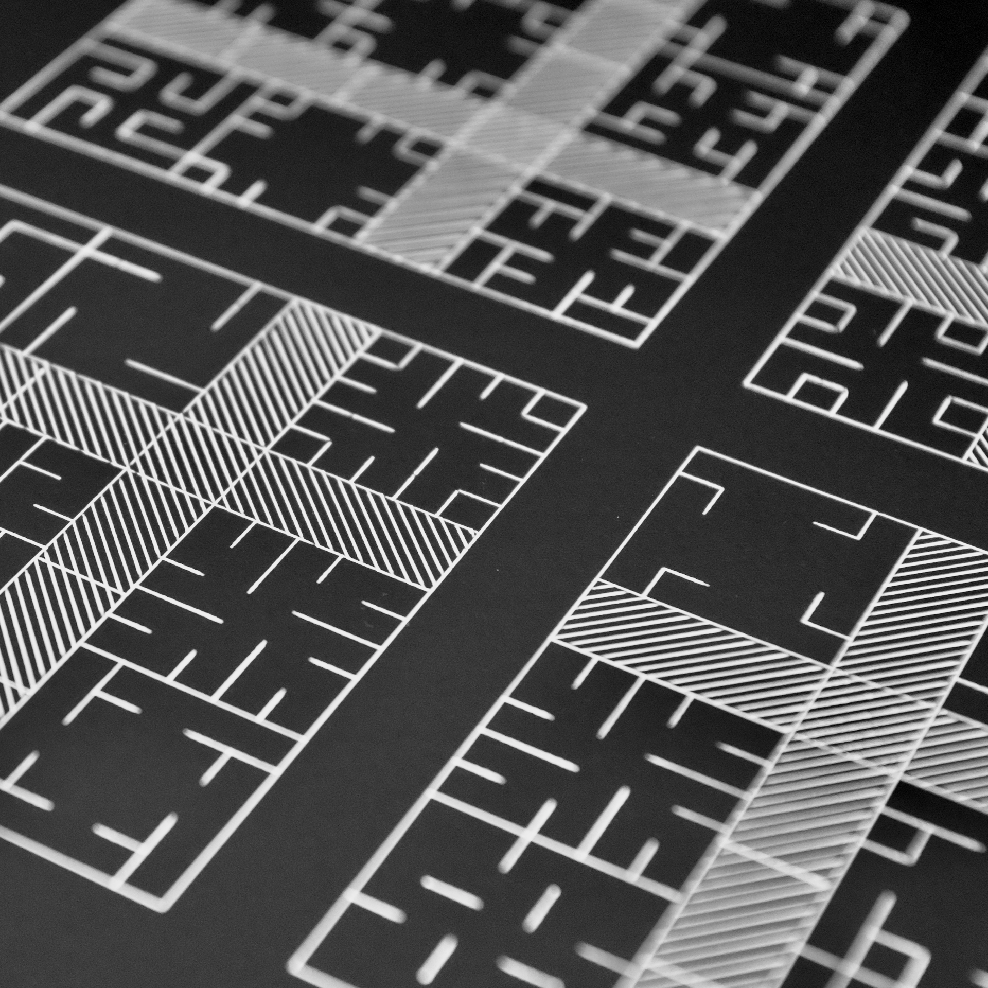
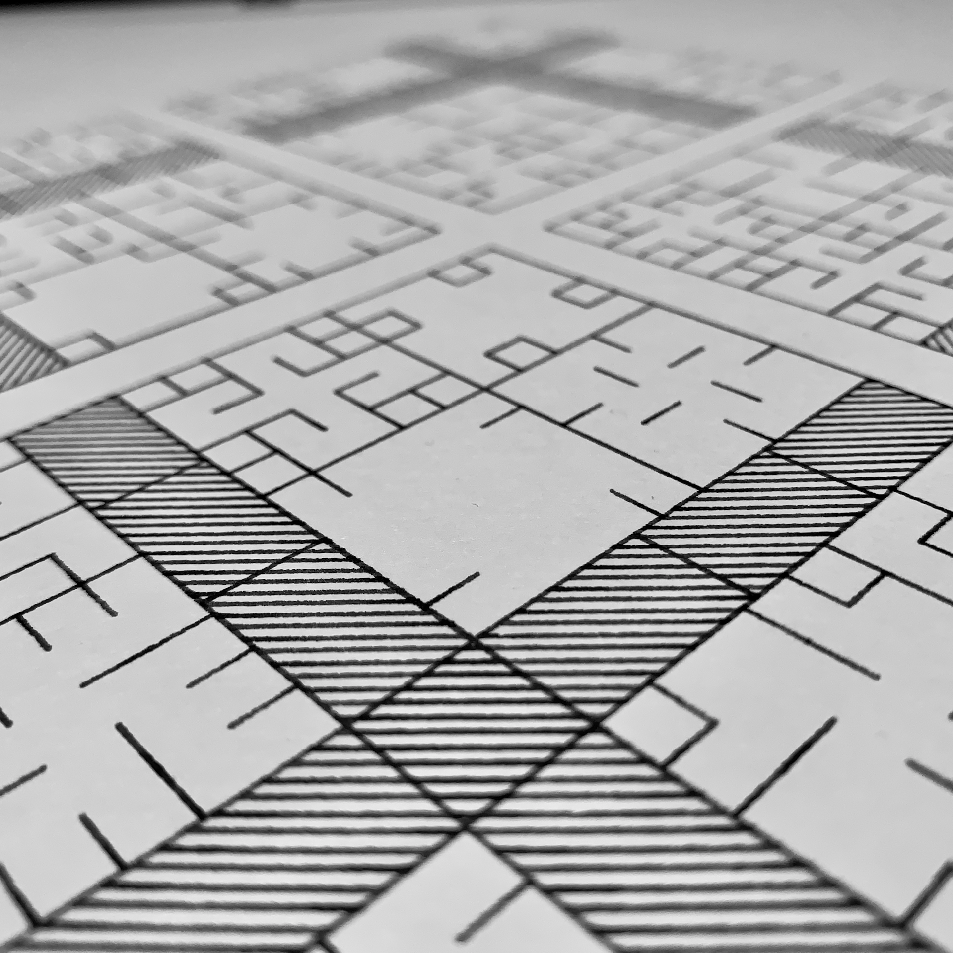
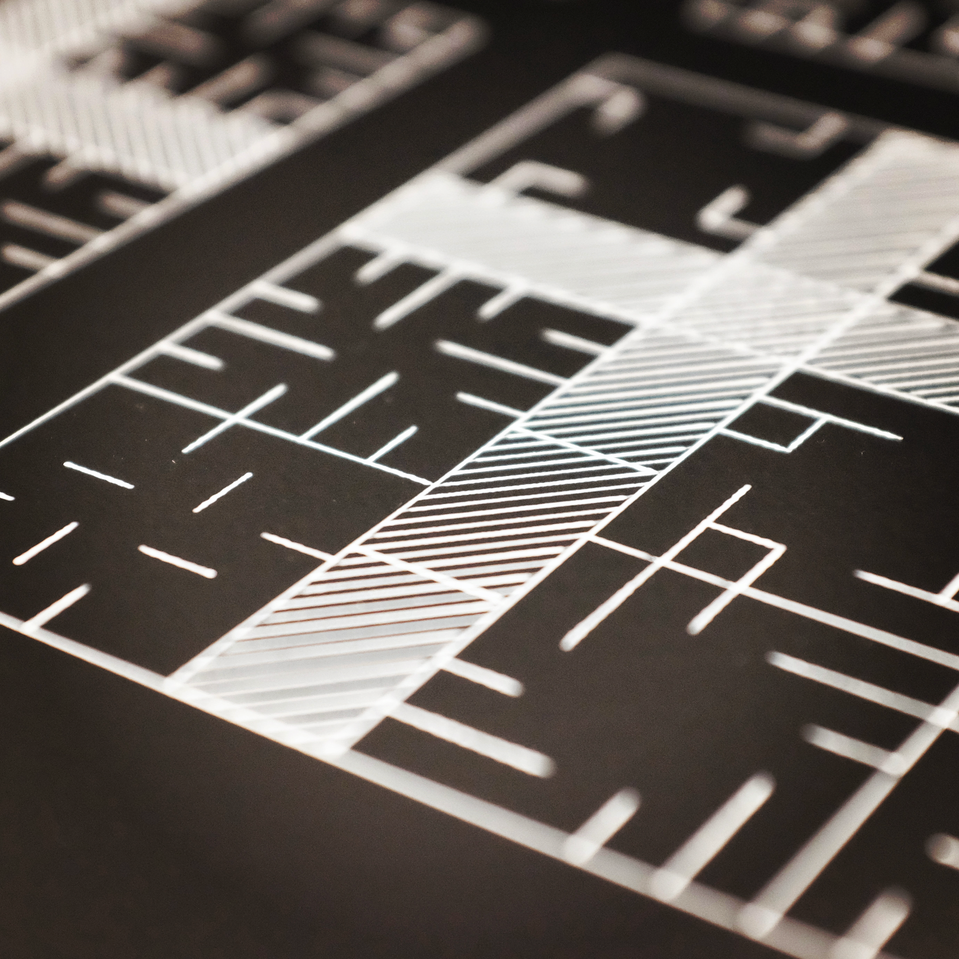
It was great fun to code. I struggled for a while on how to represent it visually, before I realised that I could create a system where little modules (blocks) of randomly-distributed roads with rotational symmetry are distributed within a larger grid layout. That gives it interesting detail at the small scale, embedded in a satisfying large-scale structure. Feeder roads encompass a block of commercial or mixed-use zoning, which is hatch-filled in the plots using Inkscape's hatch fill utility.
The biggest challenges were figuring out how to ensure that I didn't end up with too many roads that were floating on their own, unconnected to the grid (solved by checking for the presence of connector roads before plotting - though I couldn't quite catch them all), and avoiding the generation of swastikas, which pop up easily when you're using rotational symmetry (solved simply by checking each generated artwork before plotting).
The interesting thing about the Fused Grid, compared to Atlantis and Sforzinda, is that it's no longer centred on a single point - a temple or cathedral. Instead, the focal points are the blocks of homes. This mirrors society's transition from small local communities ruled over by a single individual to democracies where power flows from the ground up - in theory, at least. The importance of connectivity and flow, of transport of people and goods, also mirrors our increasingly globalised civilisation where, ultimately, the highest priorities of any city planner revolve around getting things in and out.
The Future
If the Fused Grid is a modern utopia, then what might the utopias of the future look like? It's not hard to find visions of future cities, but they tend to reflect the values and desires of the present day. How will people be living in 50 or 100 years' time? What will they value and crave? And how might those things affect their dreams of where they might want to live?
To try to answer this question I went on a long walk and thought about current trends which are likely to shape the world of the future. Some degree of climate change is a certainty at this point, thanks to decades of inaction, so rising sea levels and increasingly severe weather will force people into increasingly-dense megacities where they can be shielded from the worst impacts of natural disasters.
Connectivity and digitalisation will undoubtedly increase, fuelled by large technology companies and their business models of surveillance capitalism. Data may or may not be the new oil, but they definitely share one similarity - their perpetuation of existing power structures in our society, helping the rich get richer. Meanwhile, as those same technology companies launch tens of thousands of satellites skyward, the risk grows of Kessler syndrome, where a chain reaction of collisions between orbital satellites and other space junk creates a field of debris that destroys anything attempting to pass through it. In a worst-case scenario, this could cut us off from space for many generations, though this is unlikely.
It's not all bad news. Renewable energy is already cheaper than fossil fuels in most of the world and this trend is only likely to accelerate. Protein is the next place where this shift will likely occur - I don't think we'll stop eating farmed and hunted meat completely, but I do think it'll become something we do only on special occasions, rather than the foundation for every meal. In its place, a plethora of tasty alternatives will appear that not only consume less resources but can be produced locally. These include lab-grown meat (replacing the cheap meat market, rather than high-end steaks), mycoprotein like Quorn, and delicious, ancient plant-based products from Asia like seitan, tofu and tempeh.
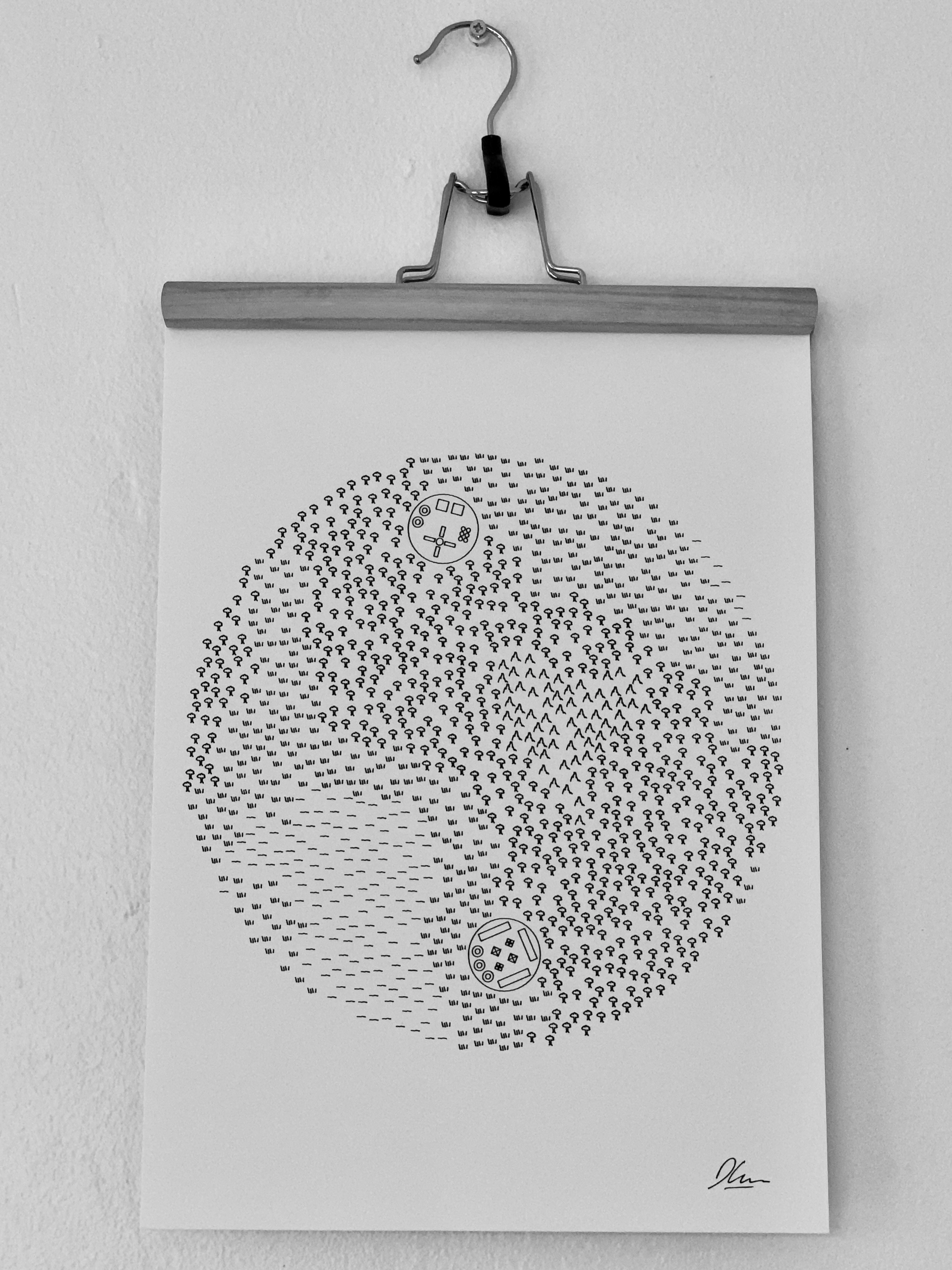
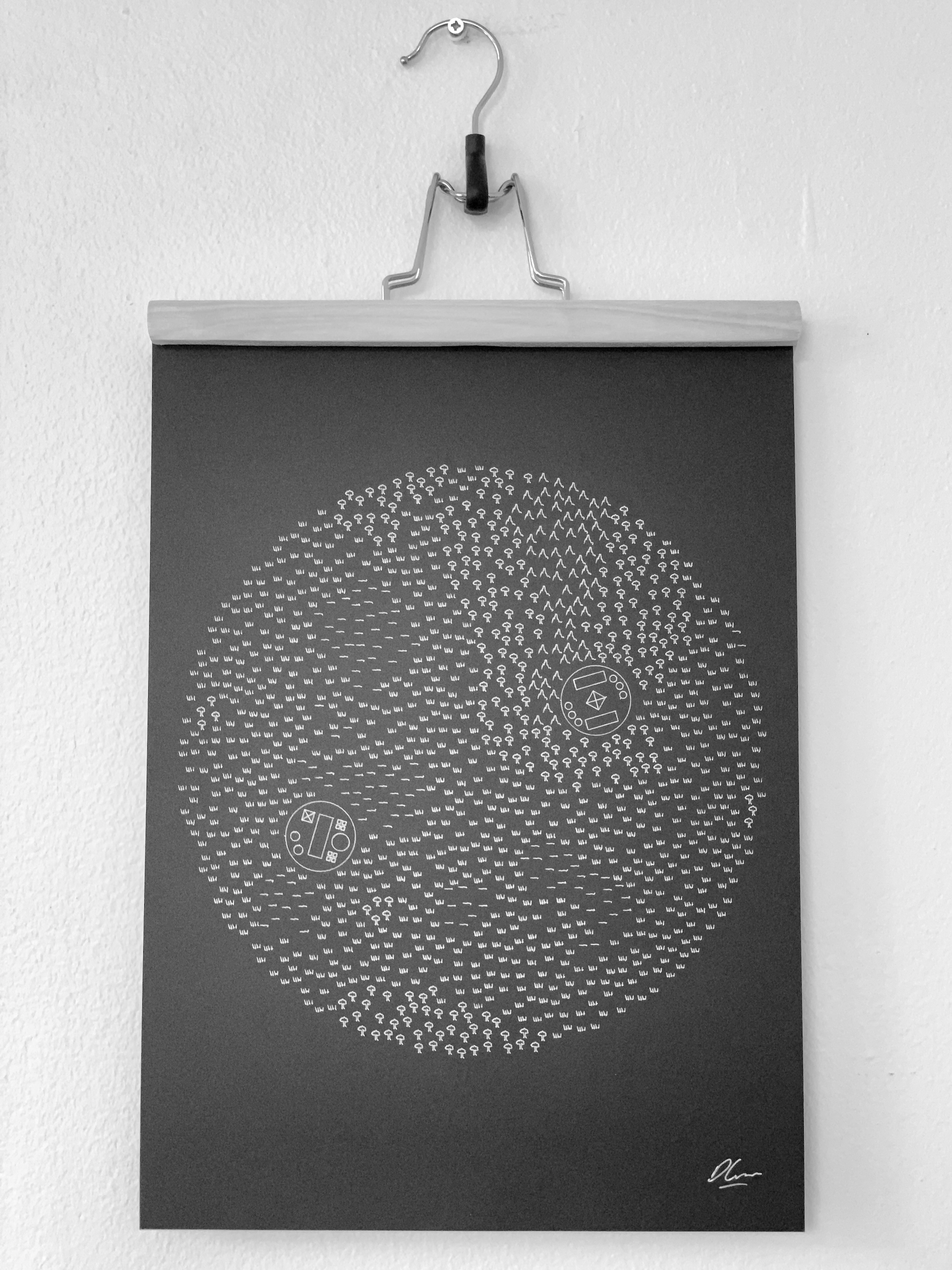
Now, let's return to the original question - in a future shaped by these trends, what kind of world will people dream of? I came up with one possible vision. It sees humankind living in not megacities but small climate-controlled domes spread across the world, each containing a community of about 150 people (Dunbar's Number). The land in between would simply be wilderness. Each dome would be powered by renewable energy, and largely self-sufficient. Each would also be connected to its neighbouring domes by cable, forming a resilient mesh network which could carry data, energy and information, rather than requiring data transfer by satellite. Most interaction between communities would therefore be virtual and digital, but the domes would of course be open - people could travel between them as weather permits and join other communities as they wish.
This vision is, of course, imperfect - like all utopias, it's unlikely to survive contact with real humans. It's also unavoidably shaped by my own biases and values - the importance I place on resilience and sustainability, my techno-optimism, and my growing interest in small communities. But I think it's a reasonable guess at what people of the future might conjure up in response to their real world situation.
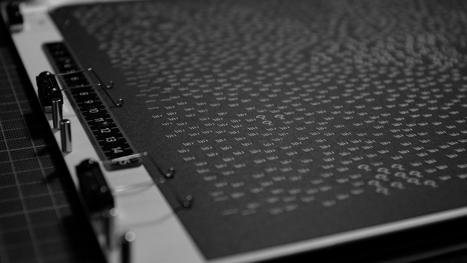
The next question was how I'd turn this vision into a generative art piece. I started by sketching out network charts, with nodes representing the domes, but they just looked like data visualization. I then tried the opposite approach - starting the system off with the wilderness.
I used Perlin noise to generate a plausible "landscape" of water, grassland, forest and mountains, using doodles from the Quick, Draw! database distributed with a circle-packing algorithm. I then placed a handful of domes randomly into those landscapes - doodling the interior layouts in a notebook and getting some help from my partner Silfa to code them by hand. She created six different alternatives, which are chosen from randomly.
Originally I had this landscape cover a whole sheet of paper, but this wasn't looking quite right. It looked like a D&D map, and it didn't thematically match the other artworks. Silfa suggested that we constrain the layout to only allow icons and domes to appear within a certain radius of the centre of the page, creating a filled circle. This was a perfect solution. The resulting artwork has a lovely blend of the organic and the synthetic. It's probably my favourite of the whole series.
Materials and Method
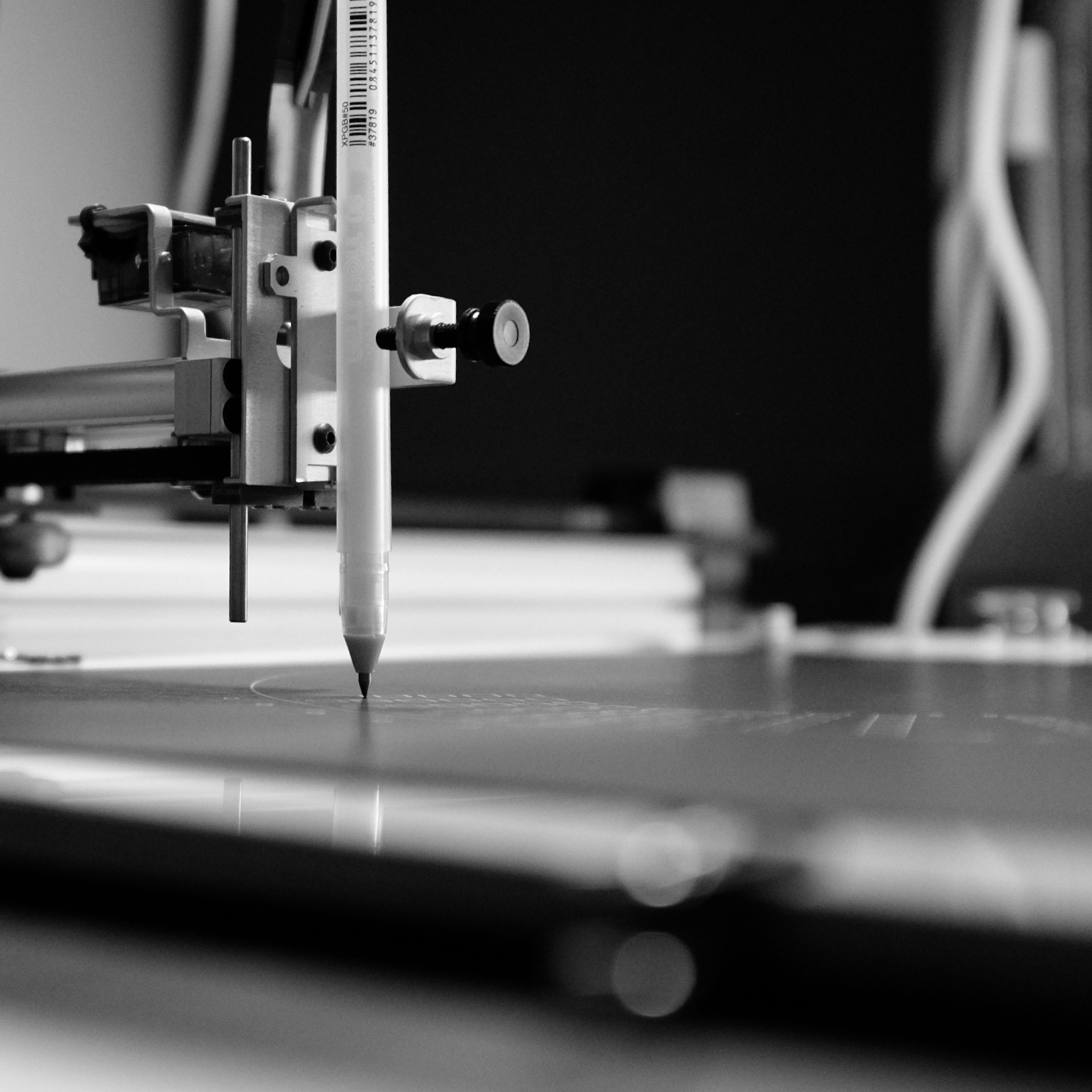
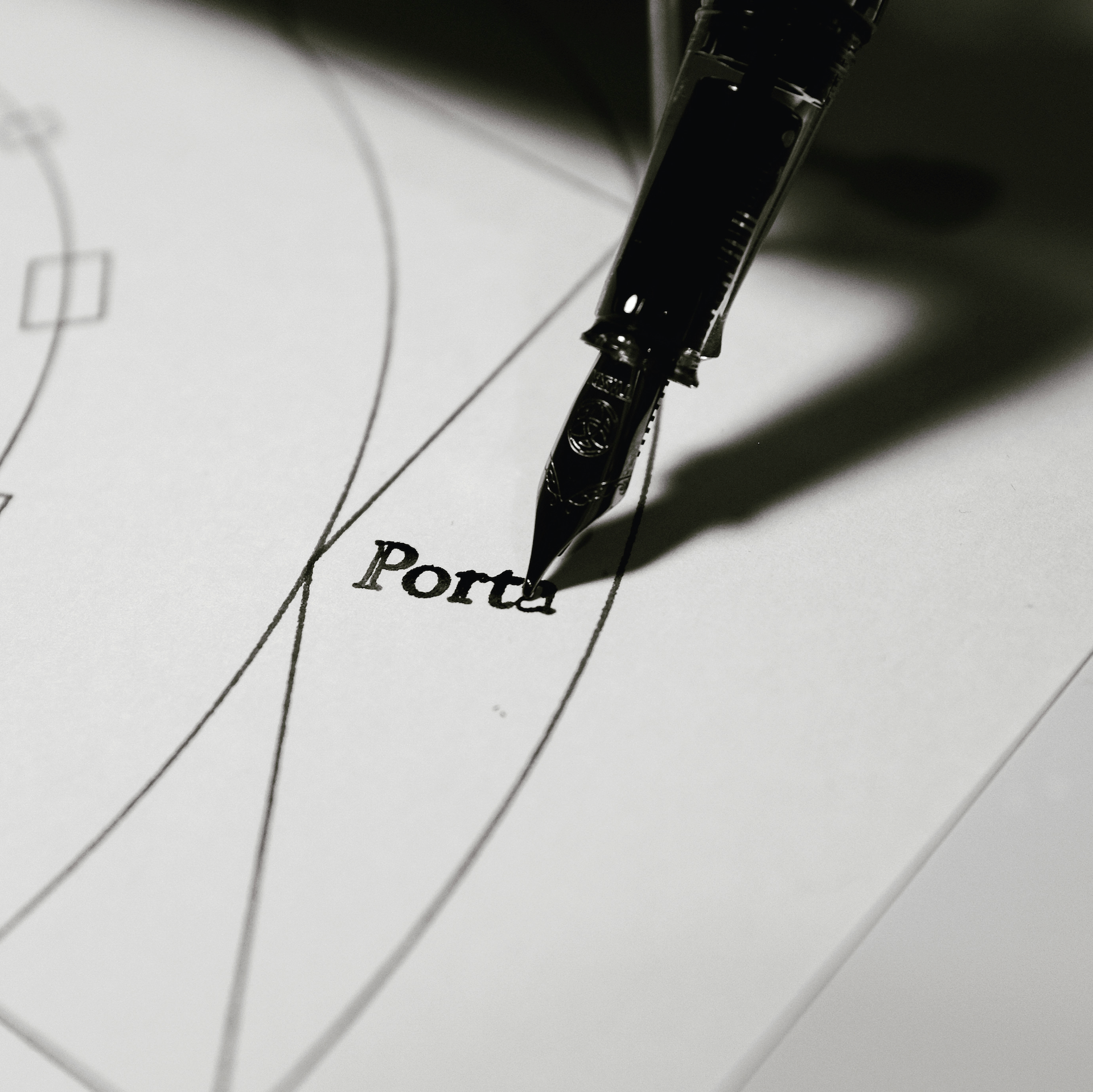
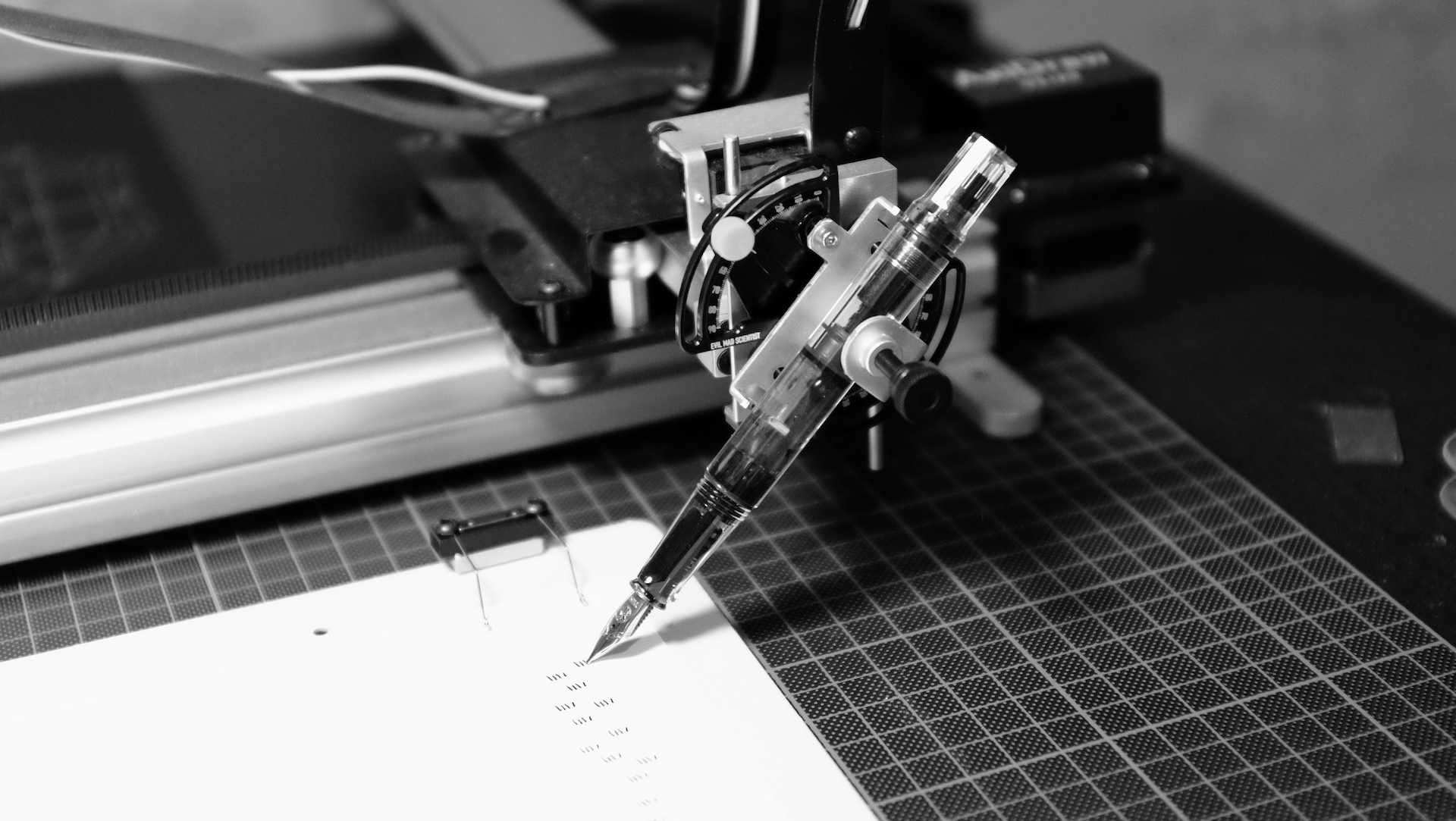
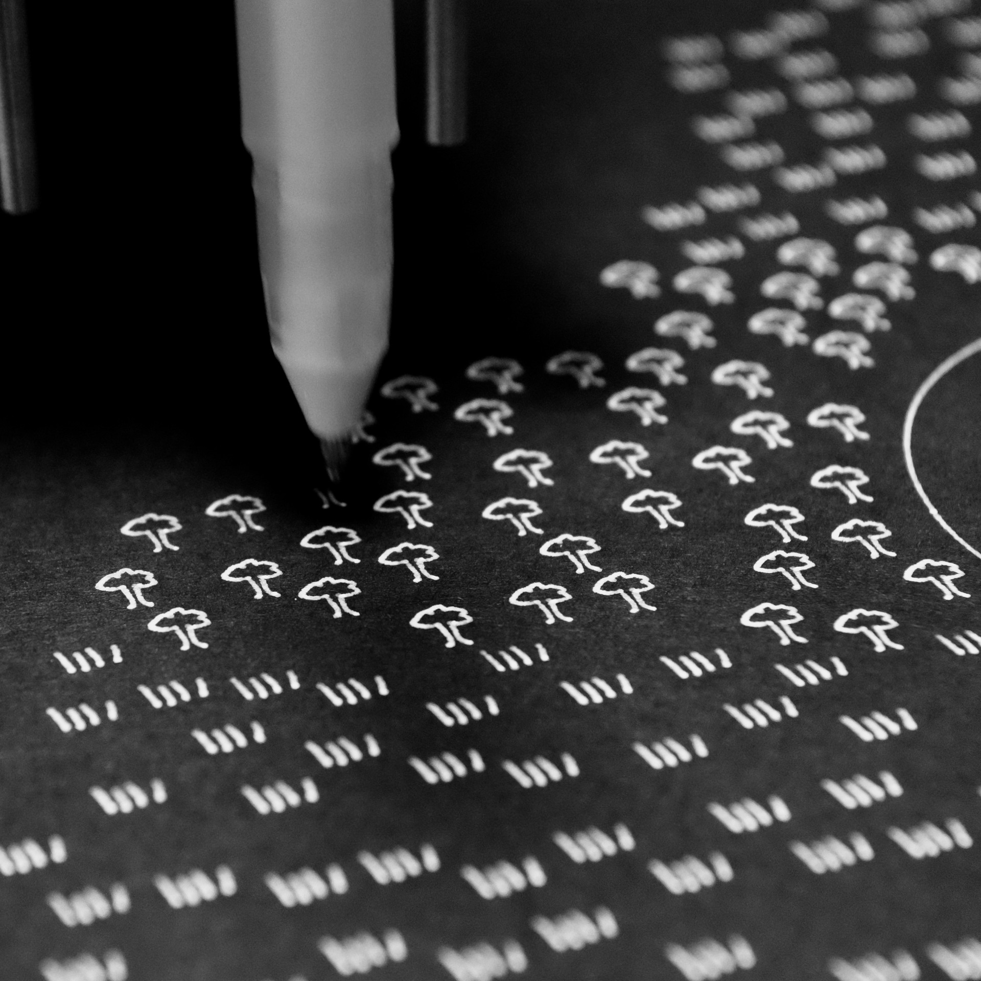
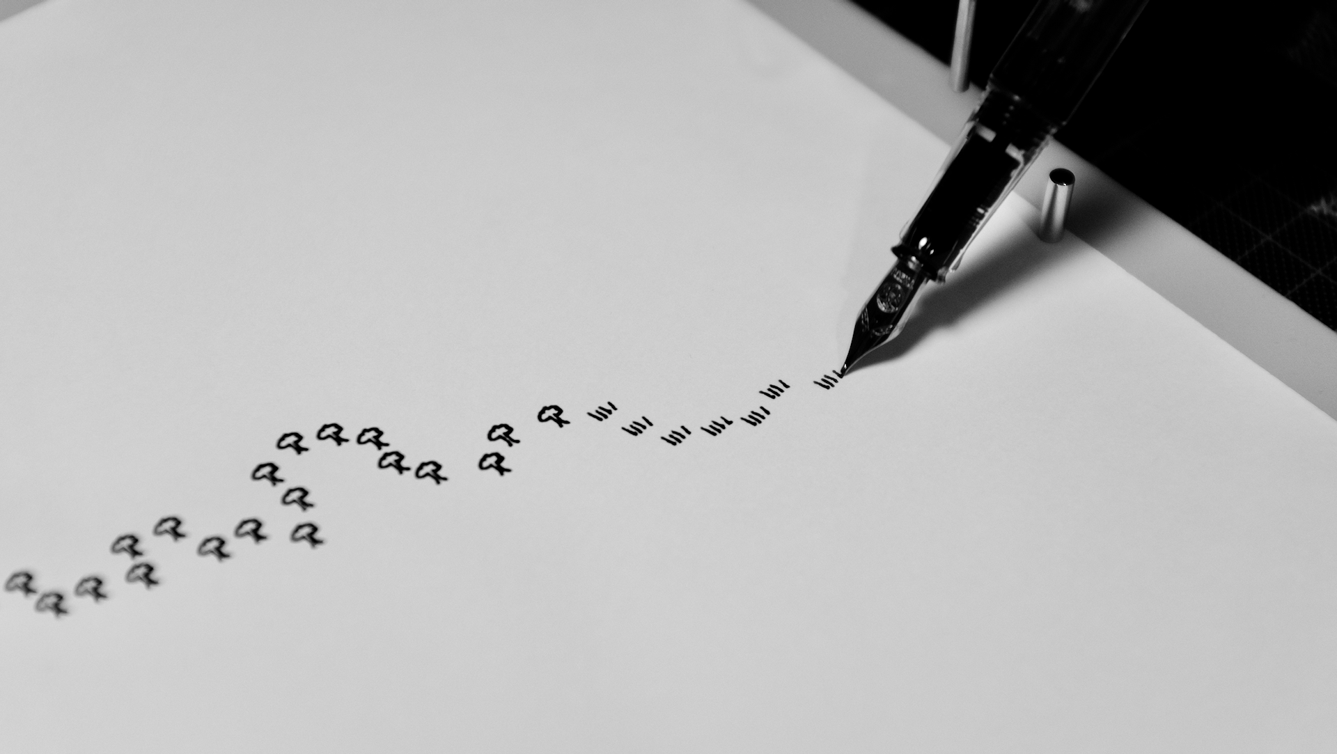
The black-on-white artworks were drawn with a TWSBI Eco fountain pen on 250 ggm Canson Bristol A3 paper. The white-on-black ones were drawn with a white Sakura Gelly Roll pen on sheets of heavy, smooth black A3 paper that I bought from a local stationary shop. I forgot to note down the exact brand, but I'll make a note of it next time I'm in there and update this post.
Other than the Atlantis artwork, which was created with Figma, the artworks were coded in Javascript using the Rune.js library for vector drawing. They were exported as SVGs, lightly edited in Inkscape and then plotted on an Axidraw V3/A3 pen plotter.
There's a reason why I chose to use a pen plotter to execute these artworks - when trying to draw out a perfect SVG with a plotter you get a bunch of little imperfections and oddities. Maybe the ink doesn't flow right in one section, or you've set the pen height wrong and you get little tails on some of the lines.
You can iron these out with practice but I chose to leave them in, because they mirror the imperfections you get when you try to put real-world humans into a utopian city. Things inevitably go wrong, and you have to live with them.
The artworks described on this page were produced specifically for the exhibition and I won't re-plot them ever again (though I may create some derivative works). There are eight in total, and I have a few left. If you'd like to buy and own one, then email me and we'll work something out. If you enjoyed this post, then you'll probably also like my newsletter - where I write about my creative process and inspiration every ten days. You can follow me on Instagram, but I'm trying to use Instagram less so let's see how that goes.
Thanks to Silfa, to Robin at Llama Lloyd for exhibiting local artists, to the Elevate crew for encouragement, to my family and friends for support, and especially to those who attended the exhibition. Finally, a thanks to you for reading to the very bottom. Not many people do that, and I appreciate it very much.