Relaunching Duncangeere.com

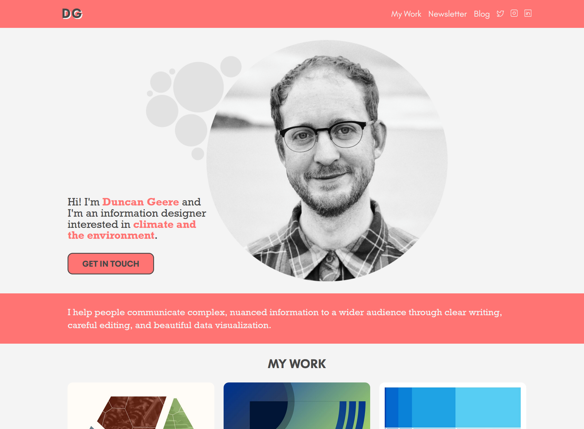
Over the weekend, I hit "publish" on the newest version of duncangeere.com. It's live now, you should go check it out.
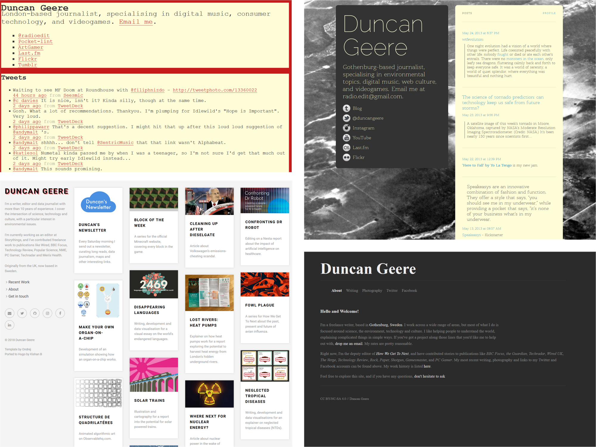
This is, I believe, the fifth incarnation of duncangeere.com since I registered the domain in November 2009. Here's a small gallery of all the previous versions, courtesy of The Wayback Machine. Many are unfortunately lacking images and styling, but you get the idea I think.
But we're here to talk about the new site, so let's do that. It's the culmination of a few months of work, and so I figured it might be useful to talk about my process in case any of you are planning a personal site redesign in the near future.
My previous site (bottom-left in the above image) was conceived in 2017, when I had a full-time freelance job and needed a page that would show projects I had worked on. A portfolio, of sorts. I knew enough to know that a static site would be fine for this - I didn't need a content management system or loads of interactivity. I used Hugo, and found a theme I liked, and without really understanding how it all worked I got something online with GitHub Pages. I knew enough to edit it but not enough to fix the suboptimal mobile view or customise things very much.
In January of this year I switched to doing more project-based work for clients, and realised slowly that I needed a site that actually sold my services, not just showcased my projects. It was time for a redesign. The first step was putting together a PDF portfolio, focused around the work I wanted to do - primarily on environmental topics. I finished this in April.
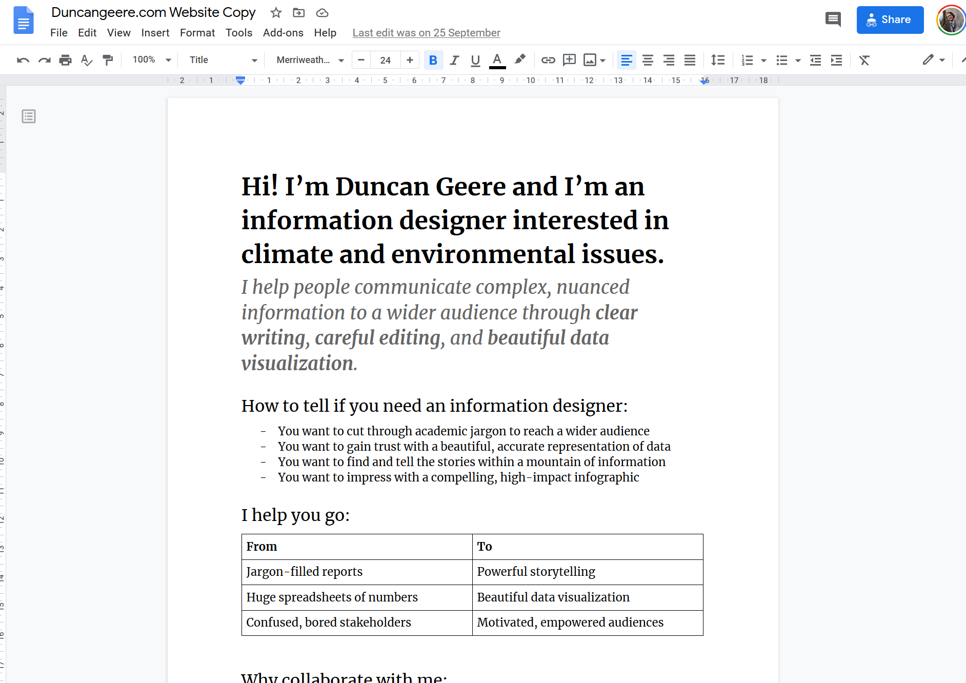
Then I started scoping out what I wanted my new site to say. I used this excellent framing to figure that out, as well as some influence from graphic designer Rob Bootle's excellent website. I wrote up all the copy for the site in a Google Doc, got some feedback from family, friends and clients, and locked that down by the start of September.
By then I'd also decided on my toolkit for the site redesign. My smart friend Will recommended a static site generator called Eleventy as the newest hotness, and also recommended a tutorial to learn it. I spent the first three weeks of September running through that tutorial - which covered not just Eleventy but also Sass, Gulp, Nunjucks and various other software packages with ridiculous names.
After that, I had to design the site. I took the copy I wanted to use and started playing around in Figma - my favourite vector graphics editor. I picked a colour palette, using the pink that I loved on my previous site as an accent colour, and slowly laid things out. My first draft wasn't too bad, and some great feedback from several patient friends made it even better.
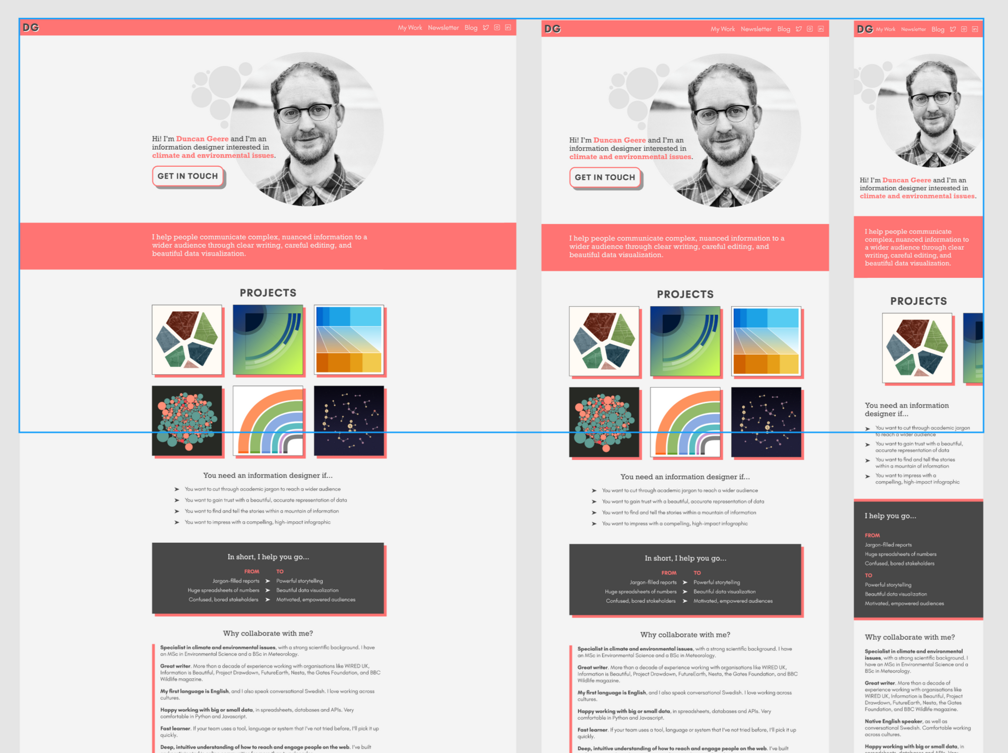
Then I just had to build the thing, which is a process I began around the start of October. Using what I'd learnt in the course, I put together the skeleton of the site with Eleventy, which was surprisingly quick and easy.
Which just left styling - composition, typography, colour, etc. This took a bit longer - CSS (the language for website styling) has always been the weakest bit of my web skills and it showed. But with the help of the tutorial course and a lot of Googling, I got it all together - finishing about half way through October.

I'm really pleased with the result. Not only was it a satisfying project, but more importantly I learned a lot of new skills in the process - skills that I'll be able to sell in the future when I need to build a site around a visualization, or similar. I now also have a much deeper understanding of how the site works, and how it can be further enhanced in the future - with a more comprehensive portfolio section, the integration of my blog, and more.
So! If you know someone who you think might find my information design services useful, then please send them a link to my new site.
That would be very kind! :)
