
Tenday Notes: 11 April - 20 April

Every ten days I share a quick digest of what I've been working on. Here's the latest. You can find more in the series here.
Day.... five(?) in plotterland, and I'm starting to think about how I can plot graphics that I've made myself, rather than things that other people have generated. I wrote about Perlin noise a few weeks back (a series of random numbers that look more "natural" than truly random numbers), but the thing about Perlin noise is that it just looks natural.
I thought: why not just use data from the natural world instead? There are all kinds of things that are collected in a gridded fashion and are free and relatively easy to access - altitude, temperature, wind speeds, rainfall, and much more. The Open Data Cube, perhaps.
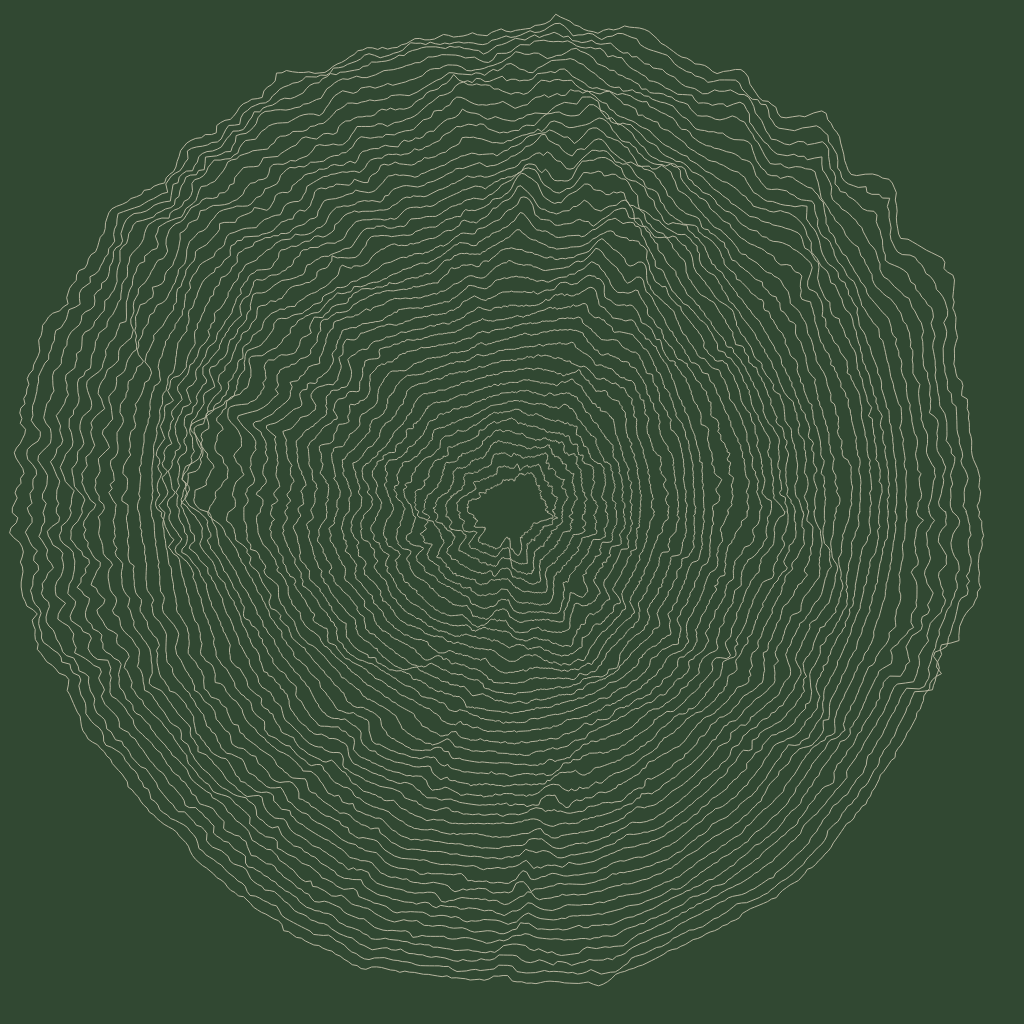
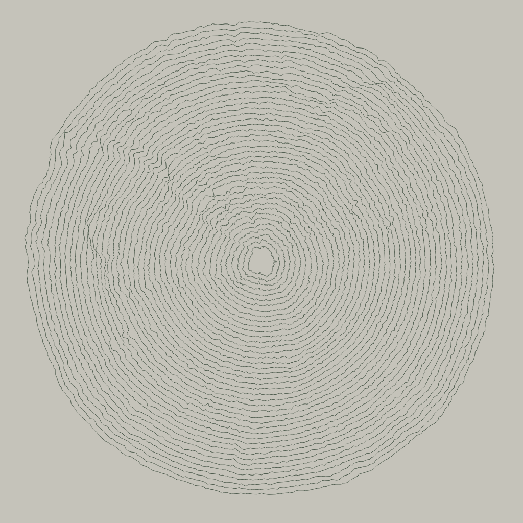
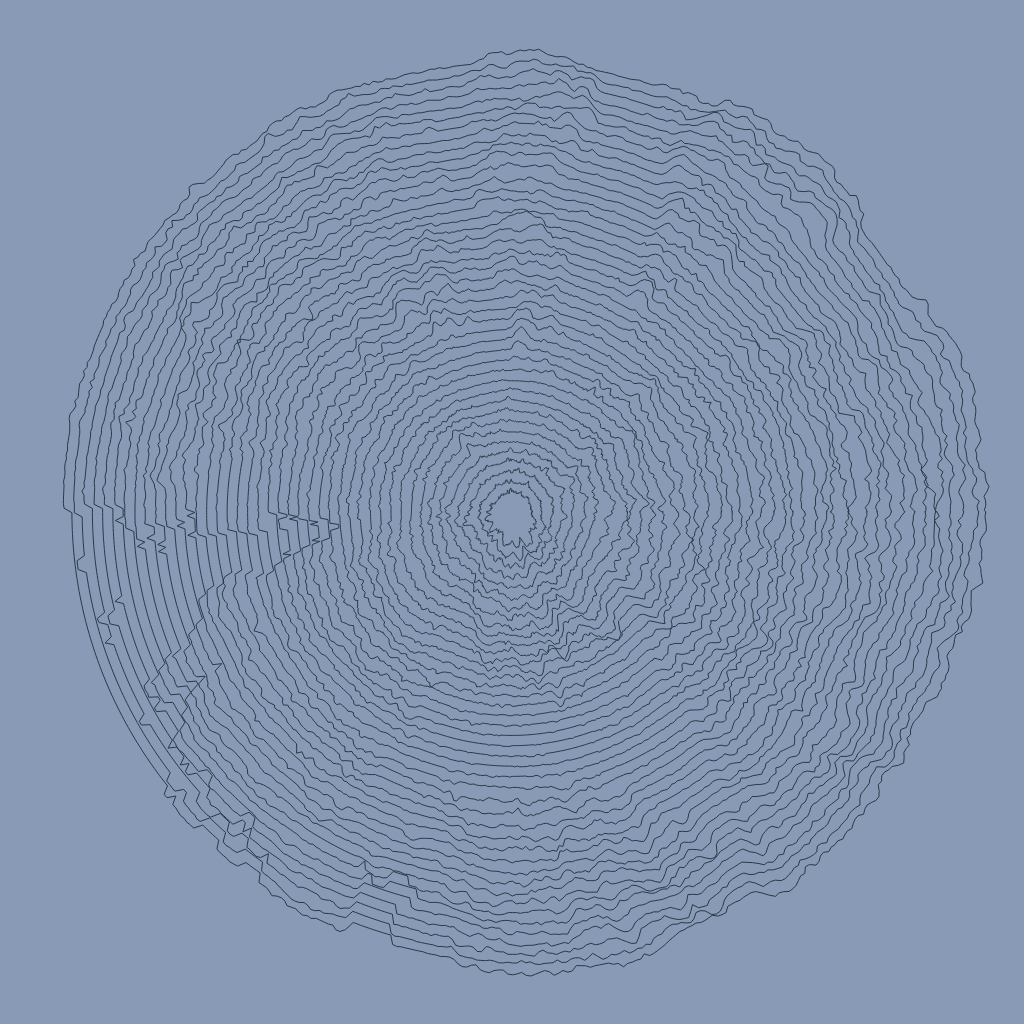
For now, I've built a little tool that pulls in a heightmap from terrain.party and uses it as noise to perturb lines. The cool thing is that you get a different result depending on where in the world you pull the heightmaps from. I then (manually) grab a satellite image of that area and pick some colours from it to use as fill and stroke.
Here are (L-R) Reading in the UK, Gothenburg in Sweden, and Zipf in Austria as examples:

Right now, my script still needs a bit of parameter tweaking once an image is loaded to make things look nice. I'm working on making that more automatic, but it's trickier than I expected.
Coming soon - more meteorological variables, more designs, hopefully some plots!
Unfortunately, my attempt to get the above script working in a plottable form hit several speed bumps. The biggest is that P5.js doesn't have an SVG exporter.
There are some hacky solutions, but honestly it looks like the best thing to do is simply learn another Javascript library that exports SVGs natively. There are several possibilites, but the one I'm leaning towards is Rune.js. I haven't totally figured out if that's just because it says it's aimed specifically at graphic designers.
I worked through the user guide, and it's pretty nice. The only thing I'm worried about is that it doesn't seem to have been updated very much in the last couple of years. I'm worried it might be one of these projects where the creator puts a lot of effort into it and then drops it, making me reluctant to dive too deep... Still, it's perfectly capable of generating nice SVG graphics for now, so I'll give it a go with a plot and see how I get on.
I've written up a summary of my Easter Weekend plotter experiments. You can read it here:
 Duncan Geere
It includes basic setup and unboxing, as well as my first test plots and early progress in more creative directions. If you want to know what the first few days of owning a plotter are like, this should be a good guide.
A few weeks back, I collaborated with Katarina Eriksson of Märka Design to create a visualization of the inhabitants of the International Space Station over the years. It was an entry for an infographic contest that Nasa was running. We didn't win (turns out they were looking for a much more traditional infographic), but I'm proud of it. Here it is:
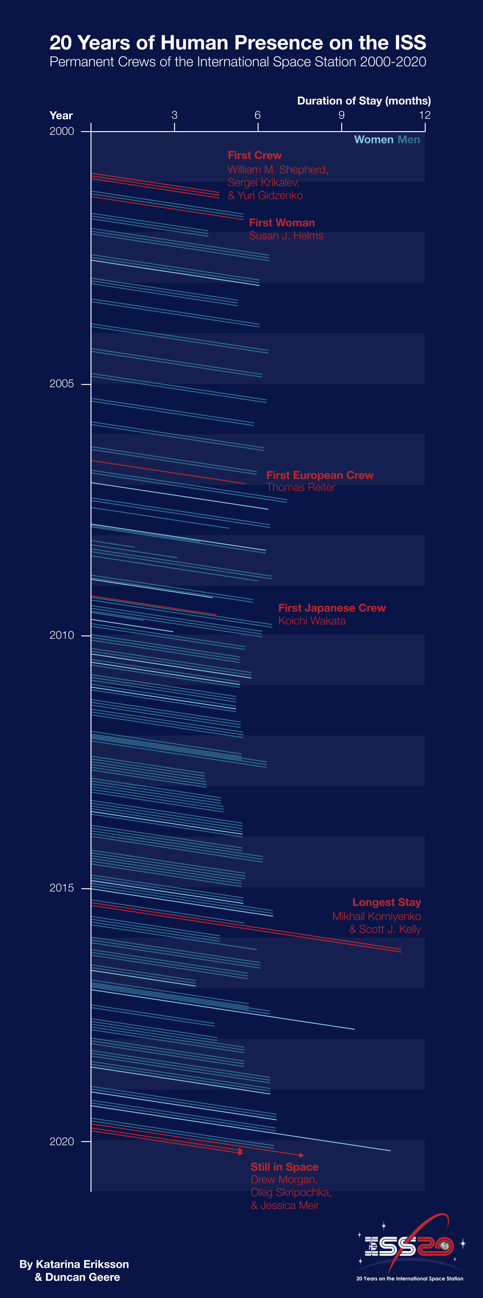
A few notes - firstly, it uses an unusual chart type - a Lexis diagram, which features time on both x and y axes, so you can see who overlapped with who. Secondly, I designed it in vertical format, so it could be more easily viewed on mobile devices. Finally, I built it with custom code in Scripter to save me drawing all the lines by hand. You can find that code in a short blog post that I wrote about the project.
Phew. It's amazing what sitting down and just starting something can do. Three hours ago I had a bunch of research done for a feature I'm writing on Earth week, but I was dreading doing the actual writing. Now? Now I've got almost the whole 3,000-word thing done. All I did was say to myself "just start writing the intro and see how you get on", and quick as a flash I'm in the zone and cranking out the words.
I'm still not sure if any of those words are actually good, mind you! I'll need to revisit it tomorrow once my brain has cleared and I can read it with some distance. But yeah - it turns out that the power of just starting something is as strong as everyone says it is.
Here's a question for you all - is there a consensus yet on accepting travel vouchers from airlines as a substitute for cancelled flights, versus pushing for a cash refund? As far as I can tell, the pros and cons of just taking the vouchers are as follows:
PROS:
- Easy, you just fill out a form.
- No stress of having to find the right telephone number and sit in a queue for ages waiting to talk to someone.
- You get to take a bonus holiday at some point in the next year.
CONS
- Flying means carbon emissions, and I'd rather not fly unnecessarily if I can avoid it (especially in the context of a "bonus holiday").
- Future flights may cost more or less than the voucher.
- There's a non-zero chance that the airline goes bankrupt, making the voucher worthless.
This issue is, of course, a very small problem in the grand scheme of the Coronavirus crisis. But I'm stuck with two cancelled trips (BA and KLM), so if anyone has any suggestions or opinions on the best way to go forward then I'd like to hear them.
After lots of great feedback on the DVS Slack and on Twitter, I've finished my Carbon in Context graphic. For a concept that literally came to me in a dream, I think it's working pretty damn well. Here it is:
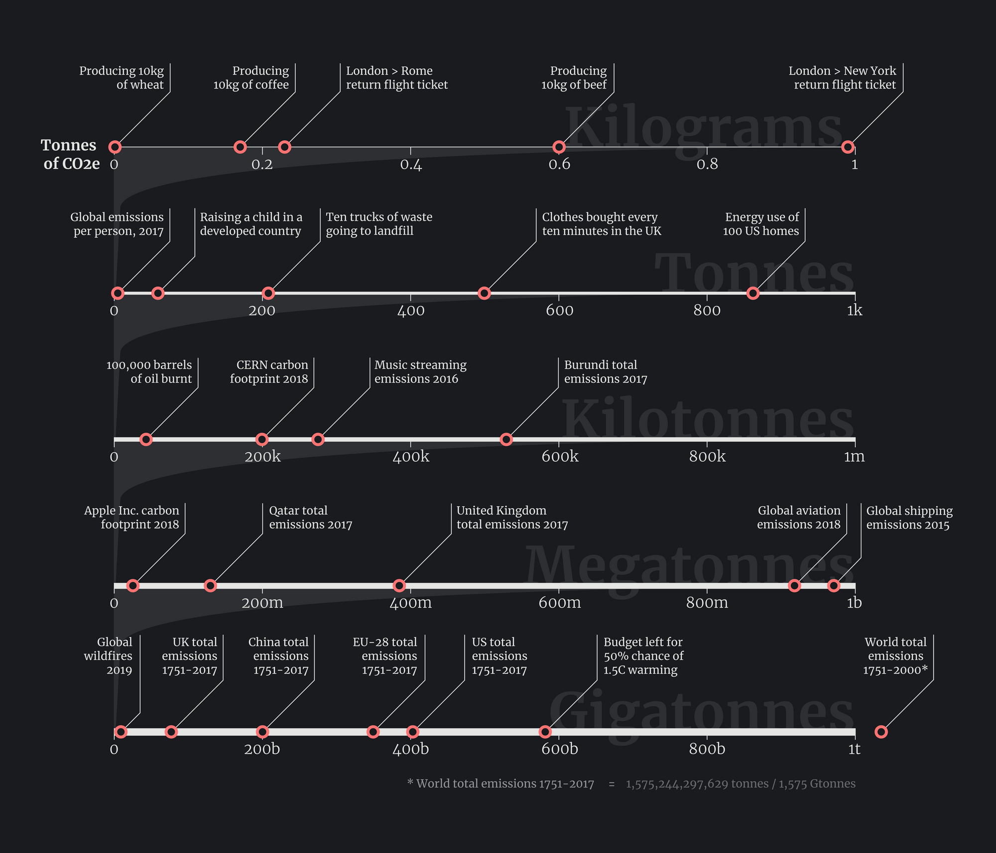
The graphic has two main objectives. The first is to give people a way to put quantities of carbon they read in the media in context. The idea is that you can read a number in an article (let's say 50 megatonnes), then go immediately to the megatonnes row and see that it's about equivalent to Apple Inc's annual carbon footprint.
The second is to demonstrate a new chart form which I'm calling a logpile plot. It's called that because it replaces a log scale (which most people don't understand) with a pile of linear axes stacked on top of each other. Each axis represents just a tiny sliver of the one below. I've never seen this form used before in the wild, so I think it's a new discovery, which is kinda exciting. It works particularly well for comparisons of wildly differing numbers, but less well for quantities that change over time.
You can see the graphic at http://duncangeere.com/carbonincontext (if you want to share it, please use that link!), and read more about how I made it and the challenges I came up against in this blog post.
This week I finished a game that I Kickstarted ages ago and have been eagerly anticipating for many months. It's called In Other Waters, and it's set on an underwater exoplanet. You play as the artificially-intelligent diving suit of a marine xenobiologist, responsible for ferrying her around and collecting samples.
There is, of course, a BIG SECRET to unearth. But what I liked about it is that most of the time you're just pootling around collecting data on different species and the beautiful interface is largely schematic - you see contour lines representing the landscape, and brightly coloured dots representing alien life. You can fill in the gaps with your mind, from the beautiful descriptions given by the main character.
It's not a long game - you could finish it in a few short hours. But it is satisfying to slowly build up a database of the ecosystems of an alien planet, much of which is clearly well-informed by how marine biology works on Earth. It's out now on PC and Nintendo Switch.

I've been playing around with an old Raspberry Pi to use with the Axidraw plotter. The first thing I did was to buy a camera module to shoot video, but the quality was pretty low on the camera so I had to abandon that idea again fairly quickly in favour of continued shooting with my iPhone.
Then I tried to repurpose the Pi as a controller machine for the plotter, the idea being that it sits next to the plotter and I can just dial into it when I want to plot something (rather than having my laptop needing to sit tethered next to it). After a lot of faffing about trying to install Nodejs and figuring out that the microUSB cable I was using was designed to only deliver power and not data, I got it half working and successfully plotted a map of Gothenburg's southern archipelago.
By half-working, I mean that I could load an SVG in Inkscape and plot it. So I guess fully working, really. I wanted to use Saxi, which I could then access from another computer, but it was struggling to move the pen up and down. Seems to be a bug, so I've reported it and we'll see how that goes.
One of the things I want to do with the plotter is run a regular "chillplot" series, where every Friday afternoon I run a long, complicated plot on the Axidraw and stream it live to the web. I did a test last week, and the result is this two-hour video showing some of Rev Dan Catt's circle rays.
Oh, while I'm talking video, Plottervision is the new YouTube channel that Silfa and I made to host all our plotter videos. We're aiming to upload a couple of videos a week - there are already a few shorter chillplot videos. Like and subscribe, y'all.
I was reading this blog post about making accessible online courses from Alex McLean (I want to make a course at some point), and there was a bit about promotion of pay-what-you-want courses that made me stop and think.
"The more I promote, the more ‘semi-interested’ people I seem to reach, and the average payment goes down."
What I like about this is that it also captures an issue with promoting things on social media. The more you push, the more people you reach who are only kinda interested, and the results are quickly diminishing.
It's more effective to cultivate a smaller community of people who are interested in what you're doing. Though of course, then you need to grow that community. The general answer to that question, from what I've read, is to make good things regularly, and to be patient because growth is exponential not linear, meaning that it starts very slowly and stays slow for a long time before sudenly taking off without warning.
If you're reading this, I guess that makes you part of my community. Thankyou!
Finally this week, the first long-form piece I've written in ages has just been published on Nightingale, the Journal of the Data Visualization Society. It's an oral history of the planetary boundaries graphic, with contributions from Johan Rockstöm, Will Steffen, and Sarah Cornell.
 Duncan Geere
It has everything! Tablecloths! Spaghetti! Doughnuts! Originally I was thinking it'd end up being a thousand words or so, but in the end it turned to be 3,000 (the 3,000 I mention above, to be precise).
If you're curious about how a simple radar chart turned into one of the most important environmental visualizations of our time, then you should give it a read.