
Tenday Notes 31 Jan - 9 Feb 2021


Every ten days I share a quick digest of what I've been working on. Here's the latest. More in the series here. Want them in your inbox? Sign up.
Outlier conference is over, and wow - what an experience. By far the best online conference I've ever attended, successful at beaming great talks into my brain but also forging new connections with smart people doing interesting work.
This is at least partially a brag, because I've been involved for the last six months or so in the organization of the event. But I was just one member of a wonderful team of volunteers under the fantastic leadership of Mollie Pettit - all of whom pulled their weight in making it such a success. So I'm mostly applauding other peoples' hard work here.
I also wanted to share what was successful for us and why, in the hope that others might take it up too. The reasons why Outlier worked so well, in my opinion, boil down to a few key decision made early on - serving a global audience, a deep commitment to accessibility, a desire to give people fun as well as knowledge, and attention to detail. Let's discuss those one at a time.
The global audience first: Outlier is run by the Data Visualization Society (DVS) which is based out of the US but has members from all around the globe. We decided very early on to ensure equitable access to the conference for all attendees, no matter their timezone. This meant running a 20-hour day of talks, which in turn meant that we had to ensure recordings of the talks were made available immediately after they finished - so that people who were asleep could catch up when they woke up. Attendees loved this "catch up" service.
Second - accessibility. We offered the ability for speakers to present in whatever language they were most comfortable in, and we wanted to make sure all talks had subtitles in English. This made it necessary for speakers to record their talks ahead of time, so they could be subtitled. After each talk we had a live Q&A the same length as the talk, which was covered by a captioning service. In addition, we had a collaborative Google Doc for each talk, where people could share interesting links, key points and quotes, questions and more. These were a hive of activity during each talk, and it was wonderful to see everyone contributing, and it also helped people to take in the talk information in whatever form they were most comfortable with. It was also cool to see some speakers use the pre-recorded video format to make their talks more visually interesting.
Third - fun. We wanted to make Outlier feel more like a festival than a conference, so we put a lot of effort into giving people other things to do than just staring at talks. We had a "networking" thing that some people used (I did not), but far more impactful for me were the "unconference" sessions that we set up in between some of the talks. In these sessions, anyone could sign up to do anything - dataviz related or not. I put on a session for people working with climate data, where we had a 16-person panel discussion on common issues that we face and how we overcome them. I also put on a session for pet owners, where we just talked about our dogs and cats for 45 minutes. Elsewhere there was karaoke, quizzing, game shows, and all sorts. It was a great way to meet and interact with other attendees, and for people who we couldn't fit onto the speaker list to still present and show their work. This was the foundation of a lot of the "social" aspects of the conference, making it feel more than just a webinar.
Finally, attention to detail. Before the conference, we ran weekly brainstorms among the team on all kinds of topics - speaker experience, accessibility, attendee activities, what could go wrong, and much more. These were hugely useful in thinking through and fine-tuning every aspect of the experience for everyone. Without these sessions, in which we purposefully got deep into the weeds of the landscape of possibilities (stretching that metaphor a bit) we couldn't have done all of the above.
What could have been better? Well, the software we used to run the event, Hopin, was not as flexible and user-friendly as we would have liked. Next time we might opt for another solution. Online conference software is in a strong growth phase right now, for obvious reasons, so I hope that by the time our next event rolls around things will have improved a lot.
We also struggled a little bit to communicate things like where talk notes and recordings were kept to attendees. We had a lot of questions on this. I'm not sure how we could do this better - perhaps a little more pre-event communication on how that would work?
Ultimately, I'm frankly astonished that we were able to put everything together in the time that we had before the event, and a lot of that was down to the immensely hard work of the whole team! I'm so honoured to have been a part of such a fantastic new event on the dataviz calendar. Roll on the next one! :)
Outlier was also the debut on the world stage for Loud Numbers - the data sonification podcast that I'm working on with Miriam Quick. We presented what we've learnt from a year of sonification work, but we also playing one of our completed sonifications to an audience for the first time.
The response was fantastic - despite the fact we were playing jungle music at 9am UK time, way before the US woke up (gotta love those catch-up videos). I'll be able to share the video in a few weeks, once it's published publicly. We bagged heaps of new followers and mailing list subscribers, and got loads of great questions from the audience - most of which we shared in our latest development log newsletter.
I've been getting back into Mapbox lately, for the first time in a while. Mapbox is an online platform that lets you make maps, and a big part of my work at Possible is making maps, so that's why I've been revisiting it.
I've been following Mapbox for a few years, after I was really impressed with its API on my Disappearing Languages project. Every time I go back, it has got better and better, and these days it's definitely the best place to make online maps.


There are a few things I need to do sometimes that require me to boot up QGIS - like actually seeing the data embedded in a shapefile, creating vector contours from a raster heightmap, or exporting an SVG. But when it comes to creating production-ready maps, Mapbox really is the best (especially since they just added a dataviz component to their library).
I've been enjoying Oliver Holms' new newsletter, Art & Attention. It's a weekly message on photography and looking at the world, with good music and reading recommendations too. Plus it just started, so this is your chance to say "I was signed up to his newsletter before he got huge". Go check out the archives.
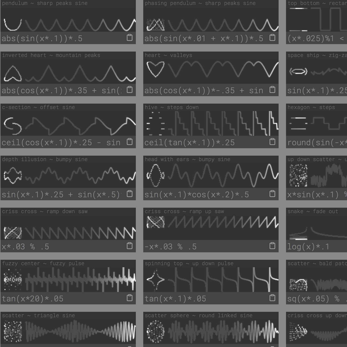
Need oscillations? I got you.
In Britain, in the 19th century, there used to be a thing called "The Season" where the upper classes had balls and parties and so on and met each other. They've been described as "mating rituals", because it was the primary way in which men and women from different families would meet and interact. Those of you who read period romance novels or watch Bridgerton will likely be very familiar with the concept already. Those of you who don't will likely not, hence the explanation.
In 1861, however, Queen Victoria's husband died. She cancelled the season for three years in mourning, and something interesting happened. Aristocratic parents could no longer arrange marriages as easily for their children, and as a result marriage between the upper classes and commoners jumped by 25%. Over time, aristocratic power subsequently crumbled.
There's a whole paper on this that was published by Marc Goñi in 2018, which is well worth a read - and not just for historical interest. Goñi argues that these findings are still very relevant today, as about 60% of all married couples in the US meet at school, work, a private party, church or a club - places of restricted entrance. In short, a very similar social stratification is going on (he quotes Gregory Mankiw calling Harvard University an "elite dating service").
You might think that dating apps would be a great leveller, as anyone has access. But these apps allow users to add search filters that exclude people on factors that are proxies for economic status - like location and hobbies. Marriage might be very different today than during The Season, but modern "mating rituals" and marital technology, Goñi argues, perpetuate inequality in just the same way.
Thanks to Ethan Mollick and Sarah Drinkwater for bringing this to my attention on Twitter!
In the 13th Century, Cistercian monks invented a neat way of writing four digit numbers in a single character space. Making a mental note to do something interesting with this on my plotter.
The Cistercian monks invented a numbering system in the 13th century which meant that any number from 1 to 9999 could be written using a single symbol pic.twitter.com/VRuEx4dkPF
— UCL Department of Mathematics (@MathematicsUCL) February 2, 2021
Some very short and very good advice from Seth Godin on making better Powerpoint presentations.
I've been working on my #100daysofmodular project, and I'm now eight days deep! To cap off my first seven days, I recorded a 35-minute ambient track based on a sonification of coral reef bleaching data.
It's called The Reef and you can hear it here.
There's quite a lot going on, but it's broadly undersea-themed, with references that include the bleaching and recovery of coral reefs over time, increasing uncertainty, and alternating between hope and fear for the future.
It's actually part of a wider project which will go into the Data&Hope zine that I'm working on with some friends, all about coral. The rest of the piece involves a generative dot-to-dot puzzle, and a spoken-word piece about some of the reasons why I have hope that coral reefs will survive for future generations. That sounds a bit mad written out, but it comes together quite well as a whole.
People say you should make art that only you would make, and with the blend of data sonification, climate change, weird synthesizer noises and oscillations between hope and fear, this track feels pretty personal to me. So I hope you enjoy it too.
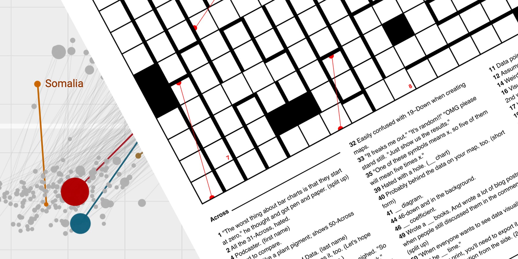
In what is possibly the nerdiest triumph of my whole life, I won a data visualization-themed crossword competition. The crossword (which can be printed out for completion here) is a lot of fun, though it's designed for dataviz enthusisats and so you'll probably struggle if you're not living and breathing the subject. Give it a try anyway?
I had totally missed that *Karen O* and *Willie Nelson* covered Under Pressure last year! It's exactly as wonderful as you'd hope it would be with that pairing.
Something very weird is happening in the British media this week. First, the pro-Brexit, pro-Tory, xenophobic, populist tabloid The Daily Express launched a "Green Britain Revolution" campaign to save Britain's environment.
Then, a day later, the Murdoch-owned pro-Brexit, pro-Tory, xenophobic, populist tabloid The Sun launched a "Green Team: Road to COP26" campaign, encouraging the government to use the opportunity of Brexit to scrap tax on solar panels, electric cars and double glazing.
This is weird, but good? Broadly good, anyway. A lot of the coverage so far is all about individual action rather than structural change. But it's definitely a weird U-turn for newspapers that until very recently were referring to climate change as a hoax.
But what's going on? Is this the right wing establishment seeing an opportunity to grab young voters and lunging for it? Is it nationalistic fervour because the UK is hosting COP26 this year? Is it a too-little-too-late desire to be seen as having been on the right side of history? Is it an attempt to distract from the building frustration over the impacts of Brexit? Answers on a postcard...
SEGUE INTO!
Are you a talented press officer looking for a new gig? Do you know one? At Possible, the climate charity that I work for, we're looking for someone to work full-time on identifying, creating and exploiting new media opportunities. If that sounds interesting, check out the job description and the application form. Oh, and shoot me an email if you have any questions about what it's like working for Possible. It's pretty great, to be honest.
Finally, I've started reading Kim Stanley Robin's The Ministry For The Future, which I picked up because it's supposedly a practical, utopian book about climate change. A plausible pathway to a better future. So far, it's absolutely delivering on that promise. Give it a look. Have you read it? Let me know what you think.