
Tenday Notes 10 July - 19 July

Every ten days I share a quick digest of what I've been working on. Here's the latest. You can find more in the series here.
My last ten days have largely been spent helping innovation thinktank Nesta write up its annual report. It has been pretty interesting - interviewing the heads of different areas of work, and putting together a summary of what they've done over the past year. It's quite an impressive collection. I've particularly enjoyed learning about Finding ctrl and the Alternarratives project
When I need a break, I've been working on my generative art and firming up my grasp of the fundamentals of Javascript. I'm pretty handy with most basic aspects of the language, but I'm a little inexperienced when it comes to using things like classes and higher-order functions. Eloquent Javascript, a book that my smart friend Filip recommended to me long ago, is helping me out.
I'm tremendously excited to be featured in Andy Kirk's Best of the Visualization Web again, in the April 2020 edition. He chose my Carbon in Context project, which showcases my concept for a "logpile chart".
I felt that the logpile chart didn't quite as much attention at the time as I might have liked, so it's lovely that Andy chose to feature it. For those who missed out, I wrote up an accompanying blog post about the ideas, and I'm very happy to answer further questions over email.
I think the logpile chart is a very useful tool for dealing with wide ranges of values, and I'd love to see it used more widely.
I'm dying for a change of scenery at the moment - I've not really been out of Gothenburg since November, and I've barely been further than walking distance from my apartment since March.
So I loved coming across Window Swap. It lets you swap the view out of your window for someone else's for a few minutes. You can also record the view from your window and submit it to the site, so someone else gets your view.
I'm looking forward to spending a week in a house on Gothenburg's northern archipelago in a few weeks' time, but until then, this will have to do.
If you’re ever in need of an open-source license for your code, consider the Climate Strike License. It prohibits use by applications or companies that threaten to accelerate climate change through fossil fuel extraction.
Many of the top open source projects used by these industries are data and dataviz-adjacent, so using the Climate Strike License on your code can do some real good for the world.
I spotted a nice dataset in Jeremy Singer-Vine's wonderful Data is Plural newsletter this week - The Historical Light Aids to Navigation. It shows the development of historical lighthouses, lightships, harbour lights and beacons in England and Wales for several benchmark years between 1514-1911.
I couldn't resist putting together a quick map. After a sketch and a few failed first drafts, I had a final piece together in about 45 minutes or so, using QGIS and Figma. Then I took about the same amount of time again to choose the right font and turn the capital "i" into a little lighthouse. Here's the result.
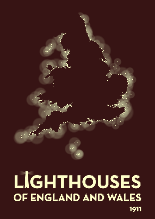
It shows all the lighthouses surrounding the coasts of England and Wales in 1911. Light radius is roughly proportional to the power of each lighthouse. I'm particularly pleased with the way the light circles are blurred a little, making it look like they're shining through sea fog, and the shadowing on the text as if it's illuminated by light.
Sometimes it doesn't feel like I'm making visualizations, it feels instead like they're somehow already made and I just bring them into existence. This was one of those occasions.
After a gap that was slightly larger than I would like, Silfa and I have uploaded a new video to our Plottervision account on YouTube.
It's an explanation of Hershey Text, a utility that turns regular fonts into stroke fonts. Why would you want to do that? Watch the four-minute video, and it's all explained.
I've got a few more videos in the backlog, so make sure you subscribe to the channel if you want to enjoy more live plotter art.
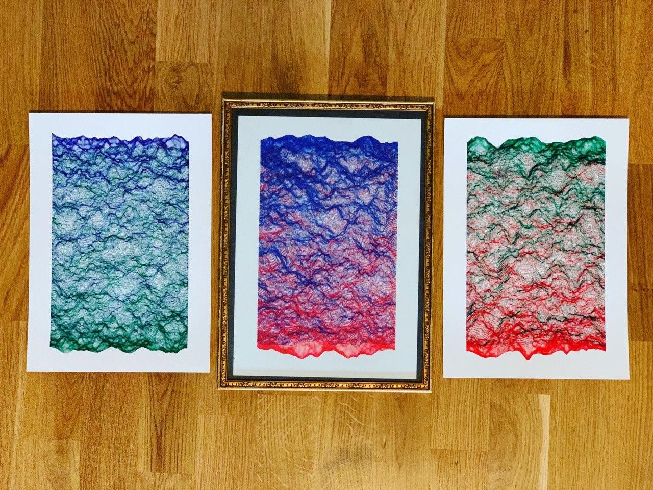
A small cafe near where I live likes to put the work of local artists up on the walls - a different artist each week. As I’m a local artist, I sent them a message and asked if they might have a slot for some of my plotter pieces. Turns out they do.
So I’m going to be exhibiting eight pieces of my work on the week of 29 August at Llama Lloyd in Gothenburg. That work will, for the first time, be on sale.
I’m not totally sure yet what I’ll exhibit. It might be something I’ve already made, and it might be something new. There’s a good chance that it’ll have a geographical component, tied to the local neighbourhood. I’ll figure it out in the next few weeks.
If you’re in Gothenburg, I’ll have an “opening” on 29 August where I’ll be hanging out at the cafe. It would be nice to see you. If you’re not in Gothenburg then I’ll post some photos on my blog and link them here. I still don’t have any plans to sell my work online, but if there’s a piece I’ve made that you particularly love then message me and we might be able to work something out.