Tenday Notes: 19 Sep - 27 Sep

Every ten days I share a quick digest of what I've been working on. Here's the latest. You can find more in the series here.
2020 was supposed to be a year of walking. I had grand plans to walk the Gotaleden, and maybe the Höga Kustenleden if I was feeling brave. That didn't happen, because I didn't want to take public transport to/from the starts of those walks, and then my bike crash took me out for six weeks or so at the height of the summer.
As case numbers in Sweden have gone down, I've cautiously started using buses and local trains again (with a facemask, which is very unusual here) so the Gotaleden might still be a possibility in the Autumn. But I've tried to start walking more on weekends to begin building up my tolerance for longer walks in the meantime. A few weeks ago I did a 24k walk to Ytterby, and today I did about 15km in a long loop around the southern part of Gothenburg. It feels good to be outside, moving, and it's a relatively safe way to meet up with and chat to friends. Laika, my dog, loves it too. So everyone's happy.
I read a great question the other day on Tyler Cowen's blog.
“What is it you do to train that is comparable to a pianist practicing scales?”
This is a great question because it gets at the need for active repetition to get better at things. Musicians do scales to train their muscle memory, so that when they need a note they know exactly where it is without having to think about it.
For me, "practicing scales" could be several things. It could be cleaning datasets and looking for stories within (I could do this more). It could be playing with colours and shapes and typography in Figma (I do this a good amount already). It could be sketching data visualizations (I do this habitually) It could be making small, simple finished visualisations (I don't do this nearly enough).
One of the best things about working on the Beautiful News project was that it forced me to do lots of small repetitions of basic visualization tasks, making a finished, polished visual in as little time as possible. Since then, I've not actually done many of these small visualisations - and I think it's time to fix that. So I'm going to try and commit to making more small visualizations of climate and environmental data, in the same way Gabrielle Mérite does with social justice issues on her Instagram account.
Keep an eye on my blog, Twitter, and Instagram to track my progress.
This week, I read a nice article by Byrne Hobart on the value of blogging (or newslettering, I suppose). The argument frames it as a great way for introverts to network, but the same reasoning applies to extroverts and ambiverts who live in a smaller town or city, or just happen to suddenly find themselves in lockdown (the article was written last year).
There's one bit I particularly liked, and that's the concept of "microfame":
Fame is hard, and it has other costs. But there’s a second alternative: be microfamous. Microfame is the best kind of fame, because it combines an easier task (be famous to fewer people) with a better outcome (be famous to the right people).
If you’re trying to calibrate how hard it is to achieve micro-fame, focus on the micro, not the fame. Micro-fame just means your friends-of-friends have a nonzero chance of knowing who you are, and striking up a conversation with you about something mutually interesting.
The rest is short and well worth a read.
Austin Kleon has a great bit in his book Keep Going about seasons of creativity. "Part of the work is to know which season you're in and act accordingly," he writes.
As northern hemisphere summer fades into autumn, I feel like my creative seasons are following suit - I've had a super-productive few months, and I can feel that the energies that fuelled that are starting to run dry. Seeing that coming means I can be prepared for it and adjust my expectations accordingly.
In the next couple of months, I'm planning to focus more on learning (the Eleventy course, but I also want to refresh my D3 skills) and reading. That means my Tenday notes will start to (have already started to, in fact) shift from "I did this, I made this" to "I read this, I learnt this".
The key challenge in all this is remembering that the winter ends just like the summer does. Kleon quotes Thoreau: "Live in each season as it passes, and resign yourself to the influences of each."
I've finished writing the text for the upcoming redesign of duncangeere.com. The goal, as I think I mentioned in the last newsletter, is to put something together that's oriented around selling my services, rather than a vague portfolio site like it is now. Getting the tone right is important - I want to come across as authoritative and professional, but still friendly and collaborative.
My first draft came out pretty strong, largely thanks to this article which helped me to think along the right lines. Then I refined that first draft with the help of a few friends. I'm really happy with the result - the tone is spot-on, and it's pleasingly short while still carrying enough persuasive weight.
The next step is to figure out what it should look like, and so I've been starting to draft up some wireframes in Figma (my favourite vector graphics tool). While I've done a lot of work in Figma in the past, I've mostly just been moving shapes around. But this time I'm building an interface, so I used the task as an excuse to learn how to use Figma's powerful auto-layout, components and prototyping tools.
As a result, things have taken a lot longer than they might have done if I'd used a more traditional approach. But on the flip side, the resulting prototypes (for desktop, tablet and mobile - all built off the same set of components) are now really easy to tweak and play with without everything suddenly going out of alignment. But I've got a first draft, which was my goal for this week, and I've got some feedback that I'm looking forward to integrating once I go back with fresh eyes.
Then, gulp, it'll be time to code it.
I finished my first "small" visualization, as promised above. Small in quote marks, because it actually ended up pretty large in the end - eight separate mini-visualisations.
It tells the story of global greenhouse gas emissions in 2016, the latest year where global data is available. Beating climate change requires understanding the causes, so I think it's important to know that air travel - for example - represents a very small chunk of world emissions compared to, say, iron and steel production.
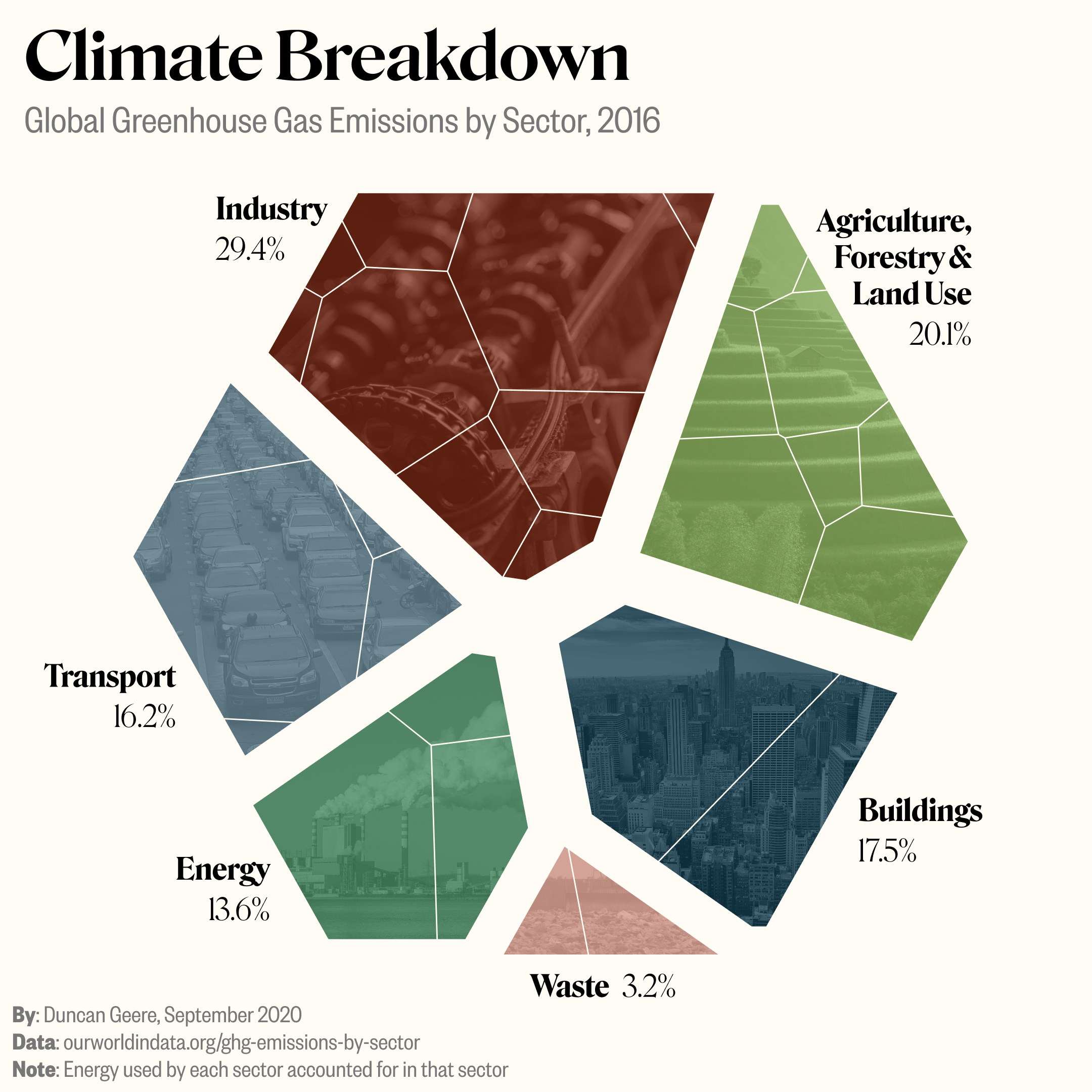
You should click through for the full set of visuals (scroll down).
The data was easy - it was all pretty much pre-processed by Our World in Data, though I did change some of their categorisation so that energy wasn't just one huge sector of its own.
I was able to get into a really nice flow state while making it, which felt great. I did spend a bit more time on it than I planned - I was aiming for four hours but spent about six in the end (and then another hour writing social posts and replying to comments). Next time I won't let it sprawl quite so much.
It was a fun challenge to design primarily for a phone screen. That really limited the amount of text I could cram into it (and actually I probably crammed in too much as it is). I think it works well small and large, though. I'm also particularly happy with the typography, colours, and the use of photos for texture. I think they all work really nicely together.
I'm gonna try and keep up the pace on these, making one every other week or so. Let's see how that goes. I take requests, so if you have any subjects you'd like to see me visualise, preferably (but not exclusively) environmental, then hit me up.