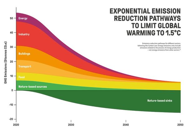
Completed Work The 1.5C Carbon Playbook Yesterday, a project I worked on launched at the World Economic Forum in Davos. It's a short and sweet guide for companies who want to keep the planet's temperature below 1.5C. I helped edit the text, and worked on the information visualization. You can access
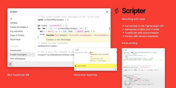
Design Scripter: Sketching with Code If you love Figma [http://www.figma.com] as much as I do, this may excite you. All-round smart dude Rasmus Andersson has built a Figma plugin called Scripter [https://www.figma.com/c/plugin/757836922707087381/Scripter] that lets you write simple scripts (in Typescript [https://en.wikipedia.org/wiki/
Behind the Scenes Defending the Truth There's an interesting line in the latest FlowingData newsletter [https://flowingdata.com/2020/01/16/process-72-misleading-map/]. > It's difficult to plan for every single interpretation and use of your visualization once it enters the internet ethers. It's impossible to control. Nathan is writing about
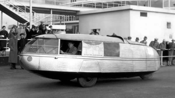
Music Dymaxion Rotation Discovering new music has become more difficult for me in recent years, for two key reasons. The first is that I've had less time to spend reading the music press, which was always my favourite source of recommendations. The second is that music itself has splintered into zillions
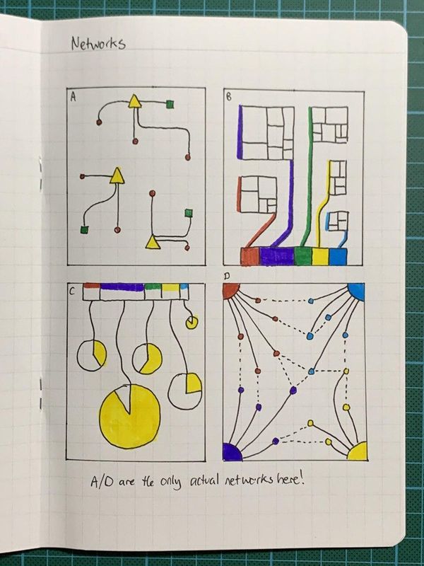
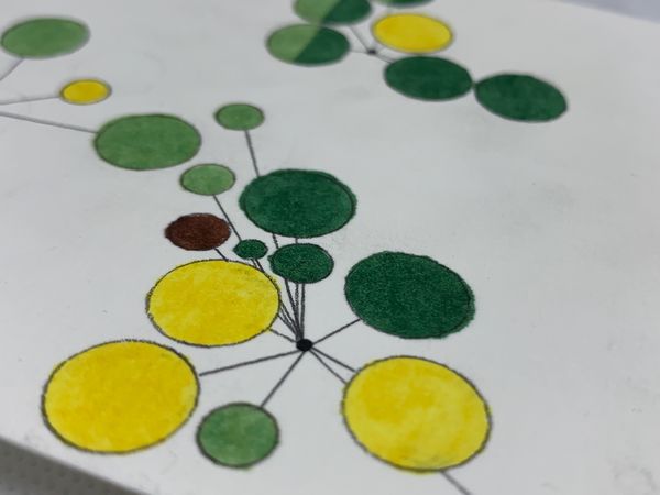
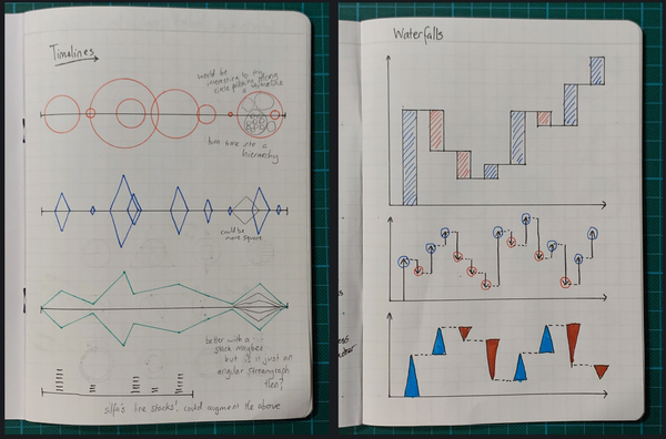
Behind the Scenes Sketchbook Pages #2 Every few days I try and fill a page in a sketchbook with visual ideas that don't have any data behind them. I pick a theme, then execute on it in a few different ways. Here are a few recent pages:
The Geography of TV & Radio I love these beautiful maps of TV and radio coverage in the United States [https://erdavis.com/2020/01/04/visualizing-the-geography-of-fm-radio/], created by Erin Davis. Read more about their creation over on Erin's blog [https://erdavis.com/2020/01/04/visualizing-the-geography-of-fm-radio/]. (via Giuseppe Solazzo [https://us5.campaign-archive.com/
Inspiration Atomic Habits & Cadence For the last few months, I've been trying to cultivate better habits. Much of this was after reading James Clear's Atomic Habits [https://amzn.to/36ReVE3], which is the best self-help book I've read in some time. It's simple, clear, exactly as
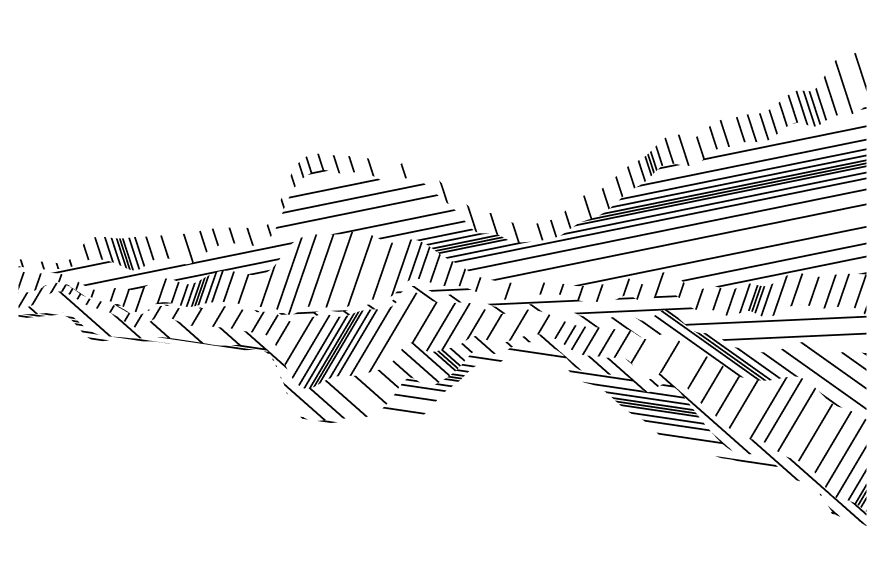
Experiments Replicated Territories The other day I saw this great bit of plotter work on Twitter, and loved the look, so I wanted to see if I could replicate something similar digitally. > Territories #axidraw [https://twitter.com/hashtag/axidraw?src=hash&ref_src=twsrc%5Etfw] #processing [https://twitter.com/hashtag/processing?
Tools I Love Tools I Love #1: Copic Multiliner SP Tools are important [https://blog.duncangeere.com/data-visualization-tools/]. A good tool not only removes barriers between you and what you want to do, but makes doing that thing delightful. That's why I want to share with you my current favourite pen. It's the Copic Multiliner SP
Inspiration Beginning I have a newsletter called Beginning, but today I'd like to share a cartoon by Grant Snider [https://twitter.com/grantdraws/status/1213136974787338242] with the same title. > New comic! Beginning pic.twitter.com/SfK3VK7ks9 [https://t.co/SfK3VK7ks9] — Grant Snider (@grantdraws) January 3, 2020 [https://twitter.com/
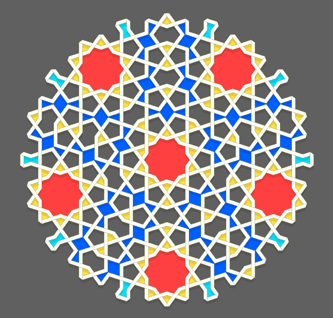
Inspiration Girih Tiles Some interpretations of Islam include a ban of depiction of animate beings, so much of religious Islamic art is geometric in nature instead. A few years back, I picked up the Islamic Design Workbook [https://amzn.to/35CuNsz], by Eric Broug, at the V&A Museum in London. It
Dataviz Dataviz in 2019 I have a love/hate relationship with roundup posts. I love reading them. I hate writing them. That's why I haven't really summed up my 2019. The best summary of 2019 in dataviz that I've read comes from Data Visualization Society founder Elijah Meeks.
Inspiration Alignment Chart Alignment Chart The latest XKCD [https://xkcd.com/2251/] goes meta D&D, though I'd argue that the alignment chart itself should be lawful evil. Actually, the soil chart (lawful good, though Wikipedia's rendition is chaotic neutral at best [https://en.wikipedia.org/wiki/Soil_texture#/media/
How to Make a Data Story Interesting Familiar information is boring. Readers skim it at best, and ignore it at worst. But unfamiliar information is boring too. Readers lack the context to understand it, so they skip it. To engage with a reader, you need to hit that sweet spot where a reader knows a little about
Completed Work Sibling Travels A few days ago, I shared a hand-drawn data visualization I made for my stepfather for Christmas. I also made a similar visualization for my sister, showing the countries we've visited together. This one was more challenging, as I didn't have as much data or an
Behind the Scenes Sketchbook Pages #1 Every few days I try and fill a page in a sketchbook with visual ideas that don't have any data behind them. I pick a theme, then execute on it in a few different ways. I've not been doing it very long, but I've
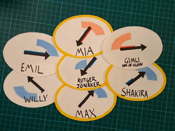
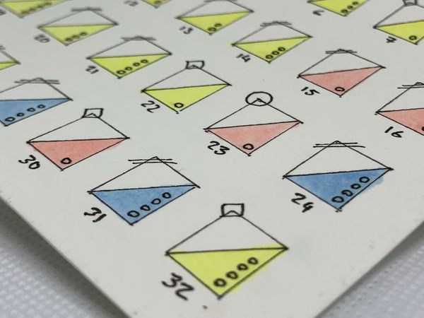
Dataviz New Year Badges For my New Year's Eve party this year, I made a small collection of hand-drawn data portraits of the attendees. The goal was to give the attendees - some of which didn't previously know each other - a conversation starter. I collected data using a Google
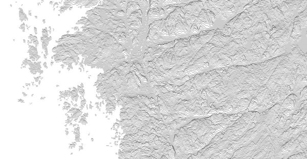
Inspiration Peak Map Ridgeline plots (formerly known as joyplots - read the explanation for the name change [https://serialmentor.com/blog/2017/9/15/goodbye-joyplots]) are a lovely way of displaying topography. Peak Map [https://anvaka.github.io/peak-map] is a website created by Andrei Kashcha that lets you go to anywhere on
Completed Work Endangered Languages of Italy As a Christmas present for my stepfather, who is learning Italian, I drew a data visualisation showing the endagered languages spoken in Italy. The visual style is heavily inspired by Giorgia Lupi [http://giorgialupi.com/], of Dear Data [http://www.dear-data.com/] fame. The opportunity for the Italian connection was
Site Admin Bar & Line? My workblog is called Bar & Line. I wanted to name it for three reasons. 1. I like the name "Bar & Line" a lot. It's classy, and a little funny. I wanted to lay my claim to it, in case I want to use it
Writing Choosing the Right Tools for Data Visualization A few weeks back, I led a discussion in the Data Visualization Society [datavisualizationsociety.com/]'s Slack community about tools for data visualization. The discussion covered favourite tools, how people approach learning a new tool, and why data sketching could change your life. Here's a summary [https:
Site Admin The First Post Owning your online presence is important. A huge Twitter or Facebook following is great, but if either platform goes away then so does your audience. That's why I'm starting a blog. This is at least the fourth blog that I've started. In the past,