2020 in Review: Information Design


A year ago I wrote that "I have a love/hate relationship with roundup posts. I love reading them. I hate writing them." Well, it turns out that writing a blog and newsletter all year makes it a lot easier to remember things, which in turn makes the work of writing a round-up post a lot easier.
So I'm going to take a break from my Tenday notes until January and instead round up the three areas where I've concentrated my work in 2020 - information design, generative art and community building. I'll be talking about what I've created, but also what I've learnt along the way - and some recommended resources for those of you who might want to dabble in any of those areas yourself. Today we're starting with information design.
I kicked off the year with a big collection of work on climate change solutions. In 2017, Project Drawdown published a book called Drawdown which describes 100 of the most promising solutions across several broad categories, ranking each by the potential cost and potential greenhouse gas savings. This year, the team wanted to update the figures - and approached me to do the design work.
The dataset was highly complex - hierarchical, with multiple scnearios to capture uncertainty, and with several sections that weren't explicitly quantified. I knew that would be a lot for a general audience to understand, so I pursued what we came to call a "telescope" approach - starting at the top level, then progressively adding detail over time.
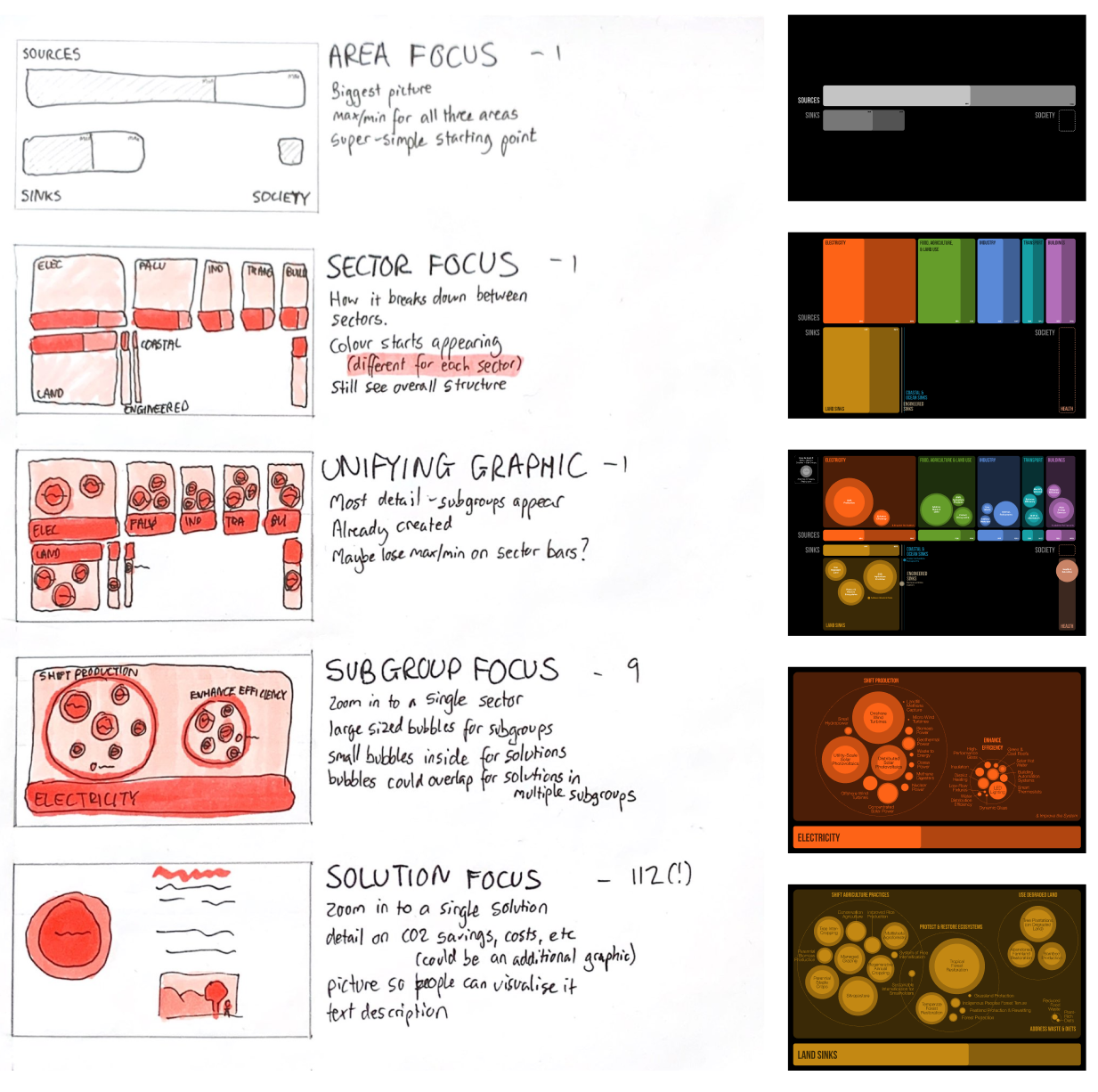
They start with something very familiar - a bar chart. That then turns into a set of stacked bars. Which then turn into circle-packed groupings, when then break down into even more detailed circle packing. I love this stepped technique, because it lets you start with a simple chart type that everyone understands, then slowly add layers of complexity. Keeping a standard visual positioning gives the reader key reference points that they can use when they're trying to understand the next level down.
The charts I made for Drawdown are now part of their standard presentation deck, and they've been seen by thousands of people attending (mostly virtual) events over the course of this year. They were also presented in the Drawdown Review 2020, remixed by Ampersand Design Studio, which can be downloaded from the Drawdown website in exchange for an email address.
Around the same time, I did some mapping work on a dataset I'd found on Wikipedia of almost 2,000 urban areas of Sweden and their population. I just had the names, not the locations, so I used Awesome Table's Geocoder add-on for Google Sheets to automatically get get latitude and longitude coordinates, which is one of my favourite tools for working with geographical data.
I had a style I wanted to emulate - a beautiful minimalist map of Spain, which was made in pandas and matplotlib. I used a totally different toolkit, though - pulling my dataset into Google Sheets for geocoding, and then exporting as a .csv into first Flourish (a dead end because you can't export their maps as SVG) and then QGIS - a fiendishly-complex piece of open-source mapping software.
In QGIS, I was not only able to position the data on the map as circles, but also adjust the map projection. That's important when working with Swedish geodata, because most common map projections distort geographies like crazy when you get too far north, and Sweden extends all the way into the Arctic Circle.
I successfully exported the map from QGIS as an SVG and then pulled it into Figma to style it up. Figma didn't love dealing with 2000 tiny circles and a fairly complex outline of the country itself, but we got there, and I published the final piece on my blog on 29 January.
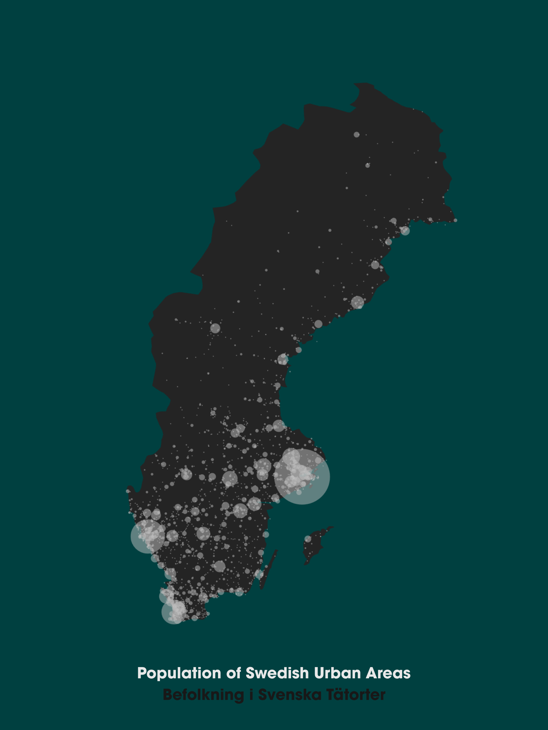
At the bottom I wrote "Eventually I'd like to get this printed HUGE." I don't know if A3 counts as huge, but if it does then my wish came true and this map now proudly adorns the wall in my living room.
In April I published Carbon in Context, a chart that helps people compare different quantities of CO2 emissions. I was pretty proud of this project not just because it solves a pressing problem in data visualization, but also because I invented a new chart type in the process.
The problem with comparing CO2 emissions is that they come on very different scales. A round ticket from London to New York emits one tonne of CO2. But the emissions associated with 2019's global wildfires are 7,800,000,000 tonnes. It's difficult to put those things on the same chart.
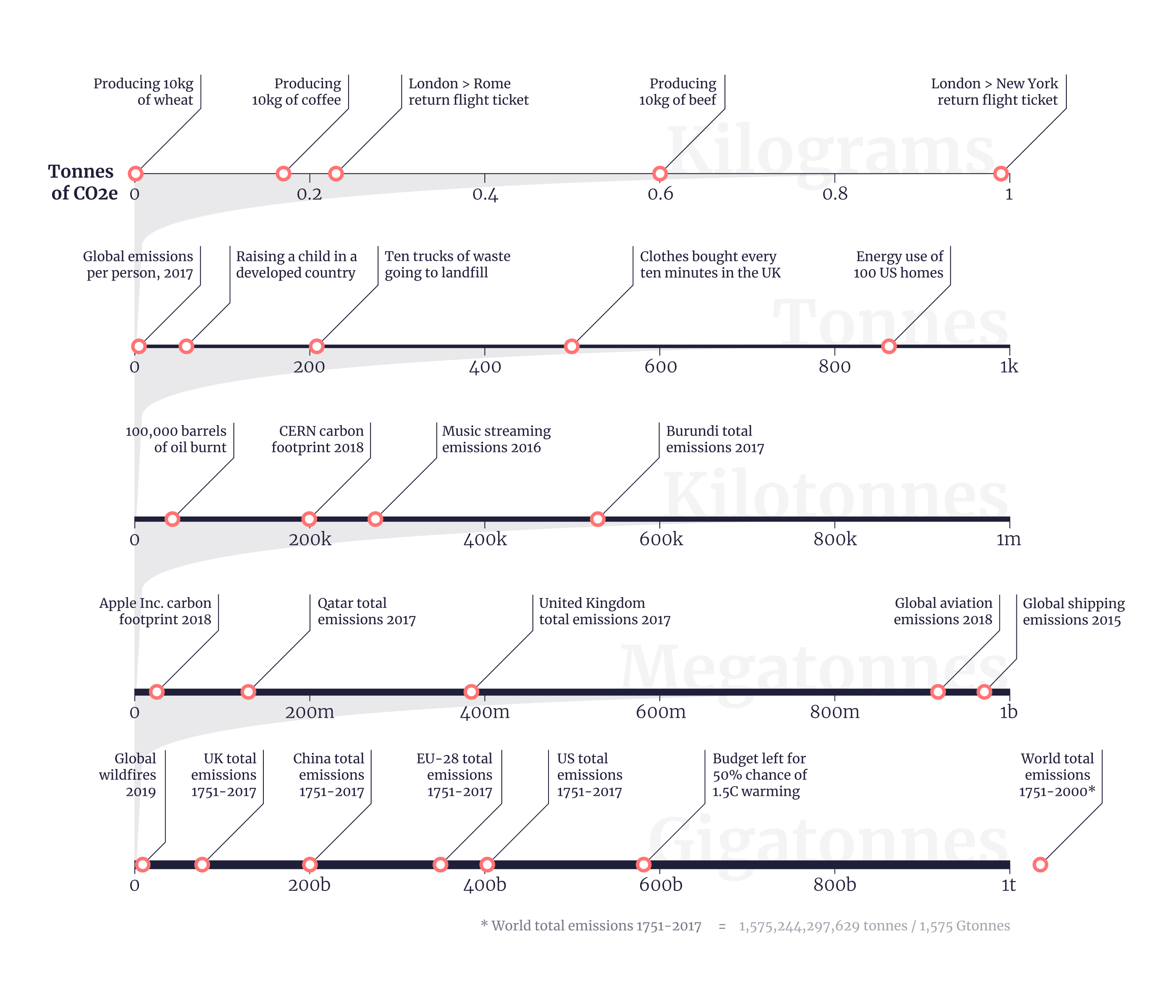
That solution that many people reach for is the logarithmic scale. But log scales are poorly understood by the general public. So instead of making a log scale, I stacked a bunch of linear scales up on top of each other - with markers showing the position of each datapoint on the most relevant axis. I call this a logpile chart, and I wrote up some thoughts on what it's useful for and what it's not useful for on my blog.
Towards the end of April, I published a graphic titled "20 Years of Human Presence on the ISS" that I created in collaboration with Katarina Eriksson of Märka Design.
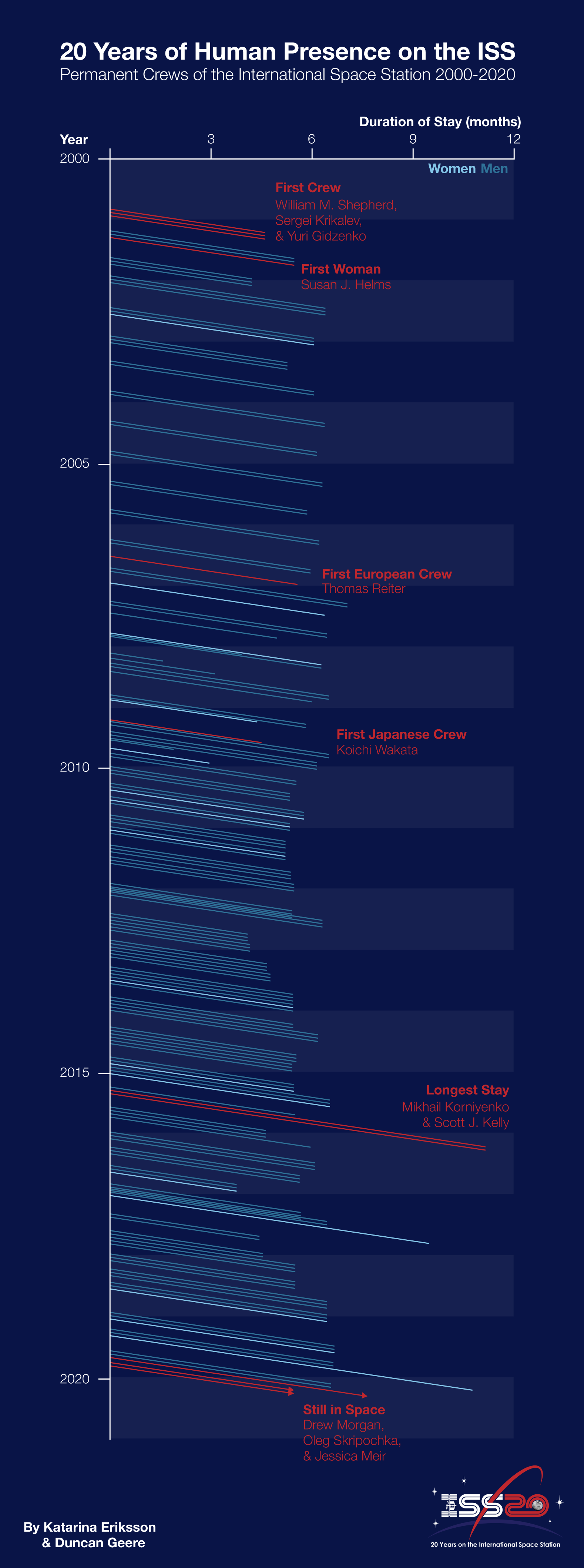
It shows the inhabitants of the International Space Station over the past 20 years in a Lexis diagram, which I custom coded into Figma. Lexis diagrams are kinda fun - they have time on both the X and Y axis, so you can see who overlapped with who. A few particularly interesting individuals are picked out in red as annotations.
In July, I published a map of the lighthouses surrounding the coasts of England and Wales in 1911. It was one of those nice graphics where you're inspired by a particular collection of data - in this case the Historical Aids to Navigation dataset.
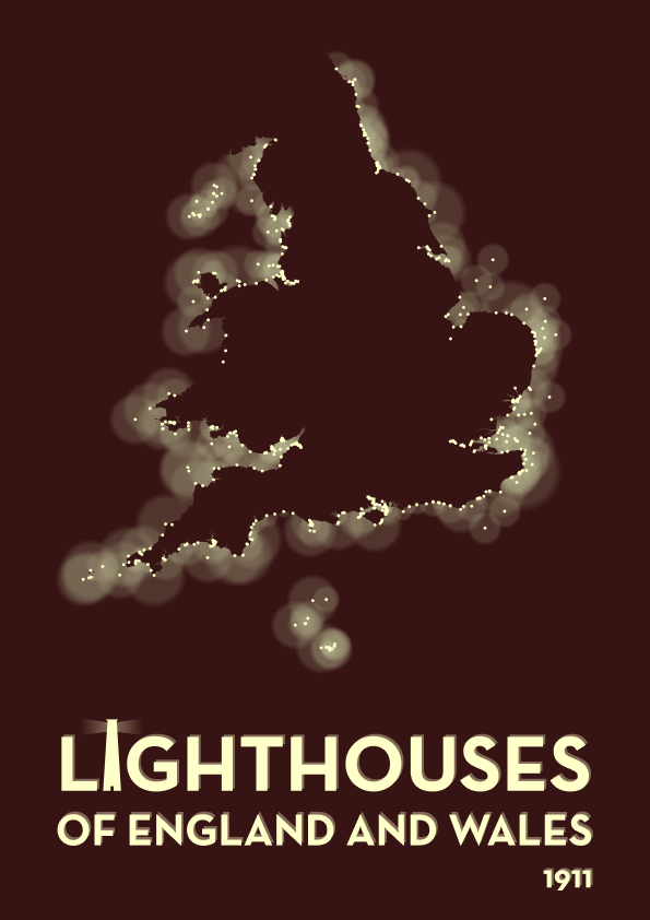
It only took a couple of hours to put together, in QGIS and Figma. I love how it looks like each lighthouse is glowing in the darkness, though if I was making it again I think I'd do it on a blue background rather than a brown one.
Don't miss the custom letter I that I designed in the title below the graphic.
In August I did a lot of work for Ellipsis Earth - a startup which has developed machine learning technology that can recognise items of trash in photos.
I was asked to help them visualize their dataset of thousands of geolocated cigarette butts, identified before and after an anti-littering campaign was conducted in the Italian city of Sorrento over the summer.
In the process, I designed a lot of custom visualizations which I put together in Figma and Mapbox. The results can be found in the final project report.
One of the most creatively-stretching projects that I worked on this year was Dataplotter - an experiment in using a pen plotter to draw visualizations, while narrating the story of the data over the top. If you've not seen it already, it's worth a watch:
In this case, I told the story of oil prices and consumption over the last few decades. It's an unusual chart format, but the narration and slow pace made it easy to walk the viewer through how it works. The reaction from the community was very positive!
Drawing dataviz with a plotter has its advantages and drawbacks, which I covered in a short article for Nightingale. I also wrote up another piece on my blog, talking more about how it was done.
 Duncan Geere
 Duncan Geere
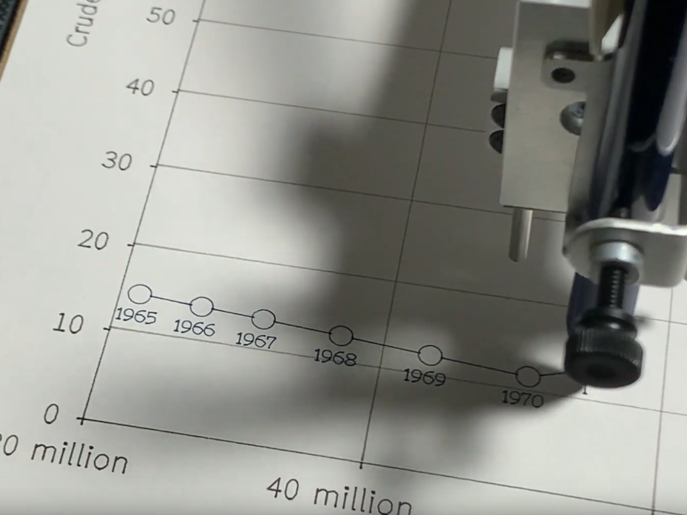
My intention was for this to be the first in a series of plotter visualizations, but honestly it was a lot of work and trial and error to get it perfect - and I haven't come across a dataset since then that would justify a repeat of the effort. I'd very much like the continue to series in the future, but let's see whether another story pops up that feels right for the medium.
In February I created a whole bunch of visualizations for a report from FutureEarth that connects recent news events with the latest environmental science research. It's titled "Our Future on Earth". I wrote up a brief description of the project on my blog.
Duncan Geere
Towards the end of the year, I began publishing a series of what I've been calling "small visualizations" for want of a better name.
They're bite-size graphics that tell a single, simple story - mostly related to climate and enviromental issues. My goal is for them to tell their story well "in the stream" on social media, but also offer extra detail to people who want to spend a couple of minutes looking at them in depth.
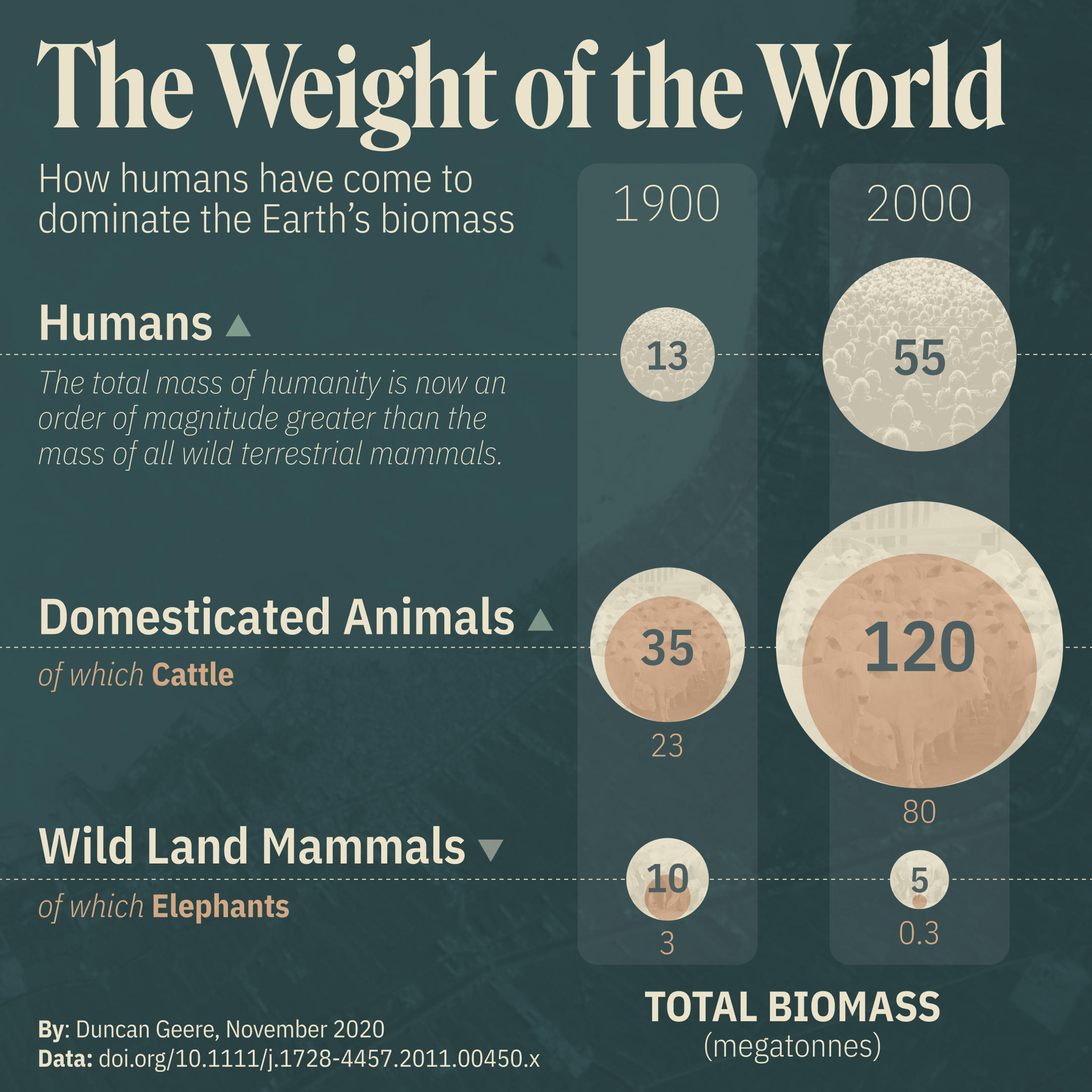
There are four so far. Climate Breakdown shows how global emissions are distributed between sectors, and offers some pointers on how to reduce your own emissions. Emissions Inequality shows how rich countries emit the vast majority of greenhouse gases. How Green Is Your Stimulus? compares the post-COVID economic recovery plans of different countries. Finally, The Weight of the World looks at how humans have changed the Earth's biosphere in the last century.
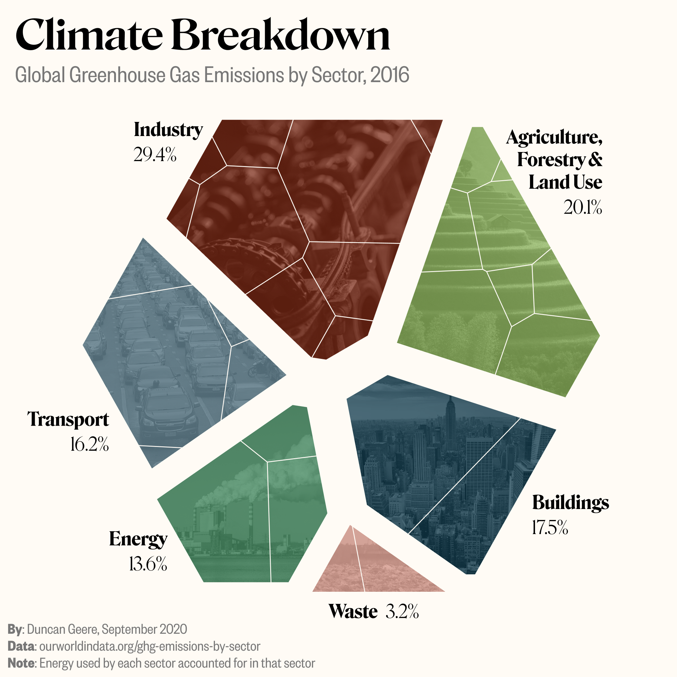
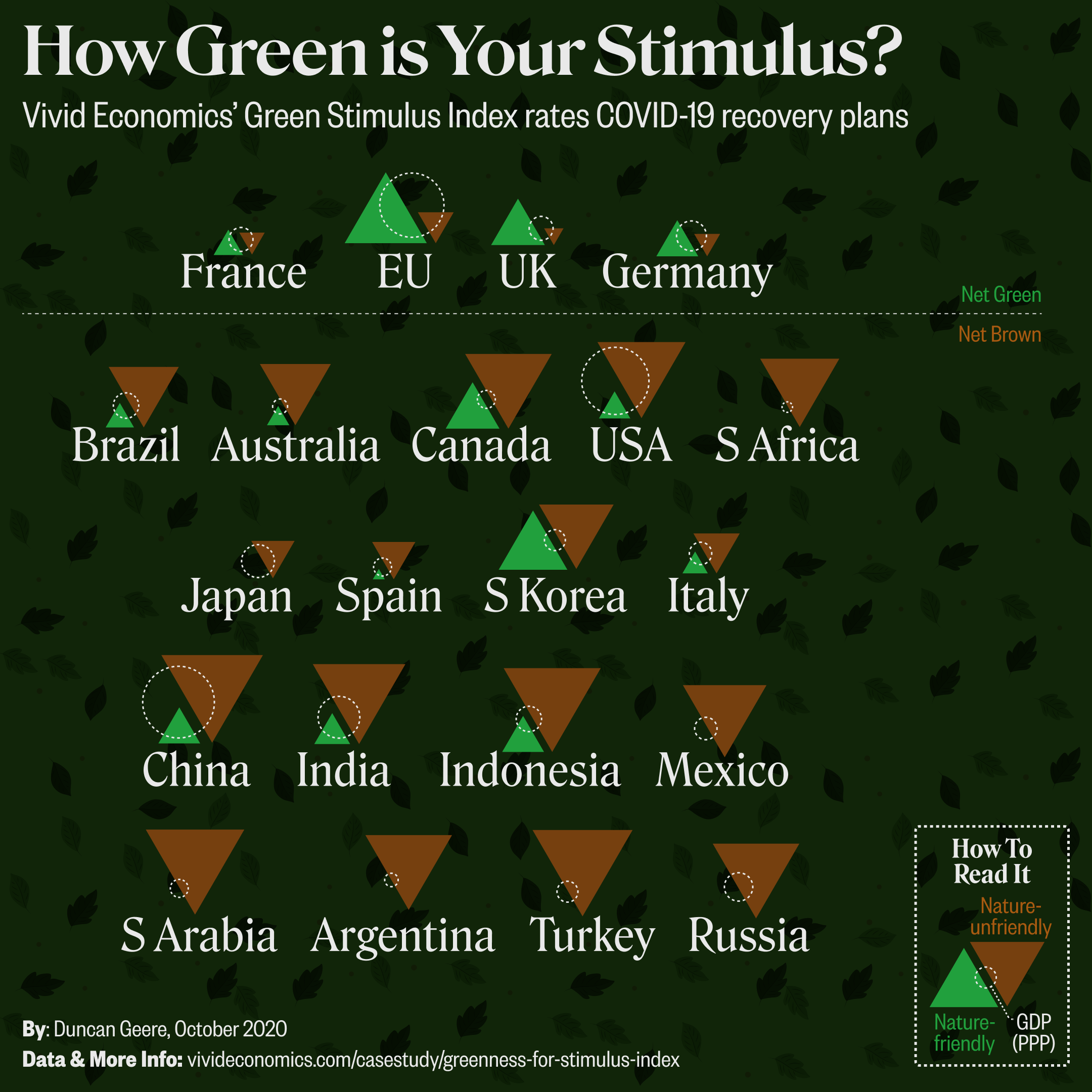
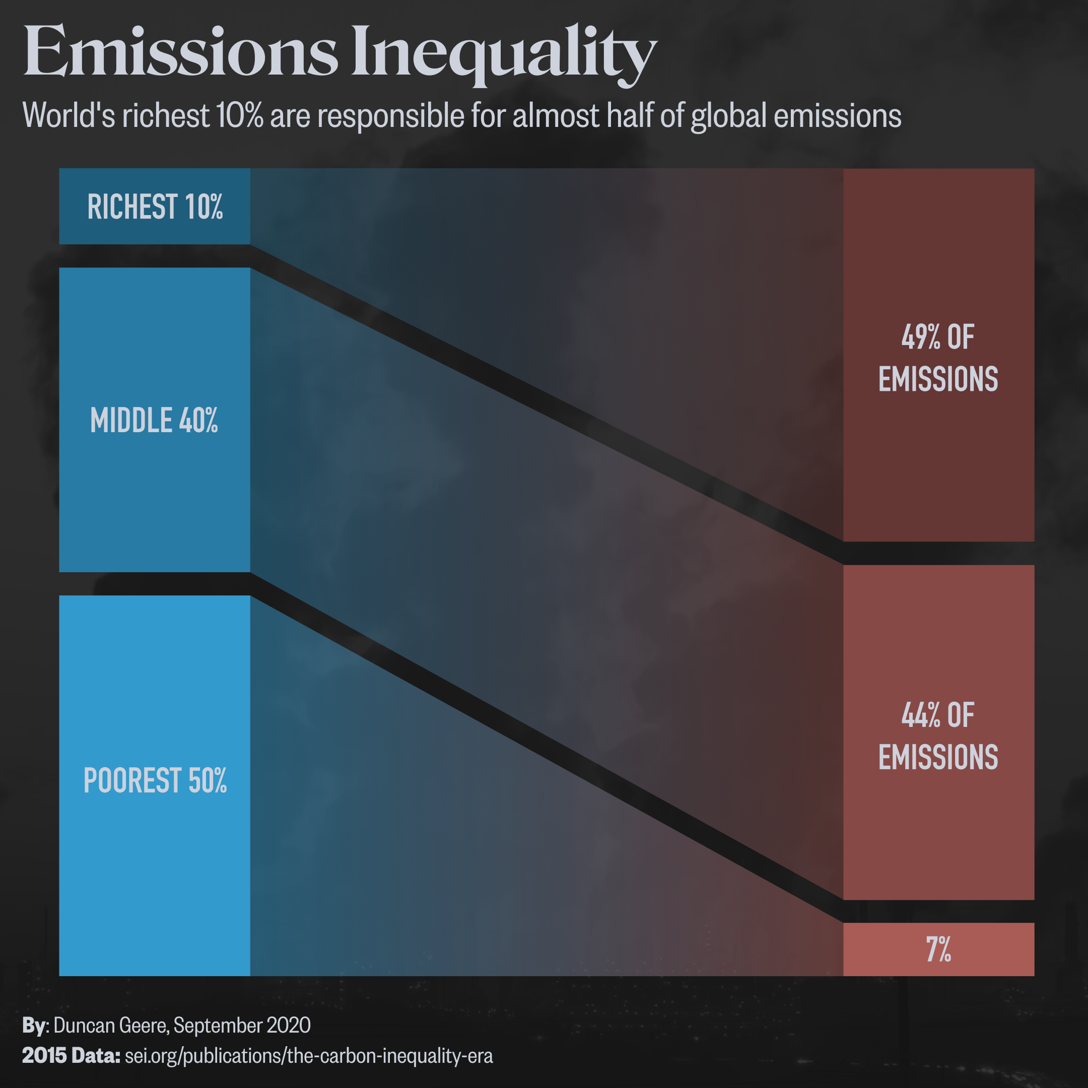
The key creative constraint on this graphics is that I try to complete them in a single morning or afternoon, so they can't sprawl. Doing lots of repetitions of small pieces like this helps me constantly practice all parts of my visualization pipeline, and experiment with new chart types and forms in the process.
A vital part of my data visualization process is sketching, and I exercise those muscles on a regular basis by drawing in a sketchbook that I keep specifically for visualization-adjacent work.
In May, I took part in a Data Visualization Society "Fireside Chat" about sketching. The full recording is online, but it's an hour long so if you don't have time then I wrote up the key points I made on my blog. It covers how I use sketching in my process, why I find sketching useful, and how to get started.
If you want to see some of my sketches, then I post them regularly on my blog under the "Sketchbook Pages" tab. I also share them on Twitter. They're quite popular, which always surprises me a little.
Duncan Geere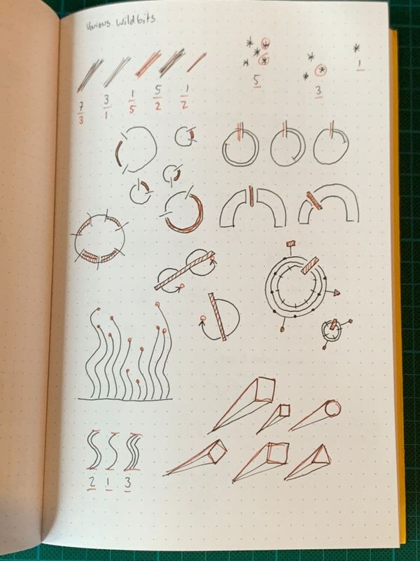
In May, my good friend Jane asked in the Data Visualization Society's Slack community whether there are any good articles that talk about the definitions of data visualization vs information design vs infographic.
It's something that I've thought about a bit, so I started typing an answer, and then I sketched a drawing, and then I typed some more, and then I realised that it's probably something that should be a blog post. So I wrote a blog post about it.
Duncan Geere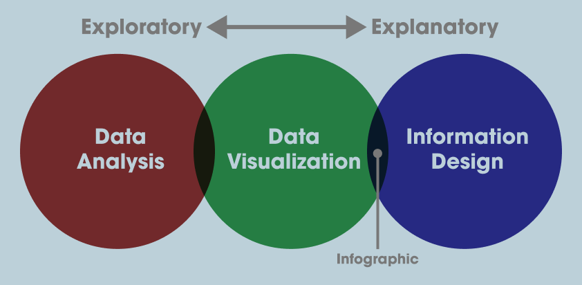
I refer back to this post quite often, whenever I'm figuring out whether I need to take more of an exploratory or explanatory approach on a project. If you've ever wondered why I call myself an information designer rather than a "data visualization design" or similar then you'll find the answer in the post.
In July, I was interviewed by Betsy Ladyzhets about what data journalism advice I'd give to science writers.
You can read the full article on The Open Notebook, but I also summarised the advice on my blog.
Duncan Geere
The key bits of advice I gave were:
- Figure out what the data is showing, but also what it’s not showing.
- Write down aspects of a dataset that you find interesting, as well as questions that come up, as you explore the data (for more on this, read my New Beginning essay from 2019).
- Good science communication thinks about its audience (more on this here).
- Join the Data Visualization Society.
I wrote a few other pieces for Nightingale this year that I haven't mentioned above. Nightingale, for those who aren't in the dataviz community, is the journal of the Data Visualization Society. Journal makes it sound very academic - it's actually just a Medium publication, and everything's written in a pretty casual tone. But it's well-read, and they're professional about having editors and illustrators and so on.
The first piece I wrote was published in December 2019, but let's sneak it into the 2020 review anyway. It's called Choosing the Right Tools for Data Visualization, and it's a summary of a discussion in the Slack community that I helped to moderate. We wanted to find out how different people use tools. It's a good read if you're curious about the different approaches out there.
Duncan GeereThen for Earth Week in April I wrote up a much longer article about the famous "Planetary Boundaries" diagram - looking at its history and influence, as well as its strengths and weaknesses. I was pretty proud of this one - it's the only journalistic "feature" I wrote all year, and it involved lots of interviews with people who were present at the time. I think it's well worth a read.
Duncan Geere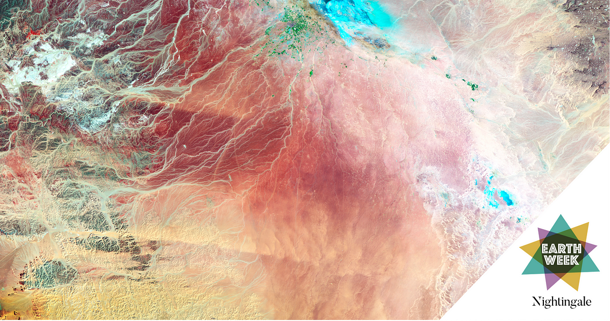
In June, July and August I did a lot of work for UK innovation think tank Nesta on helping them round up the work that they've done over the last decade. This involved talking to staff from across the organisation, reading innumerous reports and research papers and writing it up all for a general audience.
The results were published on Nesta's website, under the areas of health; education; innovation policy; the creative economy & culture; government innovation; and futurescoping.
Finally, I'd be remiss not to mention the many, many hours that I've spent this year on Loud Numbers - my upcoming data sonification podcast with Miriam Quick.
We were originally planning that Loud Numbers would be finished around now, but given that we had to build up a lot of the skills from scratch, and that we've been making it in our spare time, around client work and other projects, it has taken rather longer than we originally thought to complete.
That said, I'm super-excited about what we've been making, and can't wait to share a bit more. We'll be releasing some additional details at the end of January 2021, and looking at a release in the first half of next year.
Duncan Geere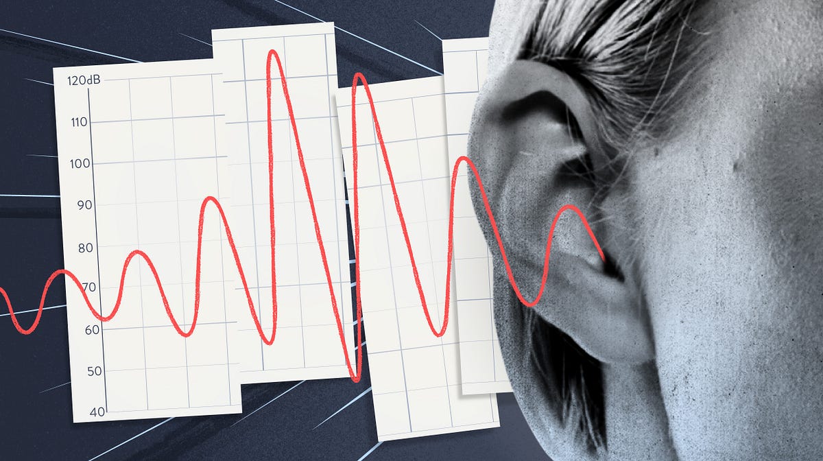
In the meantime, you can get a glimpse at what we've done so far in this just-published piece for Nightingale. And if you want to keep up with the project then subscribe to the weekly development log newsletter at loudnumbers.net.
Phew, that's a lot of stuff! If you stayed with it until the end, then give yourself a pat on the back. I'm pretty proud of what I've achieved this year in information design, and I think it's a nice mix of bread-and-butter client work, self-directed projects, and experiments into new forms and formats.
I'm looking forward to doing more of all those three things in 2021. I'm planning to put an even greater focus on environmental and climate-oriented work, get much deeper into data sonification, and explore the possibilities afforded by mashing up data with generative art. If you want to follow my work and you're not already subscribed to my newsletter, then you can sign up at buttondown.email/duncangeere.
I would also be a bad businessman if I didn't mention at this juncture than you can and should hire me if you've got a big pile of data and want to tell stories with it. Have a look at my portfolio and get in touch at duncangeere.com.


Thanks for reading, and look out for the next instalment of my 2020 review - focusing on generative art - in the coming weeks (Update: it's here! Update 2: Here's the last entry!)