Bar & Line
  • duncangeere.com
  • Blog Home
  • Dataviz
  • Design
  • Writing
  • Generative Art
Sign in Subscribe
Bar & Line
Make Your Own Data Glyphs With Joyful Data
Experiments

Make Your Own Data Glyphs With Joyful Data

The folks at Gramener's Storylabs have built a "happy little tool" built on JOY.JS [https://ncase.me/joy/] that allows you to create your own system for encoding data in glyphs. It's called Joyful Data [https://gramener.com/joyfuldata/]. Joyful Data — make happy
06 Feb 2020 2 min read
Work in Progress #3
Behind the Scenes

Work in Progress #3

I love hierarchical circle packing!
05 Feb 2020
This is how Europe is ushering in a new golden era of train travel
Completed Work

This is how Europe is ushering in a new golden era of train travel

A short piece by me for The Wired World in 2020 [https://www.wired.co.uk/topic/the-wired-world-in-2020] has just made it onto the web. It was written about six months ago, so it's not totally up-to-date, but it's the first thing I've done
03 Feb 2020 1 min read
A New Approach
Behind the Scenes

A New Approach

One month of daily posts on my new workblog! Yay! But already it's starting to feel like a bit of a chore each day, and quite often I end up putting things in a queue and publishing them a few days after the rest of the internet is
03 Feb 2020 1 min read
Centring the Reader
Inspiration

Centring the Reader

Charles-Joseph Minard [https://en.wikipedia.org/wiki/Charles_Joseph_Minard] was a 19th-century civil engineer, who become famous for his early contributions to information design. You've almost certainly seen his map of Napoleon's disastrous 1812 Russia campaign [https://en.wikipedia.org/wiki/File:Minard.png]. But
02 Feb 2020 2 min read
The Organograms of Government
Inspiration

The Organograms of Government

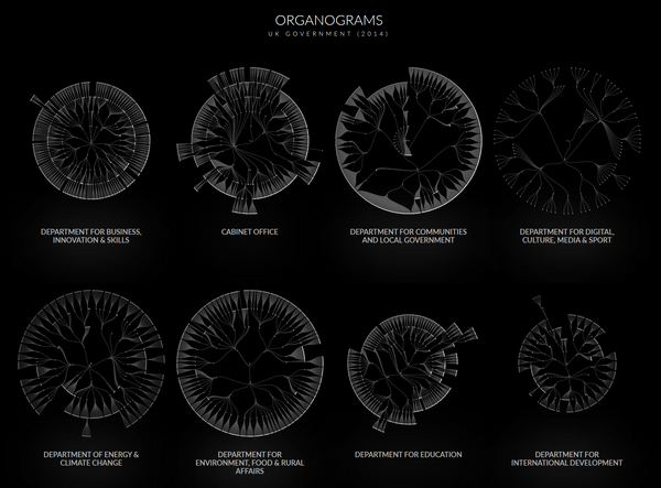
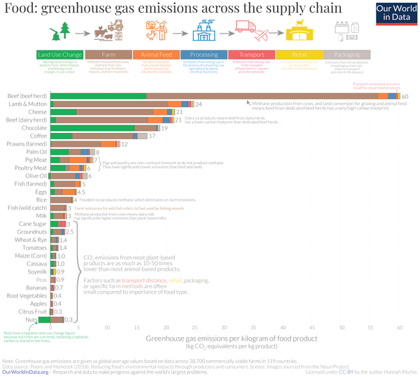
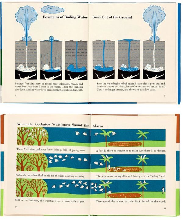
What does your organisation's structure look like? You could draw an org chart, but how about an drawing an organogram instead? These charts were put together by Peter Cook, and show how different parts of the UK government are structured (or were in 2014, anyway). Okay, so maybe
01 Feb 2020 1 min read
Food Miles Are Not As Important As You Think
Dataviz

Food Miles Are Not As Important As You Think

Our World in Data has just published a great article [https://ourworldindata.org/food-choice-vs-eating-local] about the source of the emissions associated with different foods. It's a simple stacked bar chart. Each bar represents a food, and the coloured chunks represent where the emisisons come from - the key
31 Jan 2020 1 min read
Dataviz

Google's Dataset Search Is No Longer in Beta

Rejoice, number-hunters - Google's Dataset Search tool [https://datasetsearch.research.google.com/] is now officially out of beta. According to a blog post [https://blog.google/products/search/discovering-millions-datasets-web], the search giant has indexed almost 25 million datasets. The tool previously delivered a scattershot of vaguely-related bits of
30 Jan 2020 1 min read
Population of Swedish Urban Areas
Behind the Scenes

Population of Swedish Urban Areas

Or "Befolkning i Svenska Tätorter", if you like. A quick map that I was working on a while back. It's still not quite there - it needs a legend, and maybe a bit of artworking. But right now I'm struggling to get my beloved
29 Jan 2020 1 min read
From the Archive: Cable Cars Are Changing the World
From the Archive

From the Archive: Cable Cars Are Changing the World

Back in 2017, I wrote a lengthy feature on cable cars - and specifically how they're a vital tool in urban planners' arsenals. I wrote the story, provided my own photography, and even designed little pixel art cable car spacers. You can read it here: Cable Cars
28 Jan 2020 1 min read
Design

There Are Only 10 Types of Movies

“Can I copy your homework?” “Okay, but don’t make it too obvious.” > 2. Sexy legs pic.twitter.com/0IujkDyRKi [https://t.co/0IujkDyRKi] — 𝕃𝔼𝔼 (@leesteffen) January 14, 2020 [https://twitter.com/leesteffen/status/1217167856418402305?ref_src=twsrc%5Etfw] Click through for the full ten [https://twitter.com/leesteffen/status/
27 Jan 2020
How to Add Arrowheads to One End of a Vector in Figma
Code

How to Add Arrowheads to One End of a Vector in Figma

I came upon a problem the other day. I was working on a graphic showing the increases in the amount of protected land in every country in the world over the last 15 years or so. I wanted to represent each increase with an arrow - 180 arrows in all.
26 Jan 2020 3 min read
The Missing Legacy of Marie Neurath
Dataviz

The Missing Legacy of Marie Neurath

Looking for a weekend read to dig your teeth into? You could do much worse than Jason Forrest's latest dive into the history of data visualization - The Missing Legacy of Marie Neurath [https://medium.com/nightingale/the-missing-legacy-of-marie-neurath-f9800733d1fc?source=friends_link&sk=2dbd9ba88a9b2b48c3b72cc70bb03a50] . Marie Neurath was the
25 Jan 2020 1 min read
Tools I Love #2: Flourish
Tools I Love

Tools I Love #2: Flourish

The best free platform for making charts on the web is Flourish [https://flourish.studio/]. It has the best balance of usability, chart types, customisation and export options. Flourish has been a vital part of many of the visualizations I've made. Most complex charts are combinations of simple
24 Jan 2020 1 min read
Custom Isochrone Maps
Dataviz

Custom Isochrone Maps

Isochrone maps [https://en.wikipedia.org/wiki/Isochrone_map] are one of my favourite things. They show far you can travel from a place in a given amount of time. There are lots of classic examples, but this one by Francis Galton is the first-known. It shows travel times in
23 Jan 2020 1 min read
The 1.5C Carbon Playbook
Completed Work

The 1.5C Carbon Playbook

Yesterday, a project I worked on launched at the World Economic Forum in Davos. It's a short and sweet guide for companies who want to keep the planet's temperature below 1.5C. I helped edit the text, and worked on the information visualization. You can access
22 Jan 2020 1 min read
Scripter: Sketching with Code
Design

Scripter: Sketching with Code

If you love Figma [http://www.figma.com] as much as I do, this may excite you. All-round smart dude Rasmus Andersson has built a Figma plugin called Scripter [https://www.figma.com/c/plugin/757836922707087381/Scripter] that lets you write simple scripts (in Typescript [https://en.wikipedia.org/wiki/
21 Jan 2020 1 min read
Defending the Truth
Behind the Scenes

Defending the Truth

There's an interesting line in the latest FlowingData newsletter [https://flowingdata.com/2020/01/16/process-72-misleading-map/]. > It's difficult to plan for every single interpretation and use of your visualization once it enters the internet ethers. It's impossible to control. Nathan is writing about
20 Jan 2020 3 min read
Dymaxion Rotation
Music

Dymaxion Rotation

Discovering new music has become more difficult for me in recent years, for two key reasons. The first is that I've had less time to spend reading the music press, which was always my favourite source of recommendations. The second is that music itself has splintered into zillions
19 Jan 2020 2 min read
Sketchbook Pages #2
Behind the Scenes

Sketchbook Pages #2

Every few days I try and fill a page in a sketchbook with visual ideas that don't have any data behind them. I pick a theme, then execute on it in a few different ways. Here are a few recent pages:
18 Jan 2020 1 min read

The Geography of TV & Radio

I love these beautiful maps of TV and radio coverage in the United States [https://erdavis.com/2020/01/04/visualizing-the-geography-of-fm-radio/], created by Erin Davis. Read more about their creation over on Erin's blog [https://erdavis.com/2020/01/04/visualizing-the-geography-of-fm-radio/]. (via Giuseppe Solazzo [https://us5.campaign-archive.com/
17 Jan 2020
Work in Progress #2
Behind the Scenes

Work in Progress #2

More circles! Loving the look on Original Fade.
17 Jan 2020
Inspiration

Atomic Habits & Cadence

For the last few months, I've been trying to cultivate better habits. Much of this was after reading James Clear's Atomic Habits [https://amzn.to/36ReVE3], which is the best self-help book I've read in some time. It's simple, clear, exactly as
16 Jan 2020 1 min read
Replicated Territories
Experiments

Replicated Territories

The other day I saw this great bit of plotter work on Twitter, and loved the look, so I wanted to see if I could replicate something similar digitally. > Territories #axidraw [https://twitter.com/hashtag/axidraw?src=hash&ref_src=twsrc%5Etfw] #processing [https://twitter.com/hashtag/processing?
15 Jan 2020 2 min read
Behind the Scenes

Work in Progress #1

Some lovely circles, courtesy of Flourish.
14 Jan 2020
← Newer Posts Page 10 of 11 Older Posts →
Bar & Line © 2025
Powered by Ghost